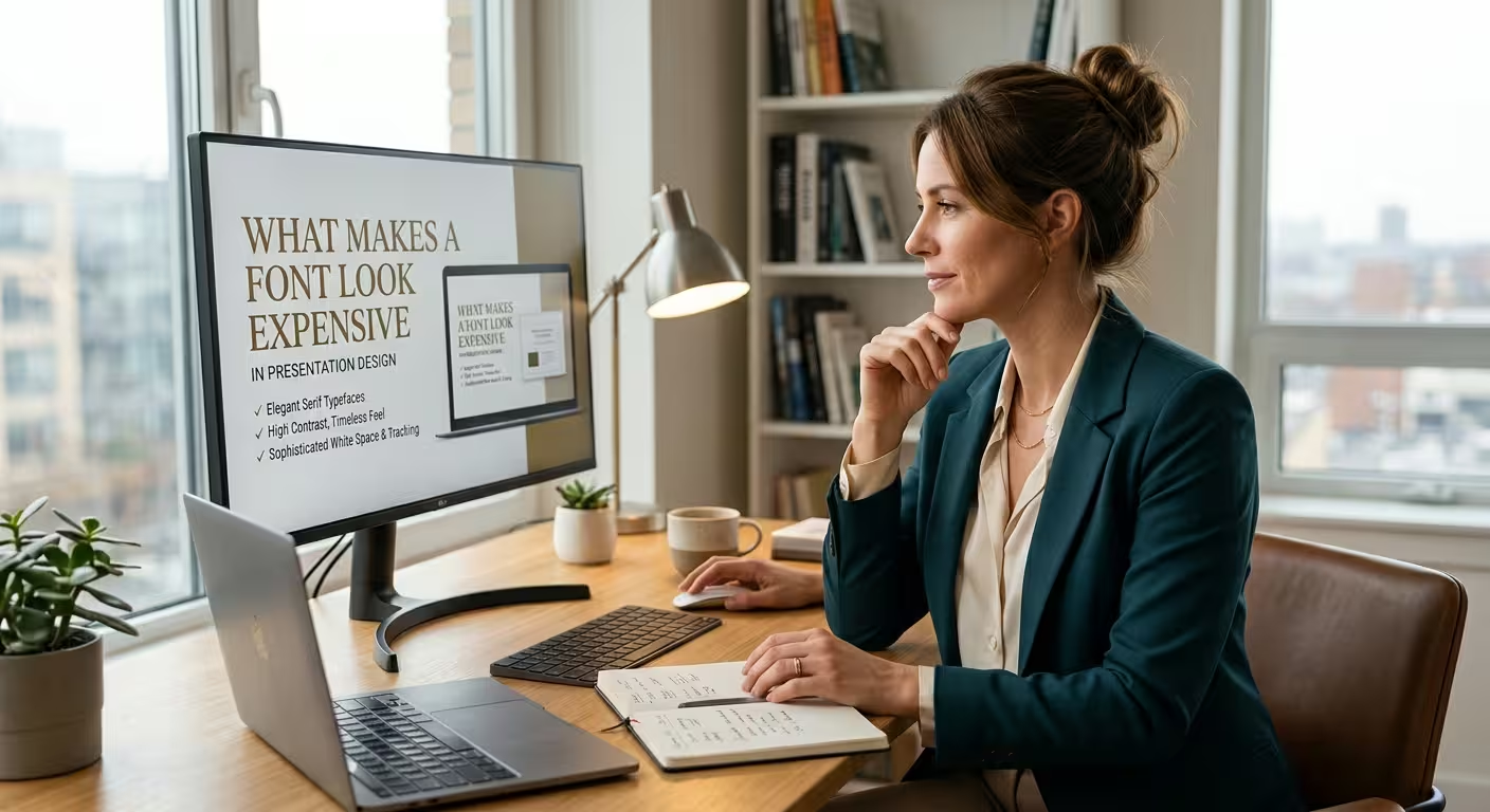
Nobody in your audience knows what you paid for your typeface. A font with a four-figure license and a free one look the same in a conference room, unless one of them has been handled with more care. That difference in care is what people actually register as "expensive."
This article is for anyone building a client, investor or leadership deck who wants the typography to feel premium without a custom-font budget. It covers what viewers read as quality, what quietly destroys it, and a short test you can run on your own slides.
Take the same headline, in the same font, twice
Imagine a hypothetical slide with a headline set in 28 pt bold, a subtitle at 24 pt just underneath, and a line of source text at 20 pt. Now imagine the same slide with a 54 pt headline, a 20 pt subtitle with extra space above it, and a source line that is clearly small but still readable. Same typeface, same words, same colors. The second one looks like it cost more.
What changed is not the font. It is the number of visible decisions. In the first version every text element competes at roughly the same volume, so the slide reads as unedited. In the second, someone obviously chose what matters. That is the same mechanism described in why the most expensive presentations often look the simplest: the premium feeling comes from editing time, and typography is where that editing becomes visible at the level of a single line.
Fewer size steps, bigger gaps between them
Premium-looking type systems tend to have three or four levels, and the jumps between them are large. Cheap-looking ones have six levels that differ by two points each. The eye can't sort 24, 26 and 28 pt into roles, so it files them all under "text."
The catch is the floor. You cannot create contrast by shrinking the bottom of the scale, because the smallest text still has to be readable from the back of the room. So the room for contrast comes from raising the top: a bigger headline, a bigger key figure. If your smallest size is already at its limit and the slide still feels flat, the problem is usually too much text, not the wrong font.
Weight needs the same caution. A light weight at headline size looks refined on a laptop, and I would not trust it on an unknown projector. Thin strokes are the first thing a washed-out or slightly soft image eats. Medium or semibold keeps the elegance and survives the room. If you want the longer reasoning on screen legibility, this guide to the best fonts for PowerPoint presentations goes through weights, viewing distance and projection conditions.
The adjustment most decks skip: spacing
Default letter spacing is designed to be acceptable everywhere, which means it is optimal almost nowhere. Two corrections do a surprising amount of work:
- Small all-caps labels (section tags, chart categories, eyebrow text above a headline) look cramped at default spacing. A little extra letter spacing makes them look deliberate.
- Large headlines usually look slightly loose by default. Tightening them a touch pulls the line together into one shape instead of a row of separate letters.
In PowerPoint this lives under Font > Character Spacing, and the custom value is set in points rather than as a percentage. That matters: a value that looks right at 60 pt will be far too aggressive if someone later shrinks the box to 24 pt, so re-check spacing whenever a text size changes. Multi-line headlines have a similar problem with line spacing. Slightly below single often looks tighter and more confident, but fonts with tall ascenders and long descenders can collide, so read the lines where a "g" or "y" sits above a "l" or "b" before committing.
Looking trustworthy and looking expensive overlap, but they aren't the same
In 2012 the filmmaker Errol Morris ran an experiment through his New York Times column. Readers were asked whether they agreed with a short passage, and without their knowledge the passage was shown in one of six fonts. More than 45,000 people responded, and the passage set in Baskerville earned the most agreement.
It is tempting to turn that into a rule: use Baskerville and your slides look credible. I would not. The quiz ran as an open web page, so screen sizes, devices and rendering were uncontrolled, and the study has had its critics for exactly that reason. What it supports is a softer point: typefaces carry a personality, and readers respond to it before they consciously read anything.
For presentations, the practical consequence is about fit rather than prestige. A delicate, high-contrast display serif on a sprint-retrospective deck (hypothetical, but a mismatch I see in different forms) reads like a costume. A heavy, friendly rounded sans on a legal risk summary has the opposite problem. A font looks expensive when its personality matches the seriousness and tone of what is being said.
How a deck stops looking expensive in transit
The fastest way to lose the premium look has nothing to do with design skill. You export the file, send it, and the recipient's computer doesn't have your font. PowerPoint quietly substitutes another one, line breaks shift, a title wraps onto a second line, and the carefully tuned spacing is gone. The audience never sees your intended version, so they judge the substitute.
Options, roughly in order of reliability: use a font the recipient is certain to have, use an open-source family that ships alongside the file, embed the font where its license allows it, or send a PDF when the deck only needs to be read. Editing by several people causes a quieter version of the same problem. Open Home > Replace > Replace Fonts before sending, and you will often find a stray extra typeface that crept in from pasted slides. If you want a framework for deciding how many fonts a deck should carry and which role each one plays, how to combine fonts in a presentation covers it, including the fallback problem.
A ten-minute test before you send
Run these three checks on your key slides:
- The swap test. Temporarily set the whole slide in a plain system font. If it still feels deliberate, your hierarchy and spacing are doing the work. If it collapses, you were leaning on the font to carry a layout that wasn't carrying itself.
- The grayscale test. Remove color. Can you still tell the title from the subtitle from the footnote by size, weight and position alone?
- The one-number test. Find the slide with a key figure. Is that figure obviously the loudest element, and is everything around it clearly quieter?
This is also where a well-built template earns its place. The value is not a fancier font. It is that size steps, weights and spacing are already fixed before anyone on the team has a chance to drift from them. If you start from a template, check that its type system survives your content before you replace its fonts.
Nobody in the room will ever know what the font cost. What they will notice is whether the type looks like someone decided it. Open your most important slide, set it in a plain system font, and ask yourself whether it still looks like that.
Comments (0)