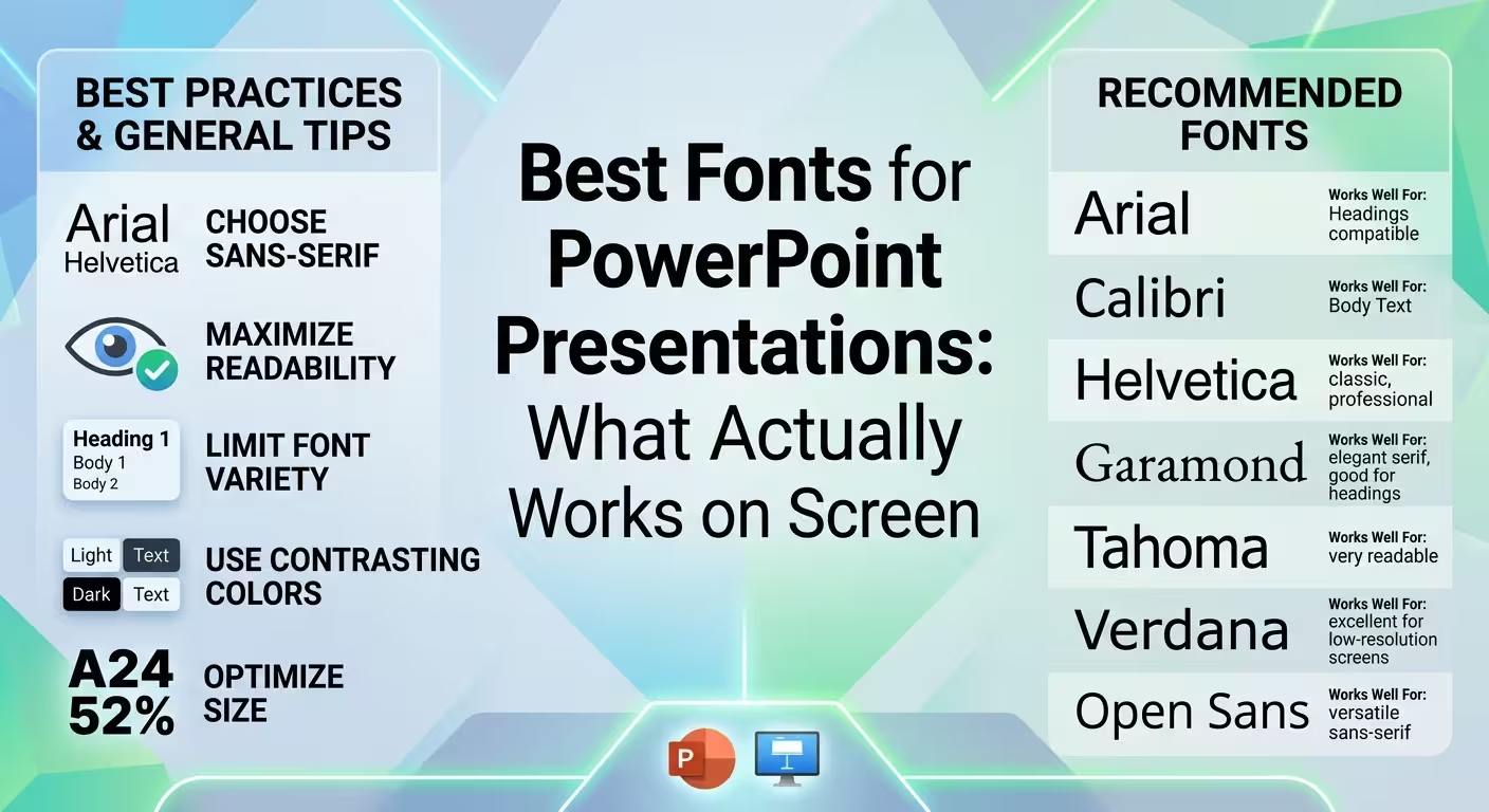
Why a Font That Looks Great on Your Laptop Can Fail in a Presentation
A font can look excellent at 100% zoom on a laptop and become surprisingly difficult to read once it is projected across a conference room. That difference is the part most font lists leave out.
When choosing the best fonts for PowerPoint presentations, the real test is not whether the typeface looks attractive in the editing window. It is whether the audience can distinguish titles, labels, numbers, and body text from the back of the room, on a projector, or on a different computer.
ImagineLayout's recent typography guidance makes the same practical distinction: presentation typography has to survive the conditions in which slides are actually viewed, including projection quality, viewing distance, and font substitution.
Start With Fonts That Have Strong, Open Letterforms
For most business and professional presentations, a clean sans-serif is a dependable starting point. Fonts with open counters, distinct letter shapes, and reasonably sturdy strokes tend to remain recognizable when the slide is viewed at a distance.
Common choices such as Arial, Calibri, Aptos, Helvetica, and Inter can work well because they are familiar, relatively neutral, and suitable for a wide range of presentation content. The important point is not that one of these fonts is universally "the best." The useful question is whether the particular font remains clear at the size and distance where your audience will see it.
Inter is also used alongside Calibri in some current ImagineLayout PowerPoint templates, illustrating a practical combination of a modern open-source typeface with a familiar built-in PowerPoint font.
Look closely at letters such as I, l, 1, O, 0, a, e, and g. If they become difficult to distinguish when the text is reduced, the font may create problems in dashboards, charts, financial figures, or technical slides even if it looks perfectly fine in a title.
Sans-Serif vs. Serif: The Screen Rule Needs a Qualification
The old advice is simple: use sans-serif fonts on screens and serif fonts in print. For presentations, that rule is too broad.
Modern serif typefaces can render well on high-resolution displays. The more important issue for projected presentations is stroke weight. Thin serifs and light weights are vulnerable when a projector is slightly out of focus, low in brightness, or viewed under difficult lighting conditions.
That means a sturdy serif headline can work, while a delicate light serif used for small body copy can become a liability. ImagineLayout's typography research makes this distinction explicitly: projection is where thin strokes become particularly vulnerable, rather than screens in general.
If you want a more editorial or authoritative look, try a serif for the main heading and a readable sans-serif for supporting text. For a technical or corporate deck, using one strong sans-serif family throughout may be the safer choice.
The Best PowerPoint Fonts Usually Have More Than One Useful Weight
Font family matters, but weight is often more useful than people expect.
A family that includes Regular, Medium, Semibold, Bold, and Black can create a complete hierarchy without introducing several unrelated typefaces. This is particularly valuable in PowerPoint because the same deck may be edited repeatedly by different people.
For example, one family can handle:
- Bold or Black: major slide titles and key figures.
- Semibold: section labels, chart headings, and secondary emphasis.
- Regular: body copy, descriptions, and supporting information.
- Medium: navigation labels, short annotations, or interface-style elements.
This approach also reduces the number of things that can go wrong when a presentation is shared. ImagineLayout's typography guidance notes that fewer typefaces can reduce consistency problems in decks that are edited or reused by multiple people.
Two Fonts Are Enough — If They Actually Contrast
Using two fonts does not automatically create good typography. Two nearly identical sans-serif typefaces can look less intentional than one well-structured family.
A more useful pairing strategy is to assign each typeface a specific role. For example, use a distinctive serif for large headlines and a neutral sans-serif for body text. Another option is a bold display sans-serif combined with a lighter, narrower sans-serif for supporting copy.
The contrast should be obvious enough that the audience can understand the hierarchy without having to consciously decode it. ImagineLayout's font-pairing guidance describes this as a functional rather than purely aesthetic decision: each text role should have a clear job.
For most professional decks, two typefaces are enough. A third can make sense for specialized content such as code or technical labels, but adding fonts simply to make individual sections feel "different" usually creates more visual work for the audience.
Font Size Is Only Half the Readability Problem
There is a common habit of choosing a font size based on how comfortable it looks on the designer's monitor. That is a poor substitute for testing the actual viewing conditions.
A slide edited at two feet from your face may eventually be viewed twenty or forty feet away. The same 20-point text that looks acceptable while editing can become useless at presentation distance.
Viewing distance also changes how much text a line can comfortably carry. Extremely wide text boxes make the eye travel farther across each line. ImagineLayout's typography guidance recommends paying attention to line length rather than assuming that increased line spacing will solve every readability problem.
As a practical test, switch to slideshow mode and step away from your monitor. If you have access to the actual room, test the deck from the furthest expected seating position. If you cannot test the room, shorter lines and more generous text sizes are safer assumptions than designing for the appearance of the editing screen.
Watch Out for Fonts That Depend on Color for Hierarchy
A presentation can use color to distinguish titles, labels, annotations, and body text, but color should not be doing all the work.
Projectors, lighting conditions, and different displays can reduce the distinction between colors. Dark blue and dark gray, for example, may become much harder to distinguish under unfavorable projection conditions.
A stronger typography system still works when the slide is viewed in grayscale. Size, weight, and position should make the hierarchy understandable before color is added. ImagineLayout recommends exactly this kind of robustness: if the hierarchy survives without color, it is less dependent on ideal viewing conditions.
Check Font Compatibility Before You Send the Deck
One of the least visible risks in presentation typography is font substitution.
If a presentation uses a font that is missing from another computer, PowerPoint or another presentation application may substitute a different typeface. That can change line breaks, text-box heights, alignment, and even the position of surrounding objects.
This is why a beautiful font that exists only on your workstation can be a worse practical choice than a less distinctive font that is reliably available to everyone who will edit or present the file.
ImagineLayout's own template pages show this issue in practice. For example, its Digital Solutions PowerPoint Template specifies Calibri as a built-in font and Inter as an open-source font supplied with the template.
If you are working with a purchased or shared PowerPoint template, check its typography before replacing the fonts. A template's established hierarchy may already account for title sizes, body weights, chart labels, and spacing. The goal should be to improve readability without accidentally breaking the layout.
Use a Template as a Starting Point, Not a Readability Guarantee
A professionally structured PowerPoint template can solve part of the typography problem before you start writing. It can establish heading sizes, body styles, spacing, and a consistent font pairing.
For example, Digital Solutions PowerPoint Template includes editable layouts and diagrams designed for presentations involving digital products, roadmaps, analytics, and business strategy. The page also specifies its PowerPoint compatibility and the Calibri/Inter font combination.
For presentations that depend heavily on charts and visual data, Information Visualization PowerPoint Template is another relevant starting point. Its structure is built around information visualization rather than text-heavy slides, which makes typography especially important for labels, annotations, and supporting explanations.
And if you are deciding whether to use one font family or a deliberate pairing, How to Combine Fonts in a Presentation provides a useful reference for assigning fonts to different presentation roles.
The Real Test for the Best PowerPoint Font
There is no single typeface that wins every presentation. The better test is whether the font survives the conditions that matter for your deck.
Before presenting, check five things: letter recognition, font weight, viewing distance, line length, and font availability. Then remove the color temporarily and see whether the hierarchy still makes sense.
One of the most useful final checks is deliberately simple: open a slide, move away from the screen, and slightly squint. If the title, key number, and main message remain obvious while secondary text recedes, the typography is doing its job. If everything turns into one gray block, changing the font family may help — but reducing the amount of text and strengthening the hierarchy may help even more.
The best presentation font is ultimately the one that stays readable after leaving your design software and entering the real world: a different screen, a different computer, a projector, a larger room, and an audience that has no interest in figuring out what your typography was supposed to say.
Comments (0)