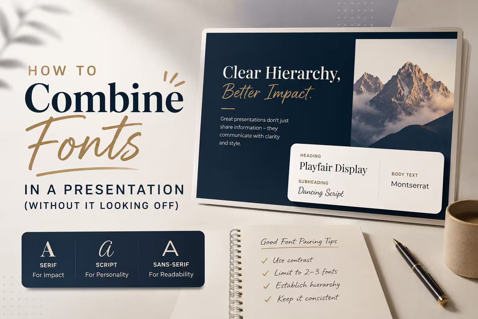
Open ten slide decks from ten different companies and you'll notice something: the ones that feel "designed" almost always use exactly two typefaces. Maybe three, if there's a monospace font tucked into a code snippet or a data label. The ones that feel amateur usually have four, five, sometimes more — not because more fonts is inherently wrong, but because most people pick fonts by mood instead of by function.
Font pairing in a presentation isn't really about taste. It's about giving every piece of text a clear job, and then choosing typefaces that make those jobs easy to tell apart at a glance.
Start With Roles, Not Fonts
Before opening a font menu, decide what needs to exist on your slides:
- A headline or title
- Body copy / bullet text
- Data labels or captions
- Occasionally, a UI or code element
Each role gets one font. Not one font "family with a twist" — one font. In my experience, the biggest source of visual noise in decks isn't bad font choices, it's assigning the same role to two different fonts across different slides because nobody defined the roles up front.
Once roles are set, the pairing question becomes much simpler: you're choosing a headline font and a body font that complement each other, not five random fonts that all seemed nice in isolation.
The Two-Font Rule (And When to Break It)
For most business presentations, two fonts is the ceiling:
- A display/heading font — something with more character, used sparingly and at larger sizes.
- A body font — clean, highly legible, used for anything read in paragraph form or in a bulleted list.
A third font is sometimes justified for monospace content (code, technical specs) or for a distinct "system" layer like chart axis labels. I wouldn't recommend going past three unless you have a very specific reason and a designer double-checking the result — beyond that point, the eye starts working to categorize text instead of just reading it.
Contrast Is the Actual Mechanism
The reason two fonts work and five don't isn't a magic number — it's contrast. A serif headline next to a sans-serif body works because they're visibly different in structure, so your eye instantly knows "this is a title, that's a paragraph" without conscious effort.
The failure mode I see most often is picking two fonts that are almost identical — say, two geometric sans-serifs with slightly different x-heights. They don't clash, but they don't do anything either. It just reads as an inconsistency, like someone changed the font by accident. If you're pairing two sans-serifs, lean on weight and size to create the contrast instead: a heavy, wide display sans against a lighter, narrower body sans can work well, while two similar-weight sans fonts of the same family logic usually won't.
Weight Does More Work Than People Expect
One thing people overlook: you can get most of the visual hierarchy you need from a single font family, if that family has a wide weight range. Light, Regular, Medium, Bold, Black — used deliberately, this alone can carry a headline, subhead, and body distinction without introducing a second typeface at all.
This is worth trying before reaching for a second font, especially for decks that will be edited by multiple people later (sales teams reusing a template, for instance). Fewer typefaces means fewer ways for the deck to drift out of consistency over time.
Practical Pairing Logic
A few dependable pairing directions:
- Serif headline + sans-serif body — classic, safe, reads as slightly more editorial or authoritative. Common in consulting-style decks.
- Bold sans headline + lighter sans body, same or related family — modern, tech-forward, low risk since you're not hunting for compatible outside fonts.
- Slab or geometric display font + neutral humanist sans body — good for pitch decks or anything that wants a bit more personality without sacrificing readability.
Whatever direction you pick, test it at actual presentation size and from actual presentation distance — a font pairing that looks fine on a laptop screen at 100% zoom can fall apart on a projector where the room's back row is squinting at 18pt body text.
Common Mistakes Worth Naming
- Using a script or handwritten font for anything but a very small, deliberate accent. It rarely survives translation to a projector or to someone else's laptop with different font rendering.
- Different fonts for different sections "for variety." This is the opposite of what makes a deck feel cohesive — variety within a section, consistency across all of them.
- Forgetting fallback fonts entirely. If you're sending the file to a client or embedding it in a CMS, a font that isn't installed on the recipient's machine will silently substitute to something else, sometimes badly. Always check how the deck renders on a system that doesn't have your fonts installed.
- Mixing font pairing logic with color logic. A font choice should carry hierarchy on its own — if you need color to explain which font is "the important one," the pairing itself probably isn't distinct enough.
A Reasonable Way to Decide
If you're not confident choosing fonts from scratch, a workable shortcut: pick one font pairing that a reputable type foundry or design system already recommends as a pairing (many font libraries publish these), and don't deviate from it slide to slide. It's not the most original approach, but it removes the guesswork, and consistency does more for a deck's professionalism than a clever font choice ever will.
Next time you're building a deck, try auditing it with just this question: if you removed all the color and just looked at the typography, could you tell the difference between a title, a subtitle, and a body line? If the answer is no, that's the font pairing to fix first — before anything else on the slide.
Comments (0)