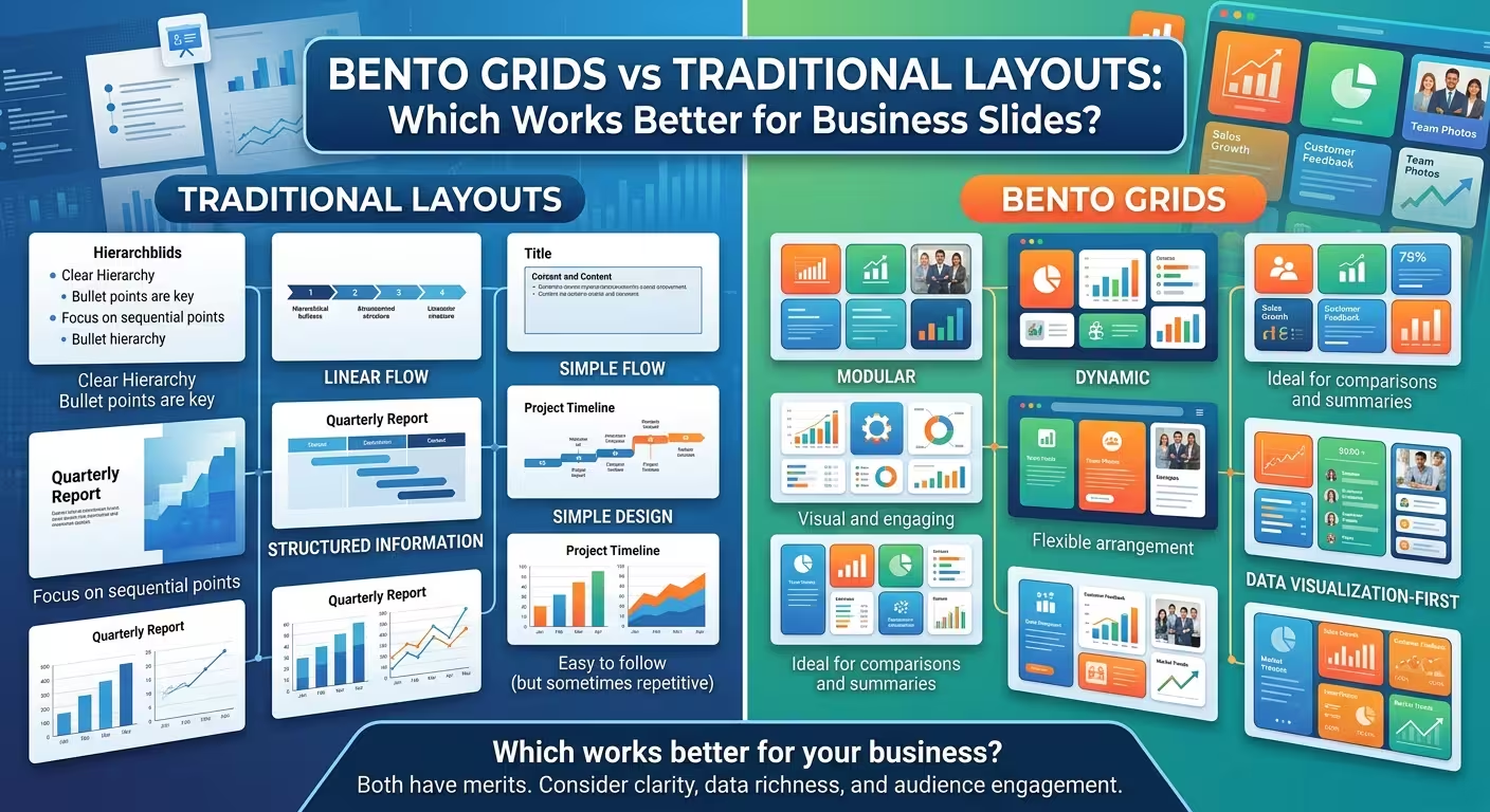
A slide can be perfectly aligned, visually polished, and still make the audience work too hard.
That is the problem behind the current popularity of bento grids. A collection of neat cards can make a business slide feel structured immediately, but structure and communication are not the same thing. For business presentations, the better choice between bento grids and traditional layouts depends less on which style looks more modern and more on how the information needs to be understood.
A bento grid solves a different problem from a traditional layout
Imagine a quarterly business review with four pieces of information: revenue, margin, customer growth, and one operational risk. If each item needs to be scanned independently, a modular grid makes sense. Each block can act as a small information unit without forcing the viewer through a predetermined sequence.
That is the fundamental strength of a bento layout: parallel information.
A traditional slide layout does almost the opposite. It usually establishes a dominant relationship between elements: headline and evidence, problem and solution, chart and takeaway, or main metric and supporting detail. The viewer is encouraged to understand one thing first and then use the surrounding content to interpret it.
So the useful question is not "Which layout looks better?" It is:
Does the audience need to compare several independent things, or understand one thing through its supporting evidence?
That distinction is more useful than calling one approach modern and the other traditional.
Where bento grids are genuinely useful
Bento layouts become valuable when the slide contains several related but relatively self-contained pieces of information.
Consider an executive dashboard. Revenue might occupy one block, gross margin another, customer acquisition another, and a short risk indicator a fourth. The viewer can enter the slide at almost any block and still understand what that block represents.
This makes bento grids particularly suitable for:
- KPI and performance summaries
- Portfolio overviews
- Product or feature comparisons
- Business-model snapshots
- Executive dashboards
- Multi-part strategy frameworks
- Overview slides where several dimensions deserve simultaneous attention
ImagineLayout's Business Model Canvas template is a practical example of this logic. Its modular blocks keep separate business-model components in fixed positions, making the whole framework readable as one overview rather than turning it into a sequence of unrelated slides.
Business Model Canvas presentation template
There is an important catch, though. A bento grid does not automatically establish priority. If every card has the same size, contrast, typography, and visual treatment, the audience may reasonably assume that every item deserves equal attention.
That is often wrong in business communication.
The hidden weakness: equal boxes can create unequal confusion
Suppose one card contains the quarter's most important financial result and five others contain supporting indicators. Giving all six cards identical visual weight creates a design problem even if the grid is perfectly aligned.
The audience now has to discover the hierarchy themselves.
This is where traditional layouts often have an advantage. A conventional composition can deliberately make one number dominant, place the explanatory chart beneath it, and push secondary context into a smaller supporting position.
The difference is subtle but important:
- Bento grid: "Here are several things you should inspect."
- Traditional hierarchy: "Here is the thing you need to understand, and here is the evidence."
Neither statement is inherently better. The problem appears when the visual structure contradicts the communication task.
I often see this when a designer converts a conventional business slide into cards simply because the card treatment looks cleaner. The original slide may have had a strong argument. After the conversion, it becomes a collection of equally important-looking facts.
The slide got tidier while the message got weaker.
Traditional layouts win when the slide has a reading path
Some business slides are not collections of information. They are arguments.
A strategy recommendation, investment case, process explanation, market diagnosis, or problem-solution slide usually benefits from a deliberate sequence. The audience needs to see the premise before the implication, or the evidence before the recommendation.
For these slides, a traditional layout can make the logic visible through position.
A common structure might be:
- one clear statement at the top;
- the primary evidence occupying the main visual area;
- a smaller supporting explanation or comparison;
- the implication or recommendation in a clearly defined location.
The exact arrangement can change, but the principle stays the same: the geometry reinforces the argument.
ImagineLayout's Business Solutions diagram collection illustrates this more sequential approach through processes, flows, cycles, tables, and directional structures. Those structures are useful when relationships such as sequence, dependency, or progression matter more than independent scanning.
Business Solutions PowerPoint diagrams
This is also why blindly converting a process slide into a bento grid can be counterproductive. A set of five boxes may show the same five stages, but the viewer loses the directional relationship between them.
The best business decks often use both
There is no requirement for a presentation to choose one layout system and use it everywhere.
In fact, that is usually where rigid design systems become uncomfortable. A 20-slide strategy deck may need a conventional argument slide, a bento-style overview, a chart-heavy analysis slide, and a process diagram. The visual language can remain consistent while the underlying information architecture changes.
The useful distinction is between design consistency and structural repetition.
You can keep typography, margins, colors, corner treatment, and spacing consistent while changing the layout according to the job of the slide. ImagineLayout's own alignment guidance makes a similar distinction: a grid can provide consistent guides without requiring every slide to use the same composition.
A practical sequence might look like this:
- Opening: traditional composition with one dominant message.
- Overview: bento grid for several independent business dimensions.
- Analysis: traditional chart-and-evidence structure.
- Framework: modular grid if the audience needs to compare components.
- Recommendation: traditional hierarchy that makes the decision unmistakable.
The result feels coherent because the visual rules stay stable even though the information structures change.
Use the grid according to the relationship between the content
Here is a simple test I use when choosing between the two.
Take the content away from the visual design and write each information unit on a separate line. Then ask what relationship exists between them.
If the units are mostly independent, a bento structure is a candidate. If removing one unit makes the meaning of the next unit change, you probably need a more connected layout.
For example, six independent KPIs can comfortably live in a modular grid. But six steps in a customer journey should not automatically become six unrelated cards. Their sequence is part of their meaning.
The same applies to comparison slides. A bento arrangement can work when each product or option has its own self-contained profile. A conventional comparison table is usually more useful when the audience needs to compare the same attributes row by row.
ImagineLayout's square-based chart collection demonstrates another useful case: a grid structure can be effective when the underlying information itself has discrete categories or a matrix-like relationship.
Square-based business chart layouts
The important point is that the grid should represent the information structure rather than decorate it.
A quick decision test before designing the slide
Before opening PowerPoint or Keynote, answer these five questions:
- Is there one message the audience must remember? If yes, start with a traditional hierarchy.
- Do several pieces of information deserve independent scanning? If yes, consider a bento grid.
- Does sequence or causality matter? Prefer a connected traditional structure, process, or diagram.
- Are all cards genuinely comparable? If not, identical boxes may create false equivalence.
- Will the slide still make sense if someone looks at the middle first? If yes, a modular structure may be appropriate. If no, create a deliberate reading path.
That last question is particularly useful for executive presentations. A senior audience may not read a slide from the top-left corner to the bottom-right corner. They may immediately look at the largest number, the highlighted box, or the chart. Your layout should make that behavior work for the message rather than against it.
So which layout works better for business slides?
Neither bento grids nor traditional layouts are universally better. They solve different communication problems.
Choose a bento grid when the slide is an organized collection of independent information. It is especially useful for dashboards, overviews, portfolios, frameworks, and multi-metric summaries.
Choose a traditional layout when the slide is an argument with a clear hierarchy or reading path. It is better suited to recommendations, explanations, evidence-led analysis, processes, and decision slides where one element needs to dominate.
The most reliable approach is not to make every slide look like a bento grid or to return every slide to a conventional two-column composition. Build the layout around the relationship between the information first, then apply the visual system.
That is also where templates can save time without taking over the design decision. A good template gives you tested structural options; it should not force a dashboard structure onto a slide that actually needs to make an argument.
The strongest business decks usually do something less fashionable and more useful: they let the content decide whether the audience should scan or follow.
Comments (0)