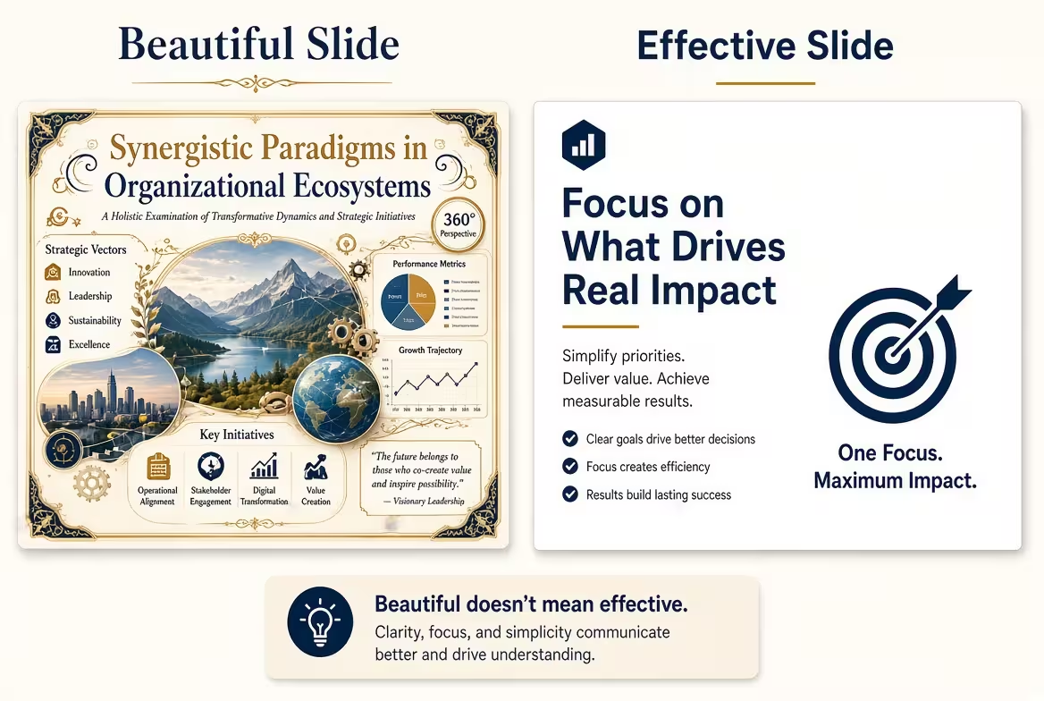
A Beautiful Slide Can Still Fail
A slide can look polished, balanced, and professionally designed and still leave the audience wondering what they were supposed to notice. That is the important difference between a beautiful slide and an effective slide: beauty is primarily about visual appeal, while effectiveness is about what the audience understands or does with the information.
This distinction matters because presentation design is not judged in a screenshot alone. A slide may look excellent when viewed on its own, yet become ineffective when an audience has only a few seconds to understand it during a live presentation.
The better question is not simply, “Does this slide look good?” It is “Can the audience find the intended message without having to decode the design first?”
Beauty Attracts Attention; Structure Directs It
A visually attractive slide often succeeds at getting attention. Strong typography, interesting graphics, balanced composition, and carefully chosen imagery can make a presentation feel polished.
But attention is only the beginning. Once the audience looks at the slide, the design needs to tell them where to look next.
Consider a slide containing a large number in the center, several supporting statistics around it, and a decorative illustration in the corner. Everything may be aesthetically consistent. If the supporting figures are just as visually prominent as the main number, however, the audience has to decide for themselves what matters.
An effective slide makes that decision easier. The primary message receives the strongest visual position, while supporting information is deliberately given less emphasis.
This is one reason visual hierarchy matters more than decoration. ImagineLayout's Main Idea PowerPoint Templates, for example, are built around editable layouts for emphasizing a central idea while keeping supporting content organized.
The Test: Remove the Presenter
One practical way to evaluate a slide is to imagine that the presenter suddenly stops talking.
Could the audience still identify the main point?
This does not mean every slide should contain a complete written explanation. A presentation is a combination of spoken and visual communication. The point is to identify whether the slide has a clear visual job.
- A beautiful slide can make the audience notice the composition.
- An effective slide makes the audience notice the intended information.
- A beautiful slide can support a memorable impression.
- An effective slide supports the specific message being presented.
For example, if the presenter is explaining that one business unit significantly outperformed the others, a chart should make that difference immediately visible. The audience should not have to compare ten labels manually before discovering the point.
ImagineLayout's Professional Column Chart PowerPoint Template illustrates this principle with chart layouts designed to make differences in magnitude easier to compare. The design is useful not because a column chart is inherently attractive, but because the visual form supports the analytical task.
When Decoration Starts Competing With the Message
One of the easiest ways to make a slide beautiful but ineffective is to give decorative elements the same visual importance as the information.
A photograph, illustration, icon, gradient, background pattern, or oversized title can dominate the composition even when it contributes little to the actual argument.
The problem becomes especially visible on business slides. A presentation might use an impressive background image and several decorative icons, but the actual decision, metric, or recommendation is reduced to a small text box.
I often approach this by temporarily ignoring the design and asking: if I had to remove 30 percent of the visual elements, which ones would I protect? The answer usually reveals the slide's real communication hierarchy.
That does not mean decorative elements are always bad. A strong image can establish context, demonstrate a product, or create an emotional association. The issue is whether the visual earns its space by helping the audience understand the subject.
Effective Slides Make Comparison Easier
Some slides are not primarily about reading. They are about comparing.
Imagine a quarterly business review where the audience needs to compare revenue across regions. A decorative infographic may look more sophisticated than a simple chart, but if the audience cannot quickly determine which regions differ and by how much, the visual treatment is working against the purpose.
This is where an effective slide becomes almost functional. Its visual structure reduces the amount of mental work required to interpret the information.
Charts, diagrams, matrices, and other visual frameworks can be particularly useful when the relationship between items matters. ImagineLayout's Pyramid Ribbon PowerPoint Charts Template, for instance, uses a hierarchical structure for situations where levels, priorities, or relationships need to be communicated visually.
The key is to select the structure because it matches the information. A pyramid should not be used simply because it looks more interesting than a list.
Ask What the Audience Should Know After One Slide
A useful design exercise is to complete this sentence before editing the slide:
“After seeing this slide, the audience should understand that…”
If the sentence cannot be completed clearly, the design problem may actually be a message problem.
Once the intended takeaway is defined, visual decisions become easier. You can decide which number deserves emphasis, whether a paragraph should become a diagram, whether several items should be grouped, or whether a supporting detail belongs on another slide.
This approach also prevents a common mistake: trying to make one slide communicate everything that belongs to an entire section of the presentation.
Beautiful and Effective Are Not Opposites
The choice is not between attractive slides and useful slides. The strongest presentations combine both.
Good visual design can make information easier to approach, while effective information design gives that visual treatment a clear purpose. The problem begins when appearance becomes the objective rather than the communication method.
Before finalizing a PowerPoint slide, look at it once as a designer and once as an audience member. As a designer, ask whether the composition feels intentional. As an audience member, ask whether you can identify the main message quickly and understand why the information is arranged that way.
If the answer to both questions is yes, the slide is doing more than looking good. It is doing its job.
Comments (0)