Why “Use Less Text” Is Bad Presentation Advice
“Use less text” sounds like good presentation advice, but it becomes misleading when important information cannot simply be removed.
Design tips, tutorials, product updates, and industry insights.
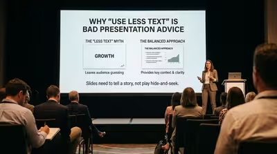
“Use less text” sounds like good presentation advice, but it becomes misleading when important information cannot simply be removed.

The priciest decks in the room are usually the emptiest — and it's not a style choice, it's what the budget actually paid for.

Everyone assumes a white slide background means you ran out of ideas — here's why it's usually the opposite.
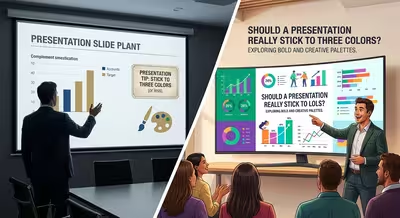
The "no more than three colors" rule gets repeated in almost every design tip list — but almost nobody explains what happens when you actually need a fourth.

A deck can look completely finished and still lose the room — here's the gap nobody's design checklist catches.

Most corporate decks aren't too short on ideas — they're too long on habits nobody's questioned in years, and here's the audit to fix that.
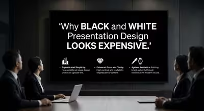
The priciest-looking decks in the room are usually missing almost every color you'd expect — except one.
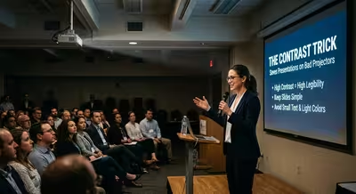
The projector in that conference room is older than your job — here's the one design decision that keeps your slides readable anyway.

There's a reason "just move it a little" turns into a four-hour afternoon — and it isn't that you're bad at your job.