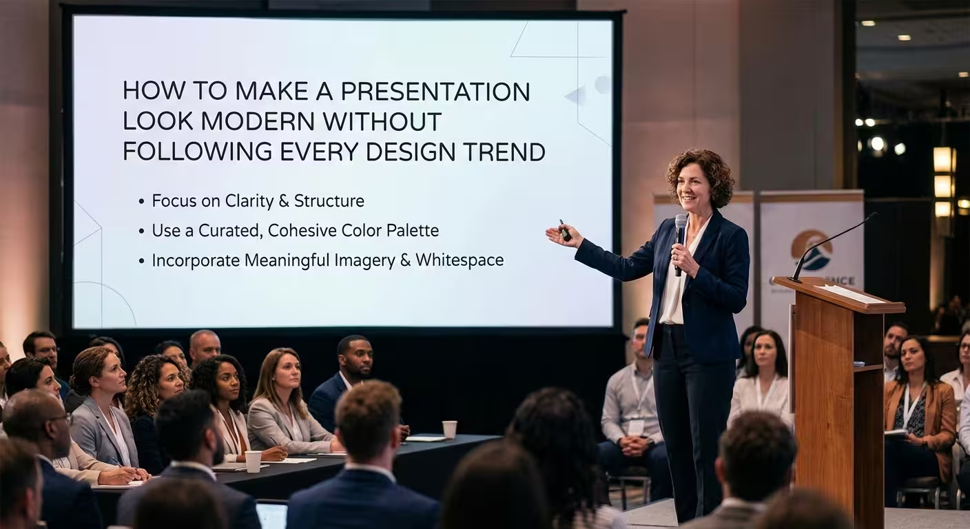
Modern Does Not Mean “Use Whatever Looks New”
A presentation can use a fashionable font, oversized text, gradients, animated objects, and still look strangely dated a few months later. The problem is usually not that the designer missed a trend. It is that the slide has no underlying system.
If you want to know how to make a presentation look modern without following every design trend, start with the structure underneath the styling. A current-looking deck usually has predictable alignment, deliberate hierarchy, reusable layouts, controlled typography, and visuals that help the audience understand the message.
This approach also makes an existing PowerPoint deck easier to refresh. Instead of replacing everything, you can identify the structural decisions that make the presentation feel old and fix those first.
Build a Grid Before You Change the Colors
One of the fastest ways to make an old presentation feel more current is to fix alignment before touching the visual theme.
Open PowerPoint's guides and gridlines and establish a small set of rules:
- One consistent left and right margin.
- A repeatable title position.
- A defined content area.
- Consistent spacing between major elements.
- Predictable alignment across related slides.
The important part is applying the system to the middle of the deck, not only to the title and final slides. ImagineLayout's own guidance on modern PowerPoint design makes the same structural distinction: a coherent grid and reusable layouts matter more than simply adding fashionable visual details.
A useful test is to place two consecutive slides side by side. Ignore their colors and content. Look only at the position of titles, charts, images, and text blocks. If every slide seems to follow a different set of invisible margins, that inconsistency will often make the deck feel older than any individual design choice.
Use Typography as a Hierarchy, Not a Collection of Fonts
You do not need a new typeface to modernize a presentation. What matters more is whether the typography clearly tells the audience what to read first, second, and third.
A practical system can be built around:
- One display style for major slide titles.
- One body style for supporting information.
- A limited number of weights for emphasis.
- Clear differences in scale between headings and supporting text.
ImagineLayout's modern-presentation guidance specifically points to scale contrast as a more meaningful source of hierarchy than simply increasing the number of typefaces. A title and body copy that are almost the same size can merge into one visual block even when both fonts are perfectly contemporary.
There is also a practical limit. If a slide contains too much information, reducing the font size to make everything fit does not make the presentation more modern. It usually makes it harder to read. In that situation, splitting one crowded slide into two is often a stronger design decision than searching for a smaller font.
Do Not Turn Minimalism Into Missing Information
Minimalism is useful until removing an element makes the slide harder to understand.
This is particularly important with charts. A chart can look cleaner after you remove labels, gridlines, legends, and other supporting elements, but the result is not necessarily more effective. If the audience now has to estimate every value visually, the slide has become simpler to look at and more difficult to read.
The better question is not “Can I remove this?” but “Does the audience need this to interpret the message?”
For a data-heavy slide, a small number of carefully selected labels may be more modern in practice than an ultra-minimal chart that forces the presenter to explain every number verbally.
ImagineLayout's business presentation chart templates demonstrate this balance through editable charts and diagrams designed to communicate business information without relying entirely on decorative elements.
See the Modern Business Presentation Charts template for examples of presentation-oriented chart and diagram layouts.
Choose a Color System That Survives Different Screens
A presentation can look excellent on your laptop and lose much of its clarity on a projector, large display, or video call.
That is why modern color design should be based on function rather than the palette that happens to be fashionable.
- Use a restrained base palette for most content.
- Reserve stronger colors for information that needs attention.
- Maintain enough contrast between text and its background.
- Give recurring colors a consistent meaning throughout the deck.
For example, if one accent color identifies the current phase of a project on one slide, it should not suddenly represent risk on the next slide.
A modern palette should also work when the presentation is viewed outside the environment in which it was designed. Very subtle colors that look sophisticated in a design mockup can lose contrast in a bright room or on a low-quality display.
This is one reason editable templates can be useful during a redesign: changing the presentation's theme colors in a structured file is faster than manually recoloring every individual object.
Replace “Trendy” Layouts With Reusable Ones
One of the easiest traps in presentation design is treating every slide as a separate creative project.
A more durable approach is to create a small family of layouts that can handle most of the information you need:
- Title and key message.
- Two-column comparison.
- Large statistic or KPI.
- Chart with supporting explanation.
- Process or timeline.
- Image with short narrative.
- Closing or decision slide.
Once these structures exist, the presentation becomes more consistent without looking repetitive. The content changes while the underlying visual grammar remains stable.
This is also where a professionally structured template can save time. Instead of constructing the grid, typography, spacing, and recurring compositions from an empty PowerPoint file, you can start with editable layouts and adapt them to the content.
Explore the Modern Square PowerPoint Template for an example of a structured presentation system built around consistent geometric layouts.
Use Motion to Control Attention, Not to Prove You Know PowerPoint
Animation is not automatically modern or outdated. Its value depends on what it does for the audience.
A transition that exists only because it looks impressive can quickly become visual noise. An animation that reveals a complex process in the same order that you explain it can make the slide easier to follow.
Before adding motion, ask one question: Would removing this animation make the explanation harder to follow?
If the answer is no, the animation is probably decorative. If the answer is yes, keep it and make the timing deliberate.
For example, a process diagram may benefit from revealing each stage in sequence. A dense chart may benefit from introducing one comparison at a time. Neither requires an elaborate transition effect.
Modernize an Existing Deck in the Right Order
You rarely need to rebuild an entire presentation to make it look more current. A staged redesign is usually easier to control.
Start with the elements that affect every slide:
- Fix the grid. Standardize margins, title positions, and content alignment.
- Fix typography. Establish a clear type hierarchy and remove unnecessary font variations.
- Fix recurring layouts. Replace improvised slide structures with a small set of reusable compositions.
- Fix color usage. Give accent colors clear roles instead of applying them randomly.
- Review charts and diagrams. Remove decorative elements that do not improve comprehension, but keep information the audience needs.
- Review animation last. Add motion only where it improves sequencing or explanation.
This order matters because changing animations before fixing the layout is usually wasted effort. If the slide structure changes later, much of that animation work has to be rebuilt.
Know Which Trends Are Worth Borrowing
Following every design trend is unnecessary, but ignoring all trends is not the answer either. Some trends reflect genuine improvements in how presentations communicate.
A useful distinction is between surface trends and structural improvements.
Surface trends include specific gradients, fashionable illustration styles, particular shapes, or visual treatments that may quickly become recognizable as belonging to a certain period.
Structural improvements are more durable. Better alignment, clearer hierarchy, editable diagrams, stronger contrast, intentional spacing, and layouts that match the information are useful regardless of the current visual fashion.
When evaluating a new design idea, ask whether you are borrowing its appearance or its underlying principle. If the principle improves communication, it is more likely to remain useful after the trend itself disappears.
Use Templates as Systems, Not as Finished Designs
A template should not dictate the content of your presentation. It should reduce the number of design decisions you have to make repeatedly.
ImagineLayout's presentation library includes PowerPoint templates, diagrams, charts, maps, and other editable presentation assets. Its template pages describe editable shapes, colors, layouts, and presentation elements that can be adapted rather than treated as fixed artwork.
Browse ImagineLayout presentation templates when you need a structured starting point for a deck rather than another collection of isolated visual effects.
The best use of a template is therefore not “make my presentation look trendy.” It is “give my presentation a reliable visual system so I can concentrate on the message.”
A modern presentation does not need to predict what will be fashionable next year. It needs to feel deliberate today: aligned elements, readable hierarchy, purposeful visuals, controlled color, and motion that supports the story. Once those foundations are in place, you can borrow individual trends when they genuinely help — and ignore the rest without making the deck look outdated.
Comments (0)