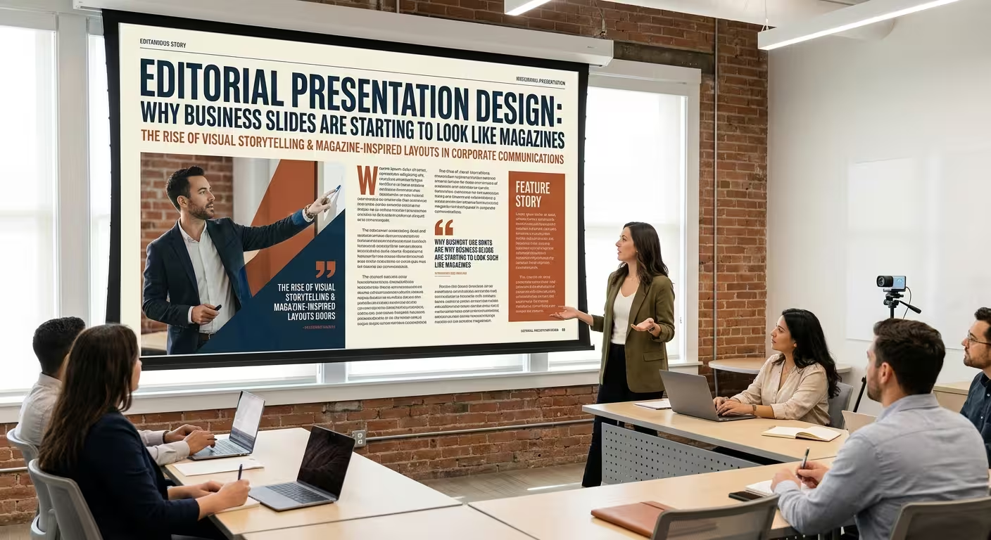
Open a few recent business presentations and you may notice something that would have seemed unusual a decade ago: the slides look less like software-generated reports and more like pages from a well-designed magazine.
Large headlines sit beside photography. Short captions replace paragraphs. Numbers are treated like editorial callouts rather than spreadsheet leftovers. Some slides use asymmetric grids, oversized typography, or a full-page image with only one sentence of context.
This is the appeal of editorial presentation design. It does not mean turning a quarterly business review into a fashion magazine. It means borrowing editorial principles to decide what deserves attention, how information is sequenced, and how a slide should feel before the audience starts reading it.
The Shift Is From “Slide” to “Page”
Traditional business slides often begin with a familiar structure: title at the top, several bullets underneath, perhaps a chart on the right. The information may be correct, but the composition is largely dictated by the presentation software.
Editorial design starts from a different question: what is the most important thing on this page?
A magazine spread might give an entire page to a photograph, a headline, or a short piece of text because the editor has decided that element deserves the reader's attention. A business presentation can make the same decision.
ImagineLayout's current presentation library reflects this broader movement toward professionally composed layouts rather than relying only on conventional corporate slide structures. Its templates cover business presentations, reports, diagrams, charts, and other presentation formats, with editable PowerPoint layouts designed for professional use.
The result is not necessarily a more decorative presentation. It can actually be a more selective one.
Magazine Grids Give Business Slides More Editorial Control
The grid is one of the strongest connections between magazine design and presentation design. A magazine page has to coordinate headlines, images, captions, columns, pull quotes, and body text without making every element compete for attention.
The same problem exists in a business deck.
Instead of positioning each object independently, an editorial presentation can establish a small set of recurring columns and margins. A headline might occupy two columns, an image four, and supporting text one. Another slide can rearrange those same proportions while keeping the underlying visual language intact.
This creates an important distinction: consistency does not require identical slides.
A deck can have a recognizable structure while allowing some pages to be image-led, others data-led, and others almost entirely typographic.
ImagineLayout's recent guidance on slide alignment similarly emphasizes using consistent guides and margins so that elements remain related across different compositions.
For business presentations, this is particularly useful when a deck contains very different kinds of information. A financial chart, an executive quote, and a product photograph do not need the same layout. They do need to feel as though they belong to the same publication.
Typography Becomes Part of the Story
Editorial design treats typography as more than a way to make text readable. Size, weight, spacing, and placement can determine how the reader enters a page.
A business slide can use this approach by separating information into clear editorial roles:
- Headline: states the main idea rather than describing the slide mechanically.
- Deck or subheading: adds context without competing with the headline.
- Body copy: provides evidence or explanation.
- Caption: identifies an image, chart, or detail.
- Data callout: isolates one number that deserves immediate attention.
This hierarchy changes the way a slide is read. Instead of asking the audience to process everything simultaneously, it creates an intended reading order.
That does not mean using oversized type everywhere. ImagineLayout's presentation typography guidance points to a practical problem that editorial designers also have to solve: typography that looks excellent while being designed may behave differently when viewed in an actual presentation environment.
For a boardroom deck, therefore, an editorial approach still has to respect presentation distance. A beautiful caption that can only be read on a designer's monitor is not successful editorial design for a presentation.
Photography Can Replace Decoration With Context
Magazine-style presentations often use photography differently from conventional corporate decks. Instead of placing a stock photograph into an empty rectangle simply because the slide needs an image, the image becomes part of the argument.
Consider a business report about expansion into a new market. A generic office photograph adds atmosphere but little information. A carefully selected photograph of the market, customer environment, product context, or physical location can establish the subject before the audience reads the supporting text.
The same principle applies to product presentations. One strong photograph can establish the physical character of a product more effectively than several small decorative icons.
The editorial approach is therefore not “add more images.” It is give an image a job.
ImagineLayout's publication and news-oriented PowerPoint templates are a direct example of this visual language: the layouts are designed around headlines, editorial content, and media-style presentation rather than conventional corporate bullet structures.
Business Data Can Be Treated Like Editorial Content
This is where the magazine influence becomes more interesting.
A financial presentation does not have to display every metric with equal visual weight. An editorial approach asks which number is the story and which numbers are supporting evidence.
For example, instead of presenting six equally sized KPI cards, a slide might lead with one major figure and use the remaining metrics as smaller supporting information.
That structure resembles a magazine article: one headline establishes the story, while secondary elements provide evidence and context.
It also changes how charts are positioned. A chart does not necessarily have to dominate half the slide simply because the underlying dataset is important. The chart can occupy the supporting role while a short analytical statement becomes the primary visual element.
This is particularly useful for executive presentations where the audience often needs the implication of the data before they need to inspect every data point.
ImagineLayout's business report collection demonstrates how presentation templates can combine report-oriented information with structured visual layouts instead of relying on a single generic slide format.
The Risk: A Magazine Look Can Become Too Editorial
There is a point where editorial presentation design stops helping.
A magazine can afford ambiguity. A business presentation often cannot.
If every slide uses unusual typography, dramatic cropping, tiny captions, asymmetrical compositions, and unconventional navigation, the audience may spend more effort figuring out the interface than understanding the message.
The safest way to use the editorial approach is to separate visual personality from information architecture.
The visual personality can be distinctive. The information architecture should remain predictable enough that the audience knows where to look for the headline, evidence, source, date, or conclusion.
This is also why editorial design should not be confused with simply making a corporate deck look fashionable. ImagineLayout's recent commentary on generic corporate presentations makes a similar underlying point: repeated default layouts can create visual sameness, while intentional decisions about composition help a presentation develop its own identity.
How to Bring the Editorial Approach Into a Business Deck
You do not need to redesign every slide as a magazine spread. A more practical approach is to introduce editorial principles selectively.
- Create a grid: define consistent margins and a small number of columns before arranging content.
- Write stronger headlines: make the headline communicate the insight rather than simply naming the topic.
- Vary the page composition: allow data, imagery, quotes, and text to use different layouts.
- Establish recurring editorial elements: captions, page labels, section markers, or small metadata lines can create continuity.
- Give images a purpose: use photography to establish context rather than fill empty space.
- Prioritize one idea: decide which piece of information deserves the strongest visual position.
A ready-made editorial or publication-style template can also provide a useful starting structure. The advantage is not that the template makes the presentation automatically effective; it gives the designer an established grid, typography hierarchy, and composition to customize.
For example, ImagineLayout's publication-focused PowerPoint resources provide editable layouts specifically suited to news, articles, publishing, and media-style communication.
The most convincing business presentations may therefore borrow less from the visual clichés of corporate decks and more from the discipline of publishing. A magazine editor decides what deserves the headline, what becomes the image, what belongs in the caption, and what can be left out.
That is the real value of editorial presentation design. The goal is not to make a PowerPoint slide look like a magazine for its own sake. It is to make every slide feel deliberately edited.
Comments (0)