The Corporate Slide Is Not Disappearing — Its Job Is Changing
For years, a familiar corporate presentation formula worked almost everywhere: a logo in the corner, a formal title, several bullet points, a chart, and enough text to make the slide understandable even without the presenter.
That approach still has its place. But increasingly, presentations are being designed around a different assumption: the slide should help the audience see the idea, not simply read what the presenter is saying.
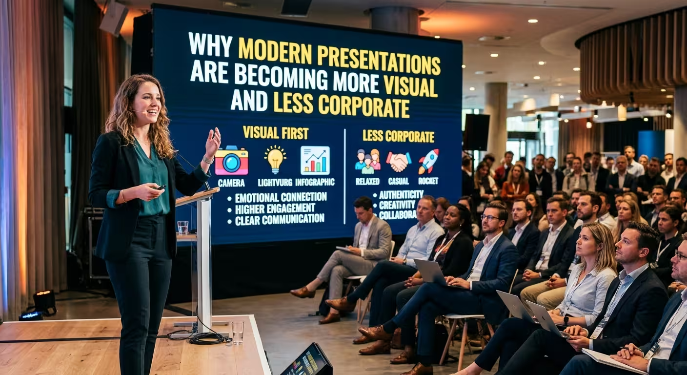
This is one reason modern presentations are becoming more visual and less corporate in appearance. The change is not really about making business presentations look informal. It is about changing how information is organized so that the audience can identify the main idea before reading every detail.
ImagineLayout's own recent guidance on modern PowerPoint design makes a similar distinction: contemporary presentation design is less about decorative trends and more about consistent grids, stronger hierarchy, controlled typography, and layouts that support the content. See the modern PowerPoint presentation guide.
People Do Not Need Every Sentence on the Slide
One of the biggest changes is the relationship between the speaker and the slide.
A traditional corporate slide often tries to be self-sufficient. It contains the explanation, the supporting details, the numbers, and sometimes even the conclusion. The presenter then talks over it.
A more visual presentation separates those responsibilities.
The speaker provides the explanation. The slide provides the visual structure that helps the audience follow it.
That might mean replacing a paragraph with a diagram, turning a list of five steps into a process, or using a single large metric instead of surrounding it with several sentences of commentary.
The important distinction is that less text does not automatically mean less information. A well-designed diagram can communicate relationships that would require several sentences to describe.
ImagineLayout's current template collection reflects this broader approach, with dedicated categories for PowerPoint diagrams, charts, timelines, roadmaps, infographics, and other visual structures rather than relying only on conventional text-and-bullet layouts. Browse the presentation template collections.
Visuals Are Becoming the Structure, Not the Decoration
There is a subtle difference between adding visuals to a presentation and designing a presentation visually.
In the first approach, the slide is still fundamentally text-based. Someone writes a paragraph and then adds an icon or stock image beside it.
In the second approach, the visual structure comes first.
Consider a strategy slide explaining four priorities. A traditional layout might present four bullet points with four small icons. A visual approach might give each priority its own section, connect the four sections to a central objective, and use short labels instead of paragraphs.
The second version does not necessarily contain fewer ideas. It simply gives those ideas a spatial relationship.
This is particularly useful for:
- processes and workflows;
- project phases and timelines;
- strategic priorities;
- organizational structures;
- comparisons;
- market or business data;
- relationships between concepts.
For these subjects, the arrangement of information can carry meaning by itself. ImagineLayout's modern infographic collection, for example, combines timelines, comparison structures, cycles, and other editable visual arrangements intended to turn dense information into visual narratives. Explore modern infographic charts.
Why the "Corporate" Look Can Start Working Against the Message
The problem is not that corporate design is inherently bad. A formal visual language can be appropriate for financial reporting, compliance presentations, board meetings, or executive communication.
The problem begins when every subject is given the same visual treatment.
A company history, a product concept, a training session, and a strategic workshop may all end up using identical title bars, bullet lists, tables, and blue corporate accents. The result can be technically professional while making very different ideas feel indistinguishable.
Modern presentation design tends to introduce more variation where the content requires it.
A timeline can look like a timeline. A comparison can look like a comparison. A process can be shown as a process. A key statistic can receive enough visual space to behave like the main message instead of being buried inside a table.
This is not an argument for making every slide experimental. It is an argument for allowing the information type to influence the layout.
Visual Does Not Mean Minimal at Any Cost
There is a trap on the other side of the trend: assuming that a modern presentation must contain almost nothing.
A slide with one word and a large photograph can look impressive in a design portfolio. It may be completely inappropriate for a financial review where the audience needs to compare several figures.
The same problem appears with charts.
Removing every label, axis, and reference point can produce a cleaner-looking chart, but it can also make the audience work harder to understand the numbers. ImagineLayout's recent discussion of modern PowerPoint design makes this exact distinction: visual simplicity should not remove information that the audience needs to interpret a chart correctly.
The better question is therefore not "How can I make this slide simpler?" It is:
"What information can the audience understand visually, and what information still needs to remain explicit?"
That question produces a much more useful form of minimalism.
Modern Presentations Give Data More Visual Context
Data is one of the clearest areas where presentation design is changing.
A table can contain everything. That does not mean it explains anything.
Modern presentation layouts increasingly use charts, highlighted figures, comparison blocks, timelines, diagrams, and visual groupings to give numbers context.
For example, instead of showing twelve monthly figures with equal visual weight, a presentation might emphasize the most important change and use the remaining values to explain the trend.
The goal is not to hide the underlying data. It is to make the intended relationship easier to recognize.
This is where editable presentation assets can be useful. A structured chart or infographic template provides a starting geometry for the information, allowing the presenter to spend more time deciding what the data means instead of manually arranging every shape.
ImagineLayout's modern business chart collection, for example, is built around editable charts and visual structures for business presentations, including layouts intended for presenting trends, strategies, and complex information.
The Shift Is Also About How Presentations Are Consumed
Modern presentations are rarely experienced in exactly one way.
A slide may be presented live in a meeting, viewed on a laptop afterward, included in a PDF, reused in a report, or shared with someone who was not in the original room.
That creates a design tension.
A slide needs enough visual context to remain understandable when someone encounters it without the presenter, but it should not become a miniature document filled with every sentence the speaker might say.
This is another reason visual structure matters. A clear diagram, process, timeline, or comparison can preserve the logic of the presentation even when the original narration is gone.
At the same time, not every slide needs to work independently. Some slides exist primarily to support a spoken explanation. Good presentation design depends on knowing which role the slide is playing.
What "Less Corporate" Really Means
"Less corporate" should not be interpreted as "less professional."
It usually means moving away from visual conventions that communicate formality for its own sake: oversized corporate headers, repetitive bullet lists, rigid information boxes, and identical layouts used regardless of content.
A modern professional presentation can still be precise, restrained, and appropriate for executives. The difference is that professionalism comes from clarity and intentional structure rather than from making every slide resemble an annual report.
That can mean using stronger typography, more purposeful imagery, editable diagrams, carefully selected color accents, and layouts that change according to the story.
The best test is surprisingly practical: remove the company logo and brand colors from a slide for a moment. If the slide still has a clear hierarchy and communicates its idea effectively, the design is probably doing more work than the branding alone.
Where This Leaves PowerPoint
None of this means PowerPoint has become obsolete. The software is still capable of producing both extremely traditional corporate decks and highly visual presentations.
The bigger change is in how people use the tool.
Modern presentation design is increasingly less about decorating a standard slide and more about selecting a visual structure that matches the information. A timeline should organize time. A chart should clarify a comparison or trend. A diagram should explain relationships. A large statement slide should create focus rather than simply fill an empty page.
That is why the move toward visual presentations is more significant than a passing preference for modern colors or minimalist templates. The real shift is from slides as documents toward slides as visual explanations.
Corporate presentations are not disappearing. They are becoming more selective about when formality helps and when visual communication does the job better.
The next time a slide feels too corporate, do not start by changing its colors. Ask what the audience is supposed to understand first — then choose a visual structure that makes that answer difficult to miss.
Comments (0)