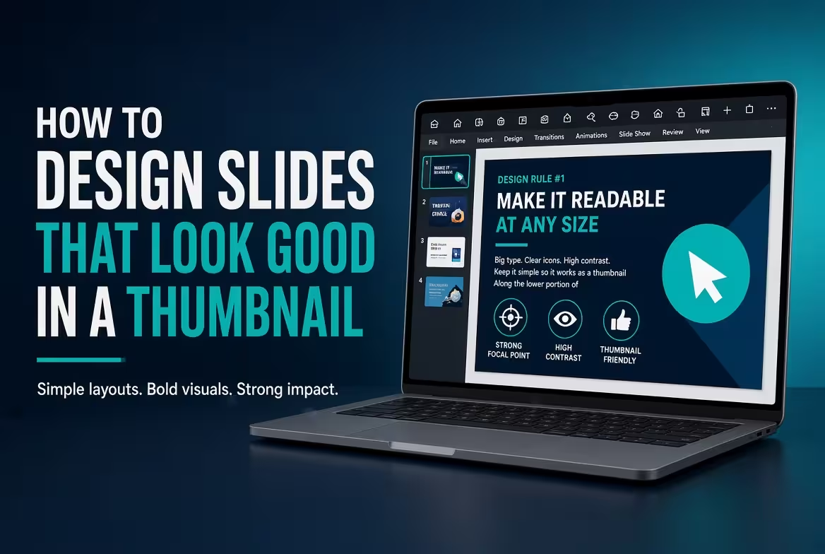
Why Thumbnail Size Is a Better Slide Test Than You Think
A PowerPoint slide can look excellent when you are zoomed in and still become almost meaningless when it is reduced to a small thumbnail. At full size, you can read every label, inspect every icon, and follow every connector. At thumbnail size, most of that detail disappears.
That makes the thumbnail a useful stress test for presentation design. If the main idea, visual structure, and most important element remain recognizable when the slide is small, the composition is probably doing its job.
ImagineLayout's guidance on visual hierarchy makes the same practical point from another direction: a slide needs a clear order in which the eye encounters its elements. A thumbnail exposes that order quickly because there is not enough space for the viewer to inspect everything equally.
Read ImagineLayout's guide to visual hierarchy for a deeper look at how the eye decides where to enter a slide.
Start With One Element That Survives the Shrink
Open a slide and reduce its size until the text is no longer comfortably readable. Do not try to read it. Instead, ask one question: What do I notice first?
If the answer is the intended headline, key number, diagram, or image, the slide has a useful starting hierarchy. If the first thing you notice is a decorative icon, a logo, a chart legend, or an unrelated colored shape, the thumbnail test has exposed a hierarchy problem.
This is particularly important because a slide can contain only one main idea and still have several competing visual entry points. A large number, bold heading, colorful chart, and oversized icon may all be technically related to the message, but if they have similar visual weight, the viewer has no obvious place to begin.
The solution is not necessarily to remove everything. Often the better move is to establish a clear visual ranking:
- First: the central message or conclusion.
- Second: the evidence supporting that message.
- Third: context, labels, sources, and secondary details.
At thumbnail size, this hierarchy becomes easier to judge because minor differences in typography and spacing disappear while major differences in size, position, and contrast remain.
Design the Headline for Recognition, Not Just Reading
A long headline may be perfectly readable on a large presentation screen but turn into an indistinguishable block of text in a thumbnail.
That does not mean every title has to be extremely short. It means the important words should be easy to identify when the slide is reduced.
Compare these two approaches:
Weak thumbnail structure:
“Overview of the Main Factors Affecting Customer Acquisition During the First Half of the Year”
Stronger structure:
“Customer Acquisition Slowed in H1”
The second version communicates the conclusion before the viewer has a chance to inspect the chart below it. Supporting details can then explain why.
ImagineLayout's presentation guidance emphasizes the difference between having a message and creating a visual entry point. The same principle applies to thumbnail design: the headline should not merely identify the subject; it should help establish what the viewer should notice first.
Use Size Differences That Remain Visible When Reduced
Thumbnail design exposes weak typography systems very quickly. If your title is only slightly larger than your body text, the distinction may disappear when the slide is reduced.
Think in terms of visible scale rather than small numerical differences. The title, key metric, supporting text, and footnote should not all compete at approximately the same visual weight.
A practical test is to duplicate the slide and temporarily make the supporting text much smaller. If the slide suddenly becomes easier to understand at thumbnail size, the original version probably gave too much visual weight to secondary information.
There is an important exception: data-heavy slides sometimes need more text because the audience is expected to inspect the slide closely. In that situation, thumbnail readability should still communicate the slide's category and main conclusion, but it does not have to reveal every data point.
Make Contrast Carry the Message
Color can help a thumbnail survive reduction, but only when it has a clear job.
If every object uses a different accent color, the thumbnail may turn into a collection of equally strong patches. A more controlled approach is to reserve the strongest contrast for the element that deserves attention.
- Use a strong contrast for the main message.
- Use moderate contrast for supporting information.
- Reduce contrast for secondary labels and references.
- Avoid making decorative elements more visually dominant than the content.
This principle becomes especially useful on charts. A chart with ten equally saturated categories may remain colorful at thumbnail size while becoming impossible to interpret. Highlighting one relevant category and visually reducing the others can preserve the intended story even when the chart becomes small.
ImagineLayout's visual-hierarchy guidance similarly recommends checking what the eye encounters first rather than assuming that a visually attractive slide automatically has a useful reading order.
Build Around Alignment So the Thumbnail Has a Clear Shape
When a slide is reduced, small spacing differences become less important than the overall structure. That is why alignment matters so much.
If three content blocks share the same left edge, the thumbnail reads them as a related group. If each block begins at a slightly different position, the entire composition can look fragmented even before the viewer reads the words.
ImagineLayout's alignment guidance recommends establishing guides before filling the slide with content and using PowerPoint's alignment tools instead of relying entirely on visual guesswork.
See the practical slide alignment rules from ImagineLayout.
For thumbnail design, pay particular attention to:
- consistent left and right edges;
- repeated image sizes;
- equal spacing between related objects;
- consistent title positions across slides;
- clear separation between major content groups.
When these relationships are stable, the thumbnail has a recognizable structure even when the text is too small to read.
Do Not Design Every Slide as a Miniature Poster
There is a temptation to make a thumbnail attractive by adding more visual elements: icons, colored cards, illustrations, badges, decorative shapes, and large background graphics.
The problem is that thumbnail size removes the context that makes those elements understandable. Several small icons that look sophisticated at full size can become visual noise when reduced.
Instead, decide which visual element carries the meaning. If a photograph explains the subject, let the photograph do that work. If a chart contains the argument, make the chart recognizable. If a single number is the conclusion, give that number enough visual weight to survive the reduction.
A useful test is to hide the small decorative elements temporarily and compare the thumbnail. If the slide becomes easier to identify without them, they were contributing visual complexity without enough informational value.
Use Slide Layouts to Keep Thumbnail Structure Consistent
Thumbnail readability is not only a problem for individual slides. It becomes much more noticeable when several slides are viewed together in Slide Sorter or a presentation library.
If every slide uses completely different title positions, margins, image proportions, and content structures, the deck can look fragmented when viewed as a collection of thumbnails.
PowerPoint's Slide Master can help establish recurring layouts, typography, colors, placeholders, and structural elements. ImagineLayout's practical Slide Master guide distinguishes between the master, individual layouts, and the content edited on each slide.
Learn how to use Slide Master in PowerPoint when you want thumbnail consistency to come from the presentation system rather than repeated manual formatting.
The important distinction is that consistency should not mean every slide has the same composition. Different slide jobs can use different layouts while still sharing the same underlying grid, title position, margins, and visual language.
Test the Slide at Three Sizes
One thumbnail check is useful, but three different viewing scales reveal different problems.
- Full size: check details, spacing, typography, charts, and alignment.
- Medium size: check whether the slide can be understood quickly without close inspection.
- Thumbnail size: check the dominant shape, focal point, headline recognition, and overall message.
At thumbnail size, do not judge whether every word is readable. Judge whether the slide has an identifiable purpose.
Ask:
- Can I tell what this slide is about?
- Can I identify the main visual element?
- Is there one obvious focal point?
- Does the headline still stand apart from the supporting content?
- Does this slide look structurally related to the slides around it?
If the answer to these questions is mostly yes, the slide is doing something important: it is communicating structure before detail.
Use a Template When the Layout Problem Is Already Solved
Designing a thumbnail-friendly slide from scratch is possible, but a professional template can remove some of the repetitive layout work. The useful part is not simply having a polished background. It is having editable layouts where the relationships between headlines, images, charts, and supporting content have already been established.
For example, ImagineLayout's Main Idea PowerPoint template is built around editable presentation layouts and a clear main-idea structure. Such layouts can provide a starting framework that you then adapt to the actual message of the slide.
The same principle applies when building your own template: create layouts for real slide jobs, establish the recurring structure in Slide Master, and then test those layouts with content of different lengths. A thumbnail test should be part of that process rather than something done only at the end.
The Thumbnail Is the Quickest Reality Check
A polished slide does not necessarily make a strong thumbnail. The thumbnail removes detail and leaves behind the things that are hardest to fake: hierarchy, proportion, alignment, contrast, and composition.
Before finalizing a presentation, shrink several slides and look at them together. If you can recognize the subject and main point of each slide without reading every word, the design is carrying its share of the communication.
If everything looks equally small and equally important, do not immediately reach for another font or decorative element. First decide what the viewer should see first. Then make that element unmistakably more important than everything around it.
Comments (0)