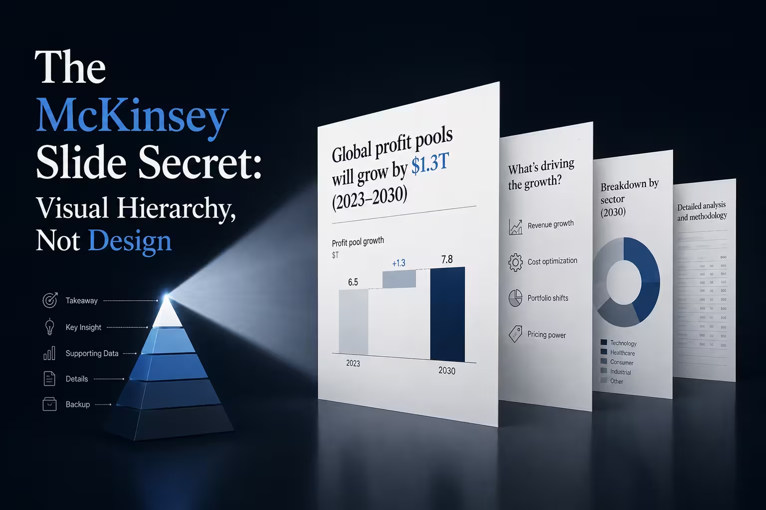
Someone once handed me a "redesigned" version of their own deck. Same content, new template — dark navy, one accent color, a serif headline font that looked expensive. It still didn't work. The client's eye still didn't know where to land first. Nothing about it was ugly. It just wasn't organized.
That gap is the part most people miss when they try to reverse-engineer a McKinsey deck. They study the palette, the grid, the spacing between elements — the design. What they skip is the thing the design is quietly serving: a forced order in which the eye is supposed to move.
Hierarchy isn't a synonym for "clean"
People use "hierarchy" loosely, usually to mean tidy — a headline, then a subhead, then some bullets, nested by font size. That's typography, and typography can absolutely exist without hierarchy. A slide can be perfectly typeset and still leave three elements competing for attention at the same visual weight, which means the reader's eye has to guess where to start.
Hierarchy, in the strict sense, is an answer to one question: in what order does this slide want to be read? Not "what does it say" — order. A slide with real hierarchy has exactly one first thing, one second thing, and everything else clearly subordinate. McKinsey's ghost-deck process gets to that order before design even starts, which is a useful habit — but the order itself is what you're borrowing when you copy the look, and it's the part a font swap can't fake.
The eye doesn't wait for your intentions
Here's the part that makes this checkable rather than opinion: people don't scan a slide the way you hope they will, they scan it the way their eyes default to. A 2006 Nielsen Norman Group eye-tracking study — later expanded to 232 participants — mapped how people's gaze actually moves across text-heavy and image-heavy layouts, and found two dominant patterns: an F-shaped scan for dense text, and a Z-shaped scan for sparser, image-led layouts. A separate Nielsen analysis of that same behavior found that on average, people only fixate on a minority of the content on a given screen before moving on.
What that means for a slide is uncomfortable if you've never designed against it: the audience is not going to carefully read your slide top to bottom the way you wrote it. Their eyes are going to land somewhere specific, first, whether or not you planned for it. Hierarchy is the discipline of making sure that first landing spot is the point you actually wanted to make — not a stray icon, not the client's logo, not a chart legend.
One message per slide still needs internal ranking
The standard McKinsey advice — one idea per slide — sounds like it should solve this automatically. It doesn't, and this is where most "clean but flat" decks go wrong. Even a slide with a single message usually has three or four visual elements carrying it: a headline claim, a supporting number, a chart, maybe a source line. Those elements still need to be ranked against each other, or the single idea arrives as a pile of equally loud pieces instead of a sequence.
I've fixed plenty of decks where the content was genuinely down to one idea per slide and the slide still failed, because the headline, the big number, and the chart title were all set at roughly the same size and contrast. Nothing was technically wrong. There just wasn't a first thing to look at. One idea isn't the same as one entry point.
Minimal doesn't guarantee hierarchy either
It's tempting to assume that stripping a slide down solves this by default — fewer elements, less competition for attention. Sometimes it does. But a genuinely minimal slide can still lack hierarchy if the two or three remaining elements are all given equal visual weight. Two bullets in the same font, same size, same color aren't hierarchy just because there are only two of them — they're a tie, and a tie forces the reader to do the ranking work you should have done for them.
The same logic runs through diagrams even more than text slides, because a diagram usually has more competing elements at once — boxes, arrows, labels, sometimes color-coding layered on top. Diagrams fail for exactly this reason more often than they fail on content: nothing tells the eye where to enter, so it enters wherever the strongest visual accident happens to be — usually not where the argument starts.
A five-minute way to check your own slide
Squint at the slide, or shrink it to thumbnail size, and ask what your eye hits first without reading anything. If the answer is the point you meant to make, the hierarchy is doing its job. If the answer is a logo, a chart axis, or a stray callout box, that's the element pulling rank it hasn't earned — and no amount of font polish fixes that, because the problem isn't typographic, it's positional and proportional.
The fix is rarely to add anything. It's usually to make the one thing that matters slightly bigger, slightly higher-contrast, or slightly earlier in the reading path — and let everything else visibly step back from it.
So next time a deck "still feels busy" after a full redesign, don't reach for another font. Shrink it, squint, and see where your eye actually goes first. That's the real audit — the one the fonts were never going to pass or fail.
Comments (0)