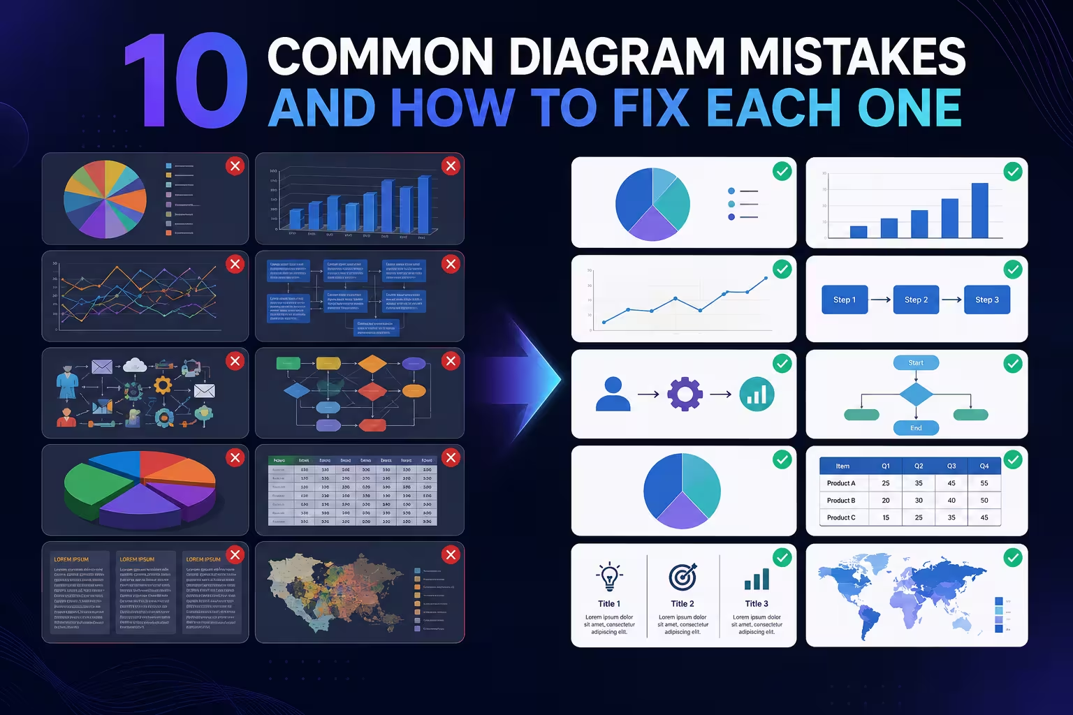
A diagram is supposed to save the reader time. Most of the ones I get handed to fix do the opposite — someone spends twenty minutes staring at a "simple" flowchart trying to figure out whether an arrow means "leads to," "reports to," or "sometimes happens after." The diagram isn't ugly. It's just quietly asking the reader to do work the designer skipped.
That gap — between what a diagram looks finished and what it actually communicates — is where most of these ten mistakes live. None of them are about taste. They're structural, which is good news, because structural problems are fixable in minutes once you know where to look.
1. Picking a chart type for how it looks, not what it claims
I've watched a project timeline get turned into a pie chart because "the client likes pie charts." A pie chart makes one claim: these parts add up to a whole. A timeline makes a completely different claim: things happen in sequence, with duration. Force one shape to make the other's argument and the reader's brain does the translating for you — badly.
The fix isn't "know your chart types" as a vague principle. It's narrower than that: before you pick a shape, write down the one sentence the diagram needs to prove. "X grew while Y shrank" wants a line. "These five things are parts of one thing" wants a pie or a stacked bar. "This happened, then this" wants a timeline or flow. If you can't state the claim in one sentence, you're not ready to pick a shape yet — that's the actual mistake, not the pie chart itself.
2. Letting a flowchart collect every edge case
Here's the pattern: a process flowchart starts clean — five boxes, one line each. Then someone in review says "but what if the payment fails," and a branch gets added. Then "what about international orders." Six months later the flowchart has eleven decision diamonds and nobody can trace the happy path through it anymore.
Each addition was individually correct. That's what makes this mistake sneaky — no single edit made it worse, but the sum did. The fix is to separate the 80% path from the exceptions on purpose: show the main flow as the dominant visual line, and push edge cases into a secondary "exceptions" branch or a separate diagram entirely. A flowchart that tries to be complete and readable at the same time usually ends up being neither.
3. Using color as decoration instead of a code
Color is the fastest thing a reader's eye processes — faster than text, faster than shape. Which is exactly why using it randomly is such a costly mistake: the reader's brain assumes color means something and starts hunting for the pattern, even when there isn't one.
In my experience the giveaway is when someone picks colors from "what looks nice together" rather than what needs to be told apart. If three departments in an org chart are red, blue, and green for no reason other than variety, a reader will spend a few seconds looking for the logic before giving up. Reserve color changes for actual category or status changes — same color always means the same thing across the whole diagram — and leave everything else in a neutral palette. It reads as less "designed," but it stops lying to the reader's pattern-matching instinct.
4. Arrows that don't agree on what an arrow means
This is the mistake behind almost every confusing org-chart-meets-flowchart hybrid I've fixed: one arrow shows "reports to," another shows "hands off work to," and a third shows "happens after." They're drawn identically. The reader has no way to tell them apart except by guessing from context — and guessing is exactly what a diagram exists to prevent.
One convention, one meaning, for the entire diagram — solid line for one relationship, dashed for another, and if a diagram genuinely needs three kinds of connection, it usually needs a legend, or it needs to be two diagrams. This is one of those "less clutter" rules people repeat everywhere, but the useful version of it isn't about clutter at all — it's about arrow semantics staying constant, which most generic advice never actually names.
5. Trying to show data and process in the same shape
A process diagram answers "what happens, in what order." A data visualization answers "how much, compared to what." Cramming both into one diagram — say, a flowchart where box size is scaled to budget — asks the reader to switch mental modes mid-read, and most people don't notice they're doing it, which is worse than an obviously broken diagram.
If a slide genuinely needs both, that's usually a sign it wants to be two visuals: a flow showing sequence, and a chart next to it showing scale. Splitting them takes more slide real estate, which is the actual trade-off — it's not free, and it's worth naming rather than pretending combining is always the win.
6. Skipping the eight-second test
Presentation researchers rarely have hard, checkable numbers on this specific behavior, but the underlying problem shows up in visualization literacy research too: in one survey-based study of how people actually read charts, a notable share of respondents reported being unfamiliar with basic chart types like line and bar graphs even though they could technically "read" them when pressed — meaning familiarity and comprehension aren't the same thing, and a diagram that assumes both is assuming too much.
That's the real argument for testing a diagram cold: hand it to someone with zero context and time how long it takes them to state, unprompted, what it's showing. If it takes longer than about eight seconds, the diagram isn't finished — no matter how polished it looks. This is uncomfortable to actually do, which is probably why it gets skipped more than any other fix on this list.
7. Ignoring how the eye actually enters the diagram
Readers don't scan a diagram evenly. In most left-to-right reading cultures, the eye lands upper-left first and drifts in a rough Z or F pattern. A diagram that puts its most important element bottom-right, or scatters the "start here" point in the middle, is fighting the reader's default scan path instead of using it.
I wouldn't recommend redesigning around eye-tracking studies for every internal slide — that's overkill for a quick team update. But for anything going in front of a client or a board, put the entry point where the eye already goes, and let the rest of the flow follow it. It's a five-minute repositioning exercise, not a redesign.
8. Reaching for 3D or heavy perspective effects
3D pie charts and tilted bar charts are still everywhere, and the reason to avoid them isn't aesthetic snobbery — it's that perspective genuinely distorts how big a slice or bar looks. A 3D pie chart makes the wedges closer to the viewer look larger than they are, purely from the angle, regardless of the actual data. That's not a style choice; it's a measurement error built into the visual.
The exception worth naming: 3D is fine, even useful, when the diagram is actually depicting something spatial or architectural — a building layout, a product exploded view. The mistake is specifically applying 3D to abstract data that has no physical depth to begin with.
9. Building a diagram that only works with narration
This is the one I see most often from people who present live a lot: the diagram has three unlabeled boxes and an arrow, and it makes perfect sense — as long as the presenter is standing there explaining it out loud. Send that same slide in a follow-up email, and it says almost nothing.
The test is simple and slightly annoying to apply honestly: could someone who wasn't in the room understand this from the file alone? If the answer depends on your narration, the diagram is a prop, not a document — and most diagrams end up getting forwarded, screenshotted, or reused long after the meeting where you explained them ends.
10. Rebuilding the same diagram from a blank canvas every time
The last mistake isn't visual at all — it's a workflow problem that causes most of the other nine. Building a flowchart, org chart, or process diagram from scratch under deadline pressure is exactly when arrow conventions drift, color logic gets abandoned halfway through, and 3D effects sneak in because the default chart-insert menu offered them.
Starting from a structured PowerPoint diagram template — or a Keynote diagram template if that's your tool — doesn't fix bad thinking about what the diagram should say, but it does remove the ad-hoc decisions around color, arrow style, and layout that tend to go wrong under time pressure. It's worth understanding what a decent template actually includes before assuming a blank canvas is the more "custom" choice — often it just means making the same nine mistakes again, from zero.
None of these are hard to fix individually. What's hard is noticing them in your own work, because a diagram you built always makes sense to you — you already know what the arrows mean. The real test was never whether you understand it. It's whether the eleventh person who opens the file, with no meeting and no narration, gets it in eight seconds too.
Comments (0)