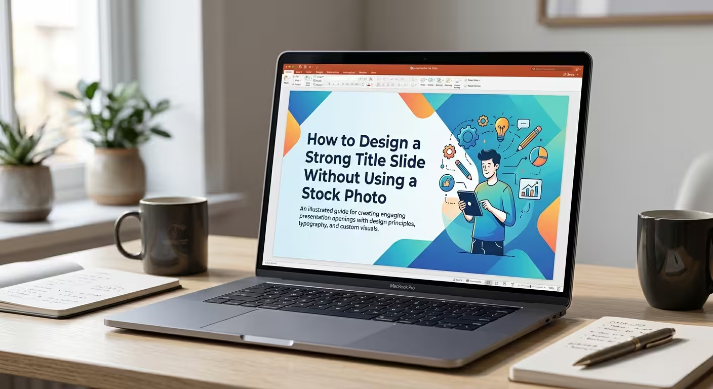
Start With the Message, Not the Background
A title slide does not need a photograph to look finished. In fact, removing the photo can make the design problem more interesting: instead of asking what image fits the topic, you have to decide what visual structure can communicate the topic before the audience reads the first content slide.
That makes the title slide a useful test of the presentation itself. If the subject, tone, and purpose can be expressed through typography, color, shapes, or composition, the opening slide can feel intentional rather than assembled from a template.
Before designing, define three things:
- The main subject: what is this presentation about?
- The audience: who needs to understand it?
- The tone: should the presentation feel analytical, educational, corporate, creative, technical, or something else?
Once those decisions are clear, the visual design becomes much easier to control.
Build the Slide Around the Title
Without a stock photograph occupying half the slide, the title can become the primary visual element. This does not mean simply making the font extremely large. It means treating the words as part of the composition.
Try creating a strong typographic hierarchy:
- Use the presentation title as the dominant element.
- Keep the subtitle noticeably smaller.
- Separate supporting information such as the presenter, company, or date from the main title.
- Give the title enough surrounding space that its position feels deliberate.
One technique I often use is to break a long title into two visual levels. The first part establishes the subject, while the second part carries the specific point or promise of the presentation.
For example:
MARKETING STRATEGY
How We Will Reach the Next Customer Segment
The first line establishes context; the second gives the audience a reason to pay attention.
Replace the Stock Photo With a Visual System
The mistake is to remove a stock photo and then leave the rest of the slide empty. A photograph normally provides scale, contrast, color, and visual weight. If it disappears, those functions still need to be considered.
Instead of one large image, build a simple visual system from editable PowerPoint elements:
- Large geometric shapes
- Lines and dividers
- Color blocks
- Circles or repeated forms
- Abstract patterns
- Oversized typography
- Small icons used as supporting accents
The important distinction is that these elements should support the title rather than compete with it.
ImagineLayout's Abstract Spectacular Backdrop PowerPoint Template demonstrates one way an abstract visual field can provide atmosphere without depending on a conventional subject photograph. The same principle can be recreated with PowerPoint shapes and theme colors.
A good test is to temporarily remove the decorative elements. If the title still has a strong position on the slide, the visual system is supporting the message instead of carrying it.
Use Shape and Position to Create Movement
A title slide can suggest movement even when nothing is animated. The trick is to give the eye a path to follow.
A diagonal shape can lead toward the title. A series of progressively smaller circles can create direction. A vertical block can establish a strong boundary between the title and supporting information.
PowerPoint's basic shapes are enough to build these effects. You do not need a complicated illustration.
For example, imagine a presentation about digital transformation. Instead of placing a photograph of computers on the right side, you could create a sequence of connected geometric blocks moving toward the title. The visual metaphor becomes part of the composition while leaving the actual subject open to interpretation.
ImagineLayout's Tape Direction PowerPoint Template uses directional shapes to guide attention toward presentation content. The broader design principle is useful even when creating a title slide from scratch: a visual element can function as an attention path rather than simply filling empty space.
Let Color Establish the Atmosphere
When there is no photograph, color has more responsibility. It can establish the tone of the presentation before the audience reads the subtitle.
A restrained palette is usually easier to control than a collection of unrelated accent colors. Start with the presentation's main brand or theme color and decide what role it will play on the title slide.
- Dark background: can create a more formal or dramatic opening.
- Light background: gives typography and geometric elements a cleaner field.
- One strong accent: can identify the title or a key visual element.
- Two related tones: can create depth without introducing a complicated palette.
Do not make every element colorful simply because there is no photograph. If the title, subtitle, shapes, and background all demand attention, the slide loses its focal point.
For presentations that need a consistent visual language across multiple slides, setting the colors and recurring elements through Slide Master can be more reliable than manually formatting each slide. ImagineLayout's practical guide to using Slide Master in PowerPoint explains how layouts, placeholders, and recurring elements can be controlled from one place.
Use an Abstract Background Only When It Has a Job
An abstract background can replace a stock photo, but it should not become a decorative substitute with no connection to the presentation.
There are several useful roles for an abstract background:
- Creating a clear contrast behind the title
- Establishing a brand color environment
- Separating the title from supporting information
- Creating a visual motif that can continue throughout the deck
That last use is particularly valuable. Suppose the title slide contains three curved shapes. Those same shapes can later become section dividers, chart accents, or diagram elements. The opening slide then introduces the visual language of the entire presentation rather than existing as an isolated design.
This is one reason a deliberately designed title slide can be more useful than a generic photograph. A photo normally belongs to the opening slide. A visual system can belong to the whole presentation.
Make the Title Slide Preview the Presentation
A strong title slide can quietly introduce the structure of what follows.
If the presentation is divided into three major sections, for example, you might introduce three visual blocks or three subtle markers on the title slide. If the deck is about a process, a directional element can hint at progression. If the presentation compares two approaches, a divided composition can establish that relationship before the comparison slide appears.
This does not mean putting an agenda on the title slide. It means letting the composition reflect the logic of the presentation.
For a business presentation, this might look like:
Title — dominant
Short positioning statement — secondary
Three small visual markers — representing the three sections that follow
The audience does not need an explanation of the markers. Their purpose is to give the opening slide a structural relationship with the rest of the deck.
Check the Slide at Presentation Size
A title slide that looks impressive while zoomed in on a laptop can behave differently when projected or displayed on a large screen. Small subtitles can disappear, low-contrast text can become difficult to read, and subtle background details can lose their intended effect.
That is why the final check should happen at approximately the size at which the audience will see the presentation.
Ask three practical questions:
- Can I identify the presentation topic immediately?
- Is there one obvious visual starting point?
- Do the secondary details remain readable without competing with the title?
If the answer to the first question is no, the problem is probably structural rather than decorative. Changing the background will not fix an unclear title hierarchy.
Use Templates for Structure, Not as a Replacement for Thinking
A ready-made PowerPoint template can save time when its underlying composition already matches the type of presentation you are building. The useful part is not simply that the template looks polished; it is that the title area, supporting elements, spacing, and visual relationships have already been established.
For example, ImagineLayout's Pro Business Conference PowerPoint Template provides presentation-oriented layouts that can be adapted to a professional opening slide without requiring a stock photograph as the central visual.
The same principle applies when creating your own design: establish the structure first, then customize the visual details.
A strong title slide without a stock photo should not feel like a title slide with something missing. It should feel as though the absence of the photo was intentional from the beginning. Use the title as a visual element, give shapes a specific role, let color establish the atmosphere, and make the composition reflect the story that follows. When those pieces work together, the opening slide can create a clear first impression using nothing more than PowerPoint's own design tools.
Comments (0)