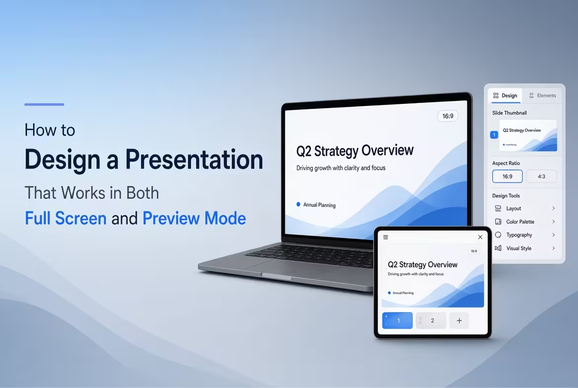
A slide can look excellent when it fills a 27-inch monitor and become almost meaningless when reduced to a thumbnail. That is not necessarily a design failure. It means the slide is being read under two very different conditions.
When designing a presentation, you need to account for both: full-screen viewing, where people can inspect details, and preview viewing, where they usually see only the dominant shapes, colors, titles, and a few words. A strong presentation keeps its main message recognizable in both situations.
Design the Slide for Two Reading Distances
Think of your presentation as having two layers of information. The first layer should work from a distance or at thumbnail size. The second can reward the viewer who looks more closely.
At full screen, an audience may notice a small annotation, a secondary number, or a supporting caption. In preview mode, those elements may disappear completely. That is acceptable if the main idea remains visible.
A useful hierarchy is:
- Primary: the main message or conclusion.
- Secondary: the evidence, comparison, or structure supporting it.
- Tertiary: notes, sources, definitions, or additional context.
The mistake is making all three levels visually equal. If every text element has similar size and weight, the slide may still be technically readable in full screen, but its message becomes difficult to identify in a preview.
Make the Thumbnail Tell the Story
One of the quickest ways to test a presentation is to reduce the slide until it resembles a thumbnail. Do not ask whether every word is readable. Ask a more useful question: Can I still tell what this slide is about?
At small scale, the viewer mainly perceives large text blocks, dominant shapes, diagrams, images, and color relationships. Fine details lose their influence.
ImagineLayout's presentation resources provide editable PowerPoint layouts designed around structured visual elements rather than locked images. Its site describes the templates as editable, with shapes that can be recolored and resized.
This is particularly useful when adapting a layout for preview viewing: you can enlarge the element that carries the main message instead of rebuilding the entire slide.
Browse editable PowerPoint presentation resources on ImagineLayout when you need a starting layout that can be adjusted for different viewing conditions.
Give the Title Enough Weight to Survive Reduction
A slide title often becomes the most important element when the slide is viewed as a thumbnail. But simply making the title larger is not always the solution.
The title should communicate the point of the slide rather than merely identify its subject.
Compare these two approaches:
Weak: “Sales Performance”
More informative: “Enterprise Sales Drove Most of the Quarterly Growth”
The second title gives the viewer useful information even before the charts and supporting details can be inspected.
This approach also helps when slides are reviewed outside the presentation itself. A deck may be scanned in a file preview, shared as a PDF, or viewed in a slide sorter. A descriptive title gives the reader an immediate reason to understand the slide.
Build Around One Dominant Visual Area
Preview mode exposes a common problem: a slide contains too many equally important objects.
Imagine a slide with four charts, three icons, two text boxes, a decorative illustration, and several small labels. At full size, everything may appear reasonably spaced. Reduced to a thumbnail, however, the objects merge into a collection of visual noise.
Instead, establish one dominant visual area. It might be:
- a large chart showing the central result;
- a process diagram showing the main sequence;
- a product image supporting the headline;
- a large number or KPI;
- a central comparison between two alternatives.
The supporting elements should explain or qualify that dominant area rather than compete with it.
ImagineLayout's library includes PowerPoint templates and diagrams covering presentation structures such as pitch decks, reports, timelines, flowcharts, matrices, and other visual formats. :contentReference[oaicite:2]{index=2} The practical lesson is to select a structure that matches the information instead of forcing every message into the same slide composition.
Do Not Design Small Text for a Problem That Should Be Solved With Structure
When a slide does not fit, shrinking the text is often the fastest response—and usually the wrong one.
If a paragraph is too long, first ask whether it belongs on the slide at all. If five data points are competing for space, determine whether they can be grouped. If several labels need to be visible, consider whether the chart type is creating unnecessary annotation.
A useful distinction is:
- Presentation information: what the audience needs while listening to you.
- Reference information: what someone may need later when studying the deck independently.
These do not always belong at the same visual scale. A presentation slide can communicate the key finding prominently while moving detailed methodology, definitions, or supporting material into notes or additional slides.
Use Aspect Ratio Consistently From the Start
Preview behavior is also affected by the shape of the slide. If the presentation is designed for one aspect ratio and later converted or displayed in another, elements near the edges can become uncomfortable to read or visually unbalanced.
For modern widescreen presentations, 16:9 is a common working format. ImagineLayout's current PowerPoint templates include 16:9 layouts, such as its Main Idea PowerPoint template.
Set the intended slide size before building the presentation rather than designing first and changing the dimensions at the end. Changing the canvas late in the process can alter spacing, image proportions, and the relationship between text and graphics.
Check the Slide at Three Different Scales
A practical review does not require sophisticated testing. Look at the same slide at three scales and ask a different question at each one.
- Full screen: Can the audience comfortably read the information and understand the relationships between elements?
- Normal editing view: Does the layout feel balanced while you are working with the slide?
- Thumbnail or preview: Is the main message still recognizable without reading every detail?
The third test is especially revealing. If the slide becomes an indistinguishable collection of boxes when reduced, the problem is usually hierarchy rather than font size.
Try temporarily removing secondary text and decorative elements. If the miniature version suddenly becomes understandable, you have identified what was competing with the main message.
Design Templates for Both Presentation and Review
A presentation is not always consumed while someone is speaking. People may review it before a meeting, skim it afterward, or open individual slides in a document viewer.
That means the slide needs enough built-in context to remain understandable without turning every slide into a page of text.
A useful compromise is to make the headline and main visual self-explanatory, while using smaller supporting elements for people who want additional detail. This creates a slide that works during a live presentation but also remains useful when reviewed independently.
Editable templates can help with this because the underlying layout can be adjusted rather than treated as a fixed picture. ImagineLayout states that its PowerPoint resources use editable shapes and support changes to colors, text, images, and other presentation elements.
Run a Final Preview Test Before You Present
Before the final presentation, make one last pass through the deck using the way your audience is likely to encounter it.
Reduce the slide thumbnails and scan them in sequence. You should be able to distinguish the purpose of each slide without opening every one. Then return to full-screen mode and check the details that the audience will actually need during the presentation.
If a slide only works when viewed at maximum size, its hierarchy probably needs another pass. If it works as a thumbnail but feels empty or confusing at full size, it may need useful supporting detail rather than more decoration.
The goal is not to make every element readable at every size. The goal is to make the right information survive at every size. When the main message remains visible in preview mode and the supporting information becomes useful in full screen, the presentation is doing two jobs without needing two separate designs.
Comments (0)