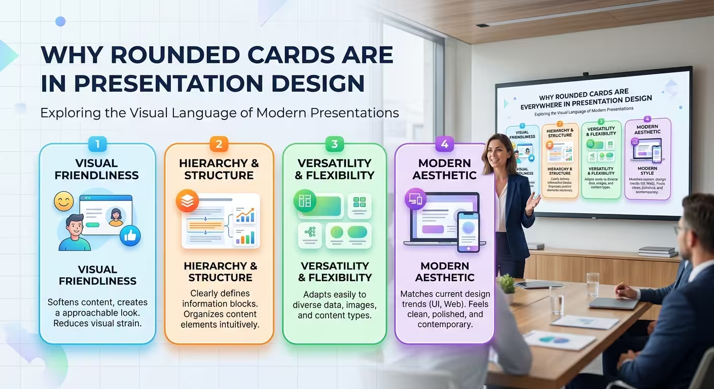
Look at enough modern presentations and a pattern becomes hard to miss: information is rarely sitting directly on the canvas anymore. It is sitting inside a rounded rectangle.
Rounded cards have moved from interface design into pitch decks, strategy presentations, reports, dashboards, and even keynote-style storytelling. The interesting question is not why designers like rounded corners. It is why this particular shape became such a useful container for information — and when using it actually makes a slide worse.
Rounded corners do more than make a box look friendly
A sharp rectangle says, “Here is a defined area.” A rounded rectangle says something slightly different: “Here is a defined area, but it belongs to the same visual environment as everything around it.”
That distinction matters on slides.
Presentation design constantly has to balance two opposing requirements. Information needs to be separated enough that the audience can understand its structure, but not so separated that every point feels like an unrelated object.
Rounded cards are unusually good at sitting between those extremes. The boundary is visible, yet visually softer than a hard-edged box, table cell, or bordered panel.
This is one reason the shape works so well for:
- related ideas that need individual containers;
- features or benefits that belong to one larger theme;
- stages in a process;
- small groups of metrics;
- comparisons where each option needs its own territory.
The important design decision is therefore not simply “use rounded cards.” It is deciding what relationship the card boundary is supposed to communicate.
The real reason cards became so common: they create a reusable visual grammar
A good presentation system does not require the designer to invent a new composition for every slide. It establishes a small set of visual rules that can be reused without making the deck feel repetitive.
Cards are particularly effective for this because the same container can hold completely different content.
One slide might contain three strategic priorities. Another might contain three customer segments. A later slide could use the same underlying geometry for three recommendations.
The content changes, but the audience already understands the visual grammar:
- one card = one unit of information;
- cards aligned together = related units;
- larger card = potentially greater importance or scope;
- space between cards = separation between ideas;
- repeated card structure = comparable information.
This is where rounded cards become more than decoration. They can act as a lightweight information architecture for the entire deck.
But there is a catch: once a visual grammar becomes familiar, viewers start interpreting it automatically. If every object is placed inside an identical card, the design can accidentally tell the audience that everything has equal importance.
The radius itself changes the character of the slide
Not all rounded cards communicate the same thing. A small corner radius on a large rectangular panel can still feel corporate and structured. A very large radius pushes the same panel toward a softer, more product-interface-like aesthetic.
That means the corner radius should be treated as part of the presentation's visual language, not as a last-minute styling setting.
Consider three hypothetical versions of the same slide.
In the first, the cards have barely rounded corners. The composition feels close to a traditional business diagram.
In the second, the corners are noticeably rounded and the cards have generous internal spacing. The slide starts to resemble a modern digital product interface.
In the third, the cards are almost pill-shaped. At that point, the shape itself becomes part of the personality of the presentation — often more playful, consumer-oriented, or informal.
The content has not changed. The geometry has.
For that reason, I would not choose a radius independently on every slide. Establish a small range and keep it consistent. A deck where one slide uses restrained corners and another suddenly uses oversized capsules often feels like two design systems were mixed together.
Cards work because spacing becomes part of the hierarchy
Here is the part that is easy to overlook: the space around a card can communicate as much as the card itself.
Imagine four cards arranged in a row. If the gaps between all four are identical, the audience will naturally read them as four parallel items.
Now reduce the gap between cards one and two while leaving a larger gap before cards three and four. Without changing a word, you have created two groups.
This is why card layouts can become powerful very quickly. The designer has several hierarchy controls working together:
- card size;
- card position;
- distance between cards;
- internal padding;
- contrast between card and background;
- typography inside the card.
The mistake is to treat all of these as decoration.
If two cards belong to the same category, their relationship should usually be visible through their position or spacing before the viewer has to read the labels. If they represent completely different strategic choices, forcing them into an identical, tightly packed row can suggest a relationship that does not actually exist.
That is one of the most useful ways to think about card-based presentation design: spacing is not empty space around the cards; it is part of the diagram.
Why cards fit modern presentation workflows so well
There is also a practical reason the pattern has spread so widely. Cards are modular.
A designer can build a presentation system around a few reusable components instead of constructing every slide from scratch. That makes cards particularly useful when a deck contains recurring structures such as metrics, recommendations, product features, risks, opportunities, or strategic initiatives.
The modular approach is visible across presentation resources as well. For example, ImagineLayout's Four Title Shapes Keynote Presentation Template uses repeated rounded rectangular forms as part of a broader shape system rather than treating the corners as an isolated visual effect.
That distinction is important. A reusable component is valuable because it reduces design decisions. A decorative card is valuable only until the audience has seen it a few dozen times.
When building a deck, I would therefore define the card as a component with rules: maximum text length, padding, radius, title treatment, optional icon position, and how the component changes when it becomes the primary message.
Once those rules exist, the designer can spend more time solving the actual communication problem instead of repeatedly rebuilding boxes.
Where the card pattern starts to fail
Rounded cards are not automatically clearer. In fact, one of their biggest weaknesses appears when designers put too much information inside them.
A card creates the expectation that its contents form one coherent unit. That is useful for a short statement, metric, feature, or recommendation. It becomes problematic when the card contains a headline, paragraph, chart, footnote, icon, badge, and secondary statistic — all competing for the same small container.
The result is technically modular but cognitively dense.
Another failure appears when every element becomes a card: title, subtitle, chart, legend, image, callout, footer. The slide then resembles a dashboard assembled from components rather than a presentation designed around a single message.
A useful test is simple: remove the card boundary mentally. If the content still has a clear relationship, the container may be doing useful organizational work. If the slide becomes almost identical without the cards, the cards may only be adding visual fashion.
There is also a contextual limit. A highly rounded, colorful card system can work naturally for a product launch or consumer-facing presentation but create the wrong tone for a formal financial review, legal briefing, or technical discussion. The geometry should support the subject and audience rather than announce a design trend.
The strongest card layouts do not make every card equal
One of the easiest ways to make a card-based slide feel generic is to create six identical boxes and give each exactly the same visual weight.
Real information rarely behaves that way.
Suppose a strategy slide contains five initiatives, but one of them is the decision the audience actually needs to discuss. Giving all five cards identical dimensions and contrast forces the audience to discover the hierarchy by reading everything.
A better system can preserve the card language while breaking the symmetry:
- make the primary card larger;
- give it more internal space;
- place it in the strongest reading position;
- reduce secondary cards visually without making them disappear;
- use spacing to create groups instead of adding more borders.
This is where the rounded-card trend becomes genuinely useful rather than merely fashionable. The card provides the repeated structure, while scale and spacing tell the audience what deserves attention.
Modern presentation templates can save considerable production time here because the underlying component geometry is already established. ImagineLayout's Round Sticker PowerPoint Diagrams Template, for example, uses repeated rounded visual units for process and cycle structures, showing how modular shapes can carry relationships rather than simply hold text.
Think of rounded cards as containers, not a style
The popularity of rounded cards is easy to explain if you stop looking at the corner radius and look at the underlying job the shape performs.
It separates information without making every boundary feel heavy. It supports modular layouts. It creates reusable components. It works with grids. And, when spacing is handled deliberately, it can make relationships between ideas visible before the audience reads every word.
But the same flexibility creates the main danger: because cards are easy to duplicate, they are also easy to overuse.
The best question is therefore not, “Should this presentation use rounded cards?” It is: “What information relationship does this container make easier to see?”
If the answer is clear, the rounded corner has a job. If there is no answer, the shape is probably there because modern presentations are expected to have it — and that is rarely a strong enough reason to give an entire slide a card-shaped frame.
Comments (0)