How to Cut Presentation Prep From Two Days to an Hour
Most prep time goes into layout, not content. Here's a practical way to shrink deck-building from two full days down to roughly one focused hour.
Design tips, tutorials, product updates, and industry insights.
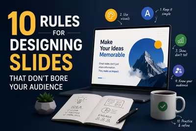
Tired of blank stares during your presentations? These 10 practical slide design rules help you keep attention without gimmicks or clutter.

Learn what separates pitch decks investors fund from ones that get ignored — structure, pacing, and the slides founders usually get wrong.
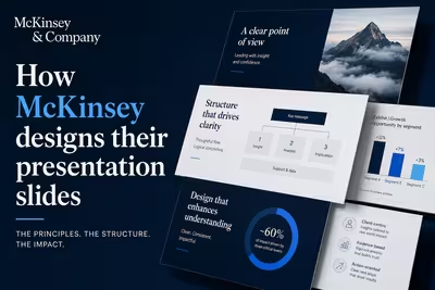
McKinsey's slide design isn't about polish — it's a structured argument system. Here's how the Pyramid Principle actually works in practice.
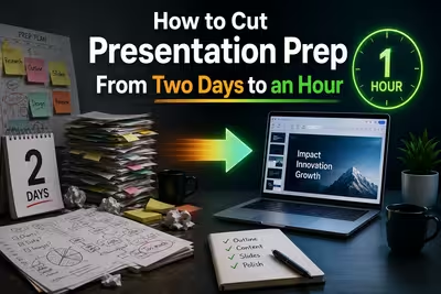
Most prep time goes into layout, not content. Here's a practical way to shrink deck-building from two full days down to roughly one focused hour.
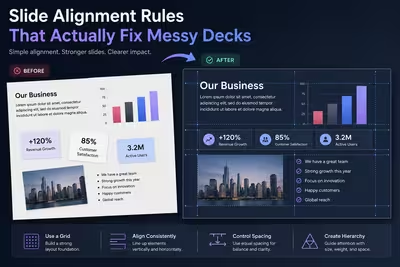
Practical alignment rules for slide design—grids, spacing, optical balance, and the small fixes that make presentations look professionally built.

A practical guide to pairing fonts in slide decks — pairing logic, sizing hierarchy, common mistakes, and how many typefaces you actually need.

Practical rules for using icons in slides — sizing, pairing, colour, and the mistakes that make a deck look amateur instead of polished.
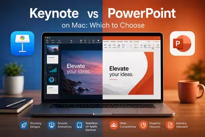
A practical comparison of Keynote and PowerPoint for Mac users — animations, file compatibility, templates, and which one actually fits your workflow.

Canva isn't always the right fit for polished decks. Here's a practical, no-fluff look at free tools that hold up for real client and business work.
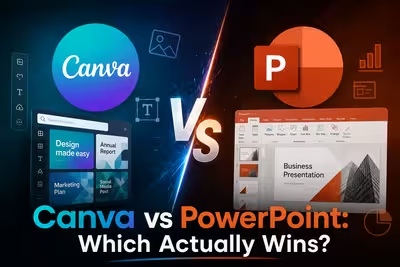
Canva or PowerPoint in 2026? A practical comparison of AI features, pricing, and workflow fit — from someone who builds decks for a living.
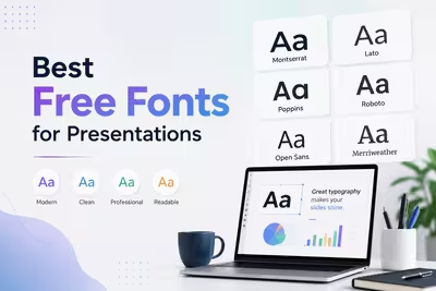
A practical, no-fluff guide to the free fonts that actually hold up on slides — readable at a distance, licensed for commercial use, and easy to pair.

Minimalist slides cut distraction and sharpen your message. Here's why simpler presentations often communicate more effectively than dense ones.