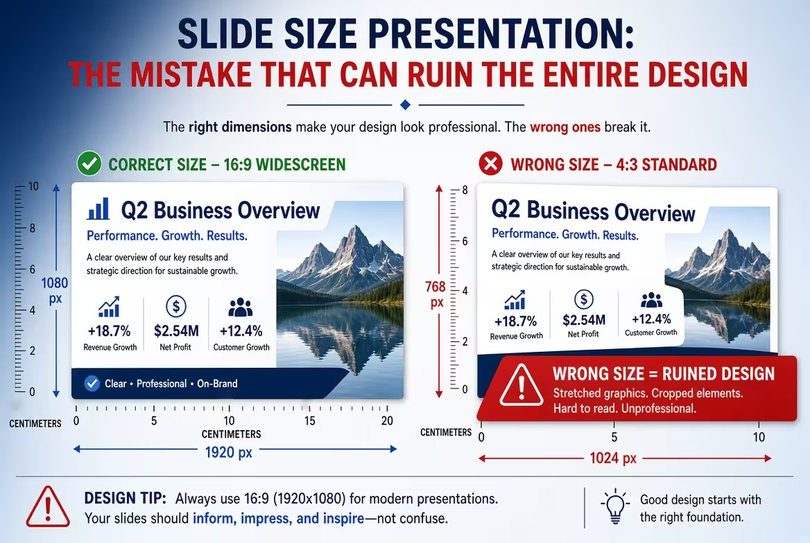
A presentation can have the right font, strong images, clean diagrams, and a carefully built grid — and still look strangely wrong. One of the least visible reasons is also one of the most expensive to fix: the slide size.
If the canvas is wrong, the problem does not stay at the edges of the slide. It changes the proportions of images, the amount of usable space, the position of text, the relationship between columns, and sometimes the entire rhythm of the deck. This is why slide size should be treated as a design decision, not a formatting detail.
Why slide size affects more than the shape of the canvas
Imagine designing a slide around a large photograph that occupies roughly half of the composition. The headline sits in a narrow column beside it, while a small data point anchors the bottom edge.
Change the aspect ratio and you have not simply made the slide wider or narrower. You have changed the relationship between those elements.
The image may need a different crop. The text column may become too narrow. A line that previously balanced the composition may now sit too close to the edge. A three-column layout may suddenly feel compressed even though every object technically fits.
This is the part people often miss: a slide is a proportional system. Its dimensions determine how much visual weight each element can occupy before the composition starts to feel distorted.
That is why changing slide size halfway through a project can create more work than expected. PowerPoint itself warns that changing dimensions may require content to be scaled, and offers options such as maximizing content or ensuring that it fits.
16:9 is not automatically the right answer
For a new presentation, 16:9 is usually the sensible starting point. Microsoft currently lists widescreen 16:9 as the default size for new PowerPoint presentations.
But “default” does not mean “always correct.”
The real question is where and how the presentation will be used.
- 16:9: a strong default for presentations intended for modern screens, laptops, conference displays, and most contemporary presentation environments.
- 4:3: still useful when an existing presentation system, archival deck, particular display, or established corporate template requires the older proportion.
- Custom dimensions: appropriate when the output is not a conventional presentation — for example, a digital signage layout, social-media graphic, printed visual, or another controlled-format deliverable.
The mistake is not choosing 4:3 instead of 16:9. The mistake is choosing a format without knowing what the final presentation needs to do.
PowerPoint provides both Standard 4:3 and Widescreen 16:9 options, as well as custom slide sizes. Its current documentation also specifies 13.333 × 7.5 inches for the Widescreen preset.
The expensive mistake: changing the size after the design is finished
This is where slide size stops being a small technical detail.
Suppose a 20-slide deck was designed in 16:9 and someone later decides it needs to be delivered in 4:3. The temptation is to select the new size and let the software scale everything.
That can produce a presentation where nothing is technically missing but everything feels slightly off.
Wide photographs lose their intended crop. Horizontal diagrams become cramped. Text blocks become taller. Objects that were separated by comfortable distances move closer together. A title that originally sat comfortably beside an image may now compete with it for space.
PowerPoint explicitly presents a scaling decision when the slide size changes because content may no longer fit the new proportions.
The important point is that scaling objects is not the same as redesigning the composition.
A professional designer should treat a major aspect-ratio change as a layout adaptation. Some elements need to move, some images need to be recropped, and some relationships need to be rebuilt rather than uniformly resized.
Images reveal the problem first
Photography is often the first thing that exposes a bad slide-size decision.
A landscape image selected for a wide composition can carry its meaning through the position of a person, product, building, or other focal point. When the slide becomes narrower, the easiest technical solution is to crop the sides.
But the crop can remove exactly the area that made the photograph useful.
The same issue appears with diagrams and illustrations. A visual designed to extend horizontally may become compressed into a smaller region. Increasing its height can make it dominate the slide; reducing it can make labels unreadable.
This is why templates built for a specific aspect ratio are more than collections of decorative elements. Their layouts have been constructed around a particular canvas.
For example, current ImagineLayout presentation assets explicitly identify their aspect ratio. A current widescreen PowerPoint map collection is built around 16:9 layouts, rather than treating the ratio as an afterthought. See an example of a 16:9 presentation template.
Why the wrong size can break an entire design system
The bigger problem appears when a presentation has its own internal system.
A well-designed deck may use the same left margin on every slide, a recurring title position, a fixed image width, consistent column proportions, and several master layouts that are reused throughout the presentation.
These relationships are calibrated to the canvas.
Change the canvas and the system has to be recalibrated.
For instance, imagine a deck where the main content begins at a fixed distance from the left edge and the right side is reserved for a supporting visual. On a wide slide, that visual can occupy a substantial horizontal area without competing with the text. On a narrower slide, the same division may leave both regions too small.
This is why simply checking whether everything “fits” is a poor quality test. A slide can contain every object and still have the wrong proportions.
When reviewing a resized deck, I would check these relationships before worrying about individual pixels:
- Does the primary content still have enough horizontal space to establish hierarchy?
- Are images still cropped around the same visual subject?
- Do repeated margins still create a consistent rhythm?
- Have diagrams become too dense because their width disappeared?
- Are titles wrapping differently from slide to slide?
- Does the visual balance still work when several slides are viewed consecutively?
The last question matters particularly. A single slide can look acceptable in isolation while the resized deck feels unstable when viewed as a sequence.
Choose the slide size before choosing the layout
There is a simple workflow that prevents most of these problems: decide the canvas before you start designing the visual system.
First determine the delivery environment. Then choose the aspect ratio. Then establish the slide master, margins, typography, image areas, and recurring layout structures.
Only after that should you start filling the deck with content.
This order may seem obvious, but it prevents a common production trap: building beautiful slides first and discovering later that the presentation has to fit another format.
If you are working from a presentation template, the same principle applies. Check the template's aspect ratio before importing your content. ImagineLayout's current template library contains PowerPoint and Keynote assets with explicitly specified formats and ratios, including 16:9 widescreen designs. Browse presentation templates on ImagineLayout.
A template can save substantial layout work, but only if its canvas matches the output you actually need. Otherwise, you are effectively buying a finished layout system and then asking it to work on a different piece of paper.
When should you change the slide size?
Ideally, before the first slide is designed.
If you discover a format problem early, changing the canvas is relatively inexpensive. If you discover it after dozens of slides have been built, the decision becomes a redesign project.
There are exceptions. Sometimes a client changes the delivery environment, a conference specifies a different display format, or an old corporate deck has to be adapted to a new standard. In those cases, do not assume that automatic scaling will preserve the original design.
Instead, identify the layouts most dependent on the old proportions and rebuild those first. Title slides, image-heavy slides, complex diagrams, comparison layouts, and slides with multiple columns usually reveal the consequences fastest.
Then use those redesigned slides as the new visual reference for the rest of the deck.
The best slide size is the one you can design for deliberately
There is no universal rule that says every presentation must use one particular dimension. There is, however, a reliable design rule: never let the software choose the proportions after you have already built the composition.
For most new screen-based PowerPoint presentations, 16:9 is a practical starting point and is the current default in PowerPoint. :contentReference[oaicite:9]{index=9} But the important part is not memorizing that number. It is understanding that the aspect ratio becomes part of the design system from the moment you place the first object.
Get the canvas right early, and typography, images, grids, diagrams, and templates have a stable environment to work within. Get it wrong, and even excellent design decisions may spend the rest of the project fighting the shape of the slide.
Comments (0)