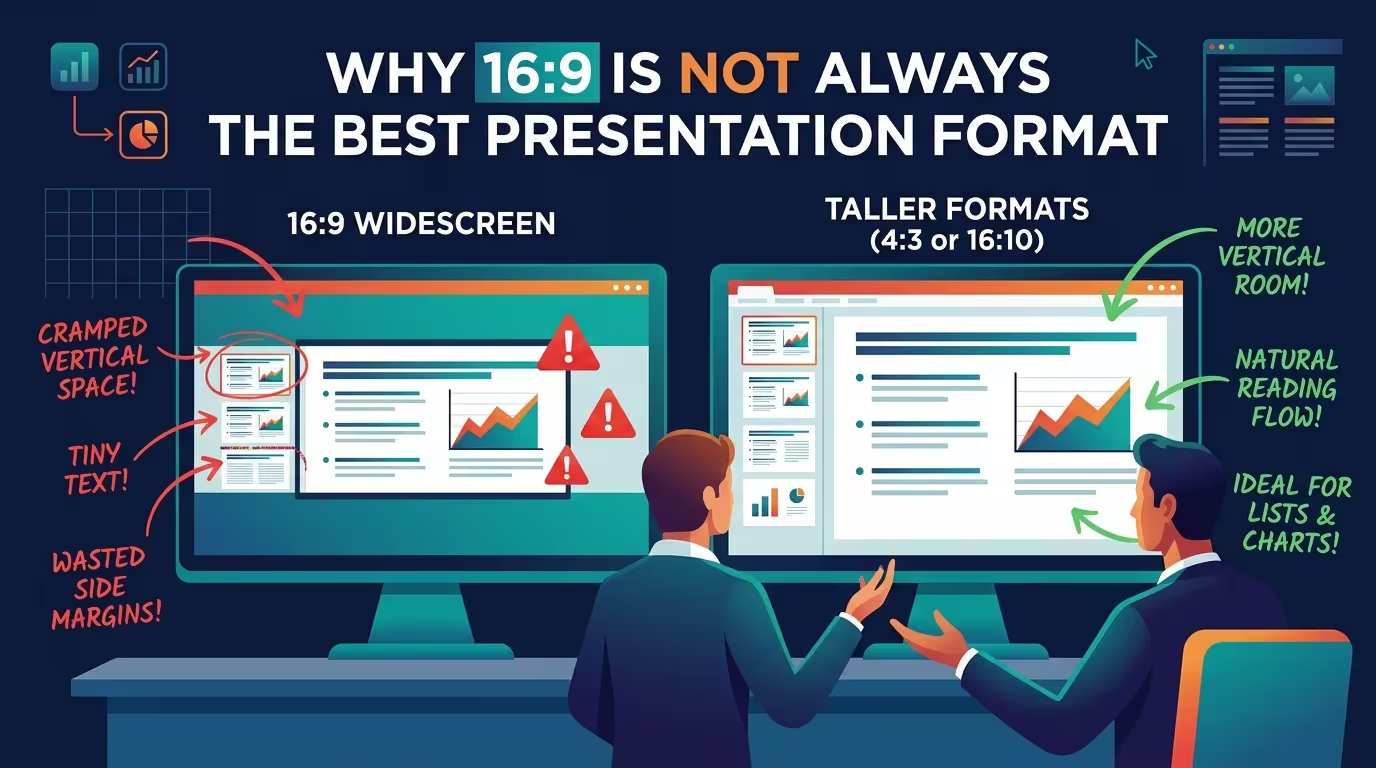
PowerPoint switched its default canvas to 16:9 in 2013, and most presenters have never touched the setting since. That's not a criticism — it's just worth noticing that the industry's most common slide shape was never chosen by the people using it. It was inherited, the way a font default gets inherited, and inherited defaults are exactly the kind of thing worth questioning once in a while.
Widescreen earns its reputation honestly in one specific context: a room with a modern projector or a screen-share on a laptop, where the slide fills the display edge to edge and nothing gets cropped. For that scenario, 16:9 is genuinely the right call, not a compromise. The problem is that fewer decks live entirely in that scenario than the standard advice assumes.
The printed handout nobody accounted for
A 16:9 slide doesn't fit a Letter or A4 page without leaving awkward margins or shrinking the content to make room for white space top and bottom. I've watched a perfectly clean widescreen deck turn into a handout with text small enough to need reading glasses, because nobody rebuilt it for paper — they just exported it. If a deck's real job is to be printed, annotated in a meeting, or left behind as a leave-behind packet, 4:3 or a Letter-proportioned canvas prints cleaner than widescreen ever will, and it's worth deciding that before the design work starts rather than after.
Where the deck actually ends up after the meeting
Here's the part most aspect-ratio advice skips entirely: a growing share of decks don't stay decks. They get exported as a PDF and reposted as a LinkedIn document carousel, and LinkedIn's own upload guidance doesn't favor widescreen for that format at all — the platform's current recommended dimensions for document posts are 4:5 portrait or 1:1 square, with 16:9 landscape listed as the option that renders smallest in a mobile feed. Design the original deck in landscape and the carousel version comes out zoomed in and cropped, or you're rebuilding every slide's layout after the fact. If a deck's second life is the more important one — say it's a thought-leadership piece meant to be sliced into a carousel — it can be worth designing in the format the carousel actually needs and building a wider presentation version second, rather than the other way around.
Dense, tabular content wants a squarer canvas
Widescreen is generous with horizontal space and stingy with vertical space, which is exactly backwards for a slide carrying a comparison table, a stacked chart with a long legend, or several rows of line items. Squeeze that content into 16:9 and the usual fix is shrinking the font until it fits — which is the wrong fix; splitting a crowded slide into two is almost always better than shrinking it to fit one. A 4:3 or near-square layout gives dense, list-heavy content more headroom without needing that trade-off in the first place, which is why finance and ops decks tend to survive the 4:3-to-16:9 transition worse than pitch decks did.
What a webcam overlay does to a widescreen slide
This one rarely makes it into aspect-ratio guides: on Zoom, Teams, and most virtual-meeting platforms, a presenter's webcam feed sits over part of the shared screen, usually along one edge or in a corner strip. A 16:9 slide designed to use every inch of its canvas will have content sitting directly under that overlay — a chart's right-hand axis, a footer, a logo. It's not a rendering bug; it's just that the slide was built assuming the full frame is visible, and in a screen-share it usually isn't. Building in a safe margin along whichever edge the platform tends to use fixes this without giving up widescreen altogether, but it only gets fixed if someone thinks to check it before the call, not during it.
Templates don't all resize the same way
One practical wrinkle worth knowing before switching a deck's aspect ratio: a slide that mixes native vector shapes with imported raster images won't resize cleanly, because the vectors scale by proportion and the images scale by pixel dimension — so a template built for 16:9 can distort or crop unpredictably the moment it's forced into 4:3 or square. Vector-based templates hold up far better under that kind of resize, which is part of why a library built on editable, proportionally scaling PowerPoint templates saves real rework the moment a deck needs to change shape mid-project rather than get redesigned from a blank canvas.
A faster way to decide
The question that actually settles this isn't "what does PowerPoint default to" — it's closer to the same question that decides whether a communication should be a deck at all: will someone be in the room to walk through it, or will it be read cold, forwarded, or repurposed without you there to explain it? That same test shows up when deciding between a slide deck and a written document — and it applies just as well one level down, to which shape the slides themselves should take. A deck presented live, on a modern screen, stays widescreen. A deck that's going to be printed, screen-shared with a webcam overlay, or cut into a LinkedIn carousel usually isn't being served by the shape PowerPoint handed it by default.
Before the next deck gets built, it's worth asking where it's actually going to be seen — not where the software assumes it will.
Comments (0)