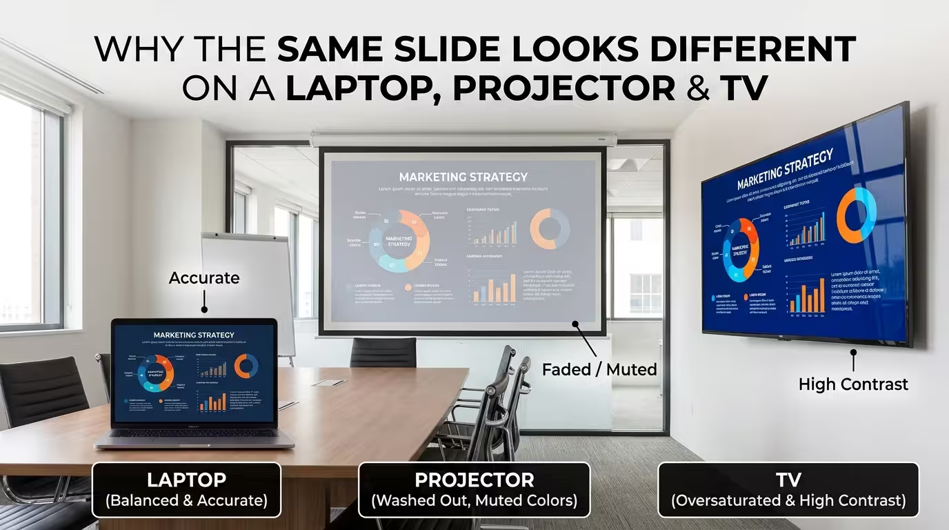
Somewhere between the laptop where a deck gets built and the room where it actually gets shown, something changes. A brand blue that looked confident and saturated on a MacBook screen shows up on the conference room projector looking closer to teal. A dark, moody title slide that read as elegant during rehearsal turns into a flat grey rectangle on the client's TV. Nobody touched the file. The colors in the PowerPoint are exactly what they were an hour ago.
This isn't a design mistake, and it isn't bad luck with a particular projector model. It's four separate, fairly mechanical reasons a display can receive the exact same pixel values and still show something different — and once you know which one is happening, most of them take under a minute to check before anyone walks into the room.
The color your laptop shows is never the color the room sees
A laptop screen and a projector aren't just different sizes of the same thing — they're often built to reproduce color through completely different physical processes. Most laptop displays render color using an LCD panel calibrated to (or close to) the sRGB color space, with three subpixels lighting up simultaneously. A lot of business and classroom projectors, especially single-chip DLP models, use a spinning color wheel that flashes red, green, and blue in rapid sequence fast enough that the eye blends them into a single color. That sequential process doesn't reproduce every hue with equal accuracy, and saturated brand colors — the specific blue in a logo, a deep red in a warning callout — are exactly the kind of color that shifts most visibly when the reproduction method changes underneath it.
I've had clients swear a template's accent color was "wrong" in a venue, when the file was untouched — the room's projector simply couldn't render that exact saturation the way the laptop screen it was designed on did. There's no universal fix for this beyond knowing it's likely to happen: if a brand color is unusually saturated, it's worth previewing the deck on whatever projector or panel is actually in the room, not just trusting how it looked on the machine it was built on.
Ambient light does more damage than a bad color choice ever could
A slide's readability isn't just a function of the colors chosen — it's a function of contrast ratio, and contrast ratio is relative to how much light is already bouncing around the room. Projector brightness is generally measured in ANSI lumens, and the useful number isn't some universal minimum — it's whatever overcomes the ambient light already present. A dim, curtained room can look sharp with a projector well under 1,000 ANSI lumens, while the same file in a bright conference room with overhead fluorescents and a window wall can wash out entirely on a projector rated several times higher, because the light hitting the screen from the room is competing directly with the light coming from the lens.
This is also why dark-background decks are the riskiest format to gamble on sight-unseen. A near-black background with white text has enormous contrast on a laptop screen in a normal office, but drop that same slide onto a projected screen in a room that can't be fully darkened, and the "black" background lifts to a washed grey while the ambient light fights the projector for dominance — sometimes taking the readability of the text with it. Given how much of a presenter's credibility rides on the room's tech actually working, it's a real risk worth planning around, not just hoping for: a survey commissioned by the display-technology company Barco found that a majority of professionals who'd experienced meeting technology problems reported it damaged the presenter's credibility, beyond the disruption of the moment itself.
The invisible setting that crushes blacks or washes out greys
Here's the one almost nobody checks, because it's buried in a menu instead of visible on the slide itself. HDMI signals can be sent in one of two color ranges: "limited" (values roughly 16–235) or "full" (0–255). If the laptop is outputting one range and the display is set to expect the other, the mismatch doesn't produce an error message — it produces a picture that's either crushing your darkest greys into pure black and clipping detail out of shadows, or lifting your blacks into a flat, washed-out charcoal that looks like a fog rolled over the slide.
This single setting mismatch can look, at a glance, exactly like a contrast or brightness problem with the slide design — which sends people down the wrong troubleshooting path, adjusting colors in PowerPoint that were never actually wrong. If blacks look off specifically on one display and fine everywhere else, the fix usually isn't in the deck at all — it's in the display's or the laptop's HDMI color-range setting, which is often labeled something unhelpful like "RGB range" or "Auto/Limited/Full" in the input settings menu.
TVs are tuned to sell themselves in a showroom, not to show your slides accurately
Consumer TVs almost never ship with an accurate picture mode active by default. Out of the box, most default to something called Vivid, Dynamic, or a similarly named mode, tuned to look punchy under the harsh, bright lighting of a retail showroom floor next to a dozen competing TVs. That mode typically boosts saturation past what the source content actually specifies and applies aggressive edge sharpening, which can add a visible halo around text and hard-edged shapes — the kind of artifact that makes clean vector icons in a template look slightly fuzzed or over-outlined on a TV that looked crisp on a laptop.
Unlike the ambient-light problem, this one's genuinely a one-time fix: switching the TV's picture mode to something labeled Standard, Movie, Cinema, or Filmmaker Mode gets far closer to showing the file as it was built, and it's worth doing before a meeting rather than during one, since some TV remotes bury picture mode two or three menus deep.
The edges of your slide might not even be visible
Older TVs, and some AV receivers passing a signal through to a TV, apply a legacy feature called overscan — designed decades ago to hide the ragged edges of old analog broadcast signals by zooming the picture in slightly and cropping
Comments (0)