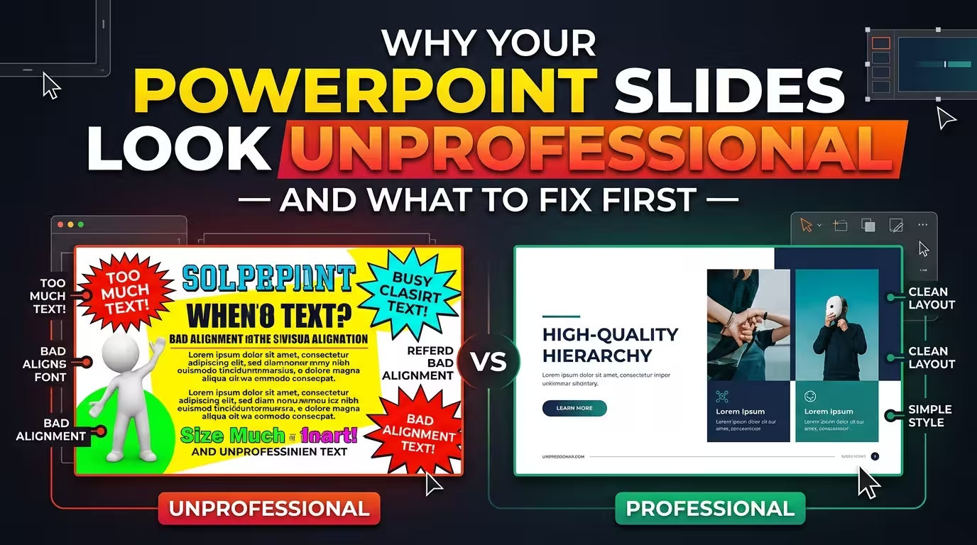
Show two people the same slide deck — one with a slightly off-brand blue, one with perfectly on-brand colors but a title that sits four pixels lower on slide 9 than everywhere else — and ask which one looks "unprofessional." Almost everyone points at the misaligned title. Nobody can usually say why. They just know something's off.
That's the part most advice on this topic skips. Bad font choices and bad color palettes get blamed constantly, but in practice, a deck can use an unconventional font and still read as deliberate and polished — as long as it's used the same way on every slide. The moment that discipline breaks, even briefly, the whole deck drops a level in the viewer's mind. If your slides look amateurish and you can't pin down exactly why, this is usually where to look first, before you touch a single font or color swatch.
Audiences detect inconsistency, not "wrongness"
Here's the reframe that actually changes what you fix: nobody in your audience is evaluating your slides against a design rubric. They're pattern-matching, mostly without realizing it. A title that's 32pt on one slide and 28pt on the next. A bullet indent that shifts by a few pixels. An icon style that's flat on slide 4 and has a drop shadow on slide 12. None of these individually looks "wrong" in isolation — they only register as a problem in contrast with everything around them.
This is why a founder can spend hours picking the "right" brand colors and still get told the deck looks thrown together, while someone else ships a deck in two default PowerPoint colors that reads as intentional. The second deck just never breaks its own rules.
Fix the master before you fix the slides
The instinct when a deck feels off is to go slide by slide, nudging things until each one looks better in isolation. That's backwards, and it's also slower. Every slide in a well-built deck inherits its fonts, color placeholders, and title position from a shared master — so a fix applied at the master level updates every slide that hasn't been manually overridden, in one pass.
The catch: a slide with a local override — someone manually resized a title box last quarter, say — keeps that override even after you fix the master. That's usually the exact slide the audience's eye snags on, and it's worth hunting down specifically rather than assuming a master-level cleanup caught everything. It's also why templates built with font substitution in mind matter more than people expect — if a listed typeface isn't installed locally, PowerPoint maps to a substitute automatically, which can quietly shift line spacing and push text past its box on exactly the slide you didn't re-check.
The deck was probably designed before it was written
A structural problem often traces back further than layout. Decks that feel unprofessional frequently skipped a step: nobody wrote out what each slide needed to say before opening the software. Charts get built as the analysis finishes, dropped onto slides in whatever order they were produced, and the argument gets reverse-engineered afterward — if it gets built at all.
One way to catch this fast: strip every slide down to just its title and read them in sequence, top to bottom, ignoring everything else on the page. If they don't form a complete, logical argument on their own, that's a content problem no amount of font-matching will fix — and it's exactly the kind of discipline consulting-style slide design is built around, where a title is a claim, not a label.
What to cut before you decorate
Once the structural skeleton is right, the temptation is to start adding — an icon here, a gradient there, an animation to "bring it to life." Do the opposite first. A slide with six colors and no clear takeaway reads as busier and less credible than a mostly neutral slide with one accent color pointing at the one thing that matters. Color that's used everywhere stops functioning as a signal.
The same applies to charts. Gridlines, a data label on every point, and a legend for two series are usually decoration the data doesn't need — and stripping it back often makes a chart look plainer, which is frequently a sign it's working rather than a sign something's missing. A longer breakdown of this — plus the whitespace and typography habits behind it — is in this set of slide design rules, which is worth a read once your structure is solid and you're ready for the polish pass.
Where a template actually saves you from this
Not every deck needs to be built from a blank slide master under deadline pressure. Templates constructed on a real slide master — where shapes are native vectors rather than rasterized images, so recoloring doesn't mean re-exporting a graphic — carry the consistency question already answered: one heading style, one body style, margins that hold from slide one to slide forty. Browsing PowerPoint templates built this way is a faster starting point than retrofitting discipline onto forty slides the night before a client review, though it doesn't remove the need to still write your argument as plain-sentence titles before you start dropping in content.
Next time a deck feels off and you can't name why, skip the font and color audit for a minute. Open the slide master, check for local overrides, and read your titles back to back as a paragraph. Usually the fix isn't a redesign — it's finding the one slide that quietly broke the pattern everyone else was following.
Comments (0)