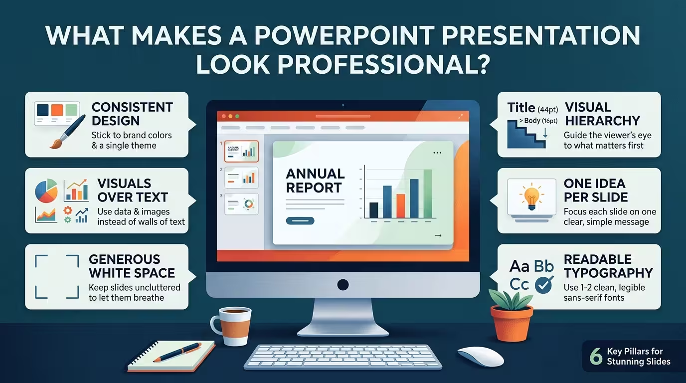
Put two decks side by side with identical content, identical brand colors, even the same stock photos, and one will still read as "professional" and the other as "someone's first attempt." The difference is rarely visible on first glance. It's usually something closer to a sixteen-pixel gap that should have been eight, or a bullet icon that's 2% larger on slide 9 than it was on slide 3. Nobody in the room will name it. Everyone will feel it.
That gap between what viewers consciously notice and what they actually register is the whole story of this article. If you've ever finished a deck, checked every box on the standard advice list — good colors, decent fonts, not too much text — and it still felt slightly off, the box you skipped probably wasn't on the list.
Alignment does more work than color ever will
Here's a test I run on other people's decks: I turn on gridlines and guides and look at nothing but object edges. In an amateur deck, text boxes are close to aligned — off by a few pixels here, nudged slightly there, because they were dragged into place by eye. In a deck that reads as professional, every edge on a slide either touches the same invisible line as something else, or it's intentionally, visibly offset for a reason.
The reason this matters more than color: viewers can't articulate misalignment, but they process it as a lack of care almost instantly, in the same way you'd notice a picture frame hanging slightly crooked before you noticed what was in the picture. Fix this first, before fonts, before palette — it's the cheapest change with the biggest perceived-quality jump, and it's the one thing a template's slide master enforces automatically instead of leaving to eyeballing on every single slide.
The "template trap": more decoration reads as less senior
One thing people overlook: adding more design elements to compensate for feeling like a slide is "boring" usually makes it look less professional, not more. Extra icons, a drop shadow here, a gradient there, three different accent colors because they all "worked" individually — each addition is defensible on its own, but stacked together they signal inexperience, because restraint is expensive. It takes a confident decision to leave a slide with one strong visual element and empty space around it, and audiences read that confidence correctly, even without knowing why.
I wouldn't recommend stripping every deck down to bare minimalism — a genuinely data-dense operations review needs more on the slide than a five-slide pitch does. But when in doubt, the fix is subtraction: pick the one element carrying the point, and cut what's only there to fill space.
Consistency is the actual deliverable, not any single choice
A well-designed slide deck doesn't just help the message land — it changes how the presenter feels walking into the room. A Prezi-commissioned Harris Poll survey with presentation coach Carmine Gallo found that the large majority of professionals said a well-crafted deck made them feel more confident presenting it, and most respondents tied presentation skill directly to career outcomes. That's a strong argument for design quality mattering beyond aesthetics — but it also implies the opposite risk: a deck that looks inconsistent slide-to-slide can quietly undercut the presenter's own confidence before anyone in the audience says a word.
Consistency here means something narrower than "use a theme." It means: the same crop ratio and color tone across every photo in the deck, the same two type sizes used for the same jobs on every slide (not four sizes used loosely), the same spacing between a chart and its caption every time it appears. One inconsistency, on its own, won't sink a deck. What sinks a deck is when a viewer's brain starts noticing the exceptions instead of the content — because now it's tracking two things instead of one.
Charts fail this the same way slides do
Charts are where the alignment-and-restraint problem shows up hardest, because software defaults actively work against you. Default gridlines, default 3D bevels on bars, a legend sitting wherever the software put it rather than where the eye actually needs it — none of that is a deliberate choice, and trained eyes can tell. A chart that looks "professional" has usually had more removed from it than added: gridlines gone or reduced to a whisper, one color used to highlight the one series that matters, direct labels instead of a legend forcing the reader to cross-reference.
This is also where a good template earns its keep — not because it makes the chart for you, but because a well-built one has already made these subtraction decisions once, consistently, so you're not re-deciding chart styling on slide 14 differently than you did on slide 4.
None of this is a checklist you run once at the end. Alignment discipline and restraint are decisions made slide by slide, and the deck that looks effortlessly professional is usually the one where someone went back through it a second time and removed things, not added them.
Comments (0)