Tables PowerPoint Diagrams
Formerly known as tables powerpoint diagram templates - this collection now covers PowerPoint diagram templates that integrate tabular clarity with visual flow elements.
An analyst compiling the annual performance overview for the board can drop metrics into pre-designed icon containers without rebuilding alignment from scratch.
Emphasis stays on data storytelling. A project manager tracking milestones or a product director comparing feature sets inserts numbers directly and maintains consistency. Download the layout that matches your next review.
 (1029)
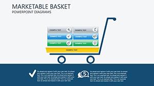
 Marketable Basket PowerPoint Diagrams: Download PPTXID: #PD00139$25.00
 (469)
(469) Portfolio PowerPoint Diagram Template: 20 SlidesID: #PD00216$15.00
 (671)
Green Progress PowerPoint Diagrams TemplateID: #PD00214$15.00
(671)
Green Progress PowerPoint Diagrams TemplateID: #PD00214$15.00 (844)
(844) Business Corporation Structure PowerPoint TemplateID: #PD00211$19.00
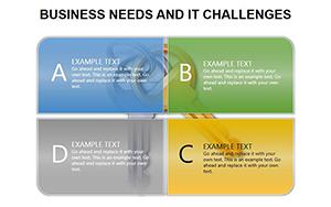 (1022)
Mastering IT Challenges and Business Needs with Professional PowerPoint DiagramsID: #PD00190$15.00
(1022)
Mastering IT Challenges and Business Needs with Professional PowerPoint DiagramsID: #PD00190$15.00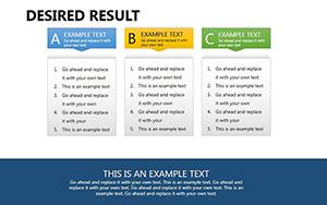 (478)
Desired Result PowerPoint DiagramsID: #PD00189$22.00
(478)
Desired Result PowerPoint DiagramsID: #PD00189$22.00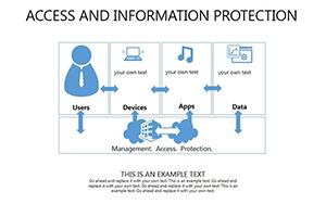 (65)
Access And Information Protection PowerPoint DiagramsID: #PD00187$25.00
(65)
Access And Information Protection PowerPoint DiagramsID: #PD00187$25.00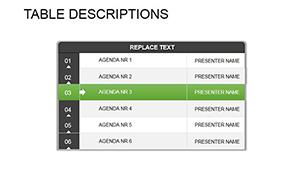 (135)
Table Descriptions PowerPoint Template: Craft Compelling Data NarrativesID: #PD00183$16.00
(135)
Table Descriptions PowerPoint Template: Craft Compelling Data NarrativesID: #PD00183$16.00 (771)
Active Directory PowerPoint Diagrams: Navigating Networks with EaseID: #PD00176$22.00
(771)
Active Directory PowerPoint Diagrams: Navigating Networks with EaseID: #PD00176$22.00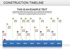 (961)
(961) Construction Timeline PowerPoint diagramID: #PD00175$23.00
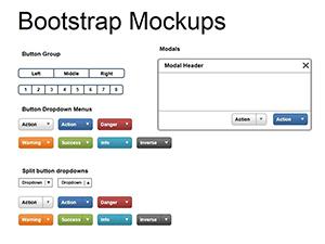 (144)
Bootstrap Mockups PowerPoint Diagrams - Editable PPTXID: #PD00181$12.00
(144)
Bootstrap Mockups PowerPoint Diagrams - Editable PPTXID: #PD00181$12.00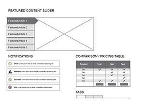 (719)
Mockups Website PowerPoint diagramsID: #PD00174$23.00
(719)
Mockups Website PowerPoint diagramsID: #PD00174$23.00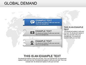 (350)
Global Demand PowerPoint Diagrams: Download PPTXID: #PD00173$23.00
(350)
Global Demand PowerPoint Diagrams: Download PPTXID: #PD00173$23.00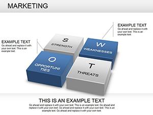 (381)
Dynamic Marketing PowerPoint Diagrams TemplateID: #PD00166$28.00
(381)
Dynamic Marketing PowerPoint Diagrams TemplateID: #PD00166$28.00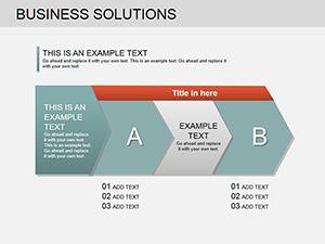 (827)
Business Solutions PowerPoint Diagrams TemplateID: #PD00163$23.00
(827)
Business Solutions PowerPoint Diagrams TemplateID: #PD00163$23.00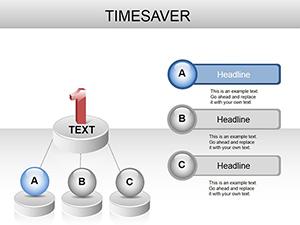 (1132)
Time Management PowerPoint Diagrams: Presentation TemplateID: #PD00162$22.00
(1132)
Time Management PowerPoint Diagrams: Presentation TemplateID: #PD00162$22.00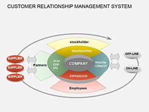 (410)
CRM PowerPoint Diagrams: Unlock Client Connections with PrecisionID: #PD00161$21.00
(410)
CRM PowerPoint Diagrams: Unlock Client Connections with PrecisionID: #PD00161$21.00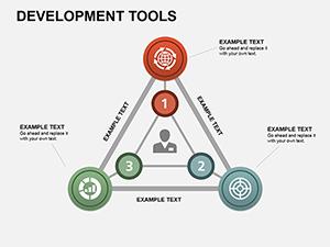 (1196)
Development Tools PowerPoint Diagrams: Streamline Your Project VisionsID: #PD00153$18.00
(1196)
Development Tools PowerPoint Diagrams: Streamline Your Project VisionsID: #PD00153$18.00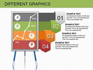 (581)
Different Graphics PowerPoint Diagrams: Embed and ImpressID: #PD00150$16.00
(581)
Different Graphics PowerPoint Diagrams: Embed and ImpressID: #PD00150$16.00 (1106)
Timeline PowerPoint Template - 11 Fully Editable Slides | Instant Download | ImagineLayoutID: #PD00148$15.00
(1106)
Timeline PowerPoint Template - 11 Fully Editable Slides | Instant Download | ImagineLayoutID: #PD00148$15.00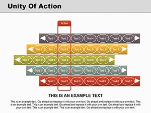 (981)
Unlock Sequence Mastery with Unity of Action PowerPoint DiagramsID: #PD00147$20.00
(981)
Unlock Sequence Mastery with Unity of Action PowerPoint DiagramsID: #PD00147$20.00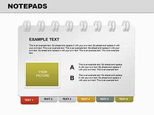 (255)
Notepads PowerPoint Diagrams: 14 Data Viz SlidesID: #PD00143$20.00
(255)
Notepads PowerPoint Diagrams: 14 Data Viz SlidesID: #PD00143$20.00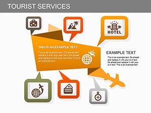 (539)
Tourist Services PowerPoint Diagram TemplateID: #PD00131$22.00
(539)
Tourist Services PowerPoint Diagram TemplateID: #PD00131$22.00 (845)
Database Tables PowerPoint Diagram TemplateID: #PD00130$20.00
(845)
Database Tables PowerPoint Diagram TemplateID: #PD00130$20.00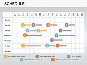 (1079)
Schedule PowerPoint Diagrams: Editable Tools for Organizational PlanningID: #PD00107$20.99
(1079)
Schedule PowerPoint Diagrams: Editable Tools for Organizational PlanningID: #PD00107$20.99 (982)
Editable 3D Graphics Keynote TemplateID: #PD00102$15.00
(982)
Editable 3D Graphics Keynote TemplateID: #PD00102$15.00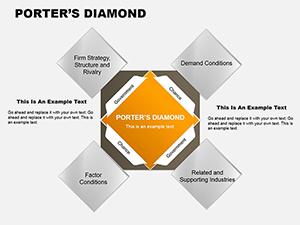 (376)
Porter's Diamond Square PowerPoint Diagrams: Forge Competitive EdgesID: #PD00092$18.00
(376)
Porter's Diamond Square PowerPoint Diagrams: Forge Competitive EdgesID: #PD00092$18.00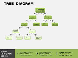 (626)
Tree Block PowerPoint Template: Branch Out Your Data StoriesID: #PD00083$8.00
(626)
Tree Block PowerPoint Template: Branch Out Your Data StoriesID: #PD00083$8.00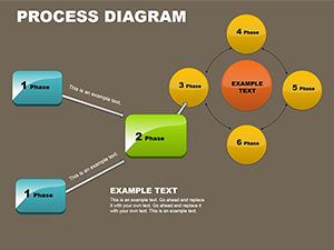 (628)
Process Block Schemes PowerPoint TemplateID: #PD00068$18.00
(628)
Process Block Schemes PowerPoint TemplateID: #PD00068$18.00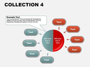 (534)
PowerPoint Diagrams Collection: Weaving Data into NarrativesID: #PD00063$18.00
(534)
PowerPoint Diagrams Collection: Weaving Data into NarrativesID: #PD00063$18.00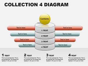 (156)
PowerPoint Diagram Collection 4: Sculpting Ideas in 3DID: #PD00062$18.00
(156)
PowerPoint Diagram Collection 4: Sculpting Ideas in 3DID: #PD00062$18.00 (44)
PowerPoint Diagrams Collection 2: Craft Data Stories That StickID: #PD00058$28.00
(44)
PowerPoint Diagrams Collection 2: Craft Data Stories That StickID: #PD00058$28.00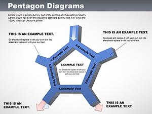 (184)
Versatile Pentagon PowerPoint Diagrams TemplateID: #PD00051$18.00
(184)
Versatile Pentagon PowerPoint Diagrams TemplateID: #PD00051$18.00
How Diagram-Integrated Tables Improve Executive Communication
Pure tables deliver numbers but lack context. These diagram templates add directional arrows, process icons, and hierarchy lines around the data cells so the story reads left to right without extra explanation slides.
Real Project Moments These Templates Shortened
A strategy consultant had 36 hours to prepare a market entry analysis. The diagram templates already positioned SWOT elements in balanced columns; the client presentation was finalized before midnight.
An IT director mapping system architecture for the CFO used the flow containers to show cost breakdowns alongside technical specs in one readable slide.
A sales enablement lead created region-by-region performance visuals for the quarterly kickoff. The standardized icon set ensured every regional manager saw the same layout language.
A finance analyst compared vendor proposals side-by-side. The diagram frames separated quantitative scores from qualitative notes without column width conflicts.
The Specific Decisions You Avoid When Starting from These Files
No time spent choosing icon libraries, matching arrow weights to cell borders, or testing color contrast on different monitors. The palette, line styles, and spacing are already corporate-ready and inherited through the slide master.
Practical Advice for Recurring Monthly Reports
Save the file as a master report template. Each month duplicate the relevant diagram slides, update the numbers, and the visual language stays identical. Departments can pull the same file and maintain brand consistency without design reviews.
Technical Note on Chart Linking in PowerPoint
When linking Excel data to the diagram tables, keep the source workbook in the same folder as the PPTX. The embedded links survive file moves and the diagram containers resize automatically to the new values without breaking the surrounding icons.
Why These Diagram Templates Stand Apart for Corporate Use
They strip away decorative elements and deliver only the structures consultants actually reuse. Every icon remains editable, every flow line adjustable, and the layout works in both 16:9 and 4:3 aspect ratios.
Need pure shape containers instead of icon flows? See our PowerPoint shape templates. For time sequences try the Keynote timeline templates. For offline collateral the business card templates share the same clean geometry.
Open the diagram file that matches your current comparison or process and update the content.
FAQ
Will these PowerPoint diagram templates work in older versions?
Tested from PowerPoint 2013 forward. Icons and flows use native shapes so compatibility holds even on 2016 editions. Newer versions gain better SmartArt conversion if you decide to ungroup for custom edits.
Can I link external Excel data to the tables?
Yes, the diagram cells accept linked tables. Refresh the link after data changes and the surrounding icons stay in position because the containers are grouped on the slide master.
Are the icons editable or locked?
All icons are native PowerPoint shapes or simple vectors. You can recolor, resize, or replace them without losing the diagram structure. No locked groups or third-party assets.
How do I maintain aspect ratio when printing?
Set the slide to 16:9 or 4:3 before printing to PDF. The grouped diagram elements scale proportionally and line weights remain consistent at 300 dpi output.