Tables PowerPoint Charts
Formerly known as tables powerpoint chart templates - this collection now covers PowerPoint Chart Templates. These templates transform data tables and charts into clear visuals for business storytelling.
Reach for them when a marketing analyst prepares the annual performance review for the CEO or a finance director builds the budget comparison for the board. The chart layouts are already structured so you focus on insights.
This collection focuses on data storytelling with comparison tables bar graphs and flowcharts. Pick the template that matches your data complexity and begin editing.
 (16)
(16) Task Progress Report PowerPoint Template with Editable ChartsID: #PC01163$12.00
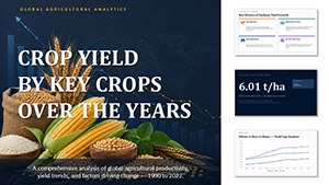 (9)
(9) Crop Yield by Key Crops Over the Years PowerPoint Template and ChartsID: #PC01150$20.00
 (9)
Hotel Occupancy by Region PowerPoint Template and ChartsID: #PC01148$20.00
(9)
Hotel Occupancy by Region PowerPoint Template and ChartsID: #PC01148$20.00 (15)
Car Sales Dynamics PowerPoint Template and ChartsID: #PC01144$18.00
(15)
Car Sales Dynamics PowerPoint Template and ChartsID: #PC01144$18.00 (14)
Sales Forecast PowerPoint Template and ChartsID: #PC01143$18.00
(14)
Sales Forecast PowerPoint Template and ChartsID: #PC01143$18.00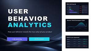 (15)
User Bahavior Analytics PowerPoint Template and ChartsID: #PC01142$14.00
(15)
User Bahavior Analytics PowerPoint Template and ChartsID: #PC01142$14.00 (17)
Equity Capital Dynamics PowerPoint Template and ChartsID: #PC01141$15.00
(17)
Equity Capital Dynamics PowerPoint Template and ChartsID: #PC01141$15.00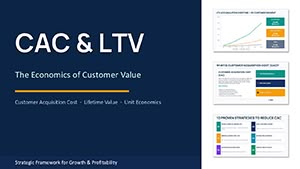 (14)
CAC and LTV PowerPoint Charts TemplateID: #PC01134$15.00
(14)
CAC and LTV PowerPoint Charts TemplateID: #PC01134$15.00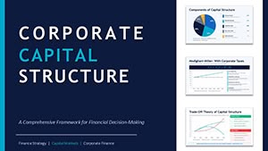 (11)
Corporate Capital Structure PPT - Editable PPTXID: #PC01127$15.00
(11)
Corporate Capital Structure PPT - Editable PPTXID: #PC01127$15.00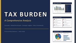 (17)
PowerPoint Tax Burden Analysis - Editable PPTXID: #PC01125$15.00
(17)
PowerPoint Tax Burden Analysis - Editable PPTXID: #PC01125$15.00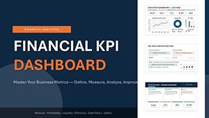 (16)
Financial KPI Dashboard Template - Editable PPTX | ImagineLayoutID: #PC01123$10.00
(16)
Financial KPI Dashboard Template - Editable PPTX | ImagineLayoutID: #PC01123$10.00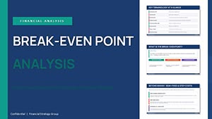 (16)
Break-even Analysis PowerPoint - Editable PPTXID: #PC01121$14.00
(16)
Break-even Analysis PowerPoint - Editable PPTXID: #PC01121$14.00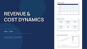 (17)
Financial Analysis Presentation Template - Editable PPTXID: #PC01119$10.00
(17)
Financial Analysis Presentation Template - Editable PPTXID: #PC01119$10.00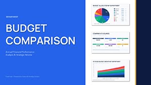 (11)
Department Budget Analysis - Editable PPTX | ImagineLayoutID: #PC01117$14.00
(11)
Department Budget Analysis - Editable PPTX | ImagineLayoutID: #PC01117$14.00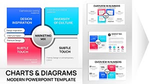 (11)
Marketing Mix PowerPoint Charts - 31 Editable Slides for Board Meetings | Instant DownloadID: #PC01090$15.00
(11)
Marketing Mix PowerPoint Charts - 31 Editable Slides for Board Meetings | Instant DownloadID: #PC01090$15.00 (9)
Sales Infographic PowerPoint Charts - Editable SlidesID: #PC01085$14.00
(9)
Sales Infographic PowerPoint Charts - Editable SlidesID: #PC01085$14.00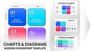 (17)
Ansoff Matrix Charts PPT Template for PowerPointID: #PC01082$20.00
(17)
Ansoff Matrix Charts PPT Template for PowerPointID: #PC01082$20.00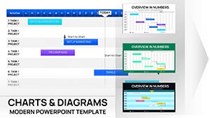 (13)
Monthly Gantt Tables Charts PowerPoint TemplateID: #PC01081$10.00
(13)
Monthly Gantt Tables Charts PowerPoint TemplateID: #PC01081$10.00 (16)
Process Flowchart PowerPoint TemplateID: #PC01075$14.00
(16)
Process Flowchart PowerPoint TemplateID: #PC01075$14.00 (900)
Architectural PowerPoint Charts Template: Elevate Your Design PresentationsID: #PC01066$24.00
(900)
Architectural PowerPoint Charts Template: Elevate Your Design PresentationsID: #PC01066$24.00 (953)
Engaging Online Math PowerPoint Charts TemplateID: #PC01060$18.00
(953)
Engaging Online Math PowerPoint Charts TemplateID: #PC01060$18.00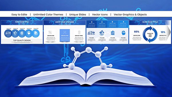 (177)
Chemistry Presentations with Customizable Education PowerPoint Charts: Fuel DiscoveryID: #PC01048$22.00
(177)
Chemistry Presentations with Customizable Education PowerPoint Charts: Fuel DiscoveryID: #PC01048$22.00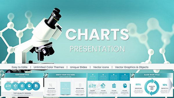 (154)
(154) Chemical and Biochemical Engineering PowerPoint Charts: Precision Tools for Complex InsightsID: #PC01041$18.00
 (594)
Business Financial PowerPoint Charts - Drive DecisionsID: #PC01036$25.00
(594)
Business Financial PowerPoint Charts - Drive DecisionsID: #PC01036$25.00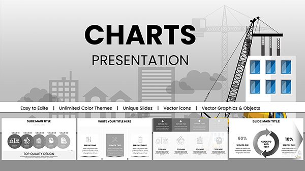 (406)
Construction PowerPoint Charts: Pro Company TemplatesID: #PC00984$20.00
(406)
Construction PowerPoint Charts: Pro Company TemplatesID: #PC00984$20.00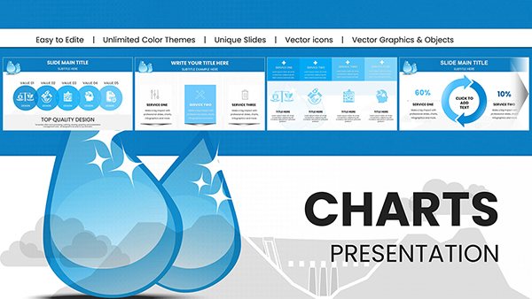 (1200)
Unleashing the Flow: Hydropower Energy PowerPoint Charts for Dynamic PresentationsID: #PC00965$20.00
(1200)
Unleashing the Flow: Hydropower Energy PowerPoint Charts for Dynamic PresentationsID: #PC00965$20.00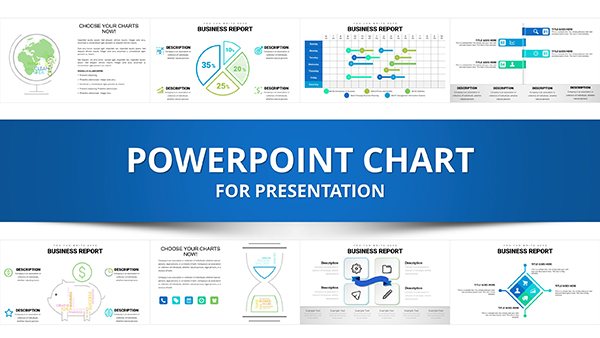 (530)
Business Analysis Solution PowerPoint ChartsID: #PC00941$25.00
(530)
Business Analysis Solution PowerPoint ChartsID: #PC00941$25.00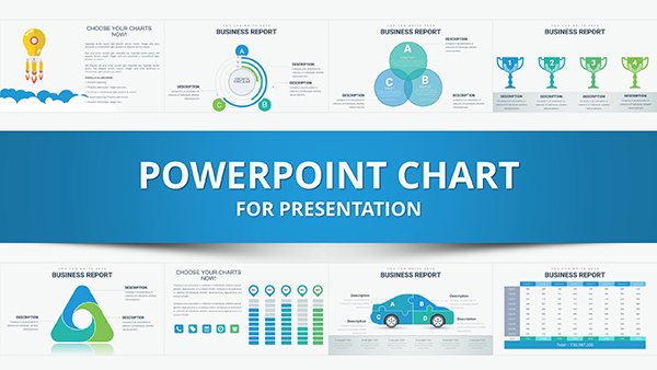 (483)
Best Choice PowerPoint Charts: Professional Templates for Decision-MakingID: #PC00939$25.00
(483)
Best Choice PowerPoint Charts: Professional Templates for Decision-MakingID: #PC00939$25.00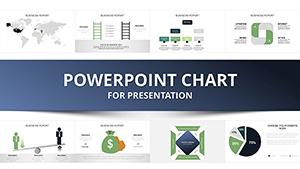 (910)
Sustainable Development PowerPoint Charts: Inspire Eco-InnovationID: #PC00937$25.00
(910)
Sustainable Development PowerPoint Charts: Inspire Eco-InnovationID: #PC00937$25.00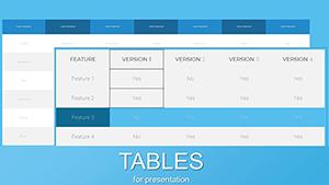 (786)
Streamline Insights: Tables Business Report PowerPoint ChartsID: #PC00887$15.00
(786)
Streamline Insights: Tables Business Report PowerPoint ChartsID: #PC00887$15.00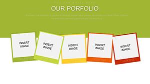 (493)
Craft Compelling Narratives: Visual Portfolio PowerPoint Charts TemplateID: #PC00886$20.00
(493)
Craft Compelling Narratives: Visual Portfolio PowerPoint Charts TemplateID: #PC00886$20.00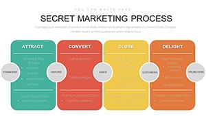 (97)
Inbound Marketing Process PowerPoint Charts Template: Streamline Your StrategyID: #PC00882$15.00
(97)
Inbound Marketing Process PowerPoint Charts Template: Streamline Your StrategyID: #PC00882$15.00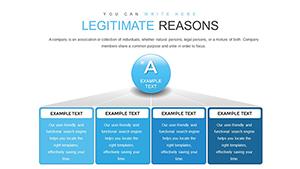 (394)
Legitimate Business Success PowerPoint Charts Template: Unlock Professional ExcellenceID: #PC00872$18.00
(394)
Legitimate Business Success PowerPoint Charts Template: Unlock Professional ExcellenceID: #PC00872$18.00
How PowerPoint chart templates turn data into stories
Pre-built layouts place headline claims above supporting numbers so the audience reads the insight before the details.
The time lost pasting Excel charts into blank slides
You manually match column widths align labels and fix color palettes across twenty slides. Those decisions pull focus from analysis.
Real scenarios where these templates changed the presentation outcome
The sales director had two days to show quarterly pipeline data. Raw tables looked cluttered until the Ansoff matrix chart template organized growth vectors.
A project manager mapped monthly Gantt timelines for stakeholders. Connectors stayed live during scope changes.
The education lead presented math engagement metrics. Custom charts kept proportions intact on export.
An architecture firm visualized design metrics. The chart set let them compare options side by side without reformatting.
Workflow advantages for recurring reports
Slide master updates refresh every instance when quarterly data arrives. Teams share one file for consistent departmental views.
Non-obvious editing techniques for charts
Link charts to external Excel before final polish so numbers update automatically while layout stays locked.
Technical tip for PowerPoint file handling
PPTX format keeps linked charts crisp on PDF export. Test the file size after embedding data to avoid lag on shared drives.
Why these charts prioritize business storytelling
The collection removes decorative padding and focuses on editing freedom. Every table and graph uses native elements so adjustments never break alignment.
Choosing the right template collection for your presentation needs
If your deck requires team structure alongside data see our organizational keynote diagrams templates. For visual icons the PowerPoint shape templates pair perfectly. When the topic involves legal arguments the justice law PowerPoint templates provide thematic support.
The collection is ready for your next data review.
What PowerPoint versions are these chart templates compatible with?
The templates work in PowerPoint 2016 and newer on Windows and Mac. Slide master layouts stay intact. Linked Excel data updates across versions when the source file remains accessible.
Do the files support chart linking to external data?
Yes native PPTX allows direct Excel linking. Refresh the data source and all visuals update while keeping your custom formatting.
Can I share the templates with my analytics team?
Yes for internal company use. Multiple users can edit copies for reports but external redistribution requires separate agreement.
How do I change aspect ratio for different screens?
Default 16:9. Switch in document settings while charts scale proportionally. Check label reflow on 4:3 and tweak padding on the master.
Are the charts fully editable after pasting data?
Yes every element uses native PowerPoint charts. Adjust colors data labels and axis scales without quality loss.