Spheres Keynote Diagrams
A collection of sphere diagrams built for Apple Keynote. These files give teams the structure they need when mapping systems or relationships that flat shapes cannot convey.
When a strategy consultant prepares an ecosystem overview for the executive team, every hour spent tweaking perspective angles and consistent shadows eats into thinking time. These templates arrive with the spheres already grouped, lit, and ready.
The realistic depth stays intact as you swap labels and colors to match your brand palette. Open the file, replace the placeholder text, and the deck moves forward. Pick the variant that aligns with your next deliverable.
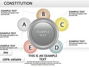 (730)
(730) Constitution Keynote Diagrams: Transform Legal Narratives into Visual MasterpiecesID: #KD00179$25.00
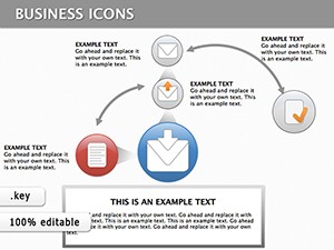 (173)
(173) Keynote Finance Icons DiagramsID: #KD00133$18.00
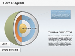 (1143)
Core Keynote Diagrams - 3D Sphere Models for InsightID: #KD00104$28.00
(1143)
Core Keynote Diagrams - 3D Sphere Models for InsightID: #KD00104$28.00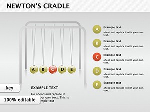 (352)
(352) Newton's Cradle Keynote DiagramsID: #KD00100$18.50
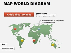 (1149)
 World Maps Keynote Template: Charting Global StoriesID: #KD00061$16.00
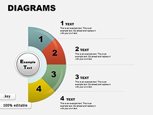 (603)
Collection 3 Keynote Diagrams: Weave Data into Visual SymphoniesID: #KD00059$22.00
(603)
Collection 3 Keynote Diagrams: Weave Data into Visual SymphoniesID: #KD00059$22.00 (11)
Versatile 19 Keynote Diagrams Collection - Fully Editable | ImagineLayoutID: #KD00056$18.00
(11)
Versatile 19 Keynote Diagrams Collection - Fully Editable | ImagineLayoutID: #KD00056$18.00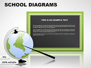 (383)
School Keynote Diagrams TemplatesID: #KD00049$22.00
(383)
School Keynote Diagrams TemplatesID: #KD00049$22.00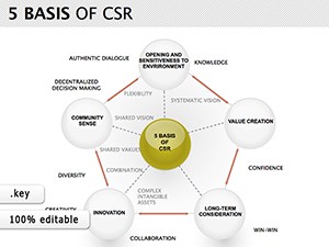 (255)
CSR Keynote Diagrams TemplateID: #KD00012$24.00
(255)
CSR Keynote Diagrams TemplateID: #KD00012$24.00
How 3D Spheres Clarify Interconnected Ideas in Keynote Presentations
Sphere diagrams shine when the message involves overlapping influences or nested priorities. A venture capital analyst mapping portfolio synergies opens one of these files and immediately sees the central core sphere surrounded by orbiting elements. The visual hierarchy guides the audience eye without extra animation steps.
What Changes When You Stop Aligning Shadows Manually
Building sphere visuals from scratch forces decisions on light source angle, gradient direction, and shadow softness across every slide. In a 45-slide board deck due in 48 hours those choices consume the same mental bandwidth as refining the actual argument. The pre-lit spheres eliminate that layer of work so focus stays on the narrative.
Four Moments Where Sphere Diagrams Saved the Deck
A product manager at a fintech startup faced a 30-minute slot to explain platform architecture to skeptical investors. The overlapping transparent spheres illustrated data flow layers without clutter; the team closed the round two weeks later.
An HR director rolling out a new competency framework to 250 managers needed to show how skills intersected with roles. Layered sphere clusters replaced a confusing matrix; feedback called the session the clearest policy update in years.
A supply-chain lead presented risk scenarios to the operations committee. Concentric spheres with varying opacity showed impact severity at a glance; the committee approved the mitigation budget without follow-up questions.
A marketing director outlined brand positioning for the global team. Orbiting spheres around a central value sphere clarified positioning pillars; the regional leads replicated the slide in their local decks within a day.
Ready to add dimension? The files are one download away.
A Non-Obvious Trick for Sphere Grouping in Keynote
Group multiple spheres before applying any scale or rotation. Keynote preserves the relative lighting and shadow offsets inside the group, preventing mismatched highlights when you later resize the entire cluster for different slide layouts.
Technical Considerations for 3D Lighting in Keynote Exports
Keynote renders sphere gradients and shadows accurately at 16:9 aspect ratio. When exporting to PDF, keep the file at original resolution; downsampling below 150 dpi can flatten the depth effect on printed handouts. Embedded fonts travel with the .key file so brand typography stays consistent on any Mac.
What Sets This Collection Apart
Every sphere stays fully movable and recolorable with no locked elements. The designs prioritize corporate storytelling over decorative flair, giving you clean editable shapes that survive repeated revisions and team handoffs.
Where to Go Next for Related Diagram Needs
If your next project needs structural depth instead of spherical layering, see the PowerPoint cube diagram templates. When data volume drives the story, the PowerPoint graph templates deliver ready chart layouts. Apple Keynote users seeking chart flexibility can also explore the Keynote graph diagrams for native format compatibility.
Choose the sphere collection that matches your timeline and open the file.
What Keynote version do these sphere diagram templates require?
Keynote 10 and newer is recommended for full 3D lighting and animation support. In versions 9 and earlier the spheres remain editable shapes but depth effects may appear flatter. If you open the file in an older release, simply update to the current version or export the deck to PDF from a newer Mac to preserve the original volume. The .key package includes all assets so no external links break.
Are the templates licensed for commercial use and team sharing?
The standard license covers use inside any number of client or internal presentations. You may modify and present the files as often as needed. Team sharing within the same organization is allowed under the single-purchase agreement; separate seats are required for multiple independent companies. The license does not permit reselling the templates themselves or extracting the sphere assets for other design tools.
How do I edit the 3D sphere effects once downloaded?
Select any sphere, open the Format panel, and adjust fill gradient, shadow offset, or reflection. Because the spheres are native Keynote shapes rather than images, every change updates instantly across all slides that reuse the master layout. Group related spheres first to keep lighting consistent when scaling the entire cluster.
What file format will I receive and how is it opened?
You receive a standard .key package. Double-click the downloaded file on any Mac with Keynote installed and the presentation opens directly to the first slide. The package contains all embedded fonts, images, and animations so nothing is missing even if you move the file between machines.
Can I export these Keynote slides to PDF without losing the lighting and shadows?
Yes, as long as you export at the original 16:9 aspect ratio and keep image quality at maximum. Keynote renders the sphere gradients and shadows as vector-based effects that survive PDF conversion. Test the export on a sample slide first; if shadows soften, increase the export DPI setting in the print dialog before saving.