Relationship Keynote Diagrams
This collection focuses on relationship diagrams in Apple Keynote - layouts designed to show how elements connect, depend, or influence each other. It`s built for analysts, consultants, and operations teams who need to explain structure, not just list components. When the message depends on connections - not hierarchy, not sequence - this format does the job better than most charts. A product manager walking into a cross - team alignment meeting faces a challenge: not explaining what each team does, but showing how decisions in one area affect another. A relationship diagram makes that visible in one slide, without forcing the audience to mentally reconstruct links from bullet points. Open the file, swap in your labels, and adjust the connectors to match your logic. Download the layout that fits your next alignment meeting.
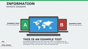 (121)
(121) Information Keynote Diagrams TemplateID: #KD00205$20.00
 (918)
(918) Decision Flow Keynote Diagram TemplateID: #KD00198$22.00
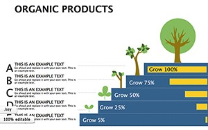 (760)
Organic Products Keynote Diagrams: Championing Sustainable ChoicesID: #KD00197$18.69
(760)
Organic Products Keynote Diagrams: Championing Sustainable ChoicesID: #KD00197$18.69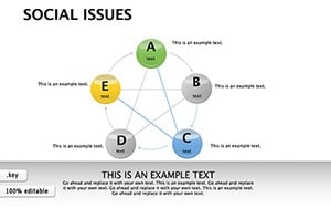 (602)
Social Issues Keynote Diagrams: Illuminating Societal ChallengesID: #KD00196$23.00
(602)
Social Issues Keynote Diagrams: Illuminating Societal ChallengesID: #KD00196$23.00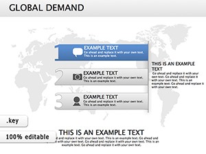 (158)
(158) Global Demand Keynote Diagrams - Presentation TemplateID: #KD00173$20.00
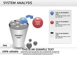 (975)
(975) Flow System Analysis Keynote Diagrams: Decode Complexity GracefullyID: #KD00169$25.00
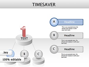 (798)
Time Management Keynote Diagrams: Presentation TemplateID: #KD00162$22.00
(798)
Time Management Keynote Diagrams: Presentation TemplateID: #KD00162$22.00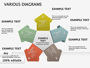 (1171)
Various Keynote diagramsID: #KD00160$26.00
(1171)
Various Keynote diagramsID: #KD00160$26.00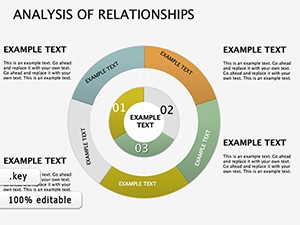 (864)
Analysis Relationships Keynote DiagramsID: #KD00159$25.00
(864)
Analysis Relationships Keynote DiagramsID: #KD00159$25.00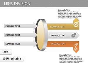 (525)
Lens Division Keynote Diagrams: Organize Ideas BrilliantlyID: #KD00129$25.00
(525)
Lens Division Keynote Diagrams: Organize Ideas BrilliantlyID: #KD00129$25.00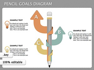 (715)
Pencil Goals Keynote Diagrams - Instant DownloadID: #KD00111$14.00
(715)
Pencil Goals Keynote Diagrams - Instant DownloadID: #KD00111$14.00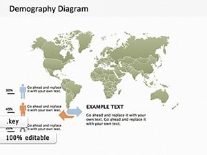 (255)
Map Demography Keynote Diagram TemplateID: #KD00109$18.00
(255)
Map Demography Keynote Diagram TemplateID: #KD00109$18.00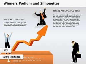 (795)
Winners Podium and Silhouettes Keynote Diagrams TemplateID: #KD00103$22.00
(795)
Winners Podium and Silhouettes Keynote Diagrams TemplateID: #KD00103$22.00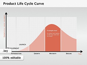 (1040)
Product Life Cycle Curve Keynote DiagramsID: #KD00101$12.69
(1040)
Product Life Cycle Curve Keynote DiagramsID: #KD00101$12.69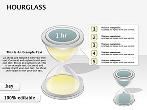 (496)
3D Hourglass Keynote Diagrams: Sand the Sands of StrategyID: #KD00091$26.00
(496)
3D Hourglass Keynote Diagrams: Sand the Sands of StrategyID: #KD00091$26.00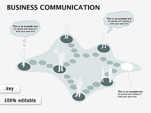 (1182)
Business Communication Keynote Diagrams: Forge Clear Connections in Every PitchID: #KD00080$14.00
(1182)
Business Communication Keynote Diagrams: Forge Clear Connections in Every PitchID: #KD00080$14.00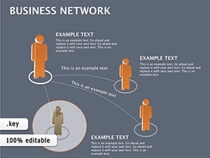 (860)
Business Network Keynote diagramsID: #KD00071$22.00
(860)
Business Network Keynote diagramsID: #KD00071$22.00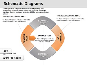 (848)
Schematic Keynote Diagrams TemplateID: #KD00050$20.00
(848)
Schematic Keynote Diagrams TemplateID: #KD00050$20.00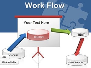 (73)
Workflow Keynote Diagrams: Chart Your Path to EfficiencyID: #KD00039$27.00
(73)
Workflow Keynote Diagrams: Chart Your Path to EfficiencyID: #KD00039$27.00 (822)
BCG Matrix Keynote diagram templateID: #KD00037$24.00
(822)
BCG Matrix Keynote diagram templateID: #KD00037$24.00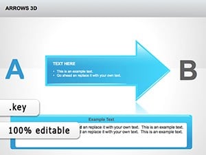 (287)
3D Arrows Keynote Template for Impactful FlowsID: #KD00034$24.00
(287)
3D Arrows Keynote Template for Impactful FlowsID: #KD00034$24.00 (1031)
Direction Arrows Keynote Diagrams - Fully Editable | ImagineLayoutID: #KD00032$14.00
(1031)
Direction Arrows Keynote Diagrams - Fully Editable | ImagineLayoutID: #KD00032$14.00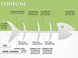 (913)
Fishbone Keynote Diagrams: Decode Complex ProblemsID: #KD00029$20.00
(913)
Fishbone Keynote Diagrams: Decode Complex ProblemsID: #KD00029$20.00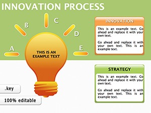 (7)
Innovation Process Keynote Diagrams - Editable .key | ImagineLayoutID: #KD00028$18.00
(7)
Innovation Process Keynote Diagrams - Editable .key | ImagineLayoutID: #KD00028$18.00 (319)
Manager Keynote Diagrams: Chart Leadership Paths with EaseID: #KD00023$24.00
(319)
Manager Keynote Diagrams: Chart Leadership Paths with EaseID: #KD00023$24.00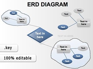 (268)
ERD Keynote Templates: Master Data Models EffortlesslyID: #KD00018$18.00
(268)
ERD Keynote Templates: Master Data Models EffortlesslyID: #KD00018$18.00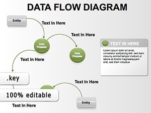 (1039)
Data Flow Keynote Diagrams - Fully Editable KeynoteID: #KD00017$20.00
(1039)
Data Flow Keynote Diagrams - Fully Editable KeynoteID: #KD00017$20.00
What this visual structure does better than flowcharts or org charts
Flowcharts imply direction. Org charts imply hierarchy. Relationship diagrams don`t assume either - and that`s the point. They work best when connections are many - to - many, influence matters more than sequence, and you need to show mutual dependencies. But they break down if overused. Too many connectors and the slide becomes noise. I`ve seen people try to map entire systems on one slide - it rarely works. Better to split into two views than force everything into one diagram. Also, unlike timelines or process flows, these diagrams rely heavily on spatial balance. Move one element too far, and the whole structure feels off. Slightly annoying at first, but once you understand the grid logic, it`s manageable.
Five real - world scenarios where a relationship diagram solved the communication problem
Strategy consultant, stakeholder map for a client workshop
Didn`t need a timeline or hierarchy. Needed to show influence paths - who affects whom, and where decisions bottleneck. The diagram became the discussion surface, not just a visual aid. In a session, the slide stayed on screen for 40 minutes while people debated connections. That`s usually a good sign.
Product manager, cross - team alignment meeting
Needed to show how decisions in one area affected another. A relationship diagram made that visible in one slide. Without it, the conversation would have required reconstructing links from bullet points. With it, the team focused on solving the actual problem.
IT architect, system dependency review
Instead of people, it was systems - APIs, services, dependencies. The diagram showed risk points: where one failure cascades. Clean connector behavior mattered more than design style. When I opened a template for a client review, the connector lines stayed attached when we moved elements. That saved time.
Marketing director, campaign ecosystem presentation
Channel relationships, audience segments. Less technical, but still dependent on clarity. The layout held multiple labels without collapsing visually. Spacing was consistent, even when adding extra nodes.
Operations lead, 11pm before a leadership review
Needed to show how reporting lines didn`t quite match decision flows. A relationship diagram said what an org chart wouldn`t. The slide showed the gap without forcing it into a hierarchy that didn`t exist.
When to choose relationship Keynote diagrams over adjacent categories
If you`re deciding between similar slide types, the choice usually comes down to what you`re trying to show. Choose relationship diagrams when connections are the message. Not sequence, not hierarchy - just how things relate. If your content is more directional, you`re better off in Keynote diagram templates with flow - based layouts. They handle step - by - step logic better. If geography is involved - regions, markets, locations - switch to Keynote map templates. Relationship diagrams don`t carry spatial meaning well. And if you`re dealing with precise numbers, use Keynote chart templates instead.
Why rebuilding a relationship diagram from scratch wastes time you don`t have
The time isn`t lost in drawing boxes and lines - it`s lost in connector behavior. When you build a relationship diagram manually in Keynote, the connector lines often disconnect when you move a shape. You then spend time reconnecting everything. These templates use Keynote`s magic connector feature correctly, with connection points placed optimally. When you move a shape, the lines stay attached. Also, the templates include pre - set spacing guides that help you maintain visual balance. If you build from scratch, you`ll spend too much time adjusting positions to make the diagram look balanced. These templates give you a starting grid that already works.
A technical observation specific to relationship diagrams in Keynote
These templates rely heavily on Keynote`s magic connector behavior. However, magic connectors have a limitation: they connect to the nearest edge of a shape, not a fixed point. If you resize a shape, the connector may jump to a different edge. The solution is to avoid resizing shapes after connecting them. Instead, duplicate the shape at the size you need, then delete the original. Also, when exporting to PDF, test the file. In some PDF viewers, magic connector lines may appear slightly misaligned. The fix is to export at high resolution and view at 100% zoom. For print, connectors are usually fine. For on - screen presentation, Keynote`s native rendering is accurate. The issue only appears in some third - party PDF viewers.
Why this collection is different from typical diagram marketplaces
Most diagram template collections focus on decorative visuals - colorful nodes, complex gradients, icons that distract from the connection logic. These templates focus on structural clarity. The color palette is restrained, the connector lines are clear, and the layout doesn`t assume a specific number of nodes. The templates are also built entirely in Keynote`s native tools, so everything is editable. However, the collection does not include highly polished, presentation - ready diagrams for every possible scenario. If you need a diagram that looks like a final infographic, these templates may feel too bare. But if you need a diagram that you can adapt quickly to your actual data, this collection is more usable than over - designed alternatives.
Related template collections on ImagineLayout
This relationship diagram collection sits alongside several other Keynote categories. For general presentation structures, start with Keynote templates. For process flows and step - by - step logic, see Keynote diagram templates. For geographic data, switch to Keynote map templates. And for data comparison, use Keynote chart templates. Choose the category that matches your communication need.
Frequently Asked Questions
How do magic connectors work in these templates, and can I add more?
Magic connectors are Keynote`s native line tools that automatically attach to shapes and stay attached when you move the shapes. In these templates, each shape has pre - defined connection points (usually four per shape: top, bottom, left, right). To add a new connector, click the Line tool in the toolbar, select Magic Connector, then click on the first shape and drag to the second shape. You`ll see the connection points highlight as you drag. To remove a connector, select it and press Delete. Important: magic connectors only work between shapes that are on the same slide layer. If you group shapes, connectors inside the group may behave unpredictably. Keep your diagram ungrouped until you finalize the layout.
Can I use these relationship diagrams in PowerPoint?
You can export the Keynote file to PowerPoint (.pptx) via File > Export To > PowerPoint. However, magic connectors are a Keynote - specific feature. In PowerPoint, the connectors convert to standard lines that do not maintain attachment when shapes move. If you need to edit the diagram in PowerPoint, you will need to reconnect lines manually after moving any shape. The recommendation: if your final output is PowerPoint, export the diagram as a PDF or image (PNG, JPEG) after you`ve finalized the layout in Keynote. That preserves the visual appearance without requiring connector behavior. Avoid doing structural edits in PowerPoint if you started in Keynote.
What`s the maximum number of nodes these diagrams can handle?
There`s no hard technical limit, but there is a readability limit. These templates are designed for diagrams with 5 - 15 nodes. At 15 nodes, the diagram becomes crowded, and connector lines may cross in ways that confuse the audience. If you need to show more than 15 nodes, consider splitting the diagram into multiple slides (e.g., by region or by function) or using a different visual format like a matrix or table. Also, the number of connections matters more than the number of nodes. A diagram with 10 nodes and 25 connections is often harder to read than a diagram with 15 nodes and 15 connections. Use the templates as a guide for maximum visual complexity. If your data exceeds that, reconsider whether a relationship diagram is the right format.
Do these templates work with Keynote for iCloud?
Yes, you can upload the templates to iCloud Drive and open them in Keynote for iCloud. However, magic connector behavior is less reliable in the web version. Connectors may detach when you move shapes, or they may not render correctly at all. If you plan to do significant editing, use the macOS Keynote app. Use Keynote for iCloud only for minor text updates or presenting. Also, the grid guides and alignment helpers that make these diagrams usable are less precise in the web version. For best results, keep a local copy on your Mac.
What`s the most common mistake when editing these relationship diagrams?
Moving a shape without also moving its connected shapes. Magic connectors will keep the lines attached, but they won`t automatically reposition the other end of the connector. If you move a central node, the connected nodes stay in place, and the connectors stretch. The result is a diagram where lines cross awkwardly. The solution is to select the whole group of related shapes before moving them. Alternatively, use Keynote`s alignment guides to maintain relative spacing. A second common error is deleting a shape without first deleting its connectors. If you delete a shape that has connectors attached, the connectors may become orphaned and remain on the slide as stray lines. Clean them up manually.
Are these diagrams accessible for screen readers?
Keynote supports basic accessibility features, but relationship diagrams are inherently visual. Screen readers can read text labels, but they cannot convey the spatial relationships or connector logic. If your audience includes people using screen readers, provide a text - based alternative: a list of connections (e.g., "Node A connects to Node B and Node C") or a table describing the relationships. The templates do not auto - generate this alternative. You would need to create it manually. For presentations where accessibility is a requirement, consider whether a list or table format would communicate the same information more accessibly. If you must use a diagram, present it as an image with a detailed alt text description.