Pie Keynote Diagrams
Formerly known as pie Keynote diagrams templates - this collection now covers Keynote pie chart diagrams and data visualization slides. Finance analysts and executives reach for these when default charts fail to tell the complete story.
Imagine a finance director preparing the quarterly revenue breakdown for the board. The meeting starts in three hours and every segment must show contribution clearly. The template provides linked pie charts so only the numbers change.
This collection focuses on data clarity. Download to begin your next report.
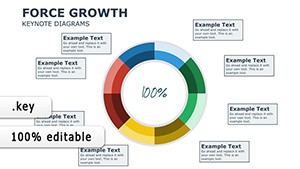 (36)
(36) Force Growth Pie Keynote Diagrams TemplateID: #KD00209$18.00
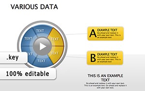 (401)
(401) Various Data Keynote Diagrams for Modern Information ManagementID: #KD00182$20.69
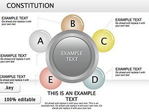 (730)
Constitution Keynote Diagrams: Transform Legal Narratives into Visual MasterpiecesID: #KD00179$25.00
(730)
Constitution Keynote Diagrams: Transform Legal Narratives into Visual MasterpiecesID: #KD00179$25.00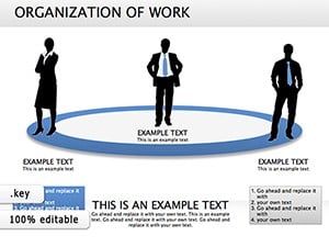 (100)
Organization of Work Keynote Diagrams: Structure Success EffortlesslyID: #KD00172$26.00
(100)
Organization of Work Keynote Diagrams: Structure Success EffortlesslyID: #KD00172$26.00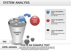 (975)
(975) Flow System Analysis Keynote Diagrams: Decode Complexity GracefullyID: #KD00169$25.00
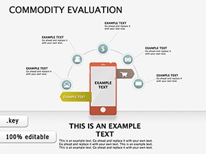 (249)
Commodity Evaluation Keynote DiagramsID: #KD00158$19.99
(249)
Commodity Evaluation Keynote DiagramsID: #KD00158$19.99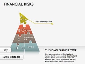 (1134)
Financial Risks Keynote Diagrams: Chart Your Course Through UncertaintyID: #KD00155$26.00
(1134)
Financial Risks Keynote Diagrams: Chart Your Course Through UncertaintyID: #KD00155$26.00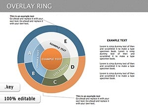 (933)
(933) Versatile Overlay Ring Pie Keynote Diagrams TemplateID: #KD00125$20.00
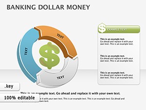 (313)
Dollar Money Banking Keynote Diagrams: Visualize Financial Flows with EleganceID: #KD00088$16.00
(313)
Dollar Money Banking Keynote Diagrams: Visualize Financial Flows with EleganceID: #KD00088$16.00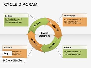 (627)
Cycle Diagram Keynote Template - Fully Editable 18 Slides | ImagineLayoutID: #KD00084$16.00
(627)
Cycle Diagram Keynote Template - Fully Editable 18 Slides | ImagineLayoutID: #KD00084$16.00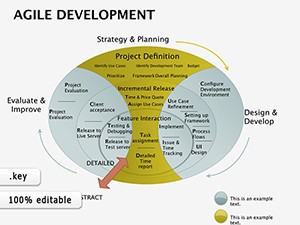 (111)
Agile Development Keynote Diagrams: Chart the Path to Iterative SuccessID: #KD00081$23.00
(111)
Agile Development Keynote Diagrams: Chart the Path to Iterative SuccessID: #KD00081$23.00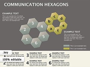 (425)
Hexagon App Communication Keynote Diagram TemplateID: #KD00070$24.00
(425)
Hexagon App Communication Keynote Diagram TemplateID: #KD00070$24.00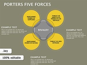 (821)
Master Competitive Landscapes with Porter's Five Forces Keynote DiagramsID: #KD00069$18.00
(821)
Master Competitive Landscapes with Porter's Five Forces Keynote DiagramsID: #KD00069$18.00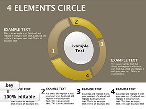 (1109)
4 Elements Circle Keynote Template: Harmonize Parts into Powerful WholesID: #KD00065$18.00
(1109)
4 Elements Circle Keynote Template: Harmonize Parts into Powerful WholesID: #KD00065$18.00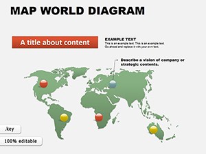 (1149)
World Maps Keynote Template: Charting Global StoriesID: #KD00061$16.00
(1149)
World Maps Keynote Template: Charting Global StoriesID: #KD00061$16.00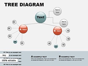 (284)
Tree Circular Keynote Diagrams - EditableID: #KD00060$16.00
(284)
Tree Circular Keynote Diagrams - EditableID: #KD00060$16.00 (603)
Collection 3 Keynote Diagrams: Weave Data into Visual SymphoniesID: #KD00059$22.00
(603)
Collection 3 Keynote Diagrams: Weave Data into Visual SymphoniesID: #KD00059$22.00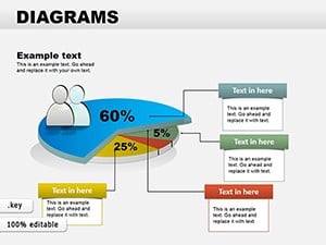 (1124)
Collection Data Pie Keynote DiagramsID: #KD00058$24.00
(1124)
Collection Data Pie Keynote DiagramsID: #KD00058$24.00 (11)
Versatile 19 Keynote Diagrams Collection - Fully Editable | ImagineLayoutID: #KD00056$18.00
(11)
Versatile 19 Keynote Diagrams Collection - Fully Editable | ImagineLayoutID: #KD00056$18.00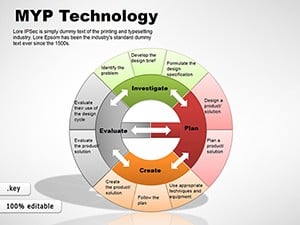 (355)
MYP Design Cycle Keynote Diagrams TemplateID: #KD00048$18.00
(355)
MYP Design Cycle Keynote Diagrams TemplateID: #KD00048$18.00 (712)
8-Element Venn Diagrams: Keynote Relationship VisualsID: #KD00045$24.00
(712)
8-Element Venn Diagrams: Keynote Relationship VisualsID: #KD00045$24.00 (83)
Venn Keynote Diagrams TemplateID: #KD00042$25.00
(83)
Venn Keynote Diagrams TemplateID: #KD00042$25.00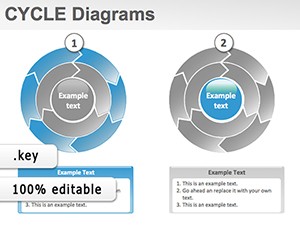 (285)
Cycle Diagrams Keynote Template: Mastering the Loop of IdeasID: #KD00026$28.00
(285)
Cycle Diagrams Keynote Template: Mastering the Loop of IdeasID: #KD00026$28.00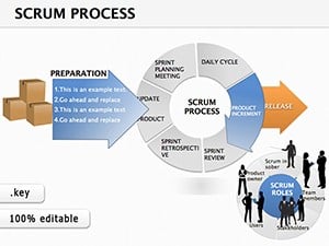 (1014)
Scrum Process Keynote Diagrams: Agile Visions That DeliverID: #KD00025$18.00
(1014)
Scrum Process Keynote Diagrams: Agile Visions That DeliverID: #KD00025$18.00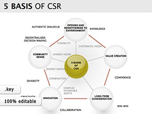 (255)
CSR Keynote Diagrams TemplateID: #KD00012$24.00
(255)
CSR Keynote Diagrams TemplateID: #KD00012$24.00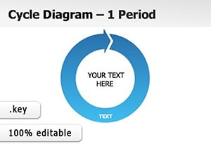 (817)
Life Cycles Keynote Diagram TemplatesID: #KD00011$24.00
(817)
Life Cycles Keynote Diagram TemplatesID: #KD00011$24.00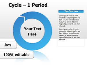 (1126)
Period Cycle Keynote Diagrams: Spin Cycles into StoriesID: #KD00007$24.00
(1126)
Period Cycle Keynote Diagrams: Spin Cycles into StoriesID: #KD00007$24.00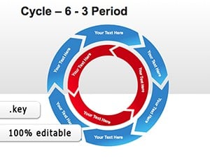 (424)
6 Period Cycle Keynote Diagrams - Editable .key | ImagineLayoutID: #KD00006$20.00
(424)
6 Period Cycle Keynote Diagrams - Editable .key | ImagineLayoutID: #KD00006$20.00
Why Default Pie Charts Rarely Work for Executive Audiences
Too many segments collapse labels and colors clash. These templates limit slices to seven and use a fixed color palette that remains readable in any lighting.
Real-World Scenarios Where These Pie Charts Save the Day
A CFO presenting year-over-year market share growth uses the side-by-side pie template to show competitive shifts without rebuilding legends.
An analyst rolling out department budget allocation creates a donut variation that highlights the largest cost center instantly.
A sales director mapping regional contribution uses the exploded pie layout with callout lines that stay attached when data updates.
A nonprofit treasurer explaining donation sources presents a clean four-slice pie that prints legibly for the annual report.
How Data-Linked Charts Support Recurring Financial Reviews
Link each pie to a single hidden data table; update the table once and every slide refreshes automatically.
Non-Obvious Customization Tricks for Financial Data
Group the legend and pie together on the master; resizing the group keeps percentage labels perfectly aligned.
Technical Considerations When Working with Keynote Pie Charts
Use "Explode" only on the slide master so the animation behaves consistently across the deck. Export to PDF with embedded fonts to keep labels crisp.
What Sets These Keynote Pie Chart Templates Apart
Charts are built for storytelling, not decoration. Every slice remains editable, legends update with data, and layouts reflow without manual fixes.
Finding the Right Template Category for Your Next Data Deck
For process visualization see our PowerPoint flowchart templates. Manufacturing teams may prefer the industry production Keynote templates. Telecom marketing may choose the telecommunication brochures templates.
Download the Keynote pie chart collection now to start your next data story.
Are these pie charts linked to live data?
Yes, each template includes a hidden data table. Change the numbers and all pies and legends update instantly.
Can I export these to PowerPoint without losing chart formatting?
Yes, Keynote`s export preserves data links and color assignments. Labels remain legible on Windows.
Do the templates support donut and exploded variations?
Yes, dedicated masters for donut, semi-circle, and exploded styles are included and fully editable.
What license covers board and client presentations?
The license allows unlimited internal and external presentations. Template resale is not permitted.
Can I change the number of slices without breaking the layout?
Yes, add or remove slices on the chart object; the legend and callouts adjust automatically because they are grouped.