Analysis Keynote Diagram Templates provide a diverse toolbox for data display. With a selection of professionally crafted templates, you can develop compelling presentations that accurately communicate the results of your investigation. These templates cover a variety of diagram styles, including flowcharts, Venn diagrams, mind maps, and statistical charts, simplifying the process of showcasing correlations, patterns, and trends in your data.
What is Analysis Keynote Diagram Templates?
Analysis Keynote Diagram Templates are pre-designed templates created particularly for Apple's Keynote presentation program. These templates depict and express complicated data, connections, and processes understandably and engagingly. They are excellent for presenting analytical material, allowing audiences to swiftly comprehend essential arguments and insights through visual representations.
Advantages of Using Analysis Keynote Diagram Templates
- Enhanced Clarity and Understanding: Diagrams simplify complicated information, allowing audiences to grasp facts and concepts better.
- Time Efficiency: Pre-designed templates provide a ready-made structure, allowing users to focus on content rather than design.
- Professional Appearance: High-quality templates provide a polished and professional appearance, increasing the overall impact of a presentation.
- Customization Flexibility: Users can easily customize these templates to meet their data and presentation styles.
- Visual Features: Charts, graphs, and flow diagrams enhance presentation engagement and memorability.
What are the different types of analysis keynote diagram templates?
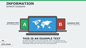
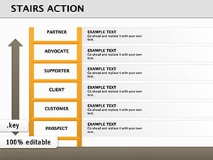
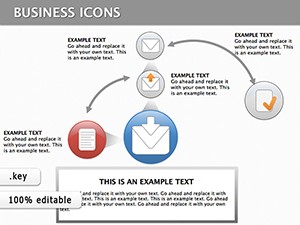
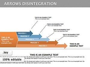
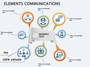
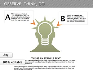
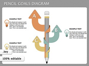
- Flow Diagrams: Ideal for depicting processes, workflows, or sequences of occurrences.
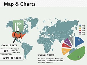
- Pie Charts: Used to show data proportions and compare various categories within a dataset.
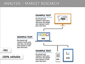
- Bar and Column Charts: Ideal for comparing groups or monitoring changes over time.
- Gantt Charts: Used for project management, demonstrating deadlines, and scheduling.
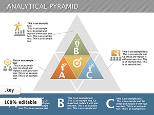
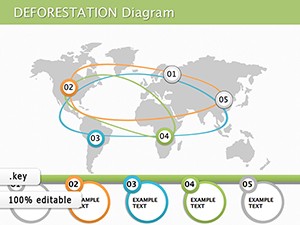
- Venn Diagrams: Useful for displaying relationships and overlaps between various data sets or groups.
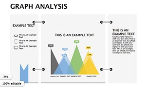
- Scatter Plots: Used to uncover relationships and trends in data sets.
Examples of Applying Analysis Keynote Diagram Templates in Various Situations
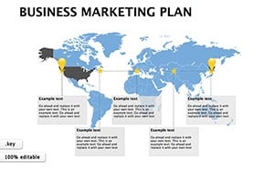
- Business Presentations: These templates can be used to provide market studies, financial reports, and project proposals.
- Education: Educators and students can use these graphics to teach difficult ideas, historical events, and scientific processes.
- Marketing: Marketers use diagrams to show consumer demographics, market segmentation, and campaign performance.
- Healthcare: Medical practitioners can use these templates to convey patient data, treatment plans, and research findings.
- IT and Technology: Diagrams assist in visualizing system designs, process flows, and technical requirements.
Where and Who Needs Analysis Keynote Diagram Templates?
- Corporate Sector: Companies and organizations typically utilize these templates for internal reporting, strategic planning, and client presentations.
- Educational Institutions: Schools, colleges, and universities use them for lectures, seminars, and academic projects.
- Non-Profit Organizations: These templates help in reporting on project outcomes, funding use, and community impact.
- Government Agencies: Used for policy presentations, public reporting, and data analysis.
- Freelancers and Consultants: Independent professionals use them to highlight their work, propose recommendations, and report findings.
User Reviews for Analysis Keynote Diagram Templates
- Ease of Use: Many users appreciate the simple and user-friendly nature of these templates, which do not require complex design skills.
- Versatility: Reviewers often highlight the variety of available templates that cater to different sectors and presentation needs.
- Time-Saving: Users frequently note how these templates streamline the presentation creation process, allowing them to focus on content.
- Customization Options: Users often praise the ability to modify templates to reflect their branding or specific needs easily.
- Professional Look: Users appreciate the polished and professional image that these templates provide, enhancing the credibility of their presentations.
In summary, Analysis Keynote Diagram Templates are versatile tools that can be used in a wide range of industries and situations. They are excellent for anyone seeking to communicate data and information clearly, professionally, and engagingly. Whether in business, education, or other industries, these templates offer significant advantages, ranging from time savings to enhanced audience understanding.
Question and Answer
Q: What are Analysis Keynote Diagram Templates? A: Analysis Keynote Diagram Templates are pre-designed presentations in Apple's Keynote program that are intended to convey data analysis, patterns, and insights graphically.
Q: How can these templates improve a presentation? A: They convey complicated facts in a professional and visually appealing manner, allowing the audience to absorb better and remember information.
Q: Which sorts of analyses may be provided using these templates? A: They are adaptable and may be used for a variety of purposes, including financial analysis, market research, corporate performance assessments, and SWOT analysis.
Q: Are the Analysis Keynote Diagram Templates customizable? A: Yes, most themes can be personalized with your information, colors, fonts, and other features to match your brand or presentation style.
Q: Can I use these templates in other presentation software? A: While they are primarily intended for Keynote, some templates may be translated for usage in other applications, such as PowerPoint, with minor changes.
Q: Are there templates designed expressly for certain industries? A: Yes, many templates are tailored to specific industries, such as banking, healthcare, and marketing, to meet distinct data display requirements.