Puzzles Keynote Diagrams
This collection includes Keynote slides built around interlocking puzzle diagrams - layouts designed to show how separate parts connect into a single outcome. They`re used by teams that need to explain sequence, ownership, or dependencies without turning the slide into a wall of arrows.
In practice, a project manager walking into a weekly delivery review doesn`t need decoration - they need to show how five moving parts fit together and where something is breaking. Puzzle layouts do that better than flowcharts when the point is structure, not direction. You drop in your stages, align ownership, and the logic reads immediately. That`s the difference.
If your next deck involves explaining how pieces connect - not just listing them - start with a layout that already carries that logic. Pick a slide, adjust the labels, and move on.
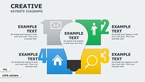 (337)
(337) Creative Keynote Diagrams TemplateID: #KD00202$22.00
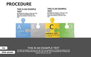 (829)
(829) Procedure Keynote Diagrams TemplateID: #KD00192$20.00
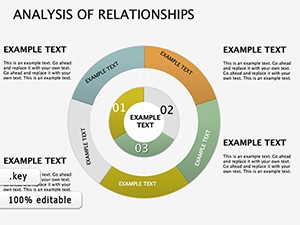 (864)
Analysis Relationships Keynote DiagramsID: #KD00159$25.00
(864)
Analysis Relationships Keynote DiagramsID: #KD00159$25.00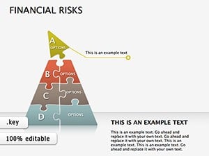 (1134)
 Financial Risks Keynote Diagrams: Chart Your Course Through UncertaintyID: #KD00155$26.00
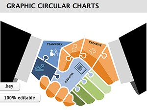 (1182)
Partnership Puzzle Keynote Diagrams: Piece Together Collaborative WinsID: #KD00151$20.00
(1182)
Partnership Puzzle Keynote Diagrams: Piece Together Collaborative WinsID: #KD00151$20.00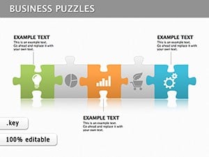 (883)
Puzzle Work Keynote DiagramsID: #KD00134$22.00
(883)
Puzzle Work Keynote DiagramsID: #KD00134$22.00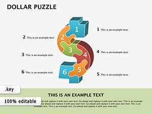 (862)
Dollar Puzzle Keynote Diagrams: Piece Together Financial NarrativesID: #KD00094$16.00
(862)
Dollar Puzzle Keynote Diagrams: Piece Together Financial NarrativesID: #KD00094$16.00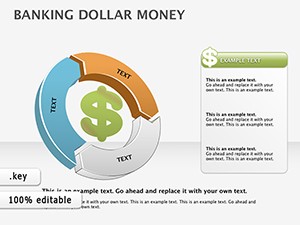 (313)
Dollar Money Banking Keynote Diagrams: Visualize Financial Flows with EleganceID: #KD00088$16.00
(313)
Dollar Money Banking Keynote Diagrams: Visualize Financial Flows with EleganceID: #KD00088$16.00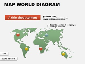 (1149)
 World Maps Keynote Template: Charting Global StoriesID: #KD00061$16.00
 (603)
Collection 3 Keynote Diagrams: Weave Data into Visual SymphoniesID: #KD00059$22.00
(603)
Collection 3 Keynote Diagrams: Weave Data into Visual SymphoniesID: #KD00059$22.00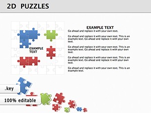 (1096)
2D Puzzles Keynote Diagram Presentation: Piece Together PersuasionID: #KD00054$24.00
(1096)
2D Puzzles Keynote Diagram Presentation: Piece Together PersuasionID: #KD00054$24.00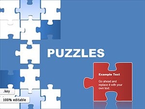 (864)
Business Puzzles Keynote DiagramsID: #KD00047$24.00
(864)
Business Puzzles Keynote DiagramsID: #KD00047$24.00 (28)
Honeycomb Keynote Diagrams: Modular Magic for Your IdeasID: #KD00038$25.00
(28)
Honeycomb Keynote Diagrams: Modular Magic for Your IdeasID: #KD00038$25.00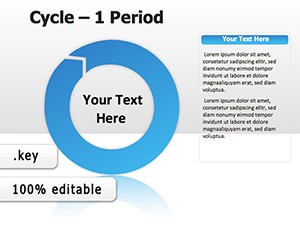 (1126)
Period Cycle Keynote Diagrams: Spin Cycles into StoriesID: #KD00007$24.00
(1126)
Period Cycle Keynote Diagrams: Spin Cycles into StoriesID: #KD00007$24.00
Where puzzle diagrams actually make the slide clearer - not just different
Puzzle diagrams are not just a visual style. They impose a very specific logic: every piece connects, and the absence of one piece breaks the whole. That sounds obvious, but in real presentations it changes how people read the slide. A bullet list says "these things exist." A puzzle says "these things depend on each other." That`s a different argument entirely.
When I`ve used these in client decks, especially in operational reviews, the conversation shifts faster. People stop asking "what are the steps?" and start asking "which piece is failing?" That`s exactly what you want.
And yes, it`s slightly rigid. You can`t just add ten extra items without breaking the layout. But that constraint forces clarity, which is usually the point anyway.
If your message depends on interdependency - not sequence - these layouts work well. Start there, then adjust.
What these layouts handle well (and where they don`t)
Puzzle diagrams are built for structured thinking. They work best when:
- You`re explaining components of a system that must all exist
- You need to assign ownership to each part of a process
- The audience needs to see completeness - not priority
They struggle when:
- You need to show timing or sequence (a timeline is better)
- The number of elements changes frequently
- Relationships are directional rather than structural
So no, this won`t replace every diagram you use. But for "how everything fits together" - it`s hard to beat.
Works as-is.
Real scenarios where puzzle diagrams earn their place
A product lead preparing a roadmap presentation for stakeholders often struggles to explain how features, teams, and timelines connect. Listing them doesn`t help. A puzzle layout lets them show how each piece contributes to the final release - and where dependencies sit. The slide becomes a conversation about risk, not just scope.
In a consulting workshop, I`ve seen teams use puzzle diagrams to map out operating models. Each piece represents a function - finance, operations, HR - and the interlocking shape makes it obvious when something is missing. Slightly awkward at first, but once filled in, it clicks immediately.
A marketing manager explaining campaign components - channels, messaging, analytics - can use a puzzle slide to show integration. Not sequence, not hierarchy. Just fit. That distinction matters when alignment is the goal.
When to choose puzzle diagrams over other diagram types
If you`re deciding between categories, here`s the practical difference.
Use puzzle diagrams when the message is about completeness and connection. If instead you need direction or flow, a better option is general Keynote diagram templates where arrows and connectors carry the logic.
For numeric comparison or structured data, puzzle layouts fall short - you`re better off with Keynote chart templates where values and scale matter more than structure.
And if your content is geographic or location-based, switch to map-based Keynote slides. A puzzle won`t help there.
Basically: use puzzles for relationships, not movement or measurement.
What you notice when you actually edit these in Keynote
The first thing I usually check is whether the shapes are grouped or built as individual objects. Here, most puzzle pieces are separate, which is good - you can resize or recolor without breaking everything. But you do need to be a bit careful with alignment. Move one piece too far and the "fit" illusion disappears.
Another detail: text placement. In some slides, labels sit inside shapes with tight padding. It looks clean, but if your text runs long, you`ll need to adjust font size or spacing manually. Not a big deal, just something to expect.
Also, these export cleanly to PDF - no weird overlaps. That`s not always true with layered diagrams, so it`s worth noting.
Why these templates work better than starting from scratch
Building a puzzle diagram manually sounds simple until you try aligning shapes perfectly and maintaining consistent spacing across slides. It turns into a geometry exercise instead of a thinking exercise.
Here, the structure is already set. The spacing is consistent. The color system is applied across slides. You focus on what each piece represents - not how to draw it. Honestly, that`s the real value.
And once you adjust the slide master, everything follows. Done.
How this collection feels in real use
These templates are built for clarity, not decoration. The layouts are simple, sometimes almost plain. But that`s why they hold up in actual business decks. No unnecessary elements, no visual noise.
There are limitations. You won`t find highly complex multi-layer systems here. And if you need extreme flexibility, you`ll still end up modifying shapes. But for most presentations - strategy, operations, planning - they`re actually useful.
That`s enough.
Can I add more puzzle pieces without breaking the layout?
Usually yes, but it depends on how the slide is built. In most cases, each puzzle piece is an individual shape, so you can duplicate and reposition it. The tricky part is spacing - keeping the "interlocking" effect consistent takes a bit of manual adjustment. From experience, it`s easier to start with a layout close to your final number of elements rather than expanding too far.
Do these templates work in PowerPoint or only Keynote?
The short answer is: they`re built for Keynote, but you can often export them to PowerPoint. That said, shapes and text alignment may shift slightly after conversion. If you`re presenting in PowerPoint regularly, it`s better to start with a native PPTX file instead of converting. Works fine for simple slides, though.
How do I change colors across all puzzle pieces quickly?
Honestly, the easiest way is through the slide master. Most templates are set up with a basic color system, so once you update the theme colors, the shapes follow automatically. If not, you`ll need to select multiple shapes and apply changes manually. Slightly annoying at first, but manageable once you see how the template is structured.
Can I use these diagrams for client presentations?
Yes. It`s the same license most marketplaces use - one buyer, one project, commercial use included. You can present, export, and share the final slides without issues. You just can`t redistribute the template files themselves. That`s basically it.
What happens if I resize a puzzle diagram slide?
I`ve seen this trip up even experienced users. When you change slide size or aspect ratio, the alignment between pieces can shift slightly. You`ll need to realign shapes manually to keep the interlocking effect clean. It`s not difficult, but it does take a few minutes. Oh, and exporting to PDF after that usually keeps everything stable.