Relationship PowerPoint Charts
Visualizing connections between ideas, processes, and data points becomes effortless with our comprehensive collection of relationship chart templates for PowerPoint and Keynote. These professionally designed diagrams help you illustrate how different elements interact, influence each other, and create meaningful patterns in your business, educational, or research presentations.
From Venn diagrams and cycle charts to matrix layouts and process flows, each template is fully customizable to match your specific needs. Replace text, adjust colors, modify layouts, and create compelling visual narratives that make complex relationships clear and memorable for any audience.
 (10)
(10) Relationship Diagram PowerPoint Template - 44 Slides | ImagineLayoutID: #PC01115$14.00
 (12)
Business Silhouettes PPT Charts Template - Editable SlidesID: #PC01110$15.00
(12)
Business Silhouettes PPT Charts Template - Editable SlidesID: #PC01110$15.00 (14)
Finish Line PowerPoint Charts - 41 Premium Slides for Project TrackingID: #PC01109$18.00
(14)
Finish Line PowerPoint Charts - 41 Premium Slides for Project TrackingID: #PC01109$18.00 (13)
Connected Balls Chart Template for PowerPoint - 26 SlidesID: #PC01084$12.00
(13)
Connected Balls Chart Template for PowerPoint - 26 SlidesID: #PC01084$12.00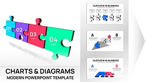 (13)
3D Puzzle Charts Template for PowerPoint - 48 Editable SlidesID: #PC01077$25.00
(13)
3D Puzzle Charts Template for PowerPoint - 48 Editable SlidesID: #PC01077$25.00 (900)
(900) Architectural PowerPoint Charts Template: Elevate Your Design PresentationsID: #PC01066$24.00
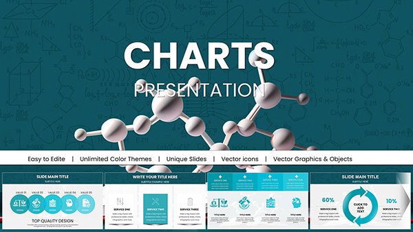 (821)
Pro Chemical & Biochemical Education PowerPoint ChartsID: #PC01062$22.00
(821)
Pro Chemical & Biochemical Education PowerPoint ChartsID: #PC01062$22.00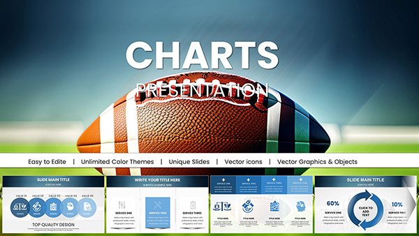 (586)
Sport Baseball PowerPoint Charts - Download PresentationID: #PC01058$20.00
(586)
Sport Baseball PowerPoint Charts - Download PresentationID: #PC01058$20.00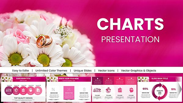 (994)
(994) Wedding PowerPoint Charts - Customizable Wedding Presentation TemplatesID: #PC01055$22.00
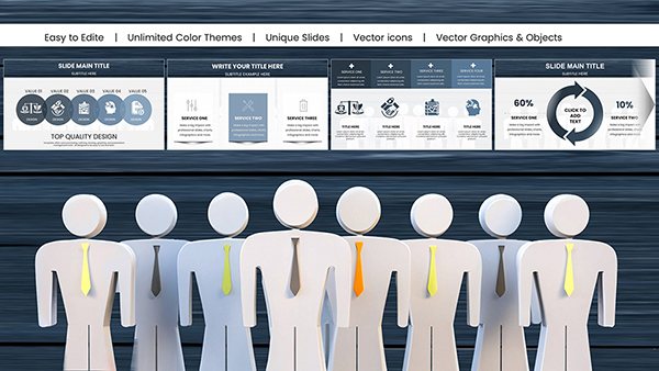 (564)
Psychology of Leadership PowerPoint Charts - Data-Driven Leadership TemplatesID: #PC01051$22.00
(564)
Psychology of Leadership PowerPoint Charts - Data-Driven Leadership TemplatesID: #PC01051$22.00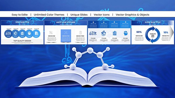 (177)
Chemistry Presentations with Customizable Education PowerPoint Charts: Fuel DiscoveryID: #PC01048$22.00
(177)
Chemistry Presentations with Customizable Education PowerPoint Charts: Fuel DiscoveryID: #PC01048$22.00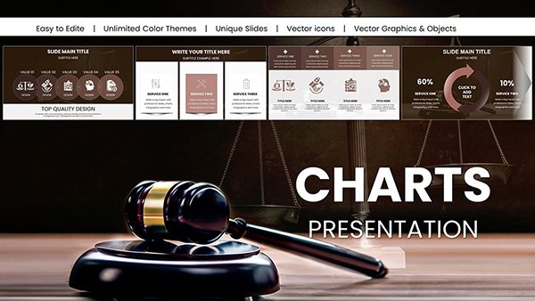 (1009)
Judge and Laws PowerPoint Charts for Impactful DeliveryID: #PC01032$25.00
(1009)
Judge and Laws PowerPoint Charts for Impactful DeliveryID: #PC01032$25.00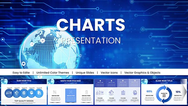 (1130)
Worldwide Internet Network PowerPoint Charts for Data MasteryID: #PC01030$18.00
(1130)
Worldwide Internet Network PowerPoint Charts for Data MasteryID: #PC01030$18.00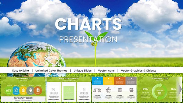 (630)
Eco Planet PowerPoint Charts for Green InnovationID: #PC01029$18.00
(630)
Eco Planet PowerPoint Charts for Green InnovationID: #PC01029$18.00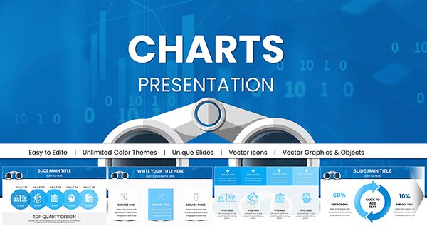 (629)
Search Marketing PowerPoint: Binoculars Charts for InsightsID: #PC00979$18.00
(629)
Search Marketing PowerPoint: Binoculars Charts for InsightsID: #PC00979$18.00 (876)
Corporate Hierarchy & Structure Chart - Presentation TemplateID: #PC00940$25.00
(876)
Corporate Hierarchy & Structure Chart - Presentation TemplateID: #PC00940$25.00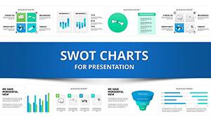 (383)
SWOT Analysis PowerPoint Charts Template DownloadID: #PC00296$20.00
(383)
SWOT Analysis PowerPoint Charts Template DownloadID: #PC00296$20.00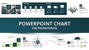 (1055)
Business Analyst PowerPoint Charts Template for Impactful PresentationsID: #PC00292$25.00
(1055)
Business Analyst PowerPoint Charts Template for Impactful PresentationsID: #PC00292$25.00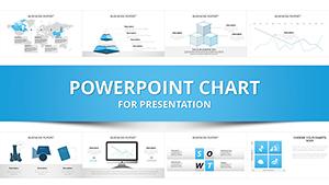 (962)
Communication Process PowerPoint Charts: Master Effective MessagingID: #PC00935$22.00
(962)
Communication Process PowerPoint Charts: Master Effective MessagingID: #PC00935$22.00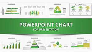 (151)
(151) Manager PowerPoint Charts Template: Elevate Your Professional PresentationsID: #PC00926$24.00
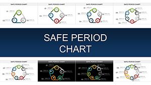 (1091)
Safe Period Charts: Your Ultimate PowerPoint Guide to Cycle AwarenessID: #PC00903$20.00
(1091)
Safe Period Charts: Your Ultimate PowerPoint Guide to Cycle AwarenessID: #PC00903$20.00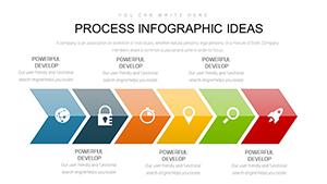 (719)
Process Infographic PowerPoint Charts TemplateID: #PC00893$20.00
(719)
Process Infographic PowerPoint Charts TemplateID: #PC00893$20.00 (752)
Preventing Sexual Violence PowerPoint Charts: Advocacy and Education ToolID: #PC00879$15.00
(752)
Preventing Sexual Violence PowerPoint Charts: Advocacy and Education ToolID: #PC00879$15.00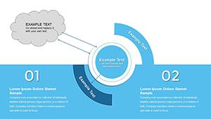 (148)
Analysis of Business Needs PowerPoint Charts: Infographic MasteryID: #PC00869$15.00
(148)
Analysis of Business Needs PowerPoint Charts: Infographic MasteryID: #PC00869$15.00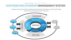 (369)
CRM System PowerPoint Charts Template - Elevate Your Data StorytellingID: #PC00860$18.00
(369)
CRM System PowerPoint Charts Template - Elevate Your Data StorytellingID: #PC00860$18.00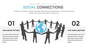 (775)
Social Connections and Happiness PowerPoint Charts TemplateID: #PC00844$14.00
(775)
Social Connections and Happiness PowerPoint Charts TemplateID: #PC00844$14.00 (129)
Momentum Concept PowerPoint Charts Template - PresentationID: #PC00834$12.00
(129)
Momentum Concept PowerPoint Charts Template - PresentationID: #PC00834$12.00 (436)
Leader PowerPoint Charts Template for PresentationID: #PC00827$12.00
(436)
Leader PowerPoint Charts Template for PresentationID: #PC00827$12.00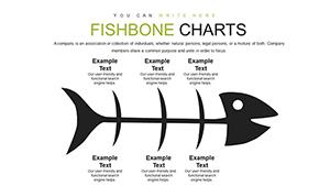 (166)
Fishbone Diagram PowerPoint Template: Unlock Solutions EffortlesslyID: #PC00799$18.00
(166)
Fishbone Diagram PowerPoint Template: Unlock Solutions EffortlesslyID: #PC00799$18.00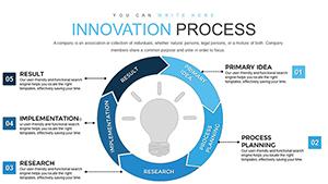 (633)
Innovation Process Steps PowerPoint Charts: From Idea to ImplementationID: #PC00798$18.00
(633)
Innovation Process Steps PowerPoint Charts: From Idea to ImplementationID: #PC00798$18.00 (779)
Houses for Sale and Rent PowerPoint Charts Template for Real EstateID: #PC00753$25.00
(779)
Houses for Sale and Rent PowerPoint Charts Template for Real EstateID: #PC00753$25.00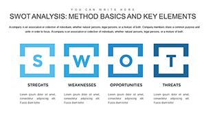 (1158)
Method SWOT Analysis PowerPoint Charts Template for StrategyID: #PC00752$24.00
(1158)
Method SWOT Analysis PowerPoint Charts Template for StrategyID: #PC00752$24.00 (899)
Empower Your Architectural Vision with Strategic PowerPoint ChartsID: #PC00740$18.00
(899)
Empower Your Architectural Vision with Strategic PowerPoint ChartsID: #PC00740$18.00
Understanding Relationship Charts in Business Communication
Relationship diagrams serve a critical function in modern presentations: they reveal connections that text alone cannot effectively communicate. Whether showing how departments collaborate, how processes interconnect, or how concepts overlap, these visual tools transform abstract relationships into concrete understanding.
The human brain processes visual information significantly faster than text. When you replace lengthy explanations with clear relationship diagrams, your audience grasps complex interactions immediately, retains information longer, and makes better decisions based on the patterns you've revealed.
Diverse Applications Across Professional Contexts
Business Strategy and Planning
Strategic planners use relationship charts to map stakeholder connections, illustrate SWOT analysis intersections, and demonstrate how different business units contribute to organizational goals. Matrix diagrams help executives visualize priority frameworks and resource allocation decisions.
Project Management
Project managers rely on relationship diagrams to show task dependencies, team member responsibilities, and workflow sequences. Circular process charts illustrate project lifecycles, while network diagrams map critical paths and milestone relationships.
Marketing and Customer Analysis
Marketing professionals visualize customer journey touchpoints, showing how awareness, consideration, and retention stages connect. Venn diagrams illustrate target audience overlaps, while ecosystem maps demonstrate how different channels and platforms interact to drive conversions.
Academic Research and Education
Researchers present theoretical frameworks, variable relationships, and causal connections using relationship charts. Educators use concept maps to show how different topics interconnect, helping students understand subject matter as integrated systems rather than isolated facts.
Technology and Systems Design
IT professionals diagram system architectures, data flows, and component interactions. Relationship charts clarify how different software modules communicate, how databases connect, and how user actions trigger system responses.
Why Professional Templates Outperform Basic Shapes
Creating relationship diagrams from PowerPoint's default shapes library presents multiple challenges. Alignment issues, inconsistent sizing, amateur color choices, and time-consuming manual adjustments plague DIY diagram creation. Our templates eliminate these obstacles:
- Proven layouts: Designs based on visual communication best practices ensure your relationships are immediately comprehensible.
- Perfect proportions: Professionally balanced elements guide the viewer's eye naturally through your diagram.
- Cohesive styling: Harmonious color schemes, typography, and spacing create polished, credible presentations.
- Instant productivity: Start with finished designs rather than spending hours positioning shapes and adjusting connectors.
- Scalability: Easily adapt templates for different complexity levels, from simple two-element relationships to intricate multi-factor systems.
Design Strategies for Effective Relationship Diagrams
Select the Appropriate Chart Type
Match your diagram style to your relationship type. Venn diagrams excel at showing overlaps and shared attributes. Cycle charts illustrate continuous or repeating processes. Matrix layouts compare multiple variables simultaneously. Hub-and-spoke designs demonstrate central concepts with radiating connections. Arrow-based flows show directional relationships and sequential dependencies.
Leverage Color Meaningfully
Use color as an information layer, not just decoration. Assign consistent colors to related elements across slides. Employ warm colors for active or positive relationships, cool colors for passive or negative ones. Maintain sufficient contrast between connected elements to ensure clarity. Limit palettes to 3-5 colors to avoid visual confusion.
Optimize Text and Labels
Keep labels concise - relationship diagrams should provide overview, not exhaustive detail. Use consistent text positioning within similar elements. Consider font size hierarchy to distinguish primary relationships from secondary connections. Place explanatory text outside the diagram when space inside elements is limited.
Show Direction and Flow
When relationships have directionality, use arrows consistently. Make arrow weight proportional to relationship strength or importance. Avoid crossing lines when possible, or use subtle bridges to indicate crossovers. Number steps in sequential processes to reinforce order.
Balance Complexity and Clarity
Resist the temptation to show every possible connection. Simplify by grouping related elements, hiding minor relationships, or creating multiple diagrams for different relationship layers. A clear diagram showing key connections beats a comprehensive but confusing web every time.
Customization Without Complexity
Our relationship chart templates are designed for users at all skill levels. Click any element to modify text. Use PowerPoint's format tools to change fills, borders, and effects. Drag elements to reposition them while maintaining alignment. Copy and paste components to expand diagrams. Add your branding elements seamlessly.
Templates maintain formatting integrity whether you're presenting on Windows, Mac, tablets, or through web-based platforms. This cross-platform reliability ensures your carefully designed relationships appear exactly as intended, regardless of presentation environment.
Animation Techniques for Dynamic Presentations
Bring relationship diagrams to life with strategic animation. Reveal elements sequentially to build understanding progressively. Highlight specific relationships while dimming others to focus attention. Use motion paths to show how connections form or evolve over time. Subtle animations maintain professionalism while significantly boosting engagement and comprehension.
Start Creating Compelling Relationship Diagrams Today
Browse our extensive template library to find relationship chart designs that match your presentation needs. Download instantly, open in your preferred software, and begin customizing. Most users complete their first diagram in minutes, not hours.
Transform how you communicate connections. Explore our relationship chart templates and discover how professional visualization makes complex interactions instantly understandable.
Frequently Asked Questions
What types of relationship diagrams are available?
Our collection includes Venn diagrams, cycle charts, matrix layouts, process flows, hub-and-spoke designs, network diagrams, concept maps, comparison charts, and interconnection diagrams suitable for various business and educational applications.
Can I modify the connections and relationships shown?
Yes. All templates are fully editable. You can add or remove elements, change connector lines and arrows, modify text and labels, adjust colors, and completely restructure the diagram to match your specific relationship requirements.
Are these templates compatible with Google Slides?
While templates are optimized for PowerPoint and Keynote, most work in Google Slides after import. Some advanced formatting features may require minor adjustments, but core diagram functionality remains intact across platforms.
How do I choose the right relationship chart for my data?
Consider your relationship type. Use Venn diagrams for overlaps, cycle charts for continuous processes, matrix layouts for comparing multiple factors, flow diagrams for sequential relationships, and network diagrams for complex multi-directional connections.
Can I animate these relationship charts during presentations?
Absolutely. All elements can be animated using PowerPoint and Keynote's built-in animation tools. Common approaches include revealing elements sequentially, highlighting specific connections, or showing progressive relationship development.
What's the maximum number of elements I should include?
For optimal clarity, limit diagrams to 5-8 major elements with their connections. If you need to show more relationships, consider creating multiple diagrams that each focus on specific relationship subsets, or use hierarchical grouping to reduce visual complexity.