Medicine - Pharma PowerPoint Diagrams
Formerly known as medicine pharma - this collection now covers medical and pharmaceutical diagrams for healthcare professionals.
A pharmaceutical product manager preparing a regulatory update for the board or a hospital administrator explaining new protocols to staff no longer wastes hours aligning icons and text boxes. These diagrams come pre-structured with accurate medical shapes, color-coded flows, and data placeholders that match industry standards. Reach for them when the meeting is tomorrow and the content must be technically correct on first pass.
This collection focuses on clinical data visualization, turning dense research into slides that executives and patients both understand. Download any template to test how the layout holds your argument together before you add your own numbers.
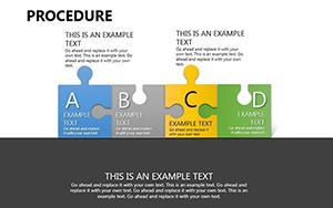 (908)
(908) Procedure PowerPoint Diagrams Template: Simplify the ComplexID: #PD00192$20.00
 (785)
(785) Innovative Startup Ideas PPT Diagrams - Fully EditableID: #PD00154$20.00
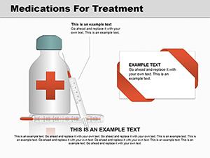 (450)
Medications Treatment PowerPoint Diagrams: 15 SlidesID: #PD00142$26.00
(450)
Medications Treatment PowerPoint Diagrams: 15 SlidesID: #PD00142$26.00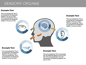 (820)
Sensory Organs PowerPoint Diagram TemplateID: #PD00115$23.00
(820)
Sensory Organs PowerPoint Diagram TemplateID: #PD00115$23.00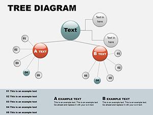 (1068)
Circular Tree PowerPoint Template: Branch into Radial BrillianceID: #PD00060$16.00
(1068)
Circular Tree PowerPoint Template: Branch into Radial BrillianceID: #PD00060$16.00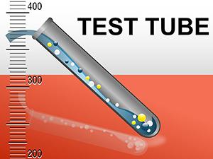 (709)
Medicine Test Tube PowerPoint Diagrams: Visualize Data DependenciesID: #PD00040$20.00
(709)
Medicine Test Tube PowerPoint Diagrams: Visualize Data DependenciesID: #PD00040$20.00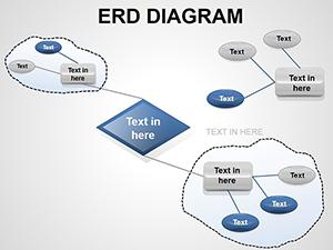 (23)
ERD PowerPoint Diagrams - Fully Editable PPTXID: #PD00018$16.00
(23)
ERD PowerPoint Diagrams - Fully Editable PPTXID: #PD00018$16.00
Why medical diagrams require more than basic shapes
Standard business slides rarely account for the precision needed in healthcare. Medical diagrams must use anatomically correct icons, standardized color codes for risk levels, and flow arrows that never imply causality where none exists. These templates start with that foundation already in place so the focus stays on the science, not the layout.
The hidden time cost when building clinical slides manually
Without a ready template you spend the first hour choosing the right icon set, the next aligning every arrow across twelve slides, and the last matching your company palette to the slide master. In a real project that means the product manager who should be reviewing trial data instead fixes column widths and font sizes until the deadline forces compromises.
Four real business moments where these templates change the outcome
A clinical research director at a mid-size pharma company has 48 hours to prepare trial results for investors. The timeline arrows and risk icons would normally consume the entire first day; with the template the structure is ready, so the team refines the narrative and adds the latest numbers.
An ER nurse educator must roll out new triage protocols to two hundred staff members. Instead of recreating the decision-tree flow from scratch, she drops her content into the pre-built diagram, adjusts the color stops for urgency levels, and distributes the deck the same afternoon.
A medical device sales lead presents efficacy data to a hospital procurement board. The circular comparison diagram already separates device performance from competitor benchmarks; she simply swaps placeholder metrics and the visual hierarchy carries the argument before she even speaks.
A hospital administrator updates the board on capacity planning. The tree-branch diagram shows department interdependencies; because the slide master already links the branches, one data change updates every related slide and the presentation stays consistent through three rounds of feedback.
How these diagrams fit into recurring presentation workflows
For quarterly clinical reporting or annual regulatory filings the same diagram layouts appear across departments. Using the slide master you update theme colors once and every instance refreshes automatically. Teams share a single master file so the finance slide on drug costs and the medical slide on patient outcomes always match in visual language.
One non-obvious tip for PowerPoint users in pharma
Before linking external Excel data to any medical chart, group the surrounding shapes and convert the group to a single object. This prevents the chart from breaking the alignment when the data refreshes. The technique also keeps the aspect ratio locked during PDF export, which matters when regulators review printed versions.
What makes ImagineLayout's medical collection different
Every diagram was built for corporate storytelling, not decoration. You can change text, recolor flows, and resize icons without breaking the structure. There are no unnecessary animations or clip-art borders; the focus is on clarity that survives boardroom scrutiny and regulatory review.
If your presentation mixes diagrams with data charts, consider our PowerPoint chart templates for complementary visuals. For broader process flows without medical focus, the general PowerPoint diagram templates provide more options. Teams working across platforms can also explore Keynote templates.
Pick the diagram that matches your next deliverable and open the file.
Frequently Asked Questions
Are these PowerPoint diagram templates compatible with older versions of Microsoft PowerPoint?
The templates are saved in PPTX format and tested to open cleanly in PowerPoint 2013 and all newer versions including Microsoft 365. In older 2010 versions, some advanced shape effects or custom animations may need manual adjustment, but the core editable diagrams and slide master layouts remain fully functional. If you encounter any rendering issue with medical icons, simply select the group and reset the shape styles using the format tab. Most users on corporate machines report zero changes needed.
Can I share these medical templates with my team or use them for client presentations?
The license included with every download permits unlimited editing and use in both internal company presentations and external client deliverables. There is no limit on the number of users within your organization, and you can distribute the edited decks as PDF exports or live presentations without additional fees. The only restriction is against reselling the original template files themselves as standalone products. This setup works for hospital networks and pharma marketing teams alike.
Do the templates support 16:9 aspect ratio, and what happens if I need to switch to 4:3?
All templates are designed in the standard 16:9 widescreen format that matches modern projectors and screens. To change to 4:3, go to Design tab, Slide Size, and select the option; the slide master will scale most elements proportionally because shapes are vector-based. For any text overflow in medical flow charts, simply adjust the font size or column widths using the built-in placeholders. The change takes under thirty seconds and preserves the visual hierarchy.
Will the diagrams work if I export the presentation to Google Slides?
While native editing is optimized for PowerPoint, you can upload the PPTX file to Google Slides and the basic shapes, text, and colors will transfer accurately. Complex grouped objects or custom medical symbols may require minor regrouping after import. For best results, finalize edits in PowerPoint before exporting to PDF for sharing via Google Drive. The embedded fonts remain intact in the PDF route.
How do I update colors across the entire deck using the slide master?
Open the template, go to View > Slide Master, and modify the color scheme or theme colors at the top level. Because every diagram uses theme colors rather than hard-coded fills, your changes apply instantly to all slides and all placeholders. This is especially useful for pharma branding updates across multiple presentations. The process takes one minute and keeps every medical icon consistent.