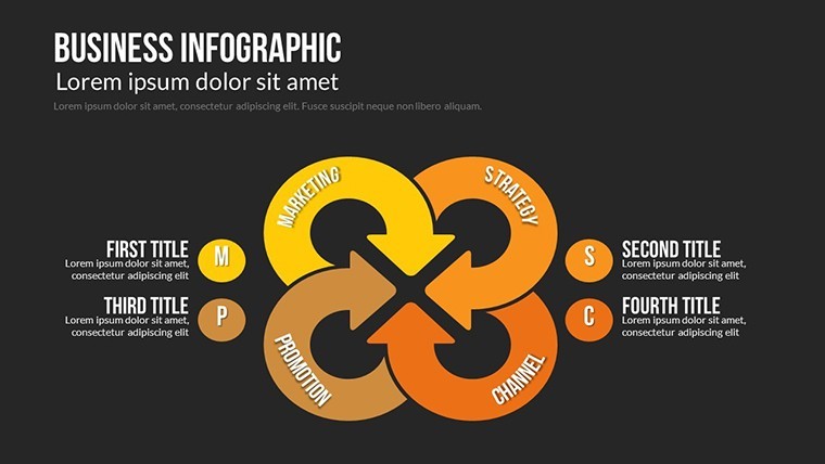
Business Infographic Process Keynote Charts: Streamline Workflows Visually


Every business thrives on smooth processes, but explaining them? That's where chaos creeps in - until now. Our Business Infographic Process Keynote Charts template redefines clarity with 21 editable slides that map interrelated activities from inputs to outputs like a conductor leading an orchestra. Geared toward operations managers, process engineers, and consultants, it's your go-to for demystifying sequences, rules, and mechanisms in captivating ways.
With custom animated effects that mimic real flow - arrows snaking through stages, icons activating in rhythm - viewers grasp complexities at a glance. Vector icons and PNGs provide building blocks for any industry, while full color variations ensure brand harmony. Inspired by lean methodology from Toyota Production System advocates, this template emphasizes efficiency, turning potential bottlenecks into highlighted opportunities.
The real value? Decks that don't just describe processes but propel improvements. Visualize a logistics firm animating supply chain links to pinpoint delays, slashing costs by 15%, or a service team charting customer journeys to boost satisfaction scores. In boardrooms or training rooms, these visuals foster alignment and innovation.
Essential Features: Processes That Flow Effortlessly
Discover the toolkit that makes orchestration simple:
- Custom Animated Effects: Timelapse builds for sequences, revealing steps progressively to build understanding.
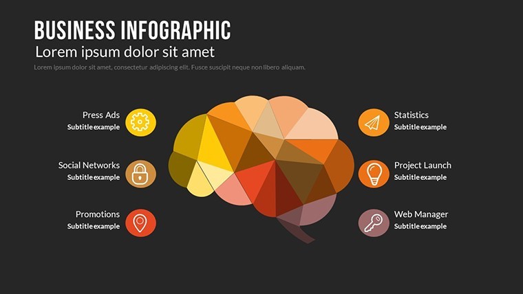
- Vector Icons & PNGs: Diverse library for mechanisms like gears or funnels, all editable for context.
- Color Full Variations: Themes for different process types - vibrant for creative flows, muted for compliance audits.
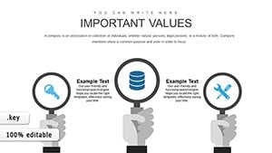
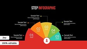
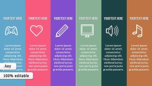
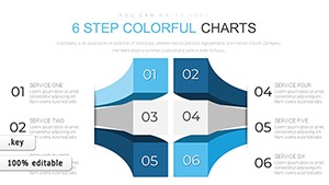
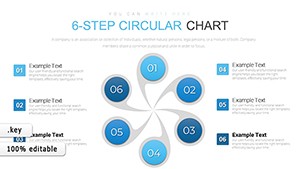
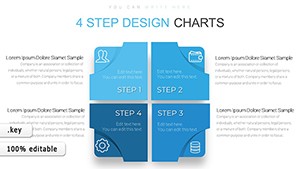
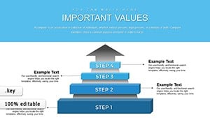
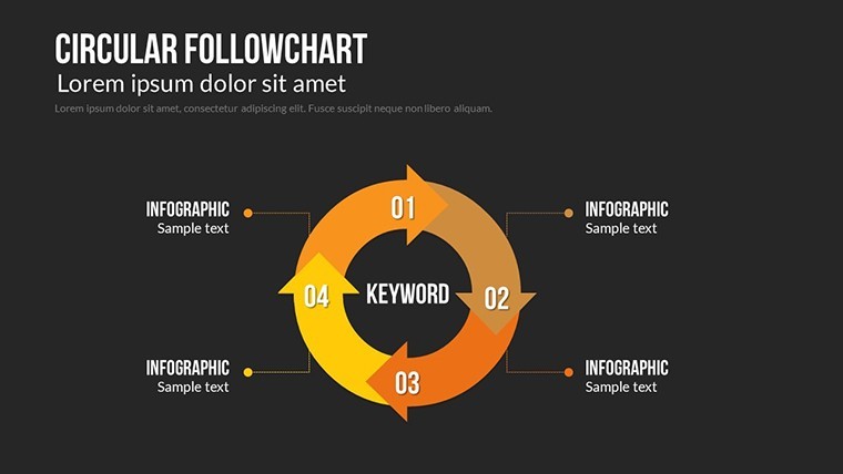
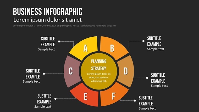
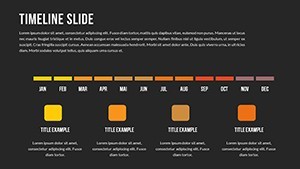
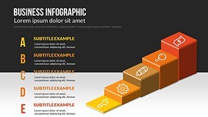
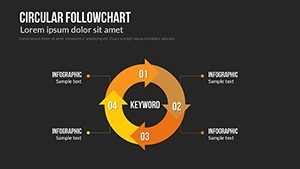
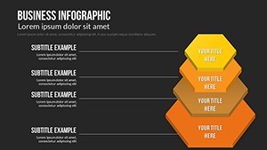
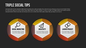
- 21 Editable Slides: From linear timelines to cyclical loops, covering every process nuance.
Keynote-native with Mac iWork polish, it supports easy photo/text swaps for personalized punch.
Use Cases Unleashed: From Ops to Overhauls
Put it to work. For compliance training, animate regulatory flows, color-coding risks per ISO standards - engaging learners beyond rote memos.
In consulting, layer mechanisms over activity charts to illustrate rule applications, as one firm did to revamp a client's procurement, yielding 30% efficiency gains.
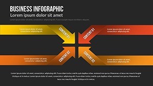
- Define Inputs/Outputs: Label endpoints in smart placeholders for quick alignment.
- Animate Mechanisms: Set triggers for interactive demos, like clicking to simulate rule enforcement.
- Integrate Rules: Use callouts for annotations, enhancing detail without clutter.
- Iterate Feedback: Share drafts via Keynote links for collaborative refinements.
Beats flowchart software by embedding directly into presentations, halving hybrid tool switches.
Customization Mastery: Fine-Tune Your Flow
Pro secrets: Sync animations with process durations for realistic pacing - short bursts for quick tasks, slow builds for analyses. Infuse light humor with whimsical icons, like cartoon bottlenecks bursting open.
Case in point: A manufacturing team visualized assembly lines, animating handoffs to expose silos, inspiring cross-training that cut errors dramatically.
Beyond Basics: Why This Template Excels
Standard processes feel rigid; this breathes life with user-centric design from interaction design gurus like Don Norman. Versatile for any scale, it's process perfection incarnate.
Orchestrate success - get Business Infographic Process Keynote Charts instantly and let your operations sing. The right flow changes everything.
Frequently Asked Questions
How do animations enhance process understanding?
They sequence activities visually, making abstract rules and mechanisms tangible and memorable.
Editable for specific industry rules?
Yes, swap icons and text to adapt for sectors like finance or healthcare seamlessly.
Mac-only, or cross-compatible?
Optimized for Mac Keynote, but exports to PowerPoint preserve core structures.
Number of icon variations?
Dozens, with vectors allowing endless customizations beyond the included PNGs.
Suitable for training sessions?
Ideal - interactive elements encourage pauses for discussions at key stages.
File setup time?
Under 30 minutes to populate with your data, thanks to intuitive layers.