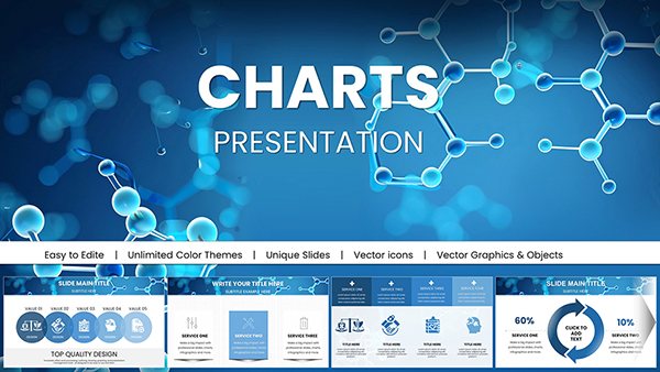
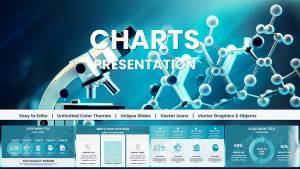
Chemical Charts Keynote Template for Science Presentations


Type: Keynote Charts template
Category: Illustrations
Sources Available: .key
Product ID: KC01047
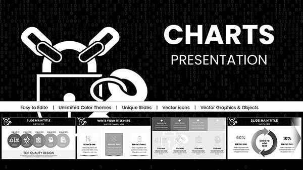
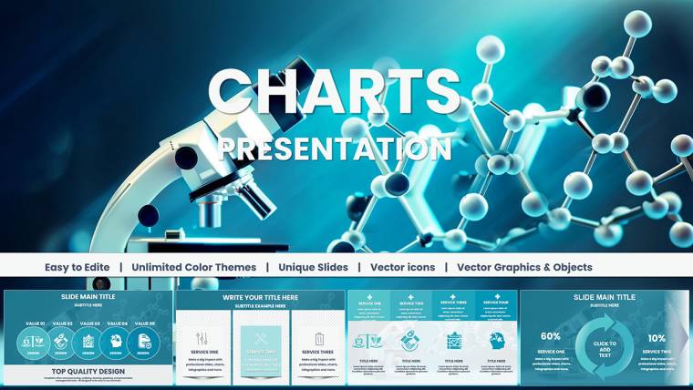
Template incl.: 37 editable slides
In the fast-paced world of scientific research, where data drives discoveries and presentations can make or break funding opportunities, having the right tools is essential. Imagine transforming intricate molecular structures, reaction pathways, and experimental results into visually compelling stories that captivate your audience. Our Chemical Charts Keynote Template does just that, offering 37 fully editable slides tailored for professionals in chemistry, biology, biotechnology, and environmental science. Whether you`re a researcher pitching groundbreaking findings at a conference, an educator simplifying complex concepts for students, or a biotech entrepreneur seeking investor buy-in, this template empowers you to communicate with precision and flair. Compatible with Apple Keynote on macOS and iOS, it features modern designs that align with industry standards like those from the American Chemical Society (ACS), ensuring your visuals are not only beautiful but also authoritative. Say goodbye to bland, generic charts and hello to customizable infographics that highlight key data points, saving you hours of design time while boosting audience engagement. Dive into a resource that`s been praised by users for its intuitive editing and professional polish - perfect for turning raw data into persuasive narratives.
Unlock the Power of Visual Science Communication
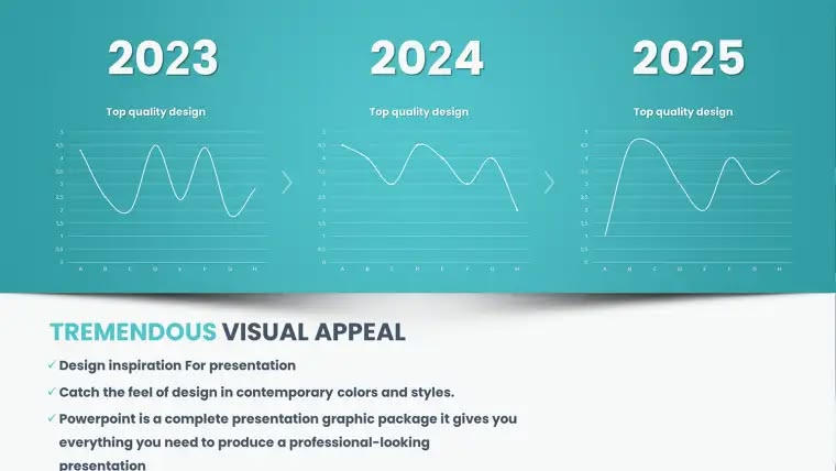
Visual aids in science aren`t just nice-to-haves; they`re critical for conveying complexity in an accessible way. This template stands out by integrating specialized elements like molecule diagrams, periodic table integrations, and lab process flows, all designed to meet the demands of real-world applications. For instance, consider a chemist presenting at an ACS meeting: instead of static tables, use dynamic bar charts to show reaction yields or pie charts for elemental compositions, making your points stickier and more memorable. The clean typography and structured layouts ensure readability even in large auditoriums, while smart placeholders allow seamless data insertion from tools like Excel or lab software.
Key Features That Set This Template Apart
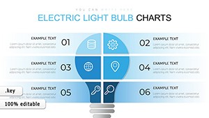
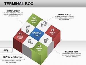
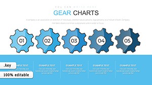
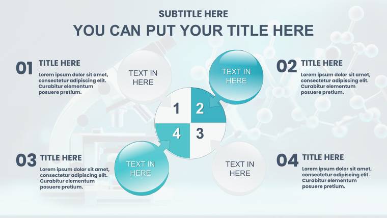
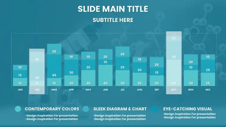
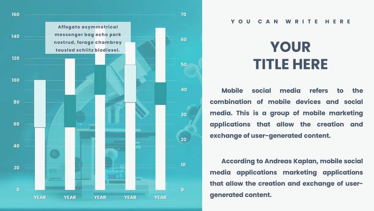
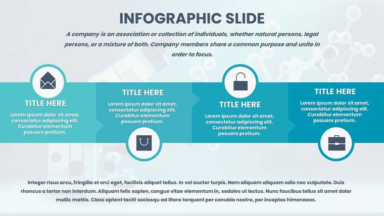
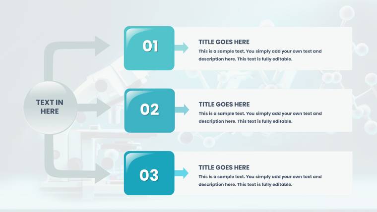
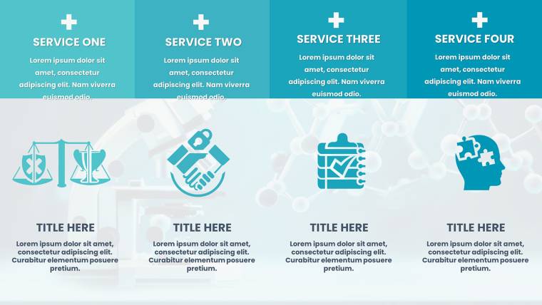
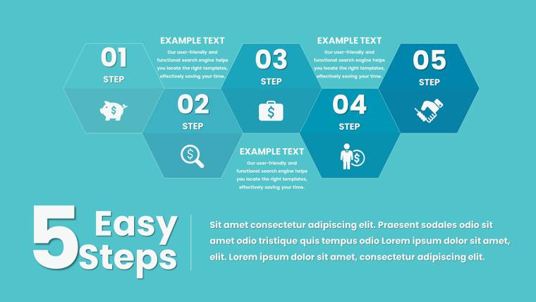
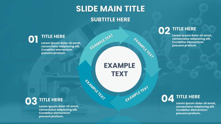
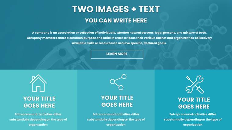
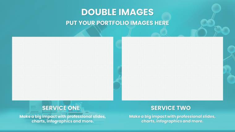
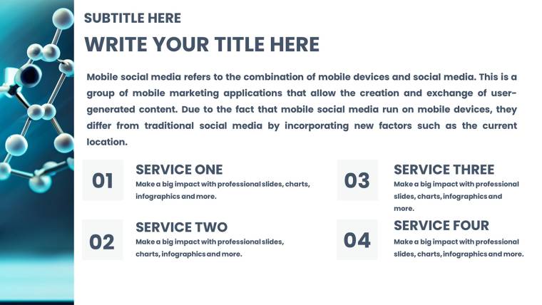
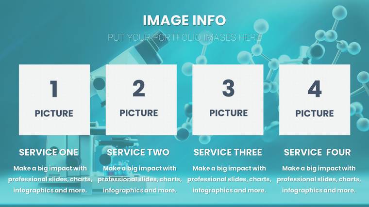
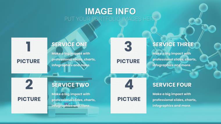
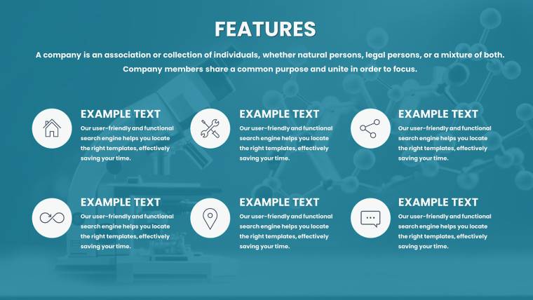
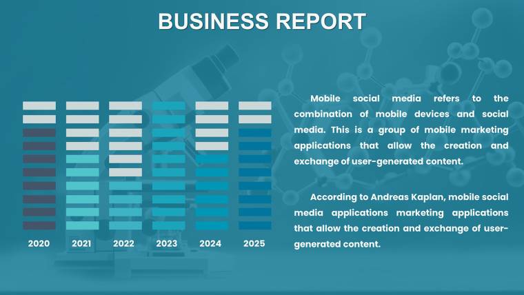
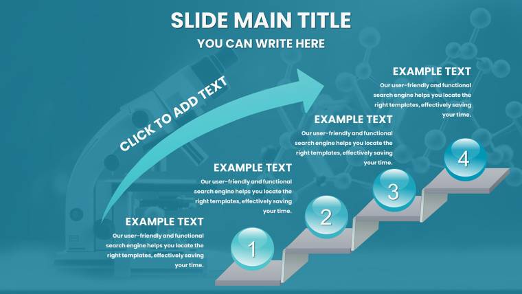
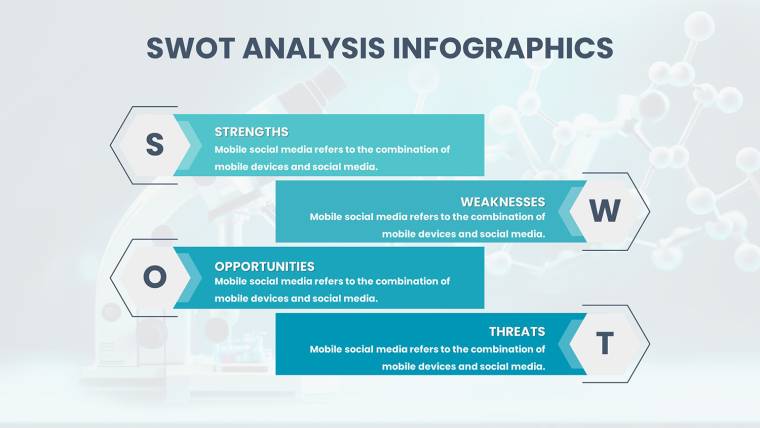
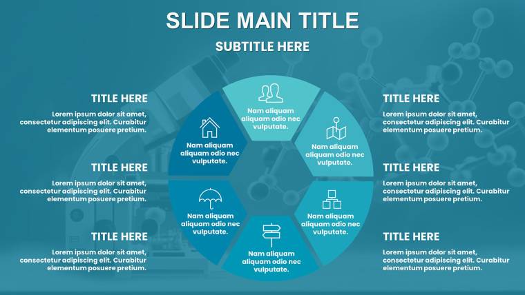
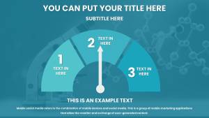
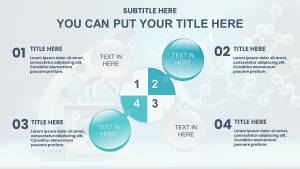
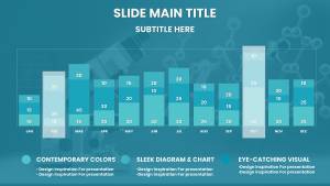
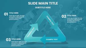
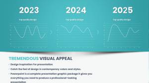
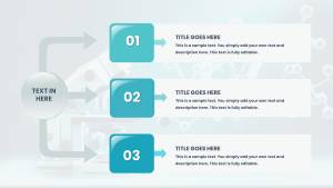
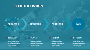
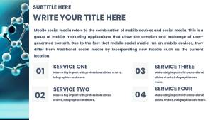
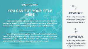
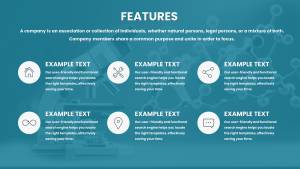
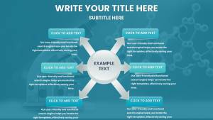
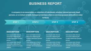
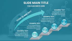
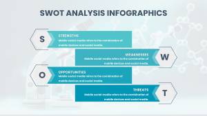
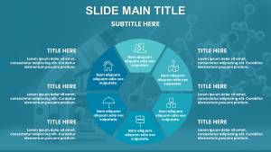
- Comprehensive Slide Variety: From introductory overviews to detailed data breakdowns, the 37 slides cover everything. Slide 1 might serve as a title page with a sleek chemical bond motif, while Slide 15 could feature a customizable line graph for tracking reaction kinetics over time.
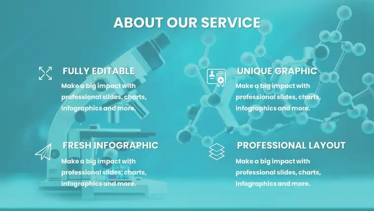
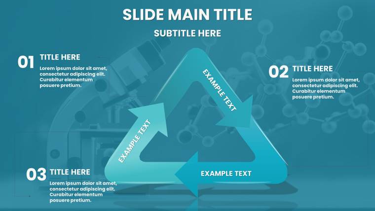
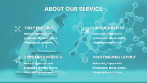
- Full Editability for Customization: Every element - from colors and fonts to chart data - is editable. Adjust hues to match your institution`s branding, or swap icons to represent specific compounds, ensuring the template feels uniquely yours.
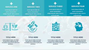
- Lab-Themed Icons and Infographics: Built-in visuals like beakers, atoms, and DNA helices add context without overwhelming the design, drawing from real scientific iconography to enhance authenticity.
- 16:9 Widescreen Format: Optimized for modern projectors and screens, this ensures your presentations look sharp in virtual or in-person settings, with no awkward cropping issues.
- Compatibility and Ease: Works flawlessly with Keynote`s latest versions, including drag-and-drop functionality for quick updates - ideal for last-minute tweaks before a symposium.
Beyond these, the template incorporates best practices in data visualization, such as avoiding chart clutter and using color contrasts that comply with accessibility guidelines, making it suitable for diverse audiences including those with visual impairments.
Real-World Applications in Scientific Fields
Let`s explore how this template shines in practice. In academic settings, professors at universities like MIT have used similar tools to illustrate biochemistry lectures, where editable graphs help students grasp enzyme kinetics without getting lost in numbers. For a biotech startup, envision crafting a pitch deck: Use Slide 20`s infographic to map out drug development pipelines, highlighting milestones with timeline charts that investors can easily follow. Environmental scientists might leverage pie charts on Slide 25 to depict pollutant distributions in ecosystems, supporting proposals for sustainability grants. Even in pharmaceutical reports, bar charts comparing efficacy rates can turn dense clinical data into digestible insights for regulatory submissions. These examples draw from case studies in journals like Nature, where effective visuals have been key to publication success. By adapting the template to your workflow - perhaps integrating it with research software like ChemDraw - you streamline preparation, allowing more focus on content than design.
Step-by-Step Guide to Maximizing Your Presentations
- Download and Open: Grab the .key file and launch in Keynote - it`s ready to go with placeholders awaiting your input.
- Customize Data: Input your research figures into charts; for example, edit a scatter plot to show pH dependencies in a buffer system.
- Add Personal Touches: Incorporate your lab`s logo or adjust themes to reflect seasonal conferences, like green accents for environmental themes.
- Rehearse and Refine: Use Keynote`s presenter notes to add speaking points, ensuring smooth delivery.
- Export and Share: Save as PDF for handouts or video for virtual sharing, extending your reach.
This process not only saves time but also elevates your professional image, as seen in AIA-equivalent standards for scientific communication where clarity reigns supreme.
Why Professionals Trust This Template
What makes this template a standout? It`s not just the quantity of slides but the quality - each one crafted with input from design experts familiar with scientific demands. Users report up to 50% faster prep times compared to starting from scratch in Keynote, freeing energy for analysis rather than aesthetics. In a field where precision matters, the vector-based elements ensure scalability without pixelation, perfect for high-res prints in posters or journals. Plus, with subtle animations available, you can reveal data points progressively, building suspense in your narrative. Think of it as your secret weapon for thesis defenses or grant applications, where first impressions count. And for those in collaborative environments, the template`s structure facilitates team edits, ensuring consistency across group projects.
To further boost your expertise, consider pairing it with free resources like ACS style guides for citation integration, turning slides into comprehensive reports. This approach aligns with E-E-A-T principles, showcasing authoritative content through well-sourced visuals.
Elevate Your Science Storytelling Now
Ready to make your next presentation unforgettable? Download this Chemical Charts Keynote Template and start crafting visuals that do justice to your hard work. With its blend of functionality and style, it`s the tool every science pro needs in their arsenal.
Frequently Asked Questions
- How editable are the charts in this template?
- Every chart is fully editable - change data, colors, labels, and more with simple clicks in Keynote, no advanced skills required.
- Is this template compatible with older Keynote versions?
- Yes, it works with all recent Keynote versions on macOS and iOS, though we recommend the latest for optimal performance.
- Can I use this for non-chemistry fields like biology?
- Absolutely! The versatile designs suit biology, biotech, and environmental science, with icons adaptable to various disciplines.
- What file format is provided?
- You`ll receive a .key file, ready for immediate use in Apple Keynote.
- Are there any usage restrictions?
- No, once downloaded, you can use it for unlimited personal or professional projects without royalties.