Capability Analysis Keynote Charts - Editable | ImagineLayout


Type: Keynote Charts template
Category: Pie, Tables, Illustrations, Analysis
Sources Available: .key
Product ID: KC00669
Template incl.: 36 editable slides
Capability Analysis Keynote Charts Template
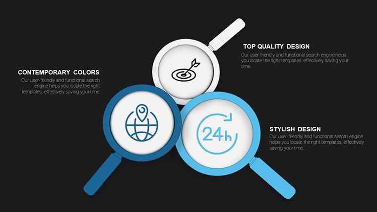
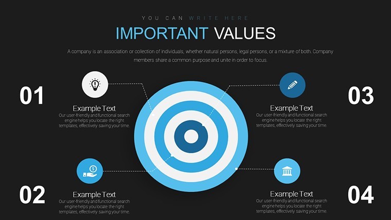
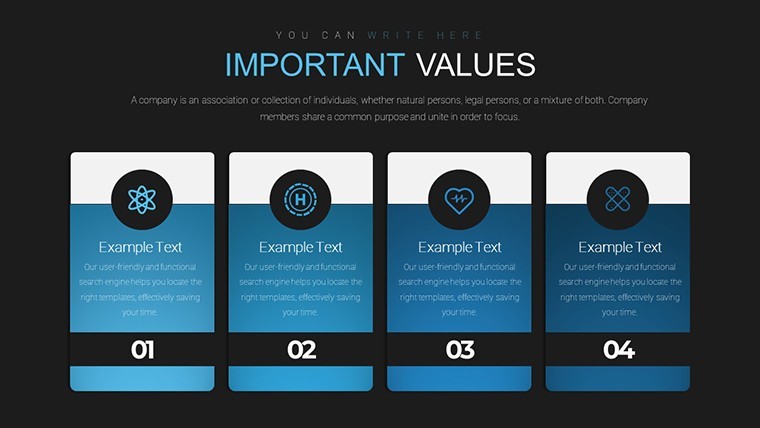
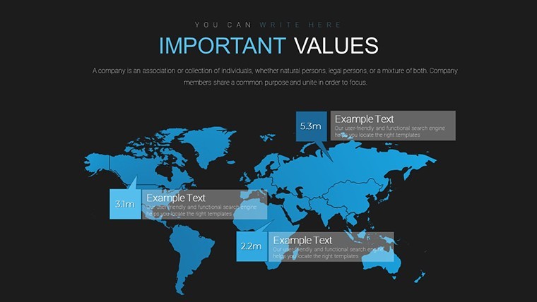
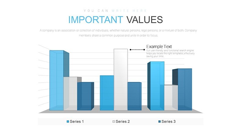
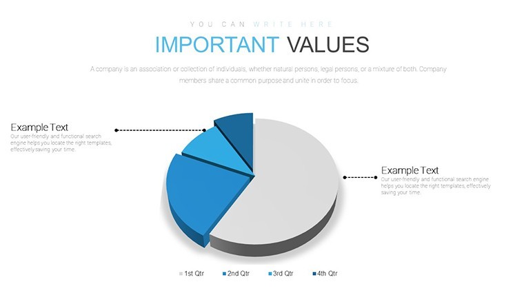
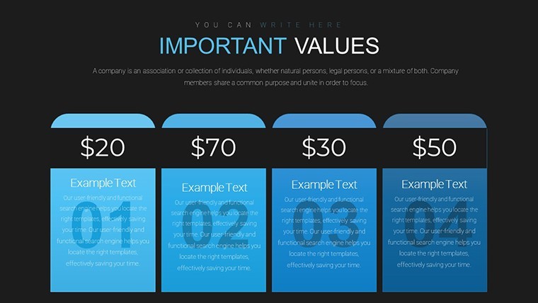
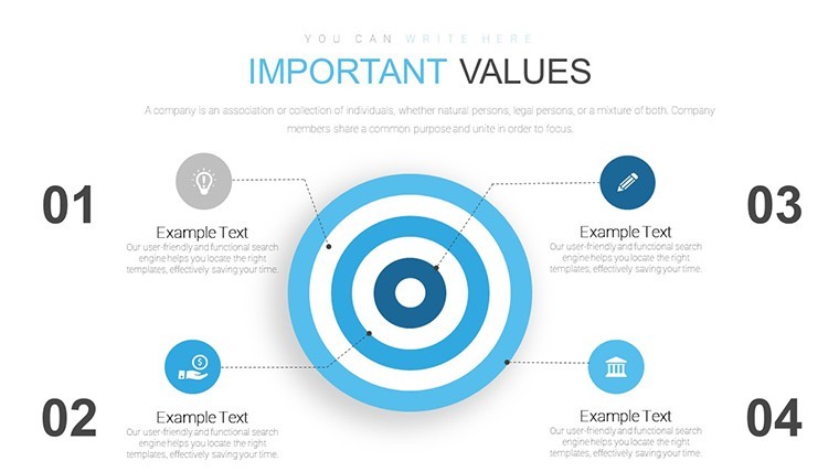
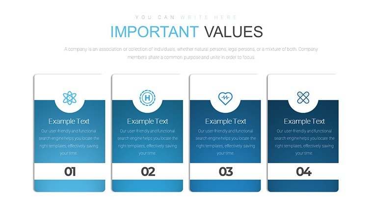
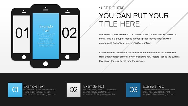
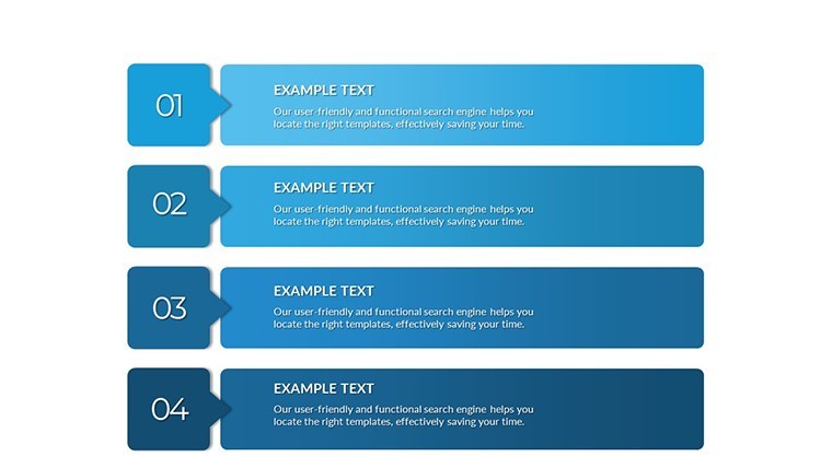
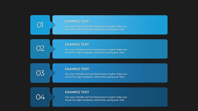
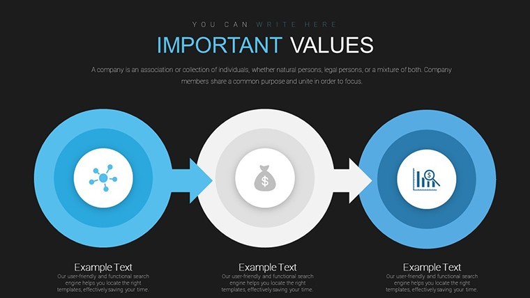
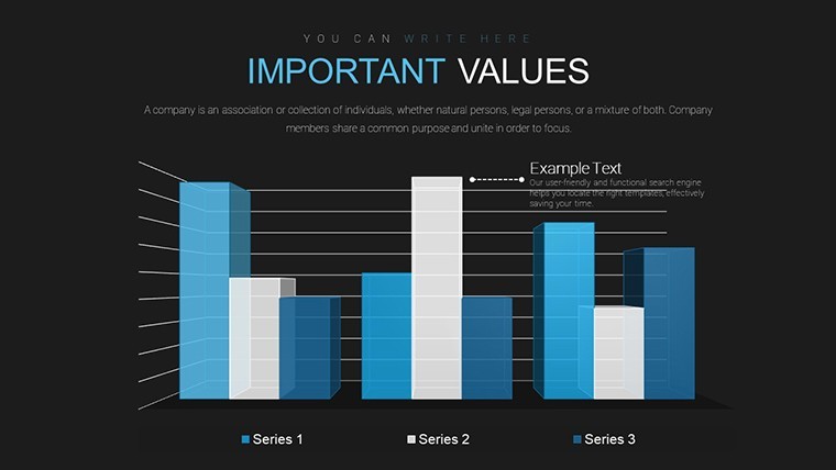
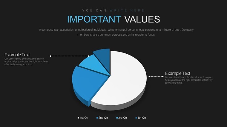
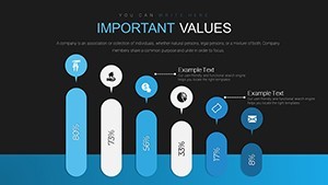
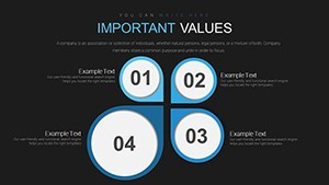
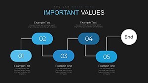
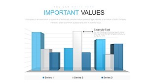
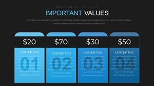
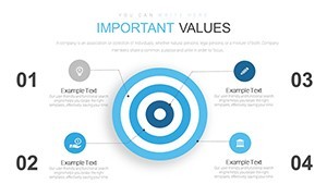
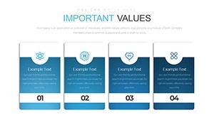
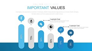
36 editable slides in KEY format give you over 20 customizable charts including radar bar graphs heat maps pie charts and line graphs for capability tasks.
No setup needed.
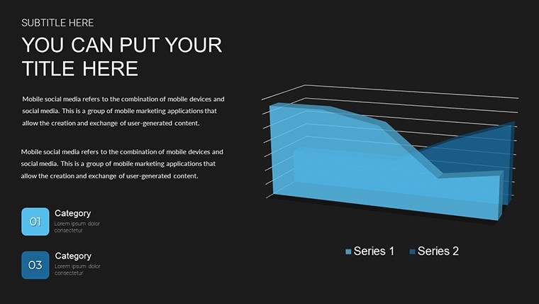
When you need to compare team skills against targets in a leadership meeting the radar and heat map structures in this Keynote chart template organize the data without manual alignment.
The paid version includes 36 editable slides with the listed chart types while free details stay unspecified on the page yet the files follow standard KEY formats compatible with current installations.
You change colors via the slide master in one step.
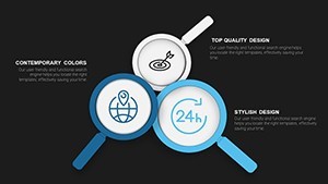
Radar charts with multiple axes and heat map grids form the specific visual detail with compact spacing for dense data.
This set suits analysts running performance reviews for department heads.
It supports prioritization analysis so you decide which capability gaps require action after viewing the full set.
In most cases you only replace text and adjust colors.
Typically teams reuse the same diagram across monthly updates.
Use this instead of building diagrams manually in Keynote.
The predefined structure keeps everything readable so you avoid adjusting spacing slide by slide.
Best used when numerical comparison matters yet not designed for purely qualitative idea mapping.
It works best for structured diagrams not creative storytelling slides.
The page does not list the exact number of color schemes but the files follow standard KEY palettes.
| Feature | Details |
|---|---|
| Slides / diagrams | 36 slides with radar bar heat maps pie line graphs |
| File format | KEY |
| Software version | Keynote 12+ on current macOS |
| Color schemes | Editable via slide master in one step |
| Editable elements | All charts text and colors resize independently |
| Aspect ratio | 16:9 |
| Free vs Paid | Paid includes 36 slides and 20+ charts |
| Masters / Backgrounds | Standard masters for palette switch |
You open the file and start editing.
Download and start editing immediately
How do I change colors via slide master?
You change colors via the slide master in Keynote by selecting the master slide first then updating the color scheme there.
This updates all 36 diagrams at once without manual edits per slide.
In practice the change takes under two minutes and works across every analysis layout.
Can I use this for client work?
The license allows use for client work as long as the template is not resold or shared as a standalone file.
You can deliver presentations built with the file to clients without extra fees.
One license covers one user for all commercial projects.
What is the difference between free and paid?
The paid version provides 36 editable slides with over 20 customizable charts.
The page does not list free version details but the full file is available upon purchase.
This difference ensures you get all structures without missing elements.
What are the refund conditions?
Refunds are available within 14 days if the file does not work as described in current Keynote.
Contact support with your order number to start the process.
No refunds apply after the file has been downloaded and used.
Which Keynote version and macOS does it require?
The files work in Keynote 12 and newer on macOS Ventura or later.
Older versions may have limited compatibility for some effects.
Test in your version before full use to confirm all capability charts display correctly.
See also Top Gear System Keynote Charts Template or Analysis & Planning Keynote Charts.