Top Gear System Keynote Charts - Fully Editable | ImagineLayout


Type: Keynote Charts template
Category: Process, Illustrations
Sources Available: .key
Product ID: KC00655
Template incl.: 20 editable slides
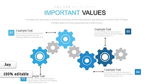
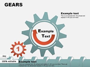
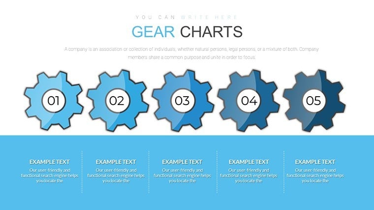
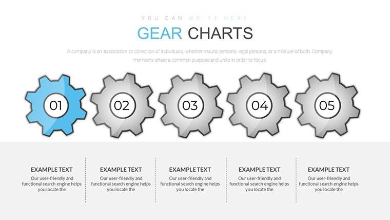
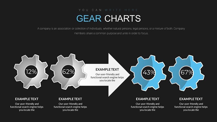
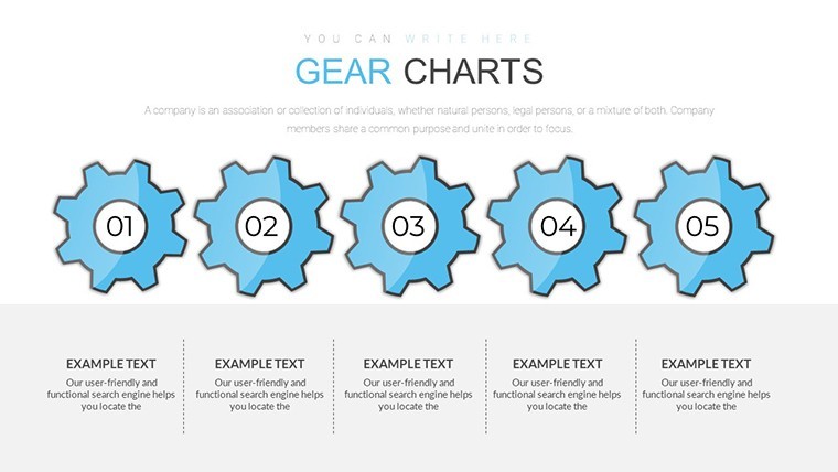
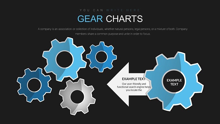
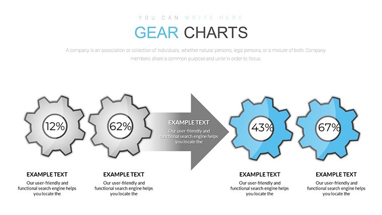
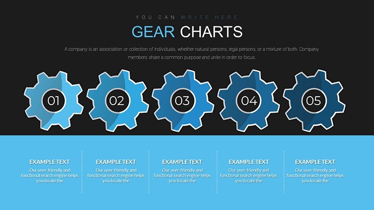
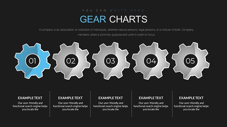
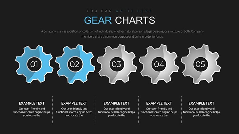
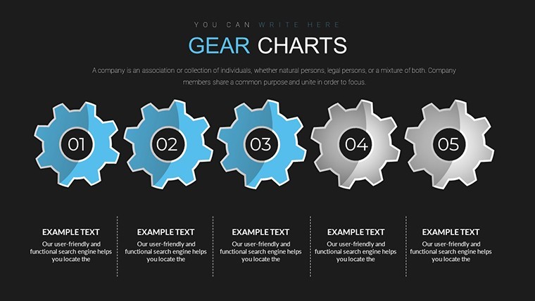
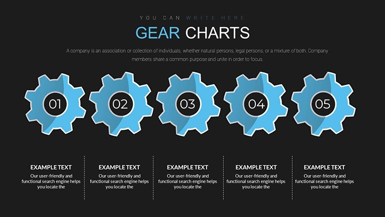
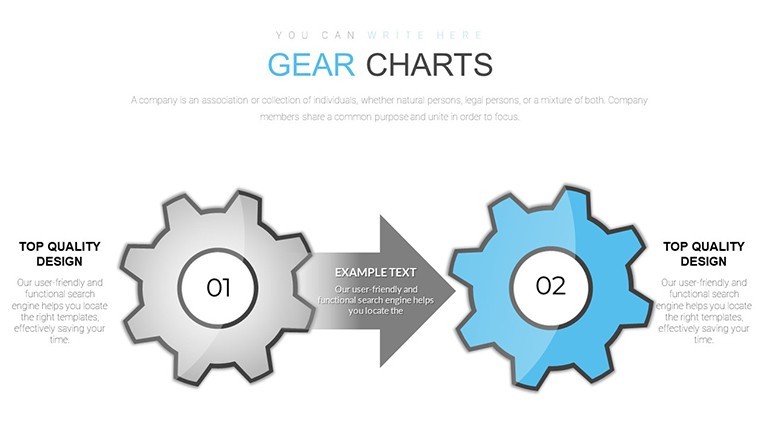
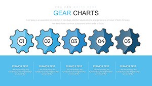
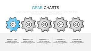
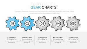
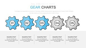
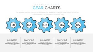
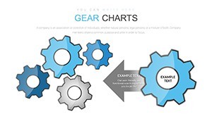
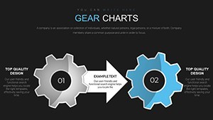
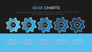
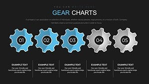
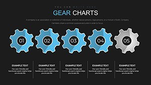
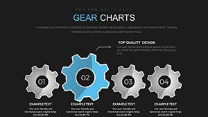
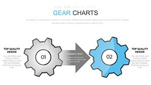
Gear system diagrams for process flow
For system overviews the KEY file supplies 20 editable slides that connect data in motion.
20 diagrams.
Interlocking gear layouts create modular flow for complex relationships.
When you need to present interconnected workflows to operations teams the file replaces manual gear drawing.
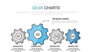
The gear structure supports relationship mapping so viewers can trace dependencies and decide on process improvements.
This clarifies priority between multiple options after the review.
For internal reporting on operational efficiency the layouts organize content without overcrowding.
Use this instead of building diagrams manually in Keynote.
The predefined structure keeps everything aligned so you don`t end up adjusting spacing slide by slide.
This suits operations leads mapping system dynamics.
The page does not list a free version but the paid file at $20 includes the complete 20-slide KEY collection compatible with current Keynote installations.
Color changes via slide master update the entire deck in seconds.
It works across multiple reports.
The file keeps structure readable on one slide.
Typically teams reuse the same diagram across monthly operations meetings.
Not ideal for simple linear timelines.
Works best for structured diagrams not creative storytelling slides.
Everything is already structured.
Download and start editing immediately
| Feature | Details |
|---|---|
| Slides / diagrams | 20 gear system diagrams |
| File format | KEY |
| Software version | Keynote 12+ on macOS |
| Color schemes | Fully customizable via master |
| Editable elements | Gears and connectors resize independently |
| Aspect ratio | 16:9 |
| Free vs Paid | Paid delivers full 20 slides no free version listed |
| Masters / Backgrounds | Single master for palette switch |
How do I change colors via slide master?
Open the file in Keynote then switch to slide master view. Adjust the theme colors once and every gear element updates automatically across all 20 slides. This works in practice for consistent branding without editing each diagram individually.
Does the license allow client work?
Yes the single-user license permits use in client projects. You may deliver the edited decks to clients as part of your service. Team use requires separate licenses per user.
What is the difference between free and paid?
The page does not list a free version. The paid version at $20 provides the complete 20-slide KEY file with all gear system diagrams. No limited free sample is mentioned.
What are the refund conditions?
Refunds are possible within 14 days of purchase if the file does not match your needs. Submit your order number to support for review. Digital nature means refunds exclude cases where the file was already edited and reused.
Apply template to existing presentation?
Copy the master slide into your existing file then paste content into the gear layouts. All formatting transfers automatically. This saves time when updating older decks.