Arrows PowerPoint Charts
A collection of arrow chart templates built for PowerPoint and Google Slides. Use them whenever sequential steps or progress must be shown at a glance instead of drawing arrows manually.
A project manager mapping the product launch timeline knows the visual must guide the audience through each phase. These slides handle arrow curvature, label placement, and animation timing so the focus stays on milestones.
This selection prioritizes directional storytelling. Pick the file that matches your process and open it in PowerPoint.
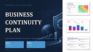 (10)
(10) Business Continuity Plan PowerPoint Template and ChartsID: #PC01146$20.00
 (10)
(10) Cycle Periods PowerPoint Template for Time-Based ChartsID: #PC01096$20.00
 (17)
Circular Cycle Diagram Template for PowerPointID: #PC01091$12.00
(17)
Circular Cycle Diagram Template for PowerPointID: #PC01091$12.00 (16)
Cycle Periods Incoming PowerPoint Charts Template - 44 SlidesID: #PC01087$20.00
(16)
Cycle Periods Incoming PowerPoint Charts Template - 44 SlidesID: #PC01087$20.00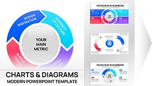 (11)
Cyclical Pie Chart PowerPoint TemplateID: #PC01079$18.00
(11)
Cyclical Pie Chart PowerPoint TemplateID: #PC01079$18.00 (780)
(780) World Development Trends PowerPoint Infographic TemplateID: #PC00297$16.00
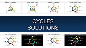 (290)
Project Cycle Steps PowerPoint Charts: Mastering Architecture ManagementID: #PC00902$20.00
(290)
Project Cycle Steps PowerPoint Charts: Mastering Architecture ManagementID: #PC00902$20.00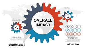 (215)
Overall Impact PowerPoint Charts Template: Unlock Professional PresentationsID: #PC00877$15.00
(215)
Overall Impact PowerPoint Charts Template: Unlock Professional PresentationsID: #PC00877$15.00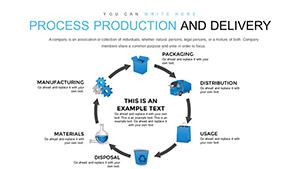 (694)
Production and Delivery Process PowerPoint Charts TemplateID: #PC00854$18.00
(694)
Production and Delivery Process PowerPoint Charts TemplateID: #PC00854$18.00 (148)
(148) Making Ideas Happen PowerPoint Charts TemplateID: #PC00850$15.00
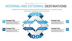 (1197)
Internal And External Destinations PowerPoint Charts TemplateID: #PC00848$15.00
(1197)
Internal And External Destinations PowerPoint Charts TemplateID: #PC00848$15.00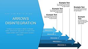 (241)
Arrows Branching PowerPoint Charts TemplateID: #PC00846$20.00
(241)
Arrows Branching PowerPoint Charts TemplateID: #PC00846$20.00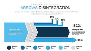 (103)
Arrows Disintegration PowerPoint Charts: Break Down Ideas VisuallyID: #PC00839$18.00
(103)
Arrows Disintegration PowerPoint Charts: Break Down Ideas VisuallyID: #PC00839$18.00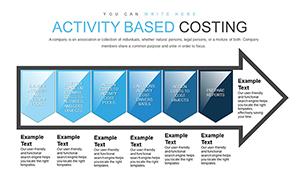 (88)
Activity-Based Costing Arrow PowerPoint Charts Template for PresentationID: #PC00823$17.00
(88)
Activity-Based Costing Arrow PowerPoint Charts Template for PresentationID: #PC00823$17.00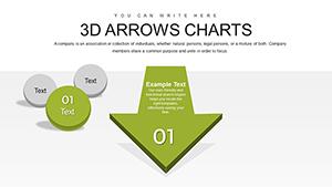 (905)
Effective 3D Arrow Charts for PowerPoint: 24 Editable SlidesID: #PC00805$20.00
(905)
Effective 3D Arrow Charts for PowerPoint: 24 Editable SlidesID: #PC00805$20.00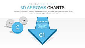 (132)
Dynamic 3D Arrow PowerPoint Charts: 62 Customizable SlidesID: #PC00804$25.00
(132)
Dynamic 3D Arrow PowerPoint Charts: 62 Customizable SlidesID: #PC00804$25.00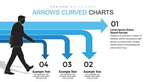 (336)
Curved Arrow PowerPoint Charts: Dynamic Flow TemplatesID: #PC00802$16.00
(336)
Curved Arrow PowerPoint Charts: Dynamic Flow TemplatesID: #PC00802$16.00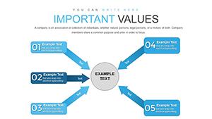 (820)
Targeting Market PowerPoint Charts Template - Download PresentationID: #PC00784$18.00
(820)
Targeting Market PowerPoint Charts Template - Download PresentationID: #PC00784$18.00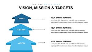 (597)
Vision, Mission, and Targets PowerPoint Charts Template: Empower Your Strategic NarrativeID: #PC00783$22.00
(597)
Vision, Mission, and Targets PowerPoint Charts Template: Empower Your Strategic NarrativeID: #PC00783$22.00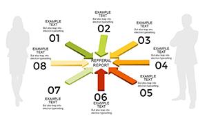 (956)
Action PowerPoint Charts Template with Centralized ArrowsID: #PC00755$16.00
(956)
Action PowerPoint Charts Template with Centralized ArrowsID: #PC00755$16.00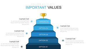 (255)
Affiliate Marketing PowerPoint Charts TemplateID: #PC00736$22.00
(255)
Affiliate Marketing PowerPoint Charts TemplateID: #PC00736$22.00 (1162)
Network Marketing PowerPoint Charts Template: Build Winning Teams VisuallyID: #PC00709$16.00
(1162)
Network Marketing PowerPoint Charts Template: Build Winning Teams VisuallyID: #PC00709$16.00 (161)
Reliance Trends World PowerPoint Charts Template: Visualize Trends EffortlesslyID: #PC00708$22.00
(161)
Reliance Trends World PowerPoint Charts Template: Visualize Trends EffortlesslyID: #PC00708$22.00 (459)
Arrows Flow PowerPoint Charts Template: Streamline Your Ideas CreativelyID: #PC00643free
(459)
Arrows Flow PowerPoint Charts Template: Streamline Your Ideas CreativelyID: #PC00643free (63)
Arrows Badges PowerPoint Charts Template - Download PPTXID: #PC00620$10.00
(63)
Arrows Badges PowerPoint Charts Template - Download PPTXID: #PC00620$10.00 (272)
Free Simple Chevron Steps PowerPoint Charts: Streamline Your Processes VisuallyID: #PC00611free
(272)
Free Simple Chevron Steps PowerPoint Charts: Streamline Your Processes VisuallyID: #PC00611free (392)
Loyalty Program PowerPoint Charts Template: Drive Customer LoyaltyID: #PC00604$18.00
(392)
Loyalty Program PowerPoint Charts Template: Drive Customer LoyaltyID: #PC00604$18.00 (481)
Goals and Activities PowerPoint Charts Template: Chart Your PathID: #PC00602$18.00
(481)
Goals and Activities PowerPoint Charts Template: Chart Your PathID: #PC00602$18.00 (662)
Interrelationships Between Factors PowerPoint Charts Template: Map Connections EffortlesslyID: #PC00596$16.00
(662)
Interrelationships Between Factors PowerPoint Charts Template: Map Connections EffortlesslyID: #PC00596$16.00 (1012)
Business Development Strategies PowerPoint Charts TemplateID: #PC00587$20.00
(1012)
Business Development Strategies PowerPoint Charts TemplateID: #PC00587$20.00 (46)
Loyalty Factors PowerPoint Charts: Build Stronger Connections VisuallyID: #PC00565$18.00
(46)
Loyalty Factors PowerPoint Charts: Build Stronger Connections VisuallyID: #PC00565$18.00 (266)
Sphere of Influence PowerPoint Charts: Map Networks and ImpactID: #PC00562$20.00
(266)
Sphere of Influence PowerPoint Charts: Map Networks and ImpactID: #PC00562$20.00 (760)
Cause and Effect PowerPoint Charts Template for PresentationID: #PC00557$16.00
(760)
Cause and Effect PowerPoint Charts Template for PresentationID: #PC00557$16.00
How do arrow charts direct audience attention through sequential steps?
The arrow shape itself creates a natural reading path that text bullets cannot replicate.
What if my process has more stages than the default arrow layout?
Duplicate the arrow group and adjust the curve handle. The slide master keeps line weight and color consistent across the entire deck.
Practical guidance for flow presentations
Store the arrow style in the slide master. Future updates then inherit the exact curvature and animation without manual recreation.
Real scenarios where the right arrow chart changes the meeting
A strategy lead presents the go-to-market plan. The curved arrow layout shows decision branches and the animation reveals each path one at a time.
An operations manager reviews the supply chain. The straight arrow with bar overlay highlights bottlenecks instantly.
A sales director shares the customer journey. The circular arrow template maps touchpoints and the client sees the loop clearly.
A consultant outlines the digital transformation roadmap. The arrow chart with icons makes each phase memorable and actionable.
What you lose when you build arrow charts manually
Drawing connectors, aligning labels, and matching arrowheads across slides consumes hours that should have gone into refining the narrative.
Technical detail for PowerPoint users
Use the morph transition between arrow slides. The shape points animate smoothly when the curvature is adjusted in the edit points tool.
What sets this collection apart
The layouts focus on corporate storytelling through directional hierarchy rather than decorative effects. All elements stay fully editable with vector scalability and color palettes drawn from standard business schemes.
Choosing the right category for your next deck
If your work involves data comparison explore our graphs PowerPoint chart templates or the cycle PowerPoint chart templates. For organizational visuals in Keynote see the hierarchy Keynote charts templates.
If this matches your current deliverable the full set is ready below.
Are these templates compatible with Google Slides?
Yes every PPTX file imports without loss of arrow curvature or animations. Linked elements become static but colors and labels remain fully editable.
Can I change the arrow direction and length?
Yes all arrows are native PowerPoint shapes. Select the arrow, go to Edit Points, and drag handles to adjust curvature or length while keeping the connector style intact.
Do the templates support team sharing?
The license allows internal company use. You may distribute the customized decks inside the organization. The files contain no watermarks and all elements remain editable without purchase restrictions.
What PowerPoint versions are supported?
The templates open in PowerPoint 2019 and newer including Microsoft 365. Older versions may require the shape update add-in but the slide master and layouts remain intact.