3D PowerPoint Charts
These 3D PowerPoint chart templates bring actual depth to your data instead of another flat bar or pie. You`ll find perspective cubes, layered pyramids, tapering funnels, volume columns, and puzzle-style breakdowns that teams use when numbers need to feel substantial rather than just listed.
Last year I was pulling together a quarterly business review for a manufacturing client. The GM needed to show not only revenue growth but actual inventory volume differences across three regions. A flat chart looked fine on my screen, but the 3D clustered column made the scale obvious when projected. One template from this collection let me adjust the viewing angle live in the meeting without rebuilding anything. That shift from "the slide is okay" to "everyone immediately gets the point" is exactly when these layouts earn their place.
Go through the collection and pull the ones that match your next review or pipeline update.
 (8)
(8) Global Finance Analytics PowerPoint Charts Template (18 Slides)ID: #PC01139$20.00
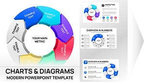 (8)
(8) 3D Volume Cyclic PowerPoint Charts - Editable SlidesID: #PC01113$20.00
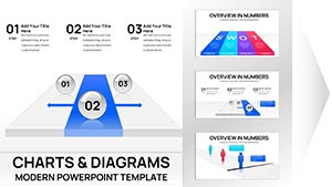 (14)
Finish Line PowerPoint Charts - 41 Premium Slides for Project TrackingID: #PC01109$18.00
(14)
Finish Line PowerPoint Charts - 41 Premium Slides for Project TrackingID: #PC01109$18.00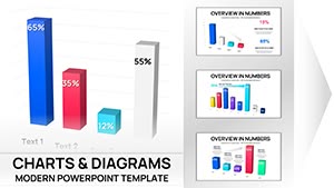 (9)
3-D Clustered Column Chart PowerPoint Template - Editable Charts for Financial ReportsID: #PC01106$14.00
(9)
3-D Clustered Column Chart PowerPoint Template - Editable Charts for Financial ReportsID: #PC01106$14.00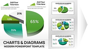 (12)
Editable PowerPoint Charts Template for Board Meetings - Fully EditableID: #PC01105$15.00
(12)
Editable PowerPoint Charts Template for Board Meetings - Fully EditableID: #PC01105$15.00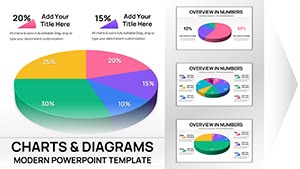 (10)
3-D Pie PowerPoint Charts - Fully Editable Ready for Board MeetingsID: #PC01104$15.00
(10)
3-D Pie PowerPoint Charts - Fully Editable Ready for Board MeetingsID: #PC01104$15.00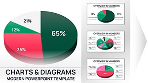 (8)
3D Pie PowerPoint Charts - Fully EditableID: #PC01103$16.00
(8)
3D Pie PowerPoint Charts - Fully EditableID: #PC01103$16.00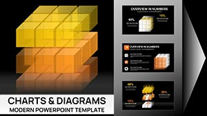 (13)
Editable 3D Cubes Charts PowerPoint TemplateID: #PC01095$22.00
(13)
Editable 3D Cubes Charts PowerPoint TemplateID: #PC01095$22.00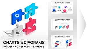 (17)
3D Puzzle Analysis Charts PowerPoint TemplateID: #PC01078$20.00
(17)
3D Puzzle Analysis Charts PowerPoint TemplateID: #PC01078$20.00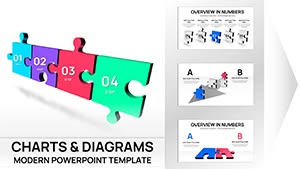 (13)
3D Puzzle Charts Template for PowerPoint - 48 Editable SlidesID: #PC01077$25.00
(13)
3D Puzzle Charts Template for PowerPoint - 48 Editable SlidesID: #PC01077$25.00 (16)
3D Puzzle Pie Charts Template for PowerPoint PresentationsID: #PC01072$20.00
(16)
3D Puzzle Pie Charts Template for PowerPoint PresentationsID: #PC01072$20.00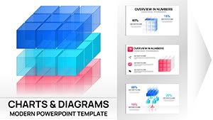 (17)
3D Cube Charts PowerPoint TemplateID: #PC01071$25.00
(17)
3D Cube Charts PowerPoint TemplateID: #PC01071$25.00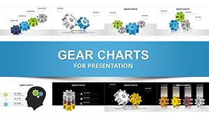 (900)
(900) 3D Gear PowerPoint Charts for Process VisualizationID: #PC00294$24.00
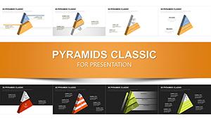 (793)
Infographic 3D Pyramids PowerPoint Charts TemplateID: #PC00290$23.00
(793)
Infographic 3D Pyramids PowerPoint Charts TemplateID: #PC00290$23.00 (424)
Rings Connection Charts - Editable PPTX | ImagineLayoutID: #PC00868$16.00
(424)
Rings Connection Charts - Editable PPTX | ImagineLayoutID: #PC00868$16.00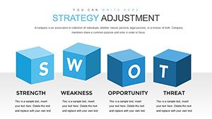 (20)
(20) Strategy Adjustment PowerPoint Charts: Enhance Goal AchievementID: #PC00866$20.00
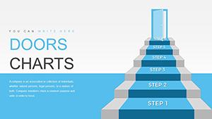 (423)
Doordash Customer Service PowerPoint Charts TemplateID: #PC00852$17.00
(423)
Doordash Customer Service PowerPoint Charts TemplateID: #PC00852$17.00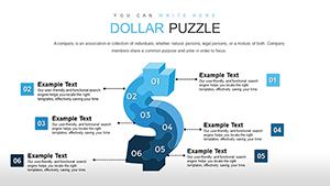 (1118)
Dollars Puzzles 3D PowerPoint Template: Decode Currency ComplexitiesID: #PC00837$13.00
(1118)
Dollars Puzzles 3D PowerPoint Template: Decode Currency ComplexitiesID: #PC00837$13.00 (1086)
Currency Converter PowerPoint Charts Template - Editable PPT SlidesID: #PC00835$15.00
(1086)
Currency Converter PowerPoint Charts Template - Editable PPT SlidesID: #PC00835$15.00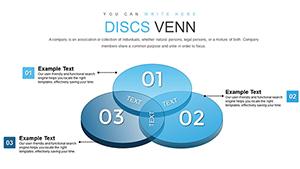 (1174)
3D Venn PowerPoint Charts Template: Visualize Relationships DynamicallyID: #PC00811$22.00
(1174)
3D Venn PowerPoint Charts Template: Visualize Relationships DynamicallyID: #PC00811$22.00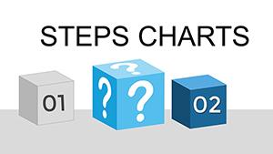 (960)
Steps Processing PowerPoint Charts Presentation TemplateID: #PC00809$20.00
(960)
Steps Processing PowerPoint Charts Presentation TemplateID: #PC00809$20.00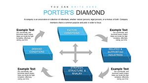 (528)
3D Cubes Porter's Five Forces PowerPoint TemplateID: #PC00806$15.00
(528)
3D Cubes Porter's Five Forces PowerPoint TemplateID: #PC00806$15.00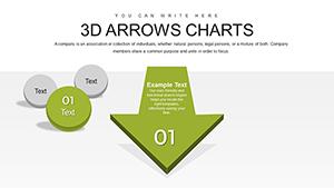 (905)
Effective 3D Arrow Charts for PowerPoint: 24 Editable SlidesID: #PC00805$20.00
(905)
Effective 3D Arrow Charts for PowerPoint: 24 Editable SlidesID: #PC00805$20.00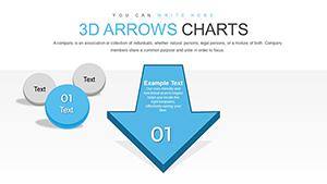 (132)
Dynamic 3D Arrow PowerPoint Charts: 62 Customizable SlidesID: #PC00804$25.00
(132)
Dynamic 3D Arrow PowerPoint Charts: 62 Customizable SlidesID: #PC00804$25.00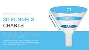 (42)
3D Funnel PowerPoint Charts Template: Visualize ProcessesID: #PC00803$20.00
(42)
3D Funnel PowerPoint Charts Template: Visualize ProcessesID: #PC00803$20.00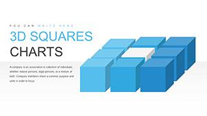 (145)
3D Squares Cube PowerPoint Charts Template - 30 SlidesID: #PC00801$18.00
(145)
3D Squares Cube PowerPoint Charts Template - 30 SlidesID: #PC00801$18.00 (537)
Business Process Modeling 3D Cube PowerPoint Charts TemplateID: #PC00794$15.00
(537)
Business Process Modeling 3D Cube PowerPoint Charts TemplateID: #PC00794$15.00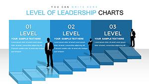 (5)
Level of Leadership 3D Cube PowerPoint Charts TemplateID: #PC00793$20.00
(5)
Level of Leadership 3D Cube PowerPoint Charts TemplateID: #PC00793$20.00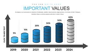 (229)
Oil Report PowerPoint Charts Template for PresentationsID: #PC00792$17.00
(229)
Oil Report PowerPoint Charts Template for PresentationsID: #PC00792$17.00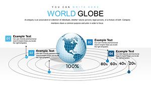 (779)
3D Model World Globe PowerPoint Charts Template for PresentationID: #PC00791$15.00
(779)
3D Model World Globe PowerPoint Charts Template for PresentationID: #PC00791$15.00 (1122)
Fully Editable Performance Trend Analysis Chart PowerPoint Template - Instant DownloadID: #PC00782$20.00
(1122)
Fully Editable Performance Trend Analysis Chart PowerPoint Template - Instant DownloadID: #PC00782$20.00 (1148)
Leadership PowerPoint Template: Climb to Success with Engaging VisualsID: #PC00769$16.00
(1148)
Leadership PowerPoint Template: Climb to Success with Engaging VisualsID: #PC00769$16.00 (956)
Action PowerPoint Charts Template with Centralized ArrowsID: #PC00755$16.00
(956)
Action PowerPoint Charts Template with Centralized ArrowsID: #PC00755$16.00
What 3D Actually Adds to Charts (and When It Doesn't)
3D perspective helps when you need to show volume, layers, or spatial relationships at a glance. A 3D clustered column communicates three data dimensions better than a flat one. A funnel with depth makes the narrowing feel physical. But the same perspective can distort value comparison if the audience is sitting at an angle or if you pack in too many series.
From repeated client work, I`ve learned 3D works best for magnitude stories or multi-layer relationships. It struggles when people need to read exact percentages quickly. In those cases the depth becomes noise.
Real Scenarios Where These 3D Templates Made the Difference
A finance director preparing investor materials used the 3D pie and clustered column templates to split revenue by product line and geography. The depth highlighted newer, smaller lines that disappeared in 2D. After the call he said the conversation stayed on strategy instead of questions about the visuals.
An operations lead tracked resource bottlenecks with 3D gears and timeline-style charts. When he added an extra milestone the night before the steering committee meeting, the connectors stayed intact and the perspective held. The team finally saw dependencies clearly instead of reading another status update.
In a strategy offsite I supported, the 3D cubes version of Porter`s Five Forces let executives move blocks around while discussing shifting competitive pressures. Repositioning one cube didn`t break the overall alignment, which saved us rework at 10pm.
A marketing manager used a 3D pyramid for campaign priority and budget allocation. The layered structure made it obvious to leadership why certain channels needed more investment without extra explanatory slides.
Editing 3D Charts in PowerPoint: What Breaks and How to Fix It
These templates mostly use grouped shapes or modified chart objects. They survive aspect ratio changes better than pure native 3D charts, but you still need to watch the 3D rotation settings. Changing slide size or copying between decks can reset the viewing angle. I usually lock one master rotation early and paste it across slides.
For funnels and pyramids, group the elements before adding animations - otherwise pieces can separate. Lighting presets matter: some default ones look cheap on big screens. Test PDF export early because shadows and perspective often flatten or shift.
3D Cubes, Pyramids, and Funnels: Choosing the Right One
Cubes suit multi-metric portfolios or scorecards. Pyramids work for clear hierarchies and prioritization. Funnels are strong for sequential conversion flows but can mislead if your stages aren`t strictly ordered. Always check how it looks from the back of the room - what feels balanced on your laptop sometimes compresses when projected.
When to Use Flat Charts or Other Diagram Types Instead
If your audience must pull exact numbers fast, switch to standard PowerPoint chart templates. For process flows or conceptual diagrams without heavy numerical data, diagram templates usually read cleaner. Reach for 3D only when the extra dimension actually reinforces the message - volume, layers, or perspective relationships - never as decoration.
Why This Collection Works for Corporate Decks
The templates here focus on editing freedom and consistent masters rather than heavy decorative effects. You won`t spend hours ungrouping to change one color. Not every file is fully animated or 100% Google Slides perfect, and some older designs rely more on grouped shapes than native charts. Still, for most board-level and client work they get the job done without last-minute panic.
Can I add more data points to a 3D clustered column without messing up the perspective?
Yes, but select the chart object carefully and adjust the 3D rotation settings afterward to keep the viewing angle consistent. In these templates the grouped versions are more forgiving than native charts. Test on your target slide size - sometimes depth values need tweaking when you go from 4 to 6 series so nothing overlaps weirdly in the room.
How do the 3D funnels behave when I change the number of stages?
Most funnel templates here use shapes that you can duplicate or delete. The connectors or tapers usually hold if you maintain proportions. I`ve had to manually adjust the angles on a couple to avoid a squished look after adding a stage. Always preview in slideshow mode.
Are these templates compatible with Google Slides?
Some are, especially the simpler cube and pyramid ones. Complex lighting and rotation effects often convert to flat or basic 3D. Open in Google Slides and check the 3D settings immediately. For critical presentations I still recommend final tweaks in desktop PowerPoint.
What happens with PDF export on these 3D charts?
Perspective and shadows can flatten or shift. Templates built with shapes tend to hold better than pure chart objects. I usually export a test page first and adjust depth or remove heavy gradients if needed for print or static shares.
Can I use the 3D cubes for something other than Porter's Five Forces?
The cube layout is flexible. You can relabel faces or adjust layers for other matrix-style analysis. Just watch alignment when you move elements - the 3D grouping helps but isn't bulletproof if you drastically change the data structure.
Do the 3D pyramids work well for hierarchy slides?
Yes, they are strong for showing priority levels or budget allocation. The layered structure makes relationships clear. Resize carefully though - the perspective can shift and make upper layers look smaller than intended if you stretch the whole group.