Timelines Keynote Diagrams
Transform your Keynote presentations with our versatile timeline diagram templates. Perfect for project planning, educational courses, and business workflows, these designs are fully editable and visually engaging.
Simplify complex processes with intuitive layouts that clearly map phases, dependencies, and milestones, keeping your audience informed and focused.
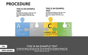 (829)
(829) Procedure Keynote Diagrams TemplateID: #KD00192$20.00
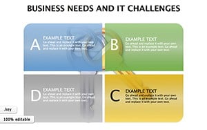 (334)
(334) Business Needs And It Challenges Keynote DiagramsID: #KD00190$15.00
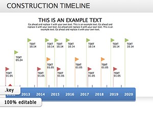 (764)
(764) Construction Timeline Keynote Diagrams: Erect Narratives That Stand TallID: #KD00175$23.00
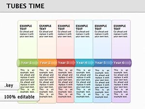 (622)
(622) Tubes Time Keynote Diagrams: Master Timelines with Fluid VisualsID: #KD00148$22.00
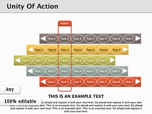 (929)
Unity of Action Keynote Diagrams: Harmonize Your NarrativesID: #KD00147$20.00
(929)
Unity of Action Keynote Diagrams: Harmonize Your NarrativesID: #KD00147$20.00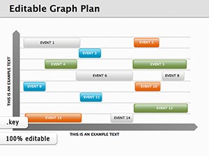 (179)
8 Graph Plan Keynote Diagrams - Instant Download | ImagineLayoutID: #KD00144$12.00
(179)
8 Graph Plan Keynote Diagrams - Instant Download | ImagineLayoutID: #KD00144$12.00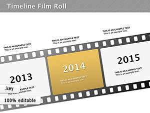 (410)
Engaging Timeline Film Roll Keynote DiagramsID: #KD00124$22.00
(410)
Engaging Timeline Film Roll Keynote DiagramsID: #KD00124$22.00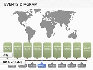 (136)
Map Events: Global Architecture Timeline KeynoteID: #KD00095$18.00
(136)
Map Events: Global Architecture Timeline KeynoteID: #KD00095$18.00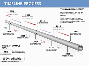 (226)
Timeline Process Keynote Template: Chart Your Path ForwardID: #KD00052$28.00
(226)
Timeline Process Keynote Template: Chart Your Path ForwardID: #KD00052$28.00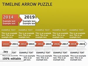 (781)
Timeline Puzzle Keynote Diagrams: Piece Together Compelling StoriesID: #KD00027$18.00
(781)
Timeline Puzzle Keynote Diagrams: Piece Together Compelling StoriesID: #KD00027$18.00 (239)
Timeline Planning Keynote Template: Visualize Success Step by StepID: #KD00002$20.00
(239)
Timeline Planning Keynote Template: Visualize Success Step by StepID: #KD00002$20.00
Why Use Timeline Keynote Diagrams
Timeline diagrams help organize and present sequences of events or project phases with clarity and style. They are more dynamic than default Keynote slides, offering a structured approach to storytelling and data visualization.
Practical Applications
- Project roadmaps and milestone tracking
- Educational timelines and course planning
- Business process workflows
- Marketing campaign schedules
Advantages Over Standard Slides
- Pre-designed arrows, branches, and swimlanes for clarity
- Icons and shapes to highlight key events
- Fully editable elements for custom branding
- Optimized for all modern Keynote versions
Creative Tips
- Use color coding to differentiate workstreams
- Apply progressive disclosure for complex projects
- Combine with visuals and icons to enhance understanding
Bring your timelines to life and communicate your plan effectively. Download and start customizing today.
FAQ
Are these Keynote timeline diagrams free to use?
Some templates are free while others are premium. Check individual template details for availability.
Can I edit these diagrams in Keynote on iPad?
Yes all timeline diagrams are fully compatible with Keynote on Mac and iPad.
Do templates include icons and shapes for milestones?
Yes each template provides visual elements like arrows, swimlanes, and milestone icons.
Can I customize colors and fonts?
Absolutely all elements are editable to match your presentation style and branding.
Are these suitable for business project presentations?
Yes these timeline diagrams are ideal for visualizing project phases and stakeholder communication in a business context.