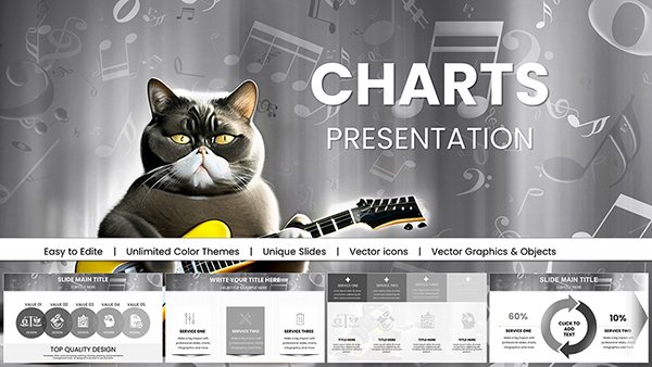
Seize market opportunities with our trading chart Keynote templates, fine-tuned for finance pros who need to dissect trends and forecasts on the fly. These designs capture volatility and patterns with unerring detail, ideal for investor meetings or strategy huddles.
Stock traders visualizing candlesticks, forex experts plotting currency pairs, or portfolio managers reviewing asset allocations will appreciate the robust toolsets. Keynote-optimized with smooth zooms and real-time data placeholders, they handle high-stakes visuals effortlessly.
Picture candlestick formations that pulse with potential or Bollinger Bands that frame breakouts - our templates make complex trading data accessible and persuasive. Swift edits keep pace with market shifts.
Explore this assortment to chart your path to compelling financial narratives.
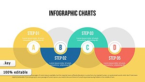
User Experience Keynote Charts: Bridging the Digital Divide
ID: #KC00404
$12.00
(1079)
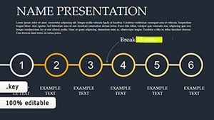
Tactical Precision: Elevate Your Planning with Keynote Charts
ID: #KC00374
$17.00
(132)
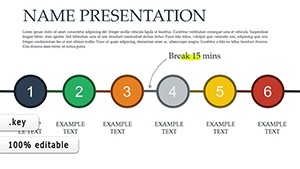
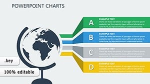
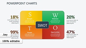
Marketing Charts Keynote Template
ID: #KC00345
$19.00
(812)
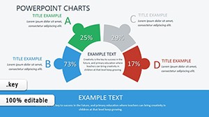
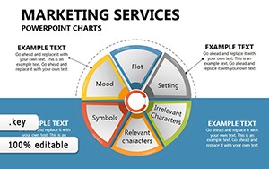
Marketing Plan Keynote Chart Template
ID: #KC00268
$22.00
Mastering Market Visuals with Trading Charts
Trading charts demand accuracy and speed, and our Keynote templates deliver both through pre-formatted candlesticks, moving averages, and volume overlays. Surpassing generic inserts with financial-specific legends and scale adjustments, they facilitate deeper dives into price actions.
Day traders benefit from multi-timeframe views, while advisors use them to narrate portfolio evolutions clearly.
Essential Advantages
Technical Indicators: RSI, MACD, and Fibonacci retracements ready to layer.
Volume Integration: Synced bars for confirming momentum shifts.
Export Readiness: High-res outputs for reports or client shares.
These elevate trading talks from numbers to narratives.
Strategic Use Cases in Finance
Equity Analysis: Line charts with EMAs track blue-chip trajectories.
Risk Management: Heat maps flag exposure concentrations.
Versatility covers the trading spectrum adeptly.
Pro Techniques for Charting Success
Align time axes consistently across slides for trend continuity.
Highlight support/resistance with shaded zones.
Use Keynote builds to unveil indicators sequentially.
Annotate pivots with trendline extensions.
Apply these for charts that anticipate and illuminate.
Advanced Trading Visual Ideas
Fuse radar charts with timelines for multi-asset correlations. Crypto enthusiasts overlay blockchain metrics on price lines. Hedge funds model scenario forks with branched graphs.
Prime example: A venture pitch charting token growth curves, securing funding through vivid projections.
Innovate to mirror market intricacies uniquely.
Acquire and Activate
Peruse our trading chart selection and download to fuel your Keynote financial firepower now.