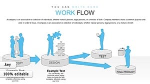
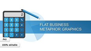
Elevate your presentations with our professional Steps Keynote Charts Templates. Perfect for business workflows education lessons or project overviews these editable charts make complex processes clear and visually engaging.
Download now and start creating stunning step-by-step slides that impress your audience.
Analysis & Planning Keynote Charts: Chart Your Path to Strategic Brilliance
ID: #KC00593
$18.00
(1015)
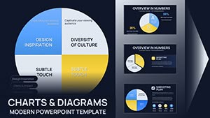
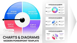
Sphere of Influence Keynote Charts: Visualize Networks and Impacts
ID: #KC00562
$20.00
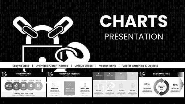
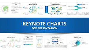
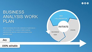
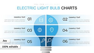
Why Choose Steps Keynote Charts
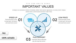
Steps Keynote Charts Templates are designed to simplify complex processes into visually compelling graphics. Unlike default slides they provide structured layouts that save time and enhance clarity.
Real-World Use Cases
Business process workflows and operational reports
Project planning and progress tracking
Educational lessons and step-by-step tutorials
Benefits Over Default Templates
Editable elements for customization
Professional design enhancing audience engagement
Time-saving structured layouts
Creative Tips and Best Practices
Use consistent color coding to indicate stages
Combine with icons for visual emphasis
Animate step transitions for dynamic presentations
Get started today and transform your presentations with ready-to-use step charts.
Frequently Asked Questions
Can I customize the Steps charts easily?
Yes all charts are fully editable allowing you to modify colors text and shapes to fit your needs.
Are these templates suitable for education?
Absolutely they work perfectly for lessons tutorials and student projects.
Can I use them for business reports?
Yes these templates are ideal for corporate presentations meetings and progress tracking.