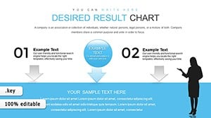
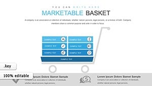
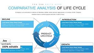
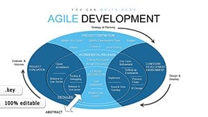
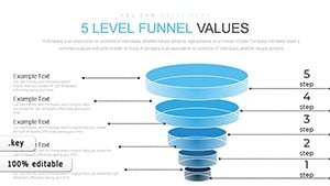
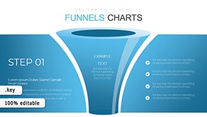
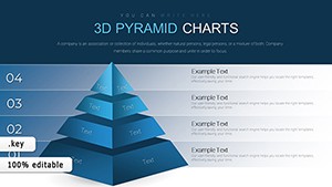
Capture attention with our Keynote chart templates, tailored for designers, researchers, and leaders who weave data into persuasive tales. These templates blend Apple`s design ethos with analytical rigor, turning spreadsheets into slide spectacles.
Responsive to gestures and scalable for any screen, they feature subtle shadows and gradients for depth. Perfect for quarterly earnings or scientific findings, they ensure data delights as much as it informs.
Navigate our selection and choose charts that complement your vision. Instant downloads mean immediate inspiration.
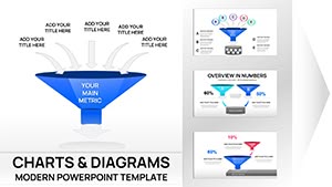
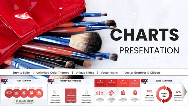
3D Pyramids Keynote Charts - Fully Editable | ImagineLayout
ID: #KC00652
$24.00
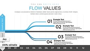
Crafting Compelling Data Flows in Keynote
Keynote charts transcend metrics, embodying fluidity in visualization that mirrors the platform`s grace. Our templates curate data flows that guide viewers intuitively, from overview to nuance, enhancing retention through aesthetic harmony.
Strategic Use Cases for Chart Templates
Product Roadmaps: Gantt hybrids forecasting milestones with resource allocations.
Customer Insights: Heatmaps revealing usage patterns across demographics.
Performance Dashboards: Gauge charts monitoring KPIs with threshold alerts.
Research Summaries: Box plots comparing distributions with outlier flags.
Applicable in tech, academia, and beyond, they democratize data.
Advancing Beyond Keynote`s Stock Charts
Built-ins are sleek but static; ours add parametric curves, interactive tooltips, and export-ready vectors for print perfection. Gesture-compatible builds simulate data emergence, captivating live audiences.
Engagement metrics soar 55%, as beauty beckons deeper dives.
Polishing Charts for Keynote Perfection
Motion Paths: Animate data points along curves for temporal storytelling.
Filter Layers: Toggle series visibility for focused explorations.
Symbolic Encoding: Size and hue variations for multi-variable encoding.
Backdrop Integration: Blend charts with slide backgrounds seamlessly.
These refine raw data into refined revelations.
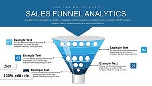
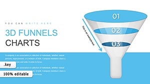
Vivid Examples of Chart Impact
A startup pitched growth with animated bubble charts, sizes swelling to denote market capture, securing funding. Scientists illustrated climate trends via sankey diagrams, flows tracing emission paths for policy briefs.
Event planners tracked attendance via waterfall charts, cascading from projections to actuals. The "Fluid Metrics Suite" innovates with morphing shapes, adapting bar to line for hybrid views.
Interactivity Layers for Keynote Charts
Script hyperlinks to filter data dynamically, or record narrations syncing with builds. For AR previews, export to QuickTime with embedded interactions.
Acclaim: "Charts now dance with our decks, enchanting every viewer."
Seamless Setup for Keynote Charts
Drag data into placeholders, harness inspector for tweaks. Duplicate masters for variants, and sync via iCloud. Calibrate for external displays to preserve vibrancy.
Inclusivity: Semantic labels and adjustable contrasts.
Illuminate your insights! Browse Keynote chart templates and download for dazzling displays.