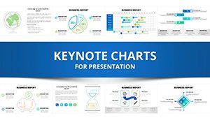
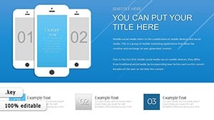
Keynote charts are essential for transforming raw data into digestible visuals that captivate audiences during presentations. Our specialized templates for Apple Keynote empower speakers, analysts, and educators to convey insights with precision and style, ensuring every slide resonates.
Designed for users across marketing, finance, and academia, these charts go beyond basic bar graphs and pie slices. They incorporate smooth animations, interactive elements, and theme-consistent styling to maintain flow in your deck. Whether you`re pitching to investors or teaching a class, a well-crafted chart can clarify trends and highlight key metrics at a glance.
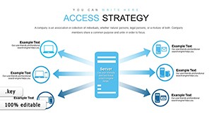
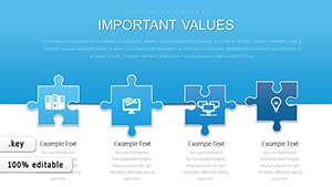
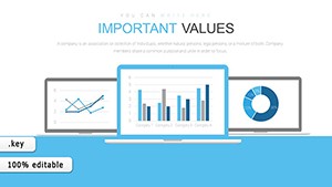
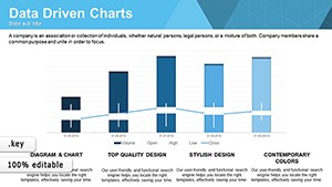
Each template is built with Keynote`s native tools in mind, featuring resizable vectors and color-coded legends for quick adjustments. From elegant line charts tracking growth to radial diagrams showing proportions, our library covers diverse data types.
Dive into our Keynote charts collection and elevate your storytelling. With drag-and-drop simplicity, you`ll spend less time formatting and more time focusing on your message.


Effective charts don`t just display numbers; they narrate your data`s story. Our templates surpass Keynote`s default options by offering layered compositions that support drill-down views and conditional formatting, making them ideal for dynamic reports. For example, animated transitions reveal data points sequentially, holding viewer attention longer than static visuals.
Audiences include business leaders analyzing quarterly results or researchers presenting findings. Benefits span from faster comprehension - reducing explanation time by half - to heightened engagement, as colorful, intuitive designs make abstract concepts tangible.
Versus standard charts, which lack polish and adaptability, our versions integrate seamlessly with Keynote themes, ensuring brand alignment without manual tweaks.
Begin with audience needs: Simplify axes for non-experts or add granular ticks for specialists. Employ consistent scales to avoid misleading perceptions, and leverage Keynote`s build effects for phased reveals. For creative flair, experiment with 3D rotations on donut charts to add depth without clutter.
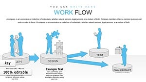
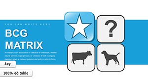
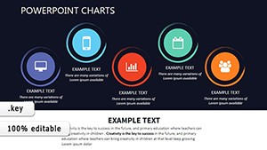
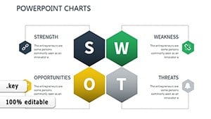
Practical examples include quarterly revenue overviews using stacked areas for product breakdowns, or SWOT analyses via bubble charts sized by impact. These applications turn routine updates into persuasive narratives.
Enhance your next presentation? Explore Keynote chart templates here and download for immediate use.
Pair charts with Keynote`s hyperlinked builds for interactive dashboards, where clicks expand sub-data. Use vector scalability to maintain crispness on large screens. For data-heavy fields like healthcare, compliance-ready templates with anonymized placeholders ensure ethical visualizations.
In education, gamify learning with progress bars as animated gauges. Compared to PowerPoint equivalents, Keynote`s fluidity shines in our optimized files, reducing lag in transitions.
| Type | Ideal Scenario | Customization Tips |
|---|---|---|
| Line | Trend Analysis | Smooth curves, multi-series overlays |
| Bar | Comparisons | Grouped stacks, error bars |
| Pie | Proportions | Exploded segments, legends |
This structure allows effortless scaling for various slide sizes.
Built with native shapes and tables, they support direct data input and style syncing via Keynote`s master slides.
Yes, copy-paste from Excel or use Keynote`s data import for seamless updates without reformatting.
Pre-set builds like wipe or scale effects are embedded, customizable to match your presentation pace.
Optimized for Apple`s ecosystem, they leverage smoother vectors and Magic Move transitions for fluid storytelling.
They adapt to any Keynote theme, but modern sans-serif palettes enhance clarity and professionalism.
Responsive elements ensure charts remain legible on iPad or iPhone screens during on-the-go demos.
Armed with these tools, your presentations will deliver data with undeniable clarity. Start downloading Keynote charts today to see the difference.
Copyright © 2009-2026 ImagineLayout All rights reserved.