Tables Keynote Diagrams
Transform your data into compelling visual stories with our premium collection of table diagram templates for Keynote. Whether you're presenting quarterly results, comparing product features, or organizing complex information, the right table design makes all the difference between confusion and clarity.
Our ready-to-use Keynote table templates combine clean aesthetics with practical functionality. Each design is fully editable, allowing you to customize colors, fonts, and layouts to match your brand identity. Say goodbye to boring spreadsheet screenshots and hello to presentation-ready data visualization that keeps your audience engaged.
 (752)
(752) Progressive Commercial Keynote Diagrams: 20 Customizable SlidesID: #KD00214$15.00
 (351)
Business Corporation Keynote Diagrams TemplateID: #KD00211$19.00
(351)
Business Corporation Keynote Diagrams TemplateID: #KD00211$19.00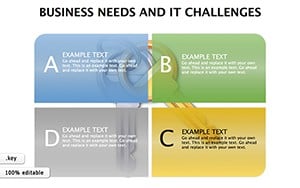 (334)
(334) Business Needs And It Challenges Keynote DiagramsID: #KD00190$15.00
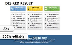 (1074)
 Desired Result Keynote Diagrams TemplateID: #KD00189$22.00
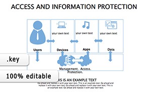 (837)
Access And Information Protection Keynote Diagram TemplateID: #KD00187$25.00
(837)
Access And Information Protection Keynote Diagram TemplateID: #KD00187$25.00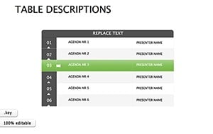 (103)
(103) Creativity with Stunning Table Descriptions Keynote DiagramsID: #KD00183$16.00
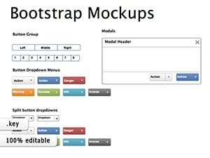 (1033)
Bootstrap Mockups Keynote Template: Elevate Your Web Design PitchesID: #KD00181$20.00
(1033)
Bootstrap Mockups Keynote Template: Elevate Your Web Design PitchesID: #KD00181$20.00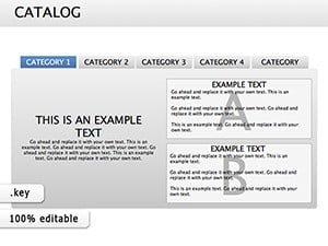 (733)
22 Catalog Keynote Diagrams - Fully Editable | ImagineLayoutID: #KD00176$16.00
(733)
22 Catalog Keynote Diagrams - Fully Editable | ImagineLayoutID: #KD00176$16.00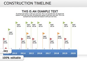 (764)
Construction Timeline Keynote Diagrams: Erect Narratives That Stand TallID: #KD00175$23.00
(764)
Construction Timeline Keynote Diagrams: Erect Narratives That Stand TallID: #KD00175$23.00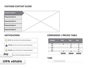 (488)
Mockups Website Keynote diagramsID: #KD00174$23.00
(488)
Mockups Website Keynote diagramsID: #KD00174$23.00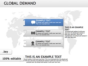 (158)
Global Demand Keynote Diagrams - Presentation TemplateID: #KD00173$20.00
(158)
Global Demand Keynote Diagrams - Presentation TemplateID: #KD00173$20.00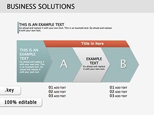 (202)
Business Solutions Keynote Diagrams Template for PresentationID: #KD00163$23.00
(202)
Business Solutions Keynote Diagrams Template for PresentationID: #KD00163$23.00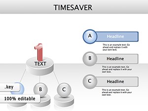 (798)
Time Management Keynote Diagrams: Presentation TemplateID: #KD00162$22.00
(798)
Time Management Keynote Diagrams: Presentation TemplateID: #KD00162$22.00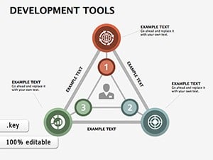 (357)
Development Tools Keynote Diagram Templates for Business & Financial AnalysisID: #KD00153$15.00
(357)
Development Tools Keynote Diagram Templates for Business & Financial AnalysisID: #KD00153$15.00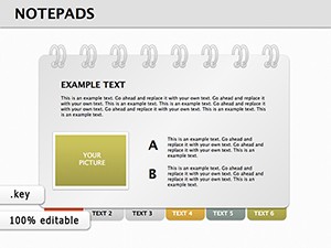 (279)
Notepads Keynote Diagram Template for Quality ManagementID: #KD00143$22.00
(279)
Notepads Keynote Diagram Template for Quality ManagementID: #KD00143$22.00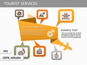 (671)
Tourist Services Keynote Diagrams for Engaging Travel PresentationsID: #KD00131$25.00
(671)
Tourist Services Keynote Diagrams for Engaging Travel PresentationsID: #KD00131$25.00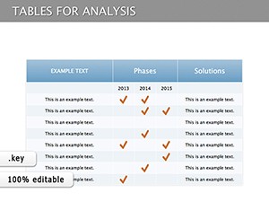 (450)
Tables for Analysis Keynote Diagrams: Unlock Deeper InsightsID: #KD00130$20.00
(450)
Tables for Analysis Keynote Diagrams: Unlock Deeper InsightsID: #KD00130$20.00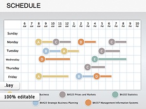 (723)
Schedule Keynote Diagrams TemplateID: #KD00107$20.00
(723)
Schedule Keynote Diagrams TemplateID: #KD00107$20.00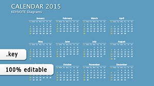 (543)
Calendar Keynote Diagrams TemplateID: #KD00102$12.00
(543)
Calendar Keynote Diagrams TemplateID: #KD00102$12.00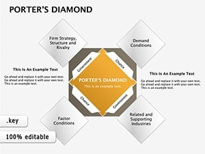 (541)
Porter's Diamond Square Keynote: Decode Market MasteryID: #KD00092$18.00
(541)
Porter's Diamond Square Keynote: Decode Market MasteryID: #KD00092$18.00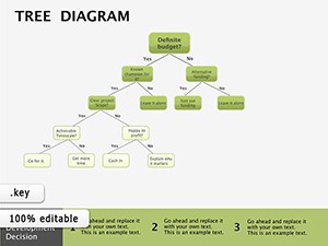 (311)
Tree Block Diagram Keynote Template for SystemsID: #KD00083$8.00
(311)
Tree Block Diagram Keynote Template for SystemsID: #KD00083$8.00 (825)
Process Block Schemes: Illuminating Workflows in KeynoteID: #KD00068$18.00
(825)
Process Block Schemes: Illuminating Workflows in KeynoteID: #KD00068$18.00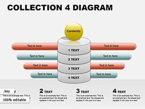 (91)
Keynote Diagram Collection 4: Weave Data into Dynamic NarrativesID: #KD00062$18.00
(91)
Keynote Diagram Collection 4: Weave Data into Dynamic NarrativesID: #KD00062$18.00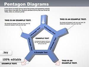 (737)
Pentagon Diagrams Keynote Template - Ready to Present | ImagineLayoutID: #KD00051$14.00
(737)
Pentagon Diagrams Keynote Template - Ready to Present | ImagineLayoutID: #KD00051$14.00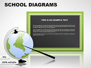 (383)
School Keynote Diagrams TemplatesID: #KD00049$22.00
(383)
School Keynote Diagrams TemplatesID: #KD00049$22.00 (822)
BCG Matrix Keynote diagram templateID: #KD00037$24.00
(822)
BCG Matrix Keynote diagram templateID: #KD00037$24.00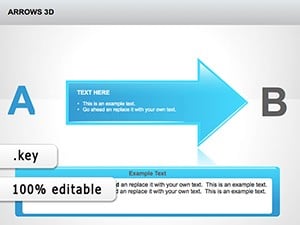 (287)
3D Arrows Keynote Template for Impactful FlowsID: #KD00034$24.00
(287)
3D Arrows Keynote Template for Impactful FlowsID: #KD00034$24.00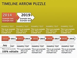 (781)
Timeline Puzzle Keynote Diagrams: Piece Together Compelling StoriesID: #KD00027$18.00
(781)
Timeline Puzzle Keynote Diagrams: Piece Together Compelling StoriesID: #KD00027$18.00 (1199)
Business Keynote Diagrams Template: Chart Your Path to IndependenceID: #KD00022$20.00
(1199)
Business Keynote Diagrams Template: Chart Your Path to IndependenceID: #KD00022$20.00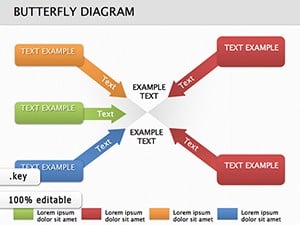 (842)
Stunning Butterfly Keynote Diagrams Template - Fully Editable Slides for Board Meetings & PresentationsID: #KD00016$14.00
(842)
Stunning Butterfly Keynote Diagrams Template - Fully Editable Slides for Board Meetings & PresentationsID: #KD00016$14.00 (23)
Sustainable Development Keynote DiagramsID: #KD00013$20.00
(23)
Sustainable Development Keynote DiagramsID: #KD00013$20.00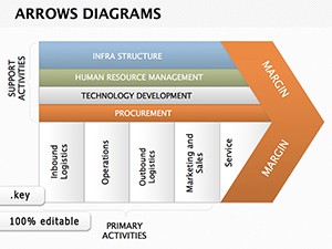 (877)
Arrows Keynote Diagrams TemplateID: #KD00010$15.00
(877)
Arrows Keynote Diagrams TemplateID: #KD00010$15.00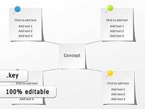 (331)
Sticker Keynote Diagram TemplateID: #KD00005$12.00
(331)
Sticker Keynote Diagram TemplateID: #KD00005$12.00
Why Choose Professional Table Diagrams Over Default Layouts
Default Keynote tables serve a purpose, but they rarely impress. Professional table diagram templates elevate your presentations by combining visual hierarchy, strategic color usage, and smart spacing. When stakeholders review dozens of presentations monthly, yours needs to stand out immediately.
Pre-designed table templates save 3-5 hours per presentation. Instead of manually formatting cells, adjusting borders, and experimenting with color schemes, you start with a proven design framework. This efficiency matters especially when preparing for urgent client meetings or last-minute board presentations.
Real-World Applications Across Industries
Business Analytics and Financial Reporting
Finance teams use table diagrams to present budget allocations, expense breakdowns, and revenue comparisons. A well-structured comparison table helps executives grasp quarterly performance trends at a glance. Modern designs with conditional formatting draw attention to critical metrics without overwhelming viewers with numbers.
Product and Service Comparisons
Marketing professionals rely on feature comparison tables when pitching products against competitors. Clean column layouts with checkmarks, icons, and highlight colors make it easy for prospects to understand value propositions. These templates work perfectly for pricing tiers, package comparisons, and specification sheets.
Project Management and Timeline Planning
Project managers utilize table formats to outline task assignments, milestone schedules, and resource allocation. Structured tables with alternating row colors improve readability during team meetings. Adding simple icons or status indicators transforms static data into actionable project dashboards.
Educational Content and Training Materials
Educators and trainers use organized tables to present course schedules, grading rubrics, and curriculum overviews. Students retain information better when complex topics are broken into digestible table formats. Clean designs help learners focus on content rather than deciphering confusing layouts.
Design Elements That Make Tables Memorable
Effective table diagrams balance form and function. Strategic use of whitespace prevents cognitive overload - each cell should breathe. Professional templates incorporate hierarchy through font weights, with headers clearly distinguished from body content.
Color psychology plays a crucial role. Subtle background tints guide the eye across rows without distraction. Accent colors highlight key figures or priority items. The best designs use 2-3 complementary colors maximum, maintaining visual consistency with your overall presentation theme.
Typography matters more than most presenters realize. Sans-serif fonts ensure readability from distance. Properly sized text - never smaller than 18pt for body content - guarantees visibility in conference rooms. Numeric data benefits from tabular figures that align vertically for easy comparison.
Best Practices for Data Presentation
Keep It Simple
Resist the temptation to cram every data point into one table. If your table exceeds 7 columns or 10 rows, consider breaking it into multiple slides. Audiences struggle to process dense information grids. Focus each table on one core message or comparison.
Use Visual Cues Strategically
Icons, arrows, and symbols reduce text while enhancing comprehension. A green checkmark communicates inclusion faster than writing "included." Traffic light colors (red, yellow, green) instantly convey status without explanation. Just ensure your visual language remains consistent throughout the presentation.
Align Numbers Properly
Right-align numeric columns for natural comparison. Left-align text columns for readability. Center alignment works for headers and short entries but becomes difficult to scan in lengthy content. These small details separate amateur from professional presentations.
Customization Tips for Maximum Impact
Start by replacing placeholder content with your actual data. Then adjust column widths proportionally - don't let one category dominate unless strategically intended. Apply your brand colors to headers and accent elements while keeping data rows neutral for clarity.
Experiment with different table styles within your template collection. Striped rows work beautifully for long datasets. Bordered cells suit formal financial reports. Minimal designs with subtle dividers appeal to creative industries. Match your table style to your audience and presentation context.
Add subtle animations to reveal table content progressively. Building tables row-by-row or column-by-column maintains audience attention and allows you to narrate each element. Avoid flashy transitions that distract from your message.
Common Mistakes to Avoid
Overcomplicating tables ranks as the number one error. Every additional row or column increases cognitive load exponentially. Ask yourself: does this data point serve my core message? If not, remove it.
Inconsistent formatting confuses audiences. If you bold certain numbers for emphasis on one slide, maintain that convention throughout. Random color choices without meaning create visual noise rather than clarity.
Forgetting mobile and print compatibility causes problems when sharing presentations digitally. Test your tables on different screen sizes. Ensure text remains readable when printed in grayscale. Professional templates account for these scenarios automatically.
Enhancing Tables with Complementary Elements
Pair tables with supporting charts for comprehensive data storytelling. A summary table alongside a trend graph reinforces your narrative from multiple angles. This combination satisfies both detail-oriented and big-picture thinkers in your audience.
Use callout boxes to highlight critical insights from your table data. A simple text box with an arrow pointing to significant figures draws immediate attention. This technique works exceptionally well when presenting to large groups where subtle details might get missed.
Ready to transform your data presentations? Browse our complete collection of Keynote table diagram templates and find the perfect design for your next important presentation. Each template downloads instantly and includes full editing capabilities.
Frequently Asked Questions
Can I edit the table templates after downloading?
Absolutely. All table diagram templates are fully editable in Keynote. You can modify colors, fonts, cell sizes, add or remove rows and columns, and adjust every design element to match your specific needs and branding requirements.
What file format do the templates come in?
Templates are delivered as native Keynote files (.key format) optimized for macOS and iOS devices. They maintain full compatibility with the latest Keynote versions and preserve all formatting when shared across Apple devices.
How many table variations are included in each template?
Most template packages include multiple table styles and size variations within a single download. You typically receive 3-8 different layouts ranging from simple comparison tables to complex multi-column matrices, giving you flexibility for various presentation scenarios.
Are these templates suitable for professional business presentations?
Yes, our table diagram templates are specifically designed for professional environments including corporate presentations, client pitches, board meetings, and investor reports. They follow design best practices that meet business presentation standards.
Can I use these templates for commercial projects?
Yes, downloaded templates include commercial usage rights. You can use them in client presentations, sell presentations containing these templates, and incorporate them into commercial projects without additional licensing fees.