Spheres PowerPoint Charts
This collection contains editable spheres PowerPoint chart templates designed for professionals who need to present layered data, relationships, or progressions clearly. It is for business analysts, educators, and marketers who reach for these instead of building 3D elements from scratch.
A project manager illustrating team dependencies or a financial analyst showing risk distribution uses the pre-built sphere layouts so the focus stays on the numbers rather than alignment.
These templates emphasize data storytelling through spherical structure.
Select the chart type that fits your next report and open the file.
 (11)
(11) Ripple Effects PowerPoint Charts TemplateID: #PC01086$15.00
 (13)
(13) Cyclical Balls Charts Template for PowerPoint - 40 SlidesID: #PC01083$14.00
 (11)
Cyclical Pie Chart PowerPoint TemplateID: #PC01079$18.00
(11)
Cyclical Pie Chart PowerPoint TemplateID: #PC01079$18.00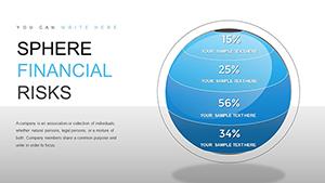 (1004)
 Sphere Financial Risks PowerPoint Charts Template - Master Risk VisualizationID: #PC00859$17.00
 (381)
Positive and Negative Effects of Technology PowerPoint Charts TemplateID: #PC00561$20.00
(381)
Positive and Negative Effects of Technology PowerPoint Charts TemplateID: #PC00561$20.00 (885)
Competitor Analysis PowerPoint Charts Template: Gain the Strategic EdgeID: #PC00539$23.00
(885)
Competitor Analysis PowerPoint Charts Template: Gain the Strategic EdgeID: #PC00539$23.00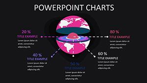 (120)
World Development Indicators PowerPoint Charts TemplateID: #PC00403$15.00
(120)
World Development Indicators PowerPoint Charts TemplateID: #PC00403$15.00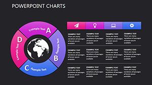 (766)
(766) Social Relationships PowerPoint Charts TemplateID: #PC00377$15.00
 (893)
Breathing Life into Data: Environmental Studies PowerPoint Charts TemplateID: #PC00319$20.00
(893)
Breathing Life into Data: Environmental Studies PowerPoint Charts TemplateID: #PC00319$20.00 (310)
Elevate Standards: Quality Category 3D PowerPoint Charts TemplateID: #PC00317$20.00
(310)
Elevate Standards: Quality Category 3D PowerPoint Charts TemplateID: #PC00317$20.00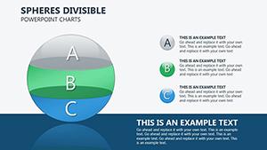 (644)
Spheres Divisible PowerPoint Charts Template PresentationID: #PC00289$22.00
(644)
Spheres Divisible PowerPoint Charts Template PresentationID: #PC00289$22.00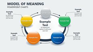 (124)
Model of Meaning PowerPoint Charts Template: Add Depth to DataID: #PC00275$16.00
(124)
Model of Meaning PowerPoint Charts Template: Add Depth to DataID: #PC00275$16.00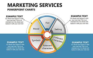 (694)
Marketing Services PowerPoint Charts: Fuel Your Campaigns with Visual FirepowerID: #PC00268$22.00
(694)
Marketing Services PowerPoint Charts: Fuel Your Campaigns with Visual FirepowerID: #PC00268$22.00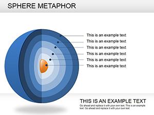 (1189)
Sphere Metaphor PowerPoint Charts: 16 Dynamic SlidesID: #PC00238$23.00
(1189)
Sphere Metaphor PowerPoint Charts: 16 Dynamic SlidesID: #PC00238$23.00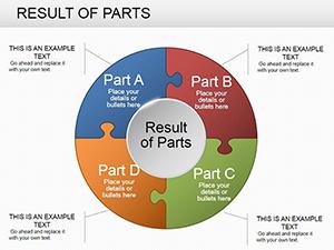 (826)
Result Parts PowerPoint Charts: 24 Data Viz SlidesID: #PC00236$20.00
(826)
Result Parts PowerPoint Charts: 24 Data Viz SlidesID: #PC00236$20.00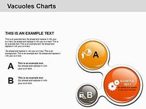 (599)
Dynamic Vacuoles Charts: Science Meets Visual BrillianceID: #PC00207$15.00
(599)
Dynamic Vacuoles Charts: Science Meets Visual BrillianceID: #PC00207$15.00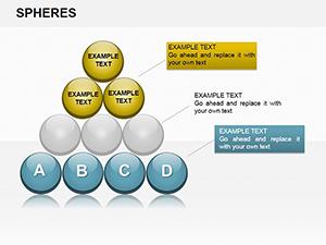 (1173)
Analysis Sphere PowerPoint Charts TemplateID: #PC00194$20.00
(1173)
Analysis Sphere PowerPoint Charts TemplateID: #PC00194$20.00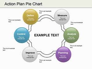 (1093)
Action Plan Pie PowerPoint Charts TemplateID: #PC00187$19.00
(1093)
Action Plan Pie PowerPoint Charts TemplateID: #PC00187$19.00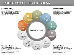 (783)
Process Server Circular PowerPoint ChartsID: #PC00180$22.00
(783)
Process Server Circular PowerPoint ChartsID: #PC00180$22.00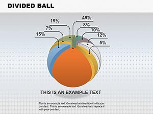 (248)
Divided Ball PowerPoint Charts TemplateID: #PC00149$26.99
(248)
Divided Ball PowerPoint Charts TemplateID: #PC00149$26.99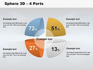 (220)
3D Sphere 4 Parts PowerPoint Charts: Segment with StyleID: #PC00132$20.00
(220)
3D Sphere 4 Parts PowerPoint Charts: Segment with StyleID: #PC00132$20.00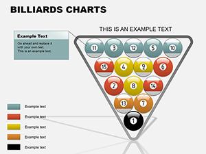 (99)
Billiards PowerPoint Charts TemplateID: #PC00087$18.00
(99)
Billiards PowerPoint Charts TemplateID: #PC00087$18.00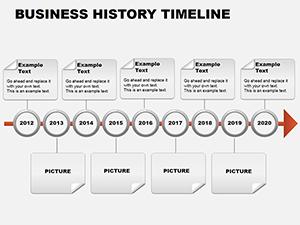 (688)
Business History Timeline PowerPoint ChartsID: #PC00084$14.00
(688)
Business History Timeline PowerPoint ChartsID: #PC00084$14.00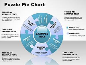 (669)
Presentations with Puzzle Pie PowerPoint Chart TemplateID: #PC00054$26.00
(669)
Presentations with Puzzle Pie PowerPoint Chart TemplateID: #PC00054$26.00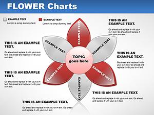 (162)
Flower Chart PowerPoint TemplateID: #PC00048$18.00
(162)
Flower Chart PowerPoint TemplateID: #PC00048$18.00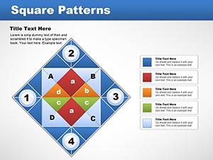 (565)
Matrix Square Patterns PowerPoint Charts TemplateID: #PC00043$15.00
(565)
Matrix Square Patterns PowerPoint Charts TemplateID: #PC00043$15.00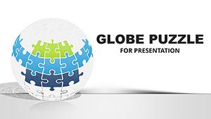 (780)
Globe Puzzle PowerPoint Charts Template for Global Architecture VisionsID: #PC00026$26.00
(780)
Globe Puzzle PowerPoint Charts Template for Global Architecture VisionsID: #PC00026$26.00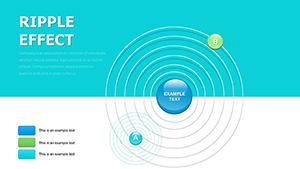 (542)
Infographic PowerPoint Template Ripple Effects - 22 Editable SlidesID: #PC00016$15.00
(542)
Infographic PowerPoint Template Ripple Effects - 22 Editable SlidesID: #PC00016$15.00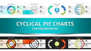 (565)
Cyclical Pie Charts Template for PowerPoint - 29 Editable SlidesID: #PC00013$14.00
(565)
Cyclical Pie Charts Template for PowerPoint - 29 Editable SlidesID: #PC00013$14.00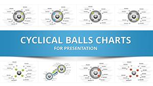 (395)
Cyclical Balls PPT Charts Template - 31 SlidesID: #PC00012$10.00
(395)
Cyclical Balls PPT Charts Template - 31 SlidesID: #PC00012$10.00 (343)
Interlocking Puzzle Pie Charts PPT TemplateID: #PC00007$18.00
(343)
Interlocking Puzzle Pie Charts PPT TemplateID: #PC00007$18.00
The value of sphere charts for turning complex data into instant understanding
Visitors want to know how spherical designs make hierarchies and networks readable at a glance. Layered and segmented spheres show multi-level systems or market share proportions without forcing the audience to decode separate charts.
Common doubts about 3D charts and how these templates address them
Many hesitate because 3D elements can look gimmicky or break on export. These templates use controlled gradients and connected spheres that remain professional even when projected in a boardroom.
Four real-world applications across industries
A marketing manager presents customer journey stages using connected spheres. The pre-linked Excel data updates conversion funnels automatically, saving the last-minute scramble before the client meeting.
An academic lecturer models molecular structures or organizational theories with layered spheres. Students grasp relationships immediately because each level has consistent depth and labeling.
A project manager illustrates workflows and team dependencies for stakeholders. Gradient spheres show progressions from planning to delivery without misaligned arrows.
A financial analyst visualizes risk distribution with segmented spheres. Positive and negative effects appear side-by-side, making the strategic recommendation obvious in one slide.
Health and wellness PowerPoint templates complement when wellness metrics need sphere visualization. For creative documents, explore art and entertainment Word templates.
Why building sphere charts manually wastes critical thinking time
From scratch you choose 3D rotation angles, gradient directions, connection line weights, and whether the sphere fits the slide master. Those decisions multiply across a 60-slide deck and leave no energy for the actual analysis.
Workflow benefits for recurring business reporting
Reusable sphere layouts and standardized chart formatting keep quarterly reports consistent across departments. Update the Excel source once and every connected sphere refreshes.
Non-obvious editing techniques
- Link charts to external Excel files so live data updates propagate through all sphere variants.
- Use the selection pane to group spheres before applying animations that reveal layers one at a time.
Technical tip for PowerPoint
Keep the 16:9 aspect ratio when exporting to PDF; 3D spheres render cleanly only when the slide master matches the final output resolution. Avoid embedding large datasets to keep file size manageable.
What makes this collection different
Designed purely for corporate data storytelling, these sphere charts offer editing freedom without decorative extras that dilute the message.
Ready to visualize your next dataset? Download the chart template that matches your story.
FAQ
What file format are the templates provided in?
All files are PPTX and work natively in Microsoft PowerPoint 2016 and newer. The sphere charts use standard PowerPoint shapes and effects so no additional plugins are required.
Is commercial use permitted and can my team use them?
Commercial use is allowed for internal reports and client presentations. Each team member should download their own copy. The license prohibits reselling the templates as-is.
How do I update the data inside the sphere charts?
Right-click any chart, choose Edit Data, and link to your Excel file. Changes propagate instantly across all connected or segmented spheres while preserving your brand colors.
What PowerPoint versions are supported?
Full support begins with PowerPoint 2016 and continues through 2026. 3D effects and gradients render consistently; older versions may require manual refresh of linked data.
Do the templates work for both 4:3 and 16:9 presentations?
All layouts default to 16:9 but can be converted to 4:3 via Design > Slide Size. Sphere proportions stay balanced because the master uses relative positioning rather than fixed pixel values.