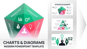
Puzzles PowerPoint Charts
Puzzle PowerPoint chart templates let you display numbers while simultaneously showing how each metric connects to the bigger strategy. A financial analyst comparing quarterly results or a marketing lead presenting campaign synergies can drop data into the pre-built puzzle segments and keep the audience focused on relationships, not raw figures.
When the board asks how individual KPIs contribute to overall success, these charts answer before the first question is raised. The interlocking layout carries the logic so your explanation stays short and memorable.
This collection focuses on interconnected data stories. Download any file and the chart placeholders are ready for your numbers.
 (8)
(8) Conceptual Plan PowerPoint Charts - 29 Strategic Framework Slides for Executive Presentations | Fully EditableID: #PC01111$18.00
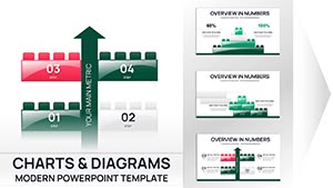 (16)
(16) 42-Slide Building Blocks PowerPoint Chart Template - Instant Download for Investor PresentationsID: #PC01107$18.00
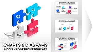 (17)
3D Puzzle Analysis Charts PowerPoint TemplateID: #PC01078$20.00
(17)
3D Puzzle Analysis Charts PowerPoint TemplateID: #PC01078$20.00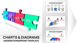 (13)
3D Puzzle Charts Template for PowerPoint - 48 Editable SlidesID: #PC01077$25.00
(13)
3D Puzzle Charts Template for PowerPoint - 48 Editable SlidesID: #PC01077$25.00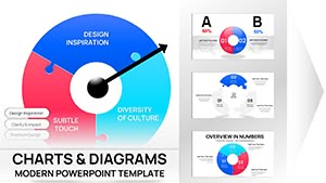 (8)
Process Puzzle Pie PowerPoint Charts TemplateID: #PC01074$15.00
(8)
Process Puzzle Pie PowerPoint Charts TemplateID: #PC01074$15.00 (10)
Dynamic Puzzle Pie Charts PowerPoint TemplateID: #PC01073$20.00
(10)
Dynamic Puzzle Pie Charts PowerPoint TemplateID: #PC01073$20.00 (16)
3D Puzzle Pie Charts Template for PowerPoint PresentationsID: #PC01072$20.00
(16)
3D Puzzle Pie Charts Template for PowerPoint PresentationsID: #PC01072$20.00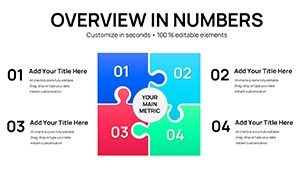 (15)
Business Puzzle Pieces PowerPoint Charts TemplateID: #PC01068$18.00
(15)
Business Puzzle Pieces PowerPoint Charts TemplateID: #PC01068$18.00 (1190)
 Burning Discounts PowerPoint Charts TemplateID: #PC01043$20.00
 (350)
(350) Gear Financial Risks PowerPoint Charts Template - Gear Up for ClarityID: #PC00858$18.00
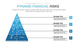 (649)
Pyramid Hierarchy Diagrams - Editable PPTX | ImagineLayoutID: #PC00857$16.00
(649)
Pyramid Hierarchy Diagrams - Editable PPTX | ImagineLayoutID: #PC00857$16.00 (414)
Business Puzzles with Answers PowerPoint Charts TemplateID: #PC00851$18.00
(414)
Business Puzzles with Answers PowerPoint Charts TemplateID: #PC00851$18.00 (1118)
Dollars Puzzles 3D PowerPoint Template: Decode Currency ComplexitiesID: #PC00837$13.00
(1118)
Dollars Puzzles 3D PowerPoint Template: Decode Currency ComplexitiesID: #PC00837$13.00 (790)
2D Puzzle PowerPoint Charts Template: Transform Data into Engaging StoriesID: #PC00817$18.00
(790)
2D Puzzle PowerPoint Charts Template: Transform Data into Engaging StoriesID: #PC00817$18.00 (794)
Puzzles for Analytics Interviews PowerPoint Charts TemplateID: #PC00812$20.00
(794)
Puzzles for Analytics Interviews PowerPoint Charts TemplateID: #PC00812$20.00 (255)
Affiliate Marketing PowerPoint Charts TemplateID: #PC00736$22.00
(255)
Affiliate Marketing PowerPoint Charts TemplateID: #PC00736$22.00 (426)
SEO Infographic PowerPoint Charts TemplateID: #PC00735$15.00
(426)
SEO Infographic PowerPoint Charts TemplateID: #PC00735$15.00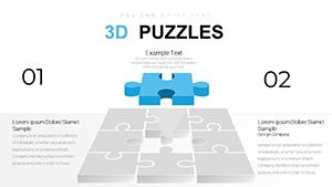 (625)
3D Matrix Puzzle PowerPoint Charts Template ProID: #PC00734$22.00
(625)
3D Matrix Puzzle PowerPoint Charts Template ProID: #PC00734$22.00 (1010)
Accumulation Infographic PowerPoint Charts TemplateID: #PC00721$15.00
(1010)
Accumulation Infographic PowerPoint Charts TemplateID: #PC00721$15.00 (1032)
Circle Puzzle PowerPoint Charts TemplateID: #PC00704$15.00
(1032)
Circle Puzzle PowerPoint Charts TemplateID: #PC00704$15.00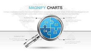 (1038)
Analysis Magnifying Glass PowerPoint Charts TemplateID: #PC00688$20.00
(1038)
Analysis Magnifying Glass PowerPoint Charts TemplateID: #PC00688$20.00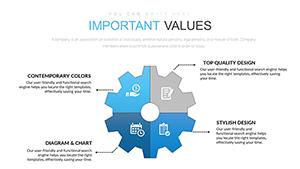 (1068)
4 Sector Gears PowerPoint Charts: Gear Up for SuccessID: #PC00666$18.00
(1068)
4 Sector Gears PowerPoint Charts: Gear Up for SuccessID: #PC00666$18.00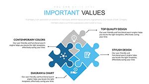 (334)
Important Rhombus Puzzle PowerPoint Charts - Presentation TemplateID: #PC00665$18.00
(334)
Important Rhombus Puzzle PowerPoint Charts - Presentation TemplateID: #PC00665$18.00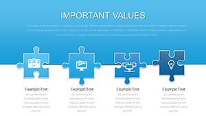 (999)
Editable Puzzles PowerPoint Charts Template for Engaging SlidesID: #PC00664$18.00
(999)
Editable Puzzles PowerPoint Charts Template for Engaging SlidesID: #PC00664$18.00 (696)
Gadgets and Software PowerPoint Charts Template: Download PPTXID: #PC00599$25.00
(696)
Gadgets and Software PowerPoint Charts Template: Download PPTXID: #PC00599$25.00 (703)
Maslow Needs Pyramid PowerPoint Charts TemplateID: #PC00598$23.00
(703)
Maslow Needs Pyramid PowerPoint Charts TemplateID: #PC00598$23.00 (1169)
Ideas Work Principles PowerPoint Charts - Presentation TemplateID: #PC00585$18.00
(1169)
Ideas Work Principles PowerPoint Charts - Presentation TemplateID: #PC00585$18.00 (120)
Goals and Opportunities PowerPoint Charts: Chart Your Path to AchievementID: #PC00564$17.00
(120)
Goals and Opportunities PowerPoint Charts: Chart Your Path to AchievementID: #PC00564$17.00 (266)
Sphere of Influence PowerPoint Charts: Map Networks and ImpactID: #PC00562$20.00
(266)
Sphere of Influence PowerPoint Charts: Map Networks and ImpactID: #PC00562$20.00 (545)
Quality Control PowerPoint Charts Template: Precision in Every PresentationID: #PC00560$25.00
(545)
Quality Control PowerPoint Charts Template: Precision in Every PresentationID: #PC00560$25.00 (381)
Growth Prospects PowerPoint Charts Template: Propel Your Business ForwardID: #PC00559$23.00
(381)
Growth Prospects PowerPoint Charts Template: Propel Your Business ForwardID: #PC00559$23.00 (1196)
Ignite Your Business Ideas with Versatile PowerPoint ChartsID: #PC00546$18.00
(1196)
Ignite Your Business Ideas with Versatile PowerPoint ChartsID: #PC00546$18.00 (327)
Creative Infographic PowerPoint Charts TemplateID: #PC00513$17.00
(327)
Creative Infographic PowerPoint Charts TemplateID: #PC00513$17.00
How puzzle charts turn data into stories of interconnection
Standard bar charts show isolated numbers. Puzzle charts add the missing layer: each segment visibly locks into the next, making it clear that one department`s result directly affects another. The structure itself explains causality without extra text.
Common doubts before downloading puzzle chart templates
Will the puzzle shapes distort my data labels? Will the 3D effect survive PDF export? Teams hesitate because they have seen decorative charts fall apart when real numbers are added. These files were built the other way around: the data drives the puzzle, not the other way around.
Real scenarios from finance and strategy roles
A CFO presents budget allocation across divisions. Each puzzle piece is a department; the fill percentage shows spend against target. The board sees instantly which areas are over or under and why they interconnect.
A strategy director maps market segments for the leadership offsite. The puzzle pie chart shows overlap between customer groups; swapping one data point instantly updates the visual relationships for the group discussion.
An operations analyst reviews supply-chain efficiency. The layered puzzle chart reveals where delays in one node cascade to the next; the team identifies the single fix that unlocks the whole flow.
A product manager tracks feature adoption. The puzzle segments represent user cohorts; the chart shows how early adopters influence the next wave, giving the roadmap meeting a clear visual narrative.
Technical note on pie and puzzle chart behavior in PowerPoint
When you edit the underlying Excel link, the puzzle segments resize automatically because each piece is built as a data-driven shape group rather than a static image. Keep the group intact and the interlocking tabs stay aligned even after major data changes. This prevents the common problem of charts breaking apart during last-minute updates.
What makes this puzzles collection stand out
The charts were designed for corporate use first. Data labels remain readable at every fill level, colors follow theme rules, and the puzzle effect never overrides the numbers. You can remove the puzzle styling entirely and still have a clean professional chart if the audience prefers.
If your deck needs simpler process flows, look at our general PowerPoint diagram templates. For pure financial visuals, the PowerPoint chart templates offer additional styles. Cross-platform teams often move to Keynote templates for similar logic.
Choose the chart that fits your current data set and start replacing numbers.
Frequently Asked Questions
Are these puzzles PowerPoint chart templates compatible with older versions of Microsoft PowerPoint?
The templates are saved in PPTX format and tested to open cleanly in PowerPoint 2013 and all newer versions including Microsoft 365. In older 2010 versions, some advanced shape effects or custom animations may need manual adjustment, but the core editable charts and slide master layouts remain fully functional. If you encounter any rendering issue with puzzle tabs, simply select the group and reset the shape styles using the format tab. Most users on corporate machines report zero changes needed.
Can I share these puzzle chart templates with my team or use them for client presentations?
The license included with every download permits unlimited editing and use in both internal company presentations and external client deliverables. There is no limit on the number of users within your organization, and you can distribute the edited decks as PDF exports or live presentations without additional fees. The only restriction is against reselling the original template files themselves as standalone products. This setup works for consulting firms and internal strategy teams alike.
Do the templates support 16:9 aspect ratio, and what happens if I need to switch to 4:3?
All templates are designed in the standard 16:9 widescreen format that matches modern projectors and screens. To change to 4:3, go to Design tab, Slide Size, and select the option; the slide master will scale most elements proportionally because shapes are vector-based. For any text overflow in puzzle segments, simply adjust the font size or column widths using the built-in placeholders. The change takes under thirty seconds and preserves the visual hierarchy.
Will the charts work if I export the presentation to Google Slides?
While native editing is optimized for PowerPoint, you can upload the PPTX file to Google Slides and the basic shapes, text, and colors will transfer accurately. Complex grouped objects or custom puzzle tabs may require minor regrouping after import. For best results, finalize edits in PowerPoint before exporting to PDF for sharing via Google Drive. The embedded fonts remain intact in the PDF route.
How do I update colors across the entire deck using the slide master?
Open the template, go to View > Slide Master, and modify the color scheme or theme colors at the top level. Because every chart uses theme colors rather than hard-coded fills, your changes apply instantly to all slides and all placeholders. This is especially useful for branding updates across multiple presentations. The process takes one minute and keeps every puzzle piece consistent.