Professional Venn Diagram PowerPoint Template | Editable Charts for Business Presentations


Type: PowerPoint Charts template
Category: Venn
Sources Available: .pptx
Product ID: PC00786
Template incl.: 34 editable slides
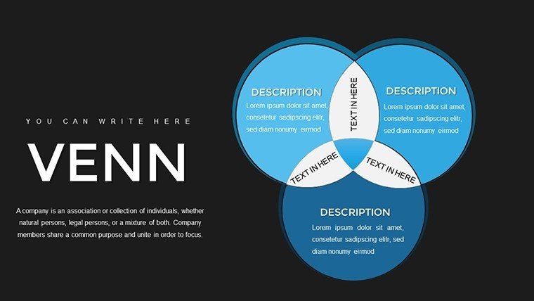
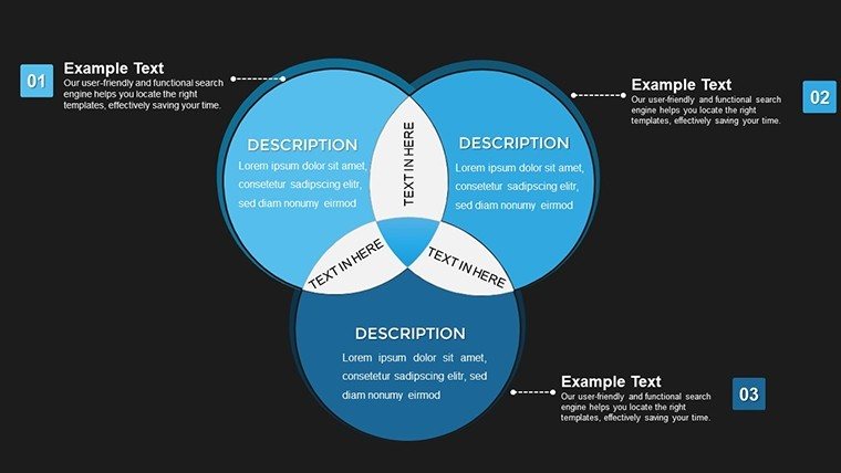
Professional Venn Diagram PowerPoint Template helps you communicate overlapping relationships, shared responsibilities, and intersecting data with clarity that executives and stakeholders expect. With 34 fully editable slides, this template is built for board meetings, investor presentations, and internal strategy sessions where visual precision directly impacts decision quality. Whether you're mapping market overlaps, clarifying team responsibilities, or explaining conceptual frameworks, this template transforms abstract relationships into concrete visuals that drive understanding and action.
Why This Template Matters in Professional Settings
In boardrooms and strategy sessions, unclear visuals cost time and credibility. This Venn diagram template solves the communication challenge that arises when you need to show how two or more concepts overlap, intersect, or share common ground. Executives interpret these diagrams as relationship maps - the intersections represent priority areas, shared resources, or alignment opportunities. The template's professional design ensures your data is presented with the clarity expected in high-stakes environments where decisions are made quickly.
Key Template Features for Business Presentations
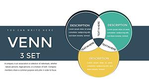
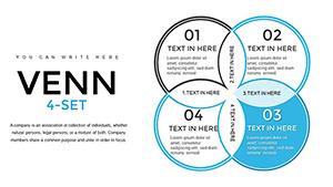
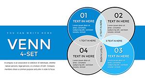
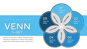
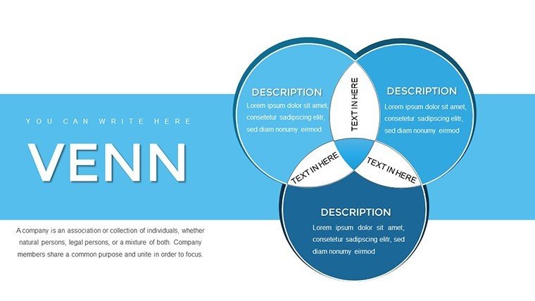
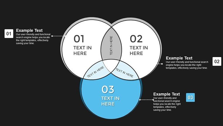
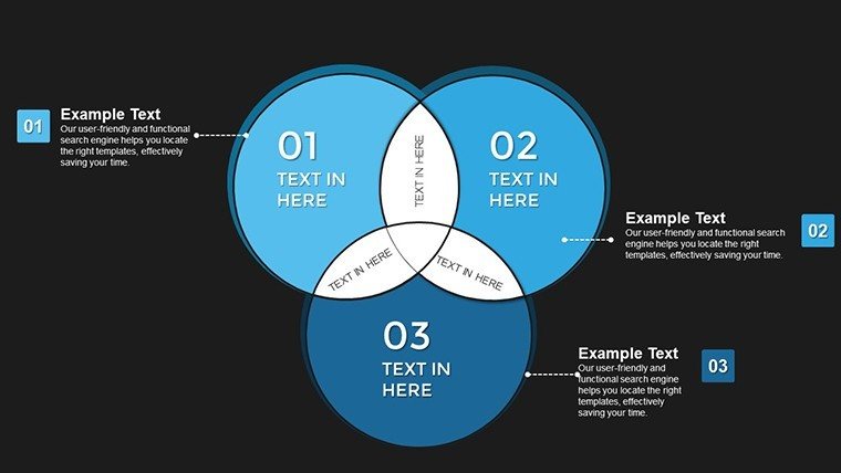
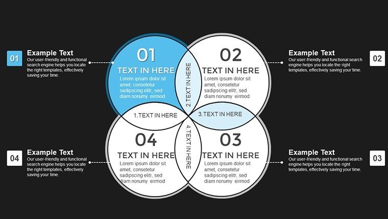
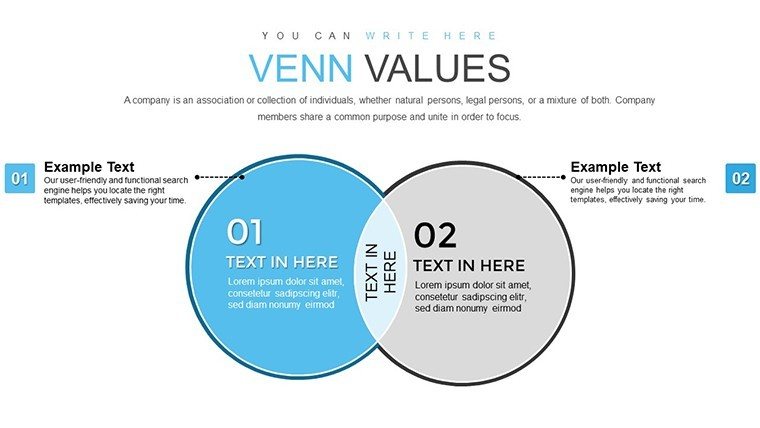
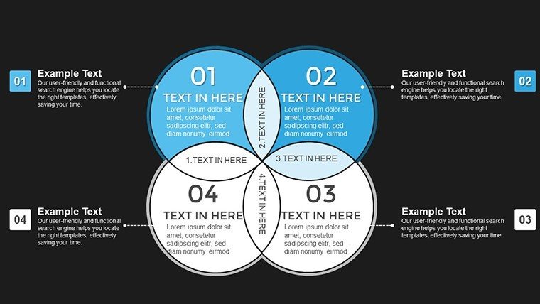
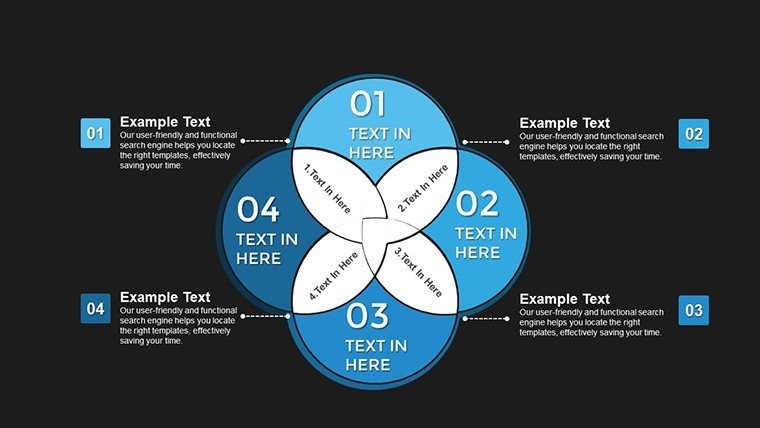
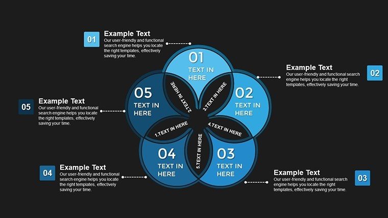
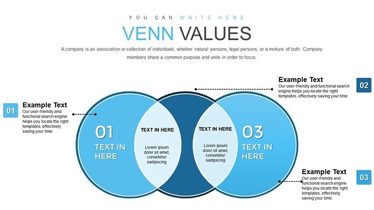
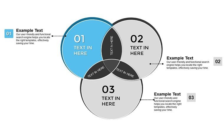
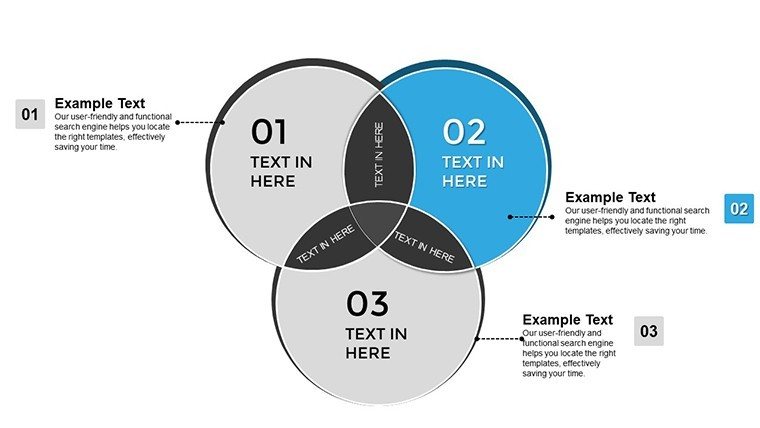
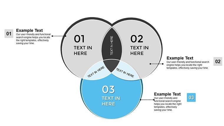
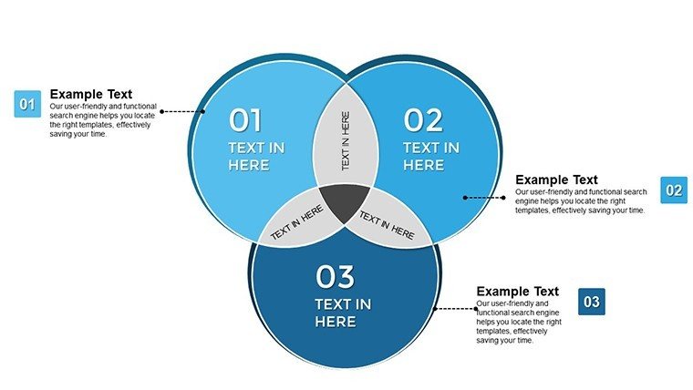
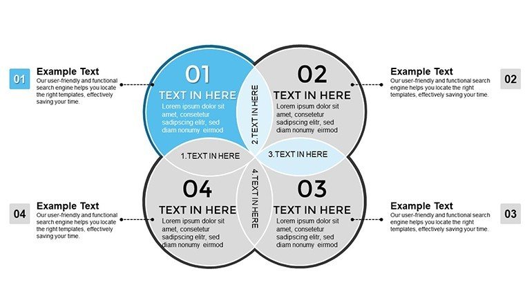
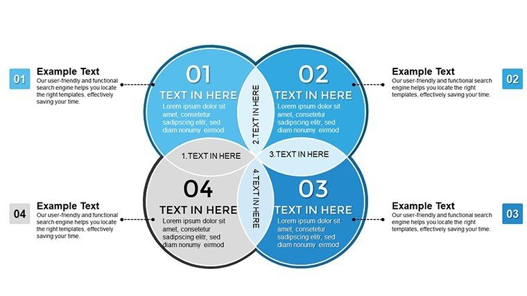
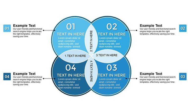
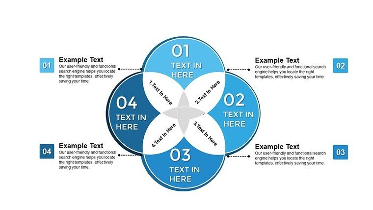
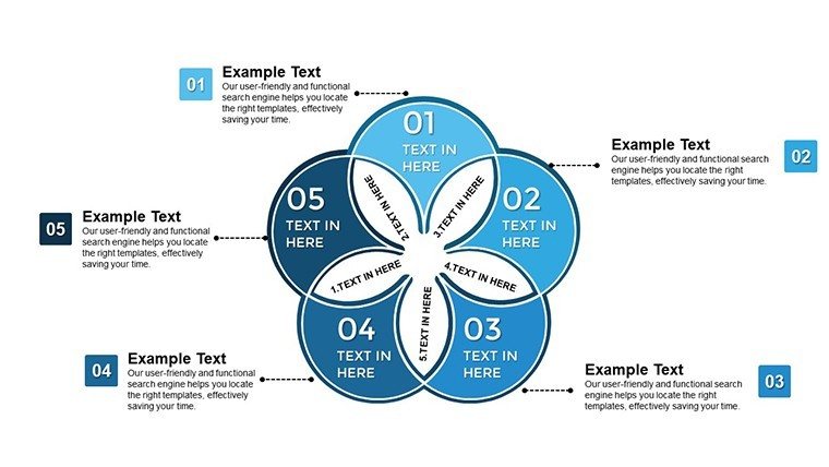
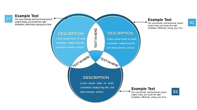
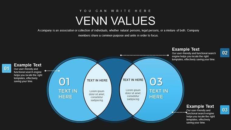
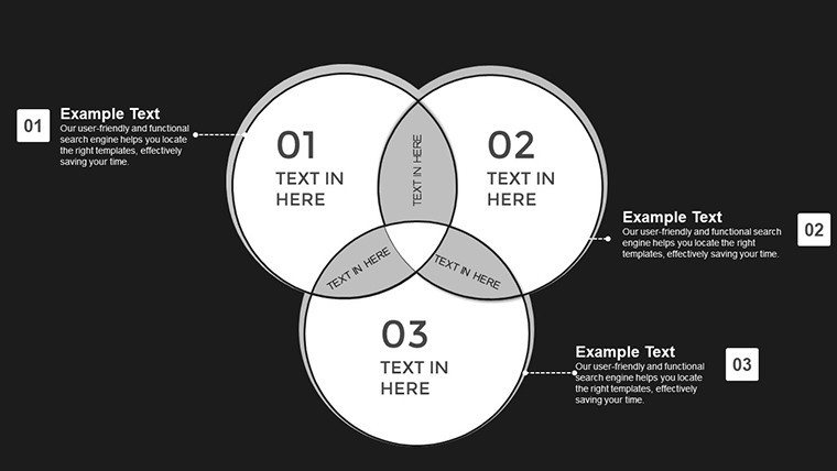
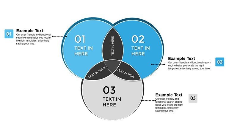
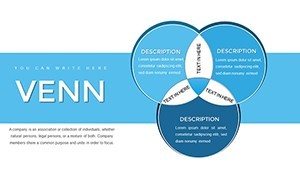
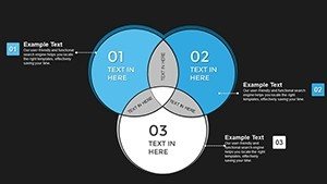
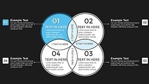
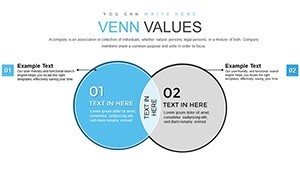
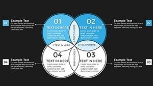
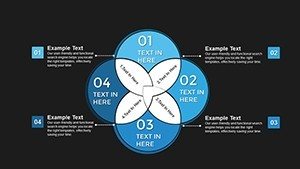
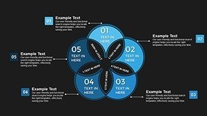
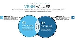
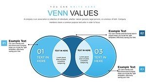
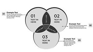
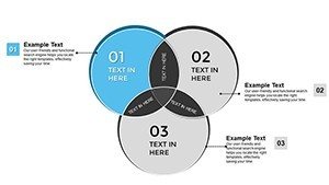
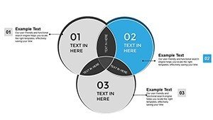
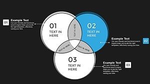
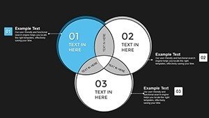
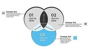
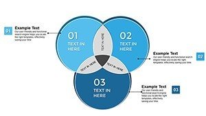
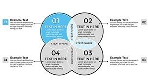
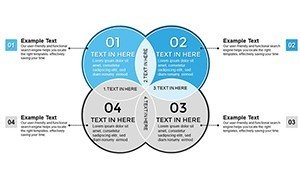
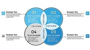
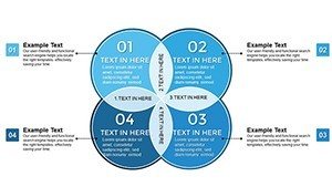
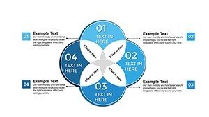
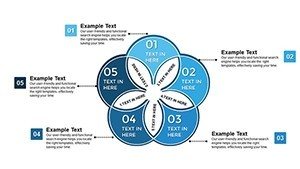
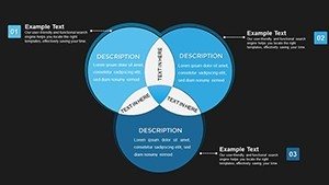
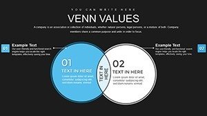
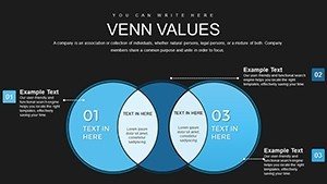
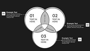
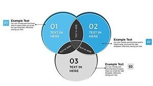
- 34 Editable Slides: Multiple layout variations including 2-circle, 3-circle, and expanded Venn configurations
- Customizable Circle Elements: Easily resize, recolor, and position circles to match your data and brand identity
- Professional Color Palette: Pre-designed color schemes optimized for readability in conference rooms and on screens
- Text Annotation Zones: Formatted text boxes positioned for clear labeling of sets and intersections
- Compatible Formats: Works seamlessly with PowerPoint 2016+, Keynote, and Google Slides for flexible collaboration
When to Use This Venn Diagram Template
Use this template when your presentation objective requires showing overlaps, commonalities, or intersections between two or more concepts. Marketing teams use it to visualize overlapping customer segments and identify cross-sell opportunities. Project managers clarify shared responsibilities between departments to prevent duplication and gaps. Strategy consultants map competitive advantages to show where clients have unique positioning. Educators simplify complex theoretical frameworks by showing how concepts relate. Each use case benefits from the template's ability to make abstract relationships visually concrete and immediately understandable.
Professional Integration Workflow
Experienced presenters follow this streamlined process when preparing Venn diagrams for executive audiences:
- Define Your Sets: Clearly identify the 2-3 categories you're comparing before opening PowerPoint
- Select Appropriate Layout: Choose the slide variant that matches your data structure (2-set, 3-set, or weighted Venn)
- Apply Brand Styling: Customize colors to match corporate guidelines, adjust circle sizes to reflect data proportions or priority levels
- Annotate Strategically: Add brief, specific labels in intersection zones - avoid generic descriptions
- Test Readability: Review on a projector or large monitor to ensure text and colors are visible from the back of the room
Real Presentation Scenarios
During a quarterly business review, a marketing director used this template to show overlapping demographics across three customer segments. The visual revealed an underserved intersection representing 18% of potential revenue, leading to immediate campaign reallocation. In a project kickoff meeting, an operations manager mapped overlapping responsibilities between IT, HR, and Finance teams. Identifying the gaps prevented delays that had plagued previous initiatives. A consultant presenting to a healthcare client used the template to visualize patient care overlaps across three service lines, uncovering coordination inefficiencies that became the foundation for process improvements.
Scenario Comparison: Contexts and Results
| Use Case | Audience Type | Outcome |
|---|---|---|
| Board Meeting Strategy Review | C-Suite, Board Members | Clear visualization of strategic initiative overlaps and priorities |
| Investor Presentation | Venture Capitalists, Angel Investors | Demonstrated market positioning and competitive advantages |
| Internal Training Session | Staff, Department Heads | Simplified understanding of conceptual frameworks and relationships |
| Client Strategy Workshop | Client Executives, Consultants | Identified process inefficiencies and collaboration opportunities |
Industry Applications
Consulting & Advisory: Map client capabilities, market opportunities, and competitive threats in strategic planning engagements.Marketing & Sales: Visualize customer segment overlaps, identify cross-sell opportunities, and target messaging strategies.Product Development: Show feature overlaps across product lines, clarify roadmap priorities, and communicate platform strategies.Education & Training: Simplify complex theoretical concepts by showing relationships between frameworks, models, or disciplines.Healthcare: Illustrate care pathway intersections, patient population overlaps, and service line coordination opportunities.
Customization Best Practices
To customize this template effectively for corporate presentations, open it in PowerPoint and select any circle to access formatting options. Change fill colors using your brand palette - most executives expect consistent visual branding. Adjust circle sizes to reflect relative importance, market share, or priority levels: larger circles naturally draw more attention. Use transparency (40-60% opacity) strategically to show overlapping zones clearly without obscuring labels. Add specific metrics or brief insights in intersection zones rather than generic labels. Most professionals spend 10-15 minutes adapting the template to their content, ensuring it looks polished and on-brand before presenting.
Transform complex relationships into executive-ready visuals. Download this template now and start editing instantly.
Frequently Asked Questions
When is a Venn diagram the right choice versus other chart types?
Use a Venn diagram when your presentation focus is on overlaps, intersections, or shared characteristics between 2-3 categories. It's ideal for showing commonalities, shared responsibilities, or market segment overlaps. Avoid it for sequential data (use timeline or flow charts), hierarchical structures (use org charts or tree diagrams), or purely quantitative comparisons (use bar or column charts). Venn diagrams excel when the story is about what categories have in common, not just how they differ.
How do I edit circles and labels to fit my specific data?
Click any circle to select it, then use PowerPoint's Format Shape menu to change colors, adjust size, or modify position. Text boxes are fully editable - simply click and type to replace placeholder content with your labels and data. To maintain visual balance, resize circles proportionally by holding Shift while dragging corner handles. For professional results, keep labels brief (2-5 words), use consistent font sizes, and ensure adequate contrast between text and background colors.
How do executives typically interpret Venn diagrams in presentations?
Executives view intersections as priority areas, shared resources, or alignment opportunities requiring action or decision. They expect the diagram to clarify relationships quickly - typically within 10-15 seconds of seeing the slide. Present your Venn by first explaining what each circle represents, then highlighting the most significant intersections with supporting data or insights. Keep intersection labels specific and actionable. Avoid cluttering the diagram with too many overlapping zones; if you have more than 3-4 meaningful intersections, consider using multiple simplified slides.
Can this template work for both internal and client-facing presentations?
Yes, the template is designed for versatility. For internal use, focus on operational details and process intersections. For client or investor presentations, emphasize market positioning, competitive advantages, or strategic alignment. Adjust the level of detail in labels and annotations based on your audience's familiarity with the content. Internal audiences may appreciate more granular data in intersections, while external stakeholders typically prefer high-level insights with supporting details available in appendix slides.
What's the most common mistake when using Venn diagrams in business presentations?
The most common mistake is overloading the diagram with too many sets or intersections, which creates confusion instead of clarity. Stick to 2-3 circles maximum for most executive presentations. Another frequent error is using vague labels like "Product A" without context - always provide specific, meaningful names. Finally, many presenters fail to annotate intersections with actual insights or data, leaving audiences to guess what the overlaps mean. Always explicitly state what each intersection represents and why it matters.