North America PowerPoint Maps
This collection includes North America map slides built for teams that need to show geography clearly without overdesign. You get layouts covering the US, Canada, and Mexico with editable regions, labels, and color groups that hold up in real decks.
If you`re a sales lead preparing a quarterly territory review or a strategy manager mapping expansion into new states, this format solves one thing charts can`t: location context at a glance. When I last used a similar map for a board update, the conversation shifted from "what are the numbers" to "where exactly is this happening" within seconds. That`s the point. The column alignment here actually saves you a lot of pain.
Pick the map layout that matches your regions and drop in your data. Done.
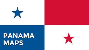 (172)
(172) Panama PowerPoint Maps: Template for Professional PresentationsID: #PM00199$48.00
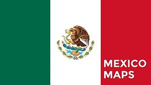 (552)
(552) Transform Your Presentations with the Editable Mexico Map PowerPoint TemplateID: #PM00195$45.00
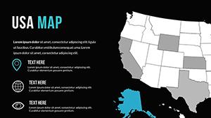 (613)
PowerPoint World Maps TemplateID: #PM00172$30.00
(613)
PowerPoint World Maps TemplateID: #PM00172$30.00 (681)
(681) World Country Maps PowerPoint Template: Unlock Global InsightsID: #PM00169$26.00
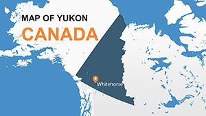 (149)
Yukon Canada Maps: PowerPoint Template DownloadID: #PM00156$8.00
(149)
Yukon Canada Maps: PowerPoint Template DownloadID: #PM00156$8.00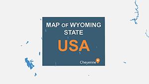 (1118)
Wyoming PowerPoint Maps: Customizable PPT SlidesID: #PM00155$13.00
(1118)
Wyoming PowerPoint Maps: Customizable PPT SlidesID: #PM00155$13.00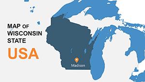 (1013)
Wisconsin PowerPoint Maps: Editable TemplatesID: #PM00154$15.00
(1013)
Wisconsin PowerPoint Maps: Editable TemplatesID: #PM00154$15.00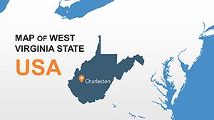 (515)
Chart West Virginia's Terrain with Expert PowerPoint MapsID: #PM00153$15.00
(515)
Chart West Virginia's Terrain with Expert PowerPoint MapsID: #PM00153$15.00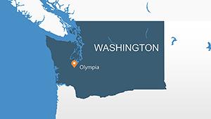 (120)
Master Washington State Visuals with This PowerPoint Maps TemplateID: #PM00152$15.00
(120)
Master Washington State Visuals with This PowerPoint Maps TemplateID: #PM00152$15.00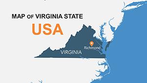 (429)
(429) Unlock Precision with the Virginia USA PowerPoint Maps TemplateID: #PM00151$15.00
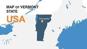 (1073)
Vermont PowerPoint Maps Template: Green Design NarrativesID: #PM00150$15.00
(1073)
Vermont PowerPoint Maps Template: Green Design NarrativesID: #PM00150$15.00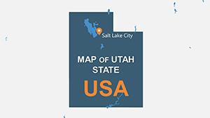 (45)
Utah PowerPoint Maps Template: Precision for Western DesignsID: #PM00149$15.00
(45)
Utah PowerPoint Maps Template: Precision for Western DesignsID: #PM00149$15.00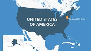 (916)
USA Counties PowerPoint Map Template - Fully Editable | Instant DownloadID: #PM00148$20.00
(916)
USA Counties PowerPoint Map Template - Fully Editable | Instant DownloadID: #PM00148$20.00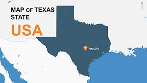 (312)
Texas PowerPoint Maps & Charts Template - Customize EasilyID: #PM00147$15.00
(312)
Texas PowerPoint Maps & Charts Template - Customize EasilyID: #PM00147$15.00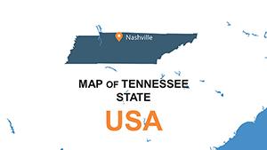 (213)
Tennessee PowerPoint Maps: Discover the Volunteer State's Secrets Through Custom VisualsID: #PM00146$15.00
(213)
Tennessee PowerPoint Maps: Discover the Volunteer State's Secrets Through Custom VisualsID: #PM00146$15.00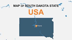 (651)
Pro South Dakota PowerPoint Maps: Craft Compelling Narratives with Mount Rushmore PrecisionID: #PM00145$14.00
(651)
Pro South Dakota PowerPoint Maps: Craft Compelling Narratives with Mount Rushmore PrecisionID: #PM00145$14.00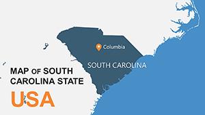 (213)
Custom South Carolina PowerPoint Maps: Elevate Your Storytelling with Palmetto State PrecisionID: #PM00144$15.00
(213)
Custom South Carolina PowerPoint Maps: Elevate Your Storytelling with Palmetto State PrecisionID: #PM00144$15.00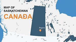 (138)
Saskatchewan Canada PowerPoint Maps: Prairie Power VisualizedID: #PM00143$8.00
(138)
Saskatchewan Canada PowerPoint Maps: Prairie Power VisualizedID: #PM00143$8.00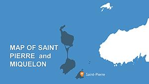 (158)
Saint Pierre and Miquelon PowerPoint Maps: Islands of InsightID: #PM00142$6.00
(158)
Saint Pierre and Miquelon PowerPoint Maps: Islands of InsightID: #PM00142$6.00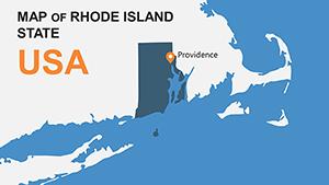 (617)
Rhode Island USA PowerPoint Maps: Charting Narratives with PrecisionID: #PM00141$8.00
(617)
Rhode Island USA PowerPoint Maps: Charting Narratives with PrecisionID: #PM00141$8.00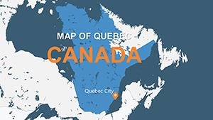 (975)
Quebec Canada PowerPoint Maps Template: Unlock Geographical StorytellingID: #PM00140$6.00
(975)
Quebec Canada PowerPoint Maps Template: Unlock Geographical StorytellingID: #PM00140$6.00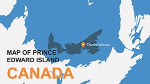 (1018)
Prince Edward Island PPT Maps Template: Customize & ExploreID: #PM00139$7.00
(1018)
Prince Edward Island PPT Maps Template: Customize & ExploreID: #PM00139$7.00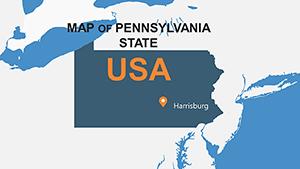 (571)
Editable Pennsylvania Maps PPT Template - Download NowID: #PM00138$14.00
(571)
Editable Pennsylvania Maps PPT Template - Download NowID: #PM00138$14.00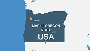 (1012)
Oregon USA PowerPoint Maps Template: Navigate the Beaver State's Diverse TerrainsID: #PM00137$15.00
(1012)
Oregon USA PowerPoint Maps Template: Navigate the Beaver State's Diverse TerrainsID: #PM00137$15.00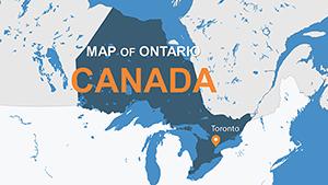 (696)
Ontario Canada PowerPoint Maps Template: Infuse Canadian Precision into Your SlidesID: #PM00136$12.00
(696)
Ontario Canada PowerPoint Maps Template: Infuse Canadian Precision into Your SlidesID: #PM00136$12.00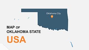 (821)
Oklahoma PowerPoint Map Template: Chart the Sooner State's Geographic StoriesID: #PM00135$15.00
(821)
Oklahoma PowerPoint Map Template: Chart the Sooner State's Geographic StoriesID: #PM00135$15.00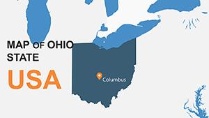 (1136)
Ohio PowerPoint Map Template: Visualize Regional InsightsID: #PM00134$15.00
(1136)
Ohio PowerPoint Map Template: Visualize Regional InsightsID: #PM00134$15.00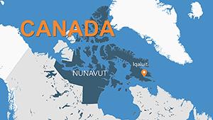 (19)
Nunavut PowerPoint Maps: Navigating the Canadian ArcticID: #PM00133$12.00
(19)
Nunavut PowerPoint Maps: Navigating the Canadian ArcticID: #PM00133$12.00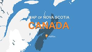 (853)
Nova Scotia PowerPoint Maps: Charting Canada's Maritime GemID: #PM00132$10.00
(853)
Nova Scotia PowerPoint Maps: Charting Canada's Maritime GemID: #PM00132$10.00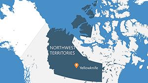 (1014)
Northwest Territories PowerPoint Maps: Northern Frontier DesignsID: #PM00131$12.00
(1014)
Northwest Territories PowerPoint Maps: Northern Frontier DesignsID: #PM00131$12.00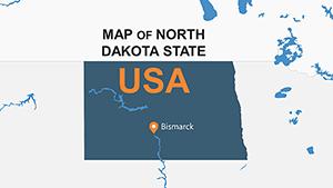 (605)
USA North Dakota PowerPoint Maps: Navigate the Heartland HorizonID: #PM00130$15.00
(605)
USA North Dakota PowerPoint Maps: Navigate the Heartland HorizonID: #PM00130$15.00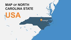 (270)
North Carolina PowerPoint Maps: Chart the Tar Heel TrailID: #PM00129$15.00
(270)
North Carolina PowerPoint Maps: Chart the Tar Heel TrailID: #PM00129$15.00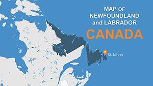 (1047)
Newfoundland and Labrador PowerPoint Maps: Coastal Design InspirationID: #PM00128$10.00
(1047)
Newfoundland and Labrador PowerPoint Maps: Coastal Design InspirationID: #PM00128$10.00
Why a regional map slide works when tables and charts fall short
Maps answer a different question. Not how much. Not how fast. Where. That sounds obvious, but in practice it changes the discussion. I`ve seen teams try to explain territory gaps with tables, and it never lands the same way. A shaded region on a map just clicks faster. And it reduces back-and-forth.
But maps fail when overloaded. Too many labels, too many colors. These layouts keep regions grouped so you can highlight patterns instead of noise. At first it feels a bit much, but once you get the logic it becomes second nature.
If you need to show distribution across geography, start here. That`s it.
Real situations where these slides actually get used
A sales director is prepping a 9am pipeline review. Numbers are ready, but the issue is regional imbalance. You know that moment when the deck is due at 9am. They drop the data into a US map slide and highlight underperforming states. Suddenly the conversation is about territory strategy, not raw data. Different outcome.
A logistics manager mapping delivery delays across Canada. Tables existed already. But stakeholders kept asking where exactly the bottlenecks were. The map fixed it. I`ve done this on a transport project and the clarity difference was immediate.
A startup expanding into Mexico regions. The founder needed to show phased rollout. A simple three-color regional map did more than five slides of explanation. Short, visual, clear. Works as-is.
What to watch for when editing map slides
These maps are usually built from grouped shapes, not live geo charts. That`s good. It means full control. But if you ungroup too aggressively, alignment can break. I`ve seen this trip up even experienced users. The quick fix is to duplicate the base slide before editing and keep one version intact.
Color consistency matters more than you think. If regions shift colors across slides, people lose track. I always set the palette in the slide master first. Saves a rebuild later. And yes, it`s slightly annoying at first.
When to use this instead of other categories
If your story depends on geography, maps win. If not, don`t force it. For structured comparisons, use PowerPoint chart templates. If you`re explaining relationships or flows, diagram templates work better. Maps are specific. They answer "where", not everything.
I`ve seen decks overloaded with maps just because they look good. Doesn`t help. Use them when location changes the decision. Otherwise skip.
Why these layouts beat starting from a blank map
It`s not about time. It`s about structure. Region grouping, label spacing, consistent borders. These small things are what usually break when you build from scratch. In practice, working on 40+ decks this year I noticed that map slides fail mostly due to clutter, not design skill.
These templates avoid that. Clean base. Editable regions. No extra decoration. But they`re not perfect if you need live data integration. Static by design.
Choose a layout, adjust regions, move on.
Also works for internal ops reviews, not just client decks.
FAQ
Can I edit individual states or provinces on the map?
Yes, in most cases each region is a separate shape. You can change color, move it, or relabel it. Just avoid ungrouping everything at once because that can break alignment. From experience, it`s better to duplicate the slide first and test edits there. Works fine after that.
Are these compatible with all PowerPoint versions?
Usually yes, but depends a bit on how old your version is. Anything from PowerPoint 2016 onward handles these without issues. Older versions may show minor font or spacing differences. Nothing critical. Oh, and you can also export to PDF from there.
Can I add more regions or custom areas?
So basically, you can duplicate shapes and create new regions, but it takes a bit of manual adjustment. The templates aren`t dynamic maps. They`re editable shapes. For most business use cases, adjusting colors and labels is enough. Full redraw is possible, just slower.
Can teams share and reuse these templates?
It`s the same license most marketplaces use. One buyer, one project, commercial use included. Teams often store the file in a shared drive and adapt slides per project. Just check license scope if you plan wide internal reuse.
What happens if I resize the map or change aspect ratio?
Honestly, resizing works, but labels may shift slightly. That`s normal with grouped shapes. Quick fix is to adjust text boxes after resizing. It takes a minute. Not ideal, but manageable.