Middle East PowerPoint Maps
This collection includes Middle East map PowerPoint templates built for teams that need to present regional data clearly - not just decorate slides. You`re working with country - level comparisons, market entry plans, or geopolitical context, and a map gives that structure instantly. A table could list countries, but it won`t show adjacency, clusters, or regional gaps the same way. A strategy analyst preparing a board update on expansion across GCC markets faces a conversation that isn`t just "which countries," it`s "how they relate geographically." That`s where a map layout carries the argument without extra explanation. In practice, this saves a surprising amount of slide space and explanation time. If your next deck needs to explain regional positioning - not just list it - start with a layout here and adjust it to your data. Download the map that matches your reporting structure.
 (133)
(133) Iran PowerPoint Maps Template: Charting Paths to PersuasionID: #PM00214$50.00
 (452)
(452) Iraq PowerPoint Maps Template: Unlock Geographical NarrativesID: #PM00213$54.00
 (708)
(708) Israel PowerPoint Maps: Download PPTID: #PM00212$55.00
 (229)
Jordan PowerPoint Maps: Custom Pro TemplateID: #PM00211$45.00
(229)
Jordan PowerPoint Maps: Custom Pro TemplateID: #PM00211$45.00 (945)
Dynamic Kuwait Maps PPT: Business-ReadyID: #PM00210$50.00
(945)
Dynamic Kuwait Maps PPT: Business-ReadyID: #PM00210$50.00 (697)
Lebanon Map PowerPoint Template - Fully Editable Vector Maps | Instant DownloadID: #PM00209$40.00
(697)
Lebanon Map PowerPoint Template - Fully Editable Vector Maps | Instant DownloadID: #PM00209$40.00 (447)
Fully Editable Oman Maps PowerPoint Template | Instant DownloadID: #PM00208$38.00
(447)
Fully Editable Oman Maps PowerPoint Template | Instant DownloadID: #PM00208$38.00 (511)
Qatar's Blueprint: PowerPoint Maps Template for Bold VisionsID: #PM00207$54.00
(511)
Qatar's Blueprint: PowerPoint Maps Template for Bold VisionsID: #PM00207$54.00 (1103)
Saudi Arabia Maps PPT: Customizable for ProjectsID: #PM00206$56.00
(1103)
Saudi Arabia Maps PPT: Customizable for ProjectsID: #PM00206$56.00 (67)
Syria Map PowerPoint Template: Geopolitical InsightsID: #PM00205$50.00
(67)
Syria Map PowerPoint Template: Geopolitical InsightsID: #PM00205$50.00 (543)
(543) Sand to Strategy: UAE PowerPoint Maps Template MasteryID: #PM00204$50.00
 (415)
Jamaica Keynote Maps: Download Maps of Jamaica TemplateID: #PM00202$50.00
(415)
Jamaica Keynote Maps: Download Maps of Jamaica TemplateID: #PM00202$50.00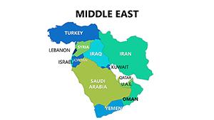 (523)
Complete Middle East PowerPoint Maps: Navigate Global StrategiesID: #PM00080$18.00
(523)
Complete Middle East PowerPoint Maps: Navigate Global StrategiesID: #PM00080$18.00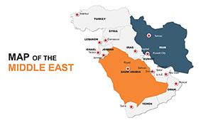 (848)
Custom Middle East Maps PPT: Navigate Global NarrativesID: #PM00049$48.00
(848)
Custom Middle East Maps PPT: Navigate Global NarrativesID: #PM00049$48.00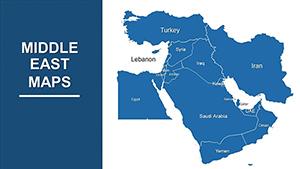 (131)
Customizable Middle East PowerPoint Maps: Precision for Global InsightsID: #PM00014$43.00
(131)
Customizable Middle East PowerPoint Maps: Precision for Global InsightsID: #PM00014$43.00
What a regional map slide communicates that a table or chart doesn`t
A Middle East map slide isn`t about decoration - it`s about spatial logic. When you place Saudi Arabia, UAE, and Qatar next to each other visually, the audience immediately understands proximity, regional grouping, and potential overlap in operations. A bar chart can compare revenue by country, but it loses that geographic relationship entirely. In real presentations, this matters more than expected. I`ve used similar layouts in expansion strategy decks where executives kept asking "how close are these markets actually?" The moment the map went in, that question disappeared. It was already answered visually.
Five real - world scenarios where a Middle East map slide solved the communication problem
Strategy analyst, board update on GCC expansion
Needed to show existing presence versus target countries across the region. The map became the central slide - highlighting coverage gaps without turning the presentation into a geography lesson. The narrative held together without extra explanation.
Consulting team, market entry recommendation for a telecom client
Needed to show coverage gaps across the region. The map highlighted existing presence versus target countries. Without it, the story fragmented across bullet points. With it, the discussion focused on strategy, not logistics.
Finance director, quarterly regional performance review
Used a map to layer revenue data across countries. It wasn`t about exact figures - those lived in tables later - it was about showing distribution. Where growth was concentrated. Where it wasn`t. The map set the stage before diving into detail.
Supply chain manager, logistics planning for Middle East operations
Marking supply routes or warehouse locations. Not perfect for detailed routing, but for high - level discussion, it worked. The map provided the visual anchor that a list of cities couldn`t.
Investor relations lead, presentation to potential investors
The slide where you need to show regional footprint quickly, without turning it into a geography lesson. The map did that. One frame, clear distribution, no extra slides.
When to choose Middle East PowerPoint maps over adjacent categories
If your message depends on geography - proximity, regional clusters, expansion paths - a map is the right choice. But not every dataset needs that. For example, if your focus is purely numeric comparison across countries, a structured table from PowerPoint chart templates might actually be clearer. Tables show all variables at once, without relying on spatial interpretation. If you`re explaining process or flow - say, supply chain steps - a diagram from PowerPoint diagram templates is usually better. Maps don`t handle sequence well. So the decision is simple: use a map when location itself is part of the argument. If it isn`t, switch to something more structured.
Why rebuilding a regional map slide from scratch wastes time you don`t have
Building a regional map slide from scratch in PowerPoint sounds simple until you need to accurately position labels for dozens of cities or ensure that country borders remain recognizable after resizing. These templates solve that. They provide editable vectors for each country in the Middle East, with pre - aligned label placeholders. You don`t need to trace borders or guess whether a city name will fit inside its region. Also, the templates include a coordinated color palette for highlighting specific countries. Change one color on the slide master, and all highlighted countries across all slides update. That`s a significant time - saver when you`re iterating on strategic priorities.
A technical observation specific to PowerPoint maps
These templates use grouped vector shapes for each country. That means you can recolor individual countries without affecting neighboring regions. However, be careful when ungrouping. If you ungroup a country to edit its internal details, you may lose the ability to recolor it easily later. The native group structure preserves the connection to the slide master color scheme. If you need to add a custom label for a specific city not already on the map, use a text box, not a shape from another map. Imported shapes may have different scaling properties. Also, when exporting to PDF, test the map slide at 100% zoom. In some PDF viewers, very thin border lines between countries may disappear. The solution is to slightly thicken border strokes (to 0.75pt or 1pt) before export.
Why this collection is different from typical map marketplaces
Many map template collections offer either highly detailed but uneditable vector files or simple but generic continent outlines that lack country - level detail. This collection hits a middle ground: editable country - level vectors for the Middle East, with pre - placed label positions for major cities and regions. The maps are politically neutral (no disputed boundaries pre - colored), which means you can adapt them to your organization`s recognition guidelines. However, the templates assume a standard Mercator projection. If you need an alternative projection, these templates won`t help. Also, the level of detail is appropriate for strategic presentations, not geographic research. If you need precise distance calculations or topographic features, use a dedicated GIS tool, not PowerPoint.
Related template collections on ImagineLayout
This Middle East map collection is one of several regional map categories. For global coverage, see world PowerPoint maps. For other specific regions, check the broader PowerPoint maps templates category. And if your message is about process or comparison rather than geography, switch to PowerPoint diagram templates or PowerPoint chart templates. Use maps when location is the argument.
Frequently Asked Questions
Can I recolor individual countries in these map templates?
Yes. Each country is a separate vector shape grouped under the slide master. Select the country, change its fill color, and the change applies only to that country. The templates use a coordinated color palette, so if you change one color on the slide master, all countries using that color update automatically. However, be careful not to ungroup the country shape. Ungrouping breaks the connection to the master and may also separate the country into its constituent paths, making it difficult to recolor as a single unit. If you need to edit internal details, duplicate the slide first, then experiment on the copy.
Do these maps include disputed territories like the Golan Heights or West Bank?
The maps are designed to be politically neutral. Boundary representations are based on commonly accepted international definitions, but disputed territories are not pre - colored or labeled in any specific way. If your presentation requires a particular stance on a disputed area, you will need to manually adjust the boundaries or coloring. The template provides the underlying vector shapes, but the political interpretation is up to you. This is standard practice for commercial map templates because organizations have different recognition policies. Always review the map against your organization`s guidelines before presenting, especially for sensitive geopolitical contexts.
Can I add city - level detail to these maps?
The templates include pre - placed label positions for major cities (e.g., Riyadh, Dubai, Doha, Kuwait City, Muscat, Manama). If you need additional cities, you can add text boxes manually. However, the map`s scale may not support detailed city - level plotting for smaller towns. For a regional map covering the entire Middle East, labels for minor cities will overlap or become illegible. If you need high - density city - level detail, consider using a more detailed sub - region map or switching to a list format. For strategic presentations, major city coverage is usually sufficient.
What happens if I resize the map slide?
The map shapes are vectors, so they can be resized without pixelation. However, resizing the entire slide changes the aspect ratio of the map relative to other slide elements like text boxes or chart placeholders. The safer approach is to resize the map object itself, not the slide. To do that, select the grouped map, hold Shift, and drag a corner handle. The labels will scale with the map, but you may need to reposition them slightly after scaling. Avoid scaling by more than 50% in either direction, as label placement accuracy may degrade. If you need a significantly different map size, it`s better to start with a template designed for that output format (e.g., widescreen vs standard).
Can I export these maps for use in other software like Adobe Illustrator?
Yes. From PowerPoint, you can save the slide as a PDF, then open that PDF in Adobe Illustrator. The vector data will be preserved, and you can edit individual country paths. However, some grouping information may be lost in the export. Also, text labels may convert to outlines or shift position slightly. If your goal is to use the map in a print publication or a non - PowerPoint environment, this is workable but requires cleanup. For best results, use PowerPoint`s native "Save as Picture" feature (right - click the map > Save as Picture) and choose EMF or SVG format. Those formats preserve vector data better than PDF.
Are there any limitations to editing these map templates?
Yes. The templates are designed for strategic presentations, not geographic research. The level of detail is appropriate for regional overviews but insufficient for hyper - local analysis. Also, the maps use a standard projection that distorts area toward the poles. For the Middle East, which is closer to the equator, distortion is minimal, but it exists. If you need precise area comparisons or distances, these templates are not suitable. Finally, the templates assume you are using PowerPoint on Windows or macOS. PowerPoint for the web may have rendering issues with complex vector groups. Always edit in the desktop version for best results.