Medicine - Pharma PowerPoint Charts
In the fast-paced world of medicine and pharmaceuticals, clear communication of complex data is essential. Our collection of pharmaceutical chart templates for PowerPoint empowers professionals to transform raw numbers into insightful visuals that drive decisions and inspire confidence.
Designed specifically for pharma executives, medical researchers, healthcare marketers, and educators, these templates feature sleek layouts with medical-themed icons, precise graphing tools, and easy-to-edit elements. Whether you're illustrating drug efficacy trials, sales forecasts, or patient outcome metrics, you'll find bar graphs, pie charts, timelines, and infographics tailored to the industry's unique needs.
Each template is fully customizable, allowing you to adjust colors to match your brand, input real-time data, and add annotations for deeper context. Say goodbye to bland spreadsheets and hello to presentations that captivate stakeholders and facilitate breakthrough discussions.
Explore our curated selection today and elevate your next boardroom pitch, conference talk, or training session. With instant downloads and compatibility across devices, creating professional pharma visuals has never been simpler.
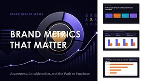 (17)
(17) Brand Metrics That Matter PowerPoint Template with Editable ChartsID: #PC01162$12.00
 (12)
Vaccination Levels By Age Group PowerPoint Template with Editable ChartsID: #PC01161$15.00
(12)
Vaccination Levels By Age Group PowerPoint Template with Editable ChartsID: #PC01161$15.00 (11)
Hospital Operations Patient Flow PowerPoint Template with Editable ChartsID: #PC01158$15.00
(11)
Hospital Operations Patient Flow PowerPoint Template with Editable ChartsID: #PC01158$15.00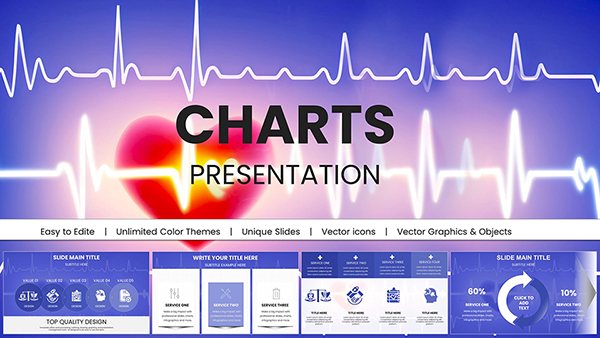 (737)
(737) Cardiology Healthcare PowerPoint Charts: Pro TemplateID: #PC01061$22.00
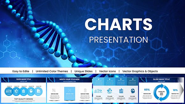 (763)
(763) Medical Presentations with 3D Visualization DNA PowerPoint ChartsID: #PC01053$24.00
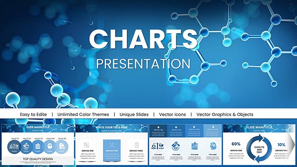 (856)
Education Presentations with Chemical Molecules PowerPoint Charts: Ignite LearningID: #PC01050$18.00
(856)
Education Presentations with Chemical Molecules PowerPoint Charts: Ignite LearningID: #PC01050$18.00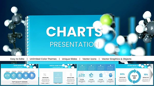 (38)
Chemical and Biomedical PowerPoint Charts: Precision for Scientific ImpactID: #PC01049$18.00
(38)
Chemical and Biomedical PowerPoint Charts: Precision for Scientific ImpactID: #PC01049$18.00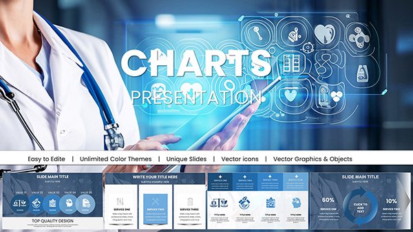 (811)
Medical Health PowerPoint Charts TemplateID: #PC01045$20.00
(811)
Medical Health PowerPoint Charts TemplateID: #PC01045$20.00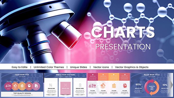 (637)
Microbiology Microscope PPT Charts DownloadID: #PC01044$22.00
(637)
Microbiology Microscope PPT Charts DownloadID: #PC01044$22.00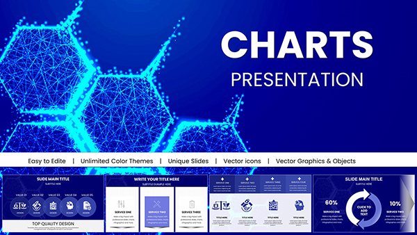 (466)
Medical Science PowerPoint Charts: Illuminating Health Data with ClarityID: #PC01040$20.00
(466)
Medical Science PowerPoint Charts: Illuminating Health Data with ClarityID: #PC01040$20.00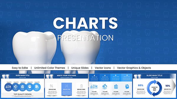 (573)
Dental PowerPoint Charts Template - Smile BrightlyID: #PC01034$22.00
(573)
Dental PowerPoint Charts Template - Smile BrightlyID: #PC01034$22.00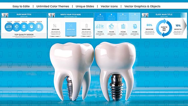 (12)
Dental Implant PowerPoint Charts: Precision for Medical ProsID: #PC01025$24.00
(12)
Dental Implant PowerPoint Charts: Precision for Medical ProsID: #PC01025$24.00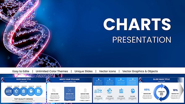 (606)
(606) Stunning DNA Genome PowerPoint Charts Presentation: Bring Genetics to LifeID: #PC01016$22.00
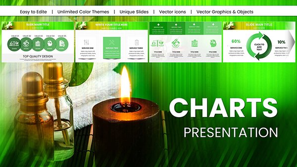 (857)
Professional Spa Procedures PowerPoint Charts Template: Optimize Your Wellness BusinessID: #PC01015$22.00
(857)
Professional Spa Procedures PowerPoint Charts Template: Optimize Your Wellness BusinessID: #PC01015$22.00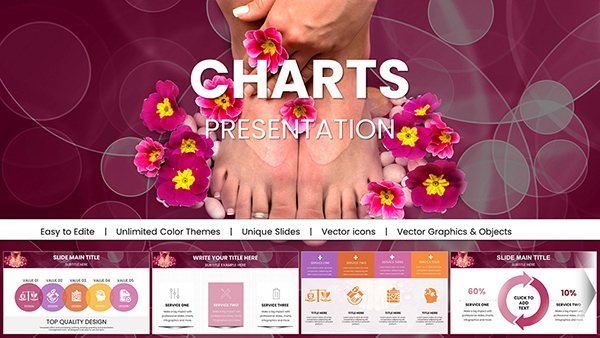 (1186)
Spa Pedicure Treatment PowerPoint Charts Presentation: Soothe Your Audience with StyleID: #PC01012$23.00
(1186)
Spa Pedicure Treatment PowerPoint Charts Presentation: Soothe Your Audience with StyleID: #PC01012$23.00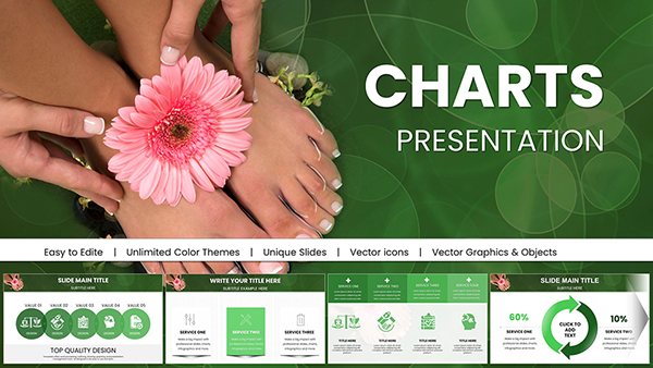 (58)
Spa Treatments PowerPoint Charts PresentationID: #PC01011$25.00
(58)
Spa Treatments PowerPoint Charts PresentationID: #PC01011$25.00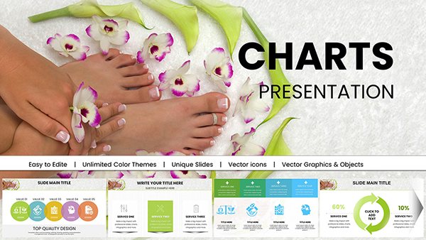 (100)
SPA Foot Treatment PowerPoint Charts TemplateID: #PC01010$22.00
(100)
SPA Foot Treatment PowerPoint Charts TemplateID: #PC01010$22.00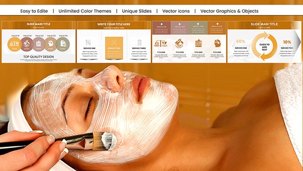 (375)
DIY Face Mask Spa PowerPoint Charts: Transform Wellness PresentationsID: #PC01005$25.00
(375)
DIY Face Mask Spa PowerPoint Charts: Transform Wellness PresentationsID: #PC01005$25.00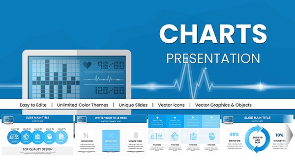 (324)
Healthcare PowerPoint Infographics: Master Medical Data VizID: #PC00978$18.00
(324)
Healthcare PowerPoint Infographics: Master Medical Data VizID: #PC00978$18.00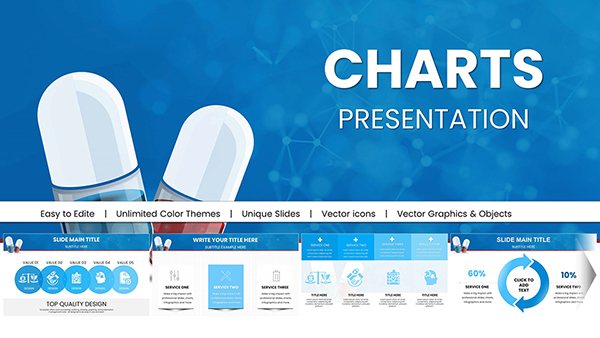 (730)
Pill Pharmaceutical Medical PowerPoint Charts: Elevate Healthcare InsightsID: #PC00977$18.00
(730)
Pill Pharmaceutical Medical PowerPoint Charts: Elevate Healthcare InsightsID: #PC00977$18.00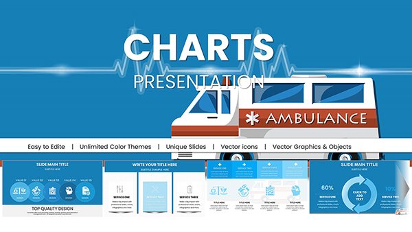 (270)
Design Ambulance PowerPoint Charts: Empower Medical CommunicationsID: #PC00975$18.00
(270)
Design Ambulance PowerPoint Charts: Empower Medical CommunicationsID: #PC00975$18.00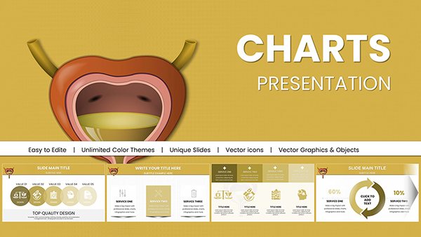 (589)
Urinary System PowerPoint Charts: Precision for Medical InsightsID: #PC00963$18.00
(589)
Urinary System PowerPoint Charts: Precision for Medical InsightsID: #PC00963$18.00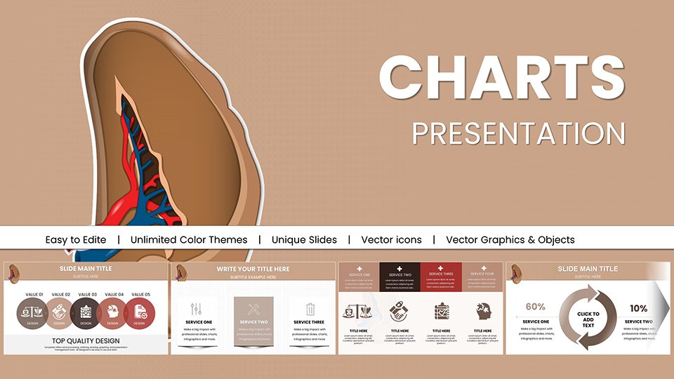 (1183)
Spleen and Blood Cell PowerPoint Charts: Hematology MasteryID: #PC00962$18.00
(1183)
Spleen and Blood Cell PowerPoint Charts: Hematology MasteryID: #PC00962$18.00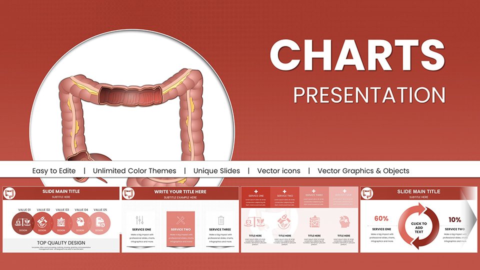 (175)
Large Intestine PowerPoint Charts: Digestive Depth UnveiledID: #PC00961$18.00
(175)
Large Intestine PowerPoint Charts: Digestive Depth UnveiledID: #PC00961$18.00 (296)
Comparative Data Chart Template for PowerPointID: #PC00960$18.00
(296)
Comparative Data Chart Template for PowerPointID: #PC00960$18.00 (855)
Vitamin K PowerPoint Charts: Empowering Health NarrativesID: #PC00956$20.00
(855)
Vitamin K PowerPoint Charts: Empowering Health NarrativesID: #PC00956$20.00 (29)
Foods Rich in Vitamin E: PowerPoint Charts for Health ProsID: #PC00955$20.00
(29)
Foods Rich in Vitamin E: PowerPoint Charts for Health ProsID: #PC00955$20.00 (963)
Vitamin D PowerPoint Template: Shining Light on NutritionID: #PC00954$20.00
(963)
Vitamin D PowerPoint Template: Shining Light on NutritionID: #PC00954$20.00 (1195)
Vitamin C Supplements PowerPoint Charts TemplateID: #PC00953$20.00
(1195)
Vitamin C Supplements PowerPoint Charts TemplateID: #PC00953$20.00 (469)
Vitamin B Benefits PowerPoint Charts TemplateID: #PC00952$20.00
(469)
Vitamin B Benefits PowerPoint Charts TemplateID: #PC00952$20.00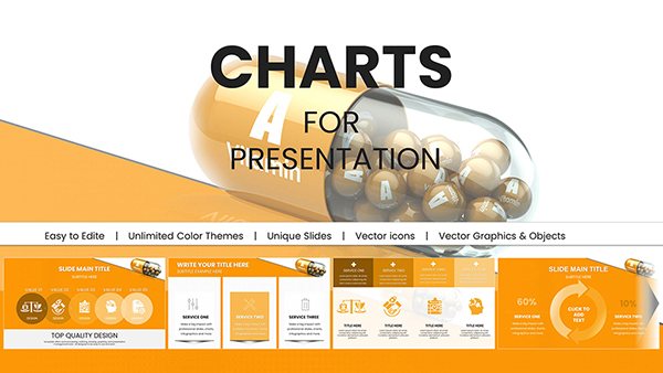 (384)
Vitamin A Mineral Supplements PowerPoint TemplateID: #PC00951$20.00
(384)
Vitamin A Mineral Supplements PowerPoint TemplateID: #PC00951$20.00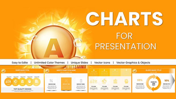 (82)
Vitamin A Carotenoids PowerPoint Charts DownloadID: #PC00950$20.00
(82)
Vitamin A Carotenoids PowerPoint Charts DownloadID: #PC00950$20.00 (408)
Vitamin A Carotenoids Presentation Charts TemplateID: #PC00949$20.00
(408)
Vitamin A Carotenoids Presentation Charts TemplateID: #PC00949$20.00
Key Use Cases for Pharmaceutical Chart Templates
Pharmaceutical chart templates shine in diverse scenarios where data visualization can make or break your message. In clinical research, use a multi-series line graph to track drug trial phases, showing efficacy rates over time with confidence intervals clearly marked. This helps investigators present findings to regulatory bodies or funding committees, ensuring every metric supports your narrative.
For sales and marketing teams, donut charts break down market share by therapeutic area, highlighting growth opportunities in oncology or cardiology. Imagine pitching a new blockbuster drug to physicians - your slide deck, powered by these templates, turns abstract revenue projections into relatable, color-coded segments that underscore competitive edges.
Educators in medical schools leverage stacked bar charts to compare treatment protocols, fostering interactive discussions on pharmacodynamics. In corporate settings, Gantt charts map out R&D pipelines, aligning cross-functional teams on milestones from discovery to market launch.
These applications extend to compliance reporting, where radar charts evaluate risk factors in supply chain logistics, or patient education materials featuring simple pictograms to explain dosage regimens. The versatility ensures your presentations resonate across audiences, from C-suite leaders to frontline healthcare providers.
Why Choose Our Templates Over Standard PowerPoint Defaults?
Standard PowerPoint charts often feel generic, with limited customization that fails to convey the precision demanded in pharma. Our templates stand out by incorporating industry-specific motifs - like molecular structures or vial icons - while maintaining a clean, minimalist aesthetic that avoids visual clutter.
Unlike defaults, which require manual formatting for every slide, ours come pre-built with smart art placeholders, dynamic data links, and animation sequences that reveal insights progressively. This saves hours of design time, allowing you to focus on storytelling rather than technical tweaks.
Accessibility is baked in: high-contrast colors for color-blind viewers, alt-text ready for screen readers, and scalable vectors that retain sharpness on any display. Plus, they`re optimized for both light and dark modes, ensuring your visuals pop during virtual webinars or in-person seminars.
Consider a head-to-head: a default pie chart might lump categories together, but our pharma variant uses exploded segments with tooltips for hover details, turning passive viewing into an engaging exploration. The result? Higher retention rates and more persuasive outcomes.
Unique Value Propositions and Best Practices
What sets our pharmaceutical chart templates apart is their emphasis on narrative integration. Each design prompts you to weave data into a compelling story - start with a hook via an animated funnel chart depicting the drug development journey, then pivot to scatter plots correlating biomarkers with therapeutic responses.
Best practice one: Always anchor charts with context. Pair a heat map of adverse event frequencies with explanatory footnotes, citing sources like FDA databases for credibility. This builds trust and positions you as a data-savvy authority.
Practice two: Leverage color psychology - blues for trust in efficacy data, greens for growth in market penetration. Our palettes are scientifically selected to evoke confidence without overwhelming the viewer.
Unique edge: Embedded formulas auto-update calculations, so if trial data shifts, your forecasts recalibrate instantly. Integrate with Excel for seamless imports, and export to PDF for regulatory submissions. For creative flair, layer in subtle gradients mimicking lab glassware, adding a touch of sophistication.
Pro tip: Test readability at 10 feet - our fonts scale perfectly, ensuring back-row attendees grasp quarterly sales trends from a combo chart blending lines and columns.
Practical Insights and Creative Applications
Let`s dive into real-world examples. A biotech firm used our waterfall chart to dissect cost breakdowns in a Phase III trial, revealing efficiencies that secured $5M in venture funding. The sequential build-up visually unpacked expenses from recruitment to analysis, making the ROI crystal clear.
Creatively, repurpose a Sankey diagram for visualizing patient flow through telemedicine platforms, showing drop-off points in virtual consultations. This not only highlights bottlenecks but inspires process improvements, like targeted reminders to boost adherence.
In pharmacovigilance, bubble charts plot signal detection - size by report volume, x-axis for onset time, y-axis for severity. Overlay trend lines to forecast emerging risks, arming safety officers with proactive tools.
For global teams, world map overlays on choropleth charts display regional approval timelines, color-coded by regulatory hurdles. This fosters collaborative strategy sessions, turning data into actionable roadmaps.
Innovate further by animating cohort analyses in survival curves, fading non-significant arms to spotlight Kaplan-Meier estimates. These touches transform routine updates into memorable narratives that drive innovation.
Explore More and Get Started Today
Ready to supercharge your presentations? Browse our full library of pharmaceutical visuals and download your favorites instantly. With user-friendly editing and expert support, crafting data stories that convert has never been easier.
Don`t settle for ordinary - unlock the power of precise, pharma-focused charts now.
Frequently Asked Questions
What types of charts are included in these pharmaceutical templates?
Our collection features bar graphs, line charts, pie and donut visuals, scatter plots, Gantt timelines, radar diagrams, and Sankey flows, all customized for medical and pharma data representation.
Are these templates compatible with Google Slides?
Yes, they are fully editable in both PowerPoint and Google Slides, with vector elements that maintain quality across platforms.
How do I customize the colors to match my brand?
Simply select the chart elements and apply your hex codes via the color picker - changes propagate across all slides for consistency.
Can I use these for regulatory submissions?
Absolutely; export options include high-res PDF and PNG formats, with built-in support for annotations and source citations to meet compliance standards.
What file formats are available for download?
Downloads come in .PPTX for PowerPoint, .ZIP for full packs, and editable source files, ready for immediate use.