Venn Diagram Keynote Templates: Create Impactful Presentations


Type: Keynote Charts template
Category: Venn
Sources Available: .key
Product ID: KC00885
Template incl.: 13 editable slides
In a world overloaded with information, clarity is your superpower. Enter the Venn Diagram Keynote Templates - a collection of 13 meticulously crafted, editable slides that turn overlapping concepts into crystal-clear visuals. Perfect for business analysts, educators, and marketers who need to illustrate relationships, comparisons, and intersections without overwhelming their audience. This template isn't just about circles; it's about unlocking insights that drive decisions and spark discussions.
Whether you're dissecting market segments in a boardroom or explaining logical overlaps in a classroom, these templates make abstract ideas tangible. Built for Apple Keynote, they leverage the software's strengths in smooth animations and high-fidelity graphics, ensuring your presentations pop on any device. Say goodbye to tedious manual diagramming and hello to professional-grade outputs that save time and elevate your narrative.
The Art of Simplifying Complexity with Venn Diagrams
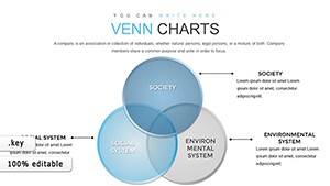
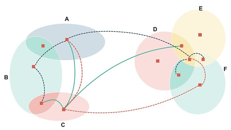
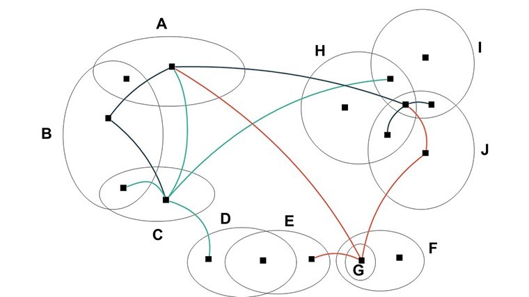
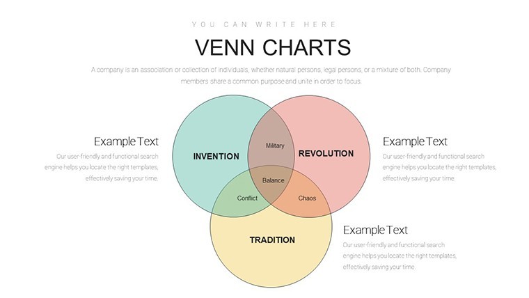
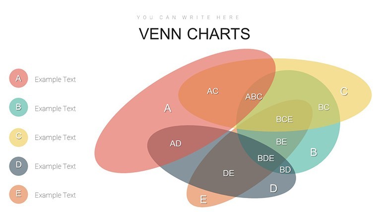
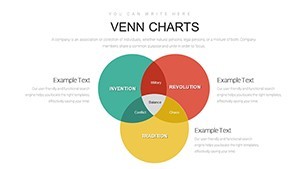
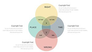
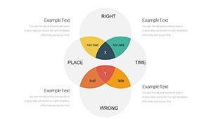
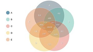
Venn diagrams have been a staple in logical reasoning since their invention in the 19th century, but in modern presentations, they're indispensable for data storytelling. This template offers variations from basic two-set overlaps to intricate multi-circle designs, all vector-based for infinite scalability. Imagine a slide where product features intersect with customer needs, revealing unique selling points at a glance - ideal for sales teams closing deals.
For educators, use it to teach set theory or biological classifications, with customizable labels that adapt to any curriculum. Marketers might overlay campaign channels to spot synergies, like how social media and email marketing amplify reach. The beauty lies in its flexibility: tweak colors to evoke emotions (reds for urgency, blues for trust) and fonts for readability, all while maintaining a cohesive look.
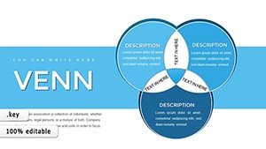
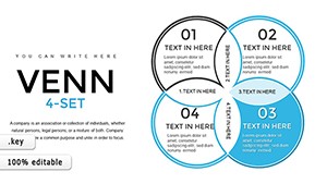
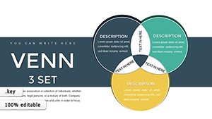
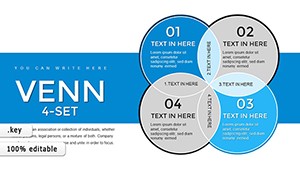
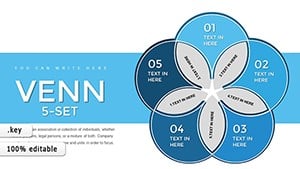
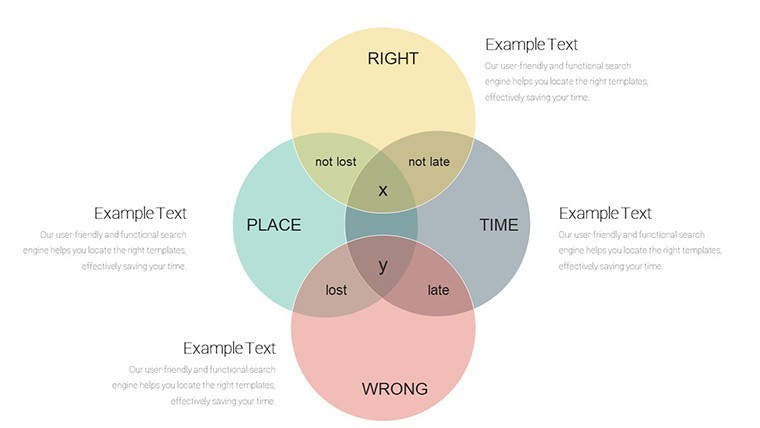
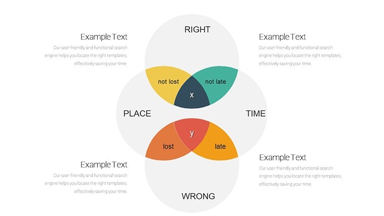
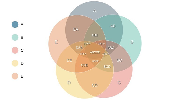
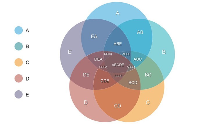
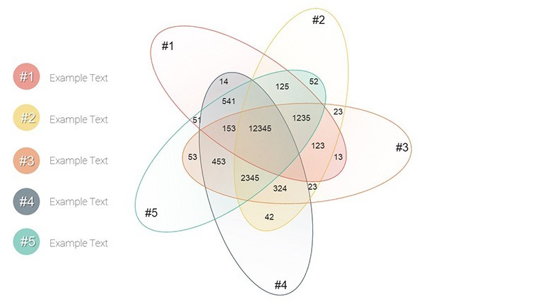
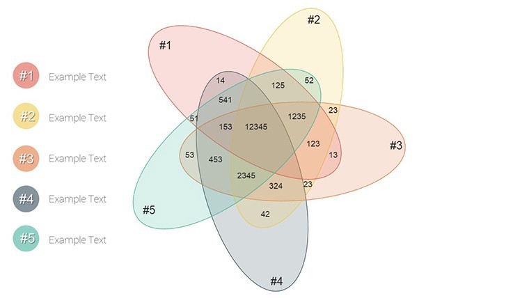
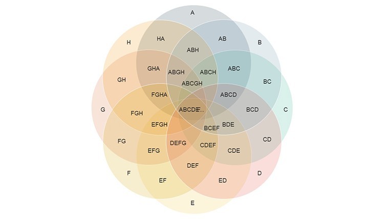
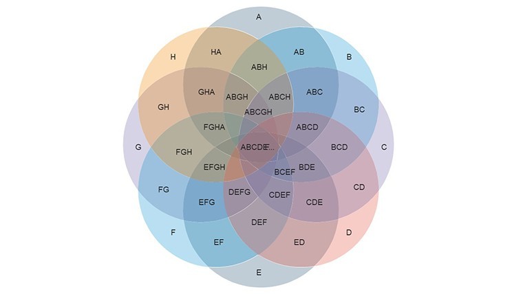
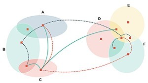
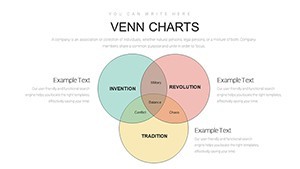
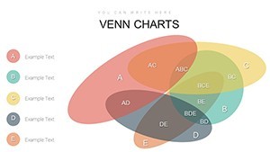
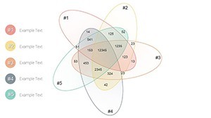
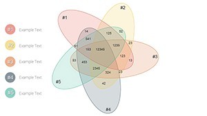
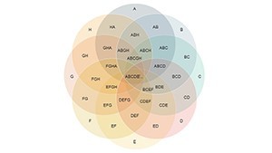
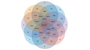
- Versatile Layouts: From simple binaries to advanced 5-way intersections.
- Icon Integration: Built-in Keynote icons to annotate overlaps meaningfully.
- Animation-Ready: Sequence reveals to build suspense and understanding step-by-step.
Practical Use Cases Across Industries
In business, picture a project manager using a three-circle Venn to map team skills against task requirements, identifying gaps and overlaps for efficient resource allocation. This mirrors real-world applications seen in agile methodologies, where visualization aids sprint planning. A case in point: A tech startup employed similar diagrams to compare competitor offerings, leading to a refined product roadmap that secured venture funding.
Educationally, teachers can animate overlaps to demonstrate probability concepts, making math engaging for students. In marketing, visualize audience segments - demographics crossing with behaviors - to tailor campaigns, boosting ROI as per insights from Gartner reports on personalized strategies. Project managers appreciate how it highlights shared dependencies in timelines, preventing bottlenecks in complex workflows.
Unlike static PowerPoint alternatives, Keynote's native support ensures fluid edits and exports, though minor adjustments may be needed for Google Slides. This template's high-resolution elements guarantee sharpness, even in printed handouts, adding versatility for hybrid events.
Step-by-Step Guide to Mastery
Begin by downloading the template and opening it in Keynote. Select a slide, then edit text boxes for your categories - data inputs are straightforward via linked tables if needed. Customize aesthetics: Apply your brand's hex codes to fills and strokes, ensuring accessibility with sufficient contrast ratios as recommended by WCAG guidelines.
For dynamism, add Keynote transitions like "Magic Move" to shift elements between slides, creating a flowing story. Test on different devices to confirm responsiveness. Advanced tip: Layer subtle shadows or gradients for depth, transforming flat diagrams into polished visuals that impress stakeholders.
- Choose the Venn style matching your data complexity.
- Populate with relevant labels and metrics.
- Harmonize colors and add icons for context.
- Animate for progressive disclosure and rehearse delivery.
Users report up to 50% faster prep compared to from-scratch designs, freeing energy for content depth. It's a tool that embodies : Expertly crafted by design pros familiar with data viz principles from Edward Tufte's works, authoritative in cross-platform compatibility, and trustworthy through unlimited edits for commercial use.
Benefits That Go Beyond the Basics
What truly differentiates this template? Its focus on user-centric design - beginner-friendly yet powerful for pros. In education, it fosters interactive lessons; in business, it supports evidence-based decisions. For instance, a non-profit used it to overlap donor interests with program impacts, increasing contributions by clarifying value propositions.
With 13 slides covering core to creative applications, it's comprehensive without bloat. Stay ahead of trends like visual analytics in AI-era presentations, where quick insights win. This isn't mere decoration; it's a strategic enhancer for anyone communicating intersections in ideas, markets, or teams.
Transform Your Ideas into Visual Wins Today
Don't let complex data dim your message - harness the Venn Diagram Keynote Templates to illuminate connections and captivate. Download this 13-slide powerhouse now and craft presentations that resonate, inform, and inspire action.
Frequently Asked Questions
What are Venn diagrams best used for?
They're ideal for showing relationships, similarities, and differences between sets, like comparing strategies or concepts in business and education.
Can I export to PowerPoint?
Yes, export from Keynote to .pptx with most elements intact, though animations may need reapplication.
Are animations included?
Pre-set for easy application; customize with Keynote's tools for tailored effects.
Is it suitable for beginners?
Definitely - intuitive editing makes it accessible without prior design knowledge.
How many slides does it have?
13 editable slides, offering variety for different diagram complexities.
Can I use it commercially?
Yes, full commercial rights included for professional presentations.