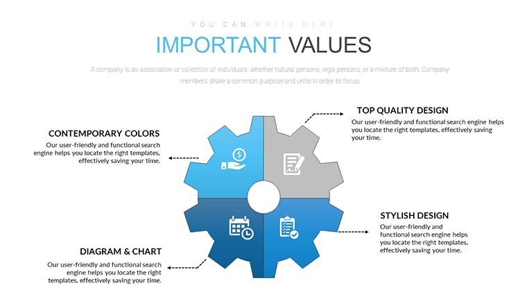
4 Sector Gears Keynote Charts for Interconnected Data


In a world where data points don't exist in isolation, visualizing their gears-like interactions can unlock deeper understandings. Our 4 Sector Gears Keynote Charts Template delivers this with 20 editable slides, merging pie chart precision with puzzle-like modularity to depict segmented relationships. Tailored for business developers, consultants, and planners, it allows you to show how elements mesh - be it team dynamics, market sectors, or process interdependencies - in a mechanically inspired design that's both functional and fascinating.
Grounded in metaphorical gears from engineering principles, akin to those in systems thinking models like Donella Meadows' work, this template facilitates illustrations of cause-effect chains. Envision a strategy session where gears represent departmental synergies, turning independently yet driving collective motion via animations. The .key compatibility and widescreen format make it versatile for diverse settings, from workshops to webinars.
Core Features Driving Your Success
This template's ingenuity comes from its hybrid nature - pie for proportions, puzzles for assembly. Colorful variations and animated effects simulate gear rotations, adding kinetic energy to static data. Full editability ensures you can recalibrate sectors, texts, or images to mirror your scenario precisely.
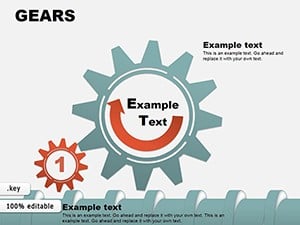
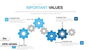
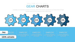
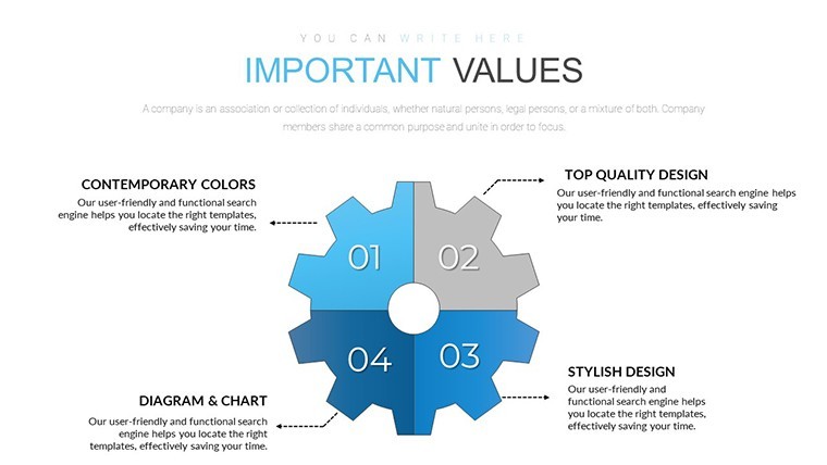
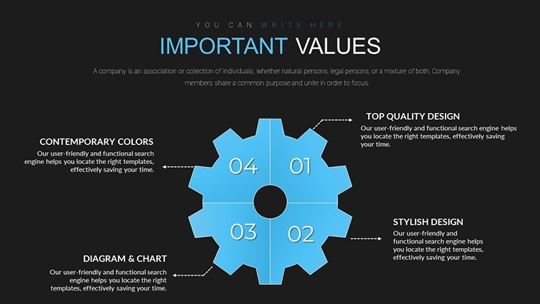
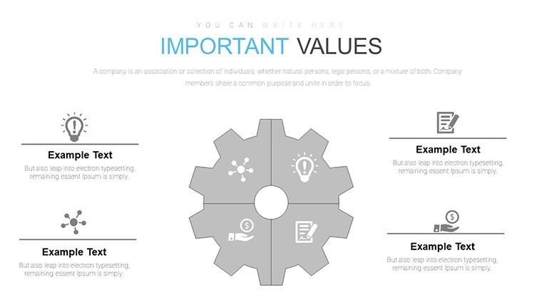
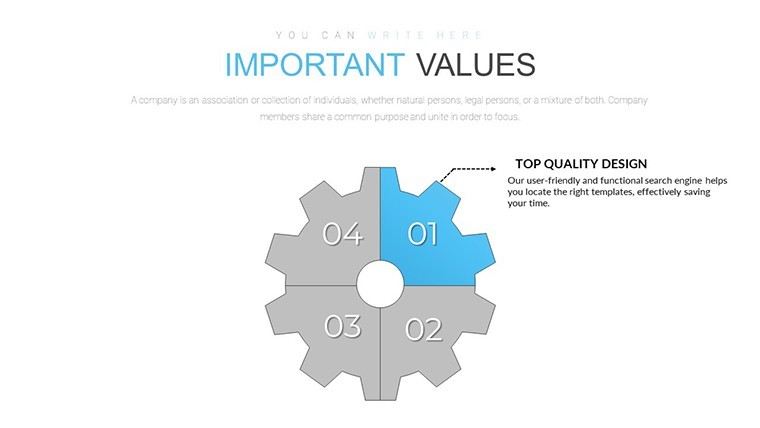
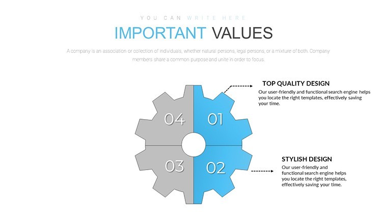
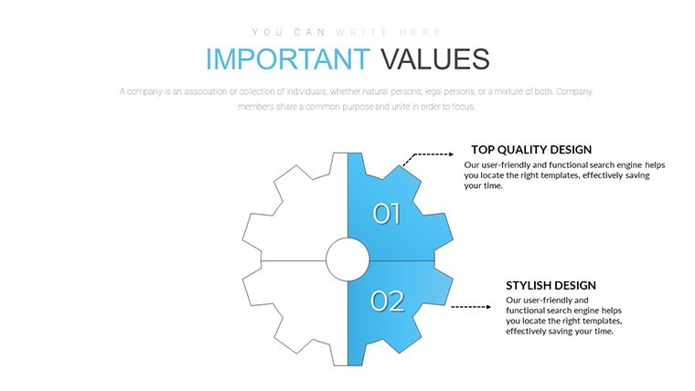
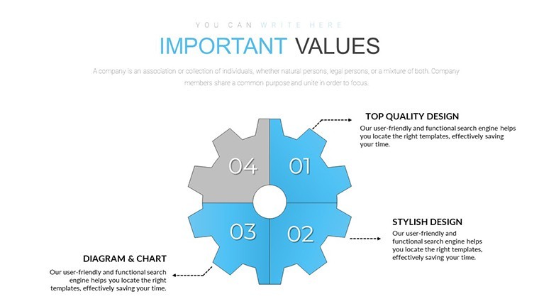
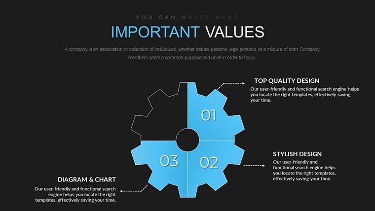
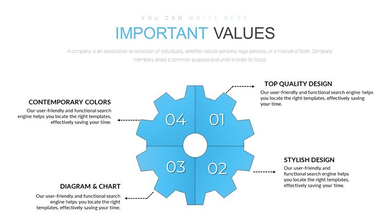
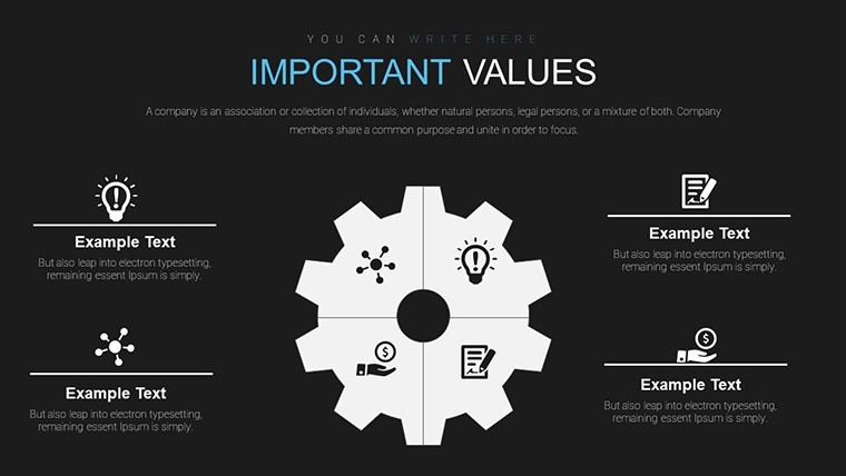
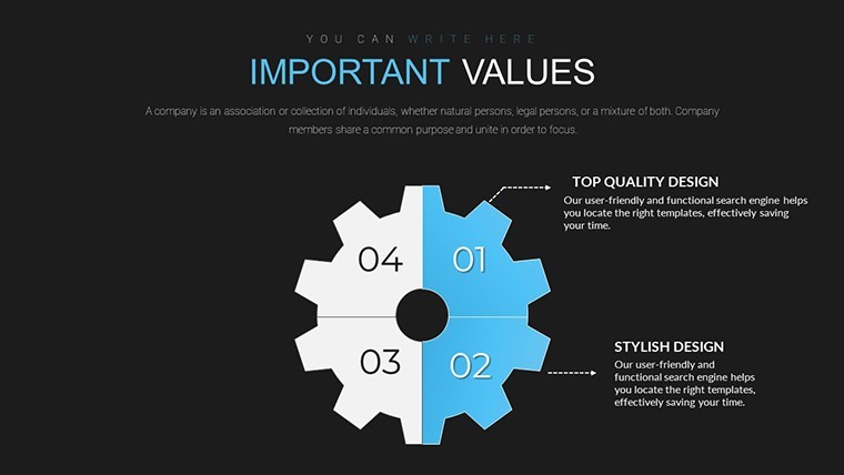
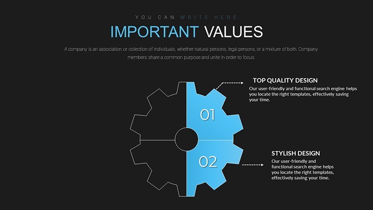
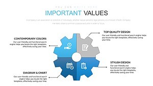
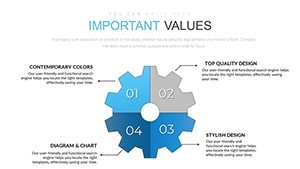
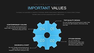
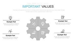
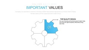
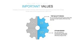
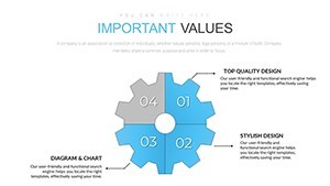
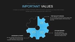
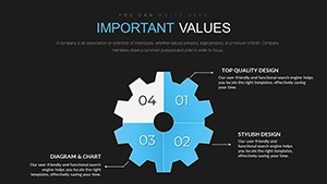
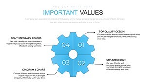
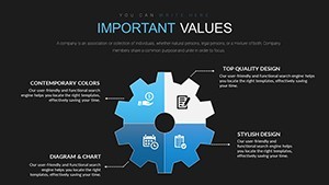
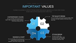
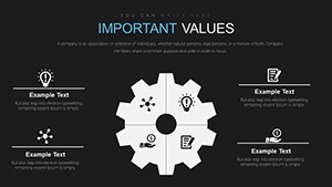
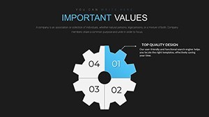
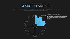
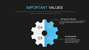
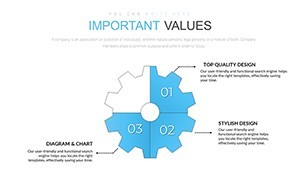
- Sector Division: Four gears for variants, sequences, or qualities, offering structured segmentation.
- Color Dynamics: Vivid options to differentiate cogs, aiding in quick relational grasps.
- Animation Mechanics: Custom spins and meshes that animate data flows engagingly.
- Text and Photo Edits: Seamless changes to personalize with your content.
- Relationship Focus: Tools to highlight interconnections, perfect for advisory contexts.
Aligned with visualization standards from experts like Garr Reynolds in "Presentation Zen," these features promote simplicity amid complexity. For businesses, gear charts can map advisory fields, as in consulting where sectors represent service pillars interlocking for client solutions.
Applying Gears Charts Effectively
Deploy this template by aligning sectors to your data's facets - quality metrics in one, sequences in another. Customize, animate, and present. Detailed steps: Open in Keynote, pick a gear slide, label sectors (e.g., R&D, Production, Sales, Marketing), color for distinction, and set animations to show meshing.
Process outline: 1. Customize layout. 2. Input specifics. 3. Animate interactions. 4. Integrate visuals. 5. Refine for audience. This fosters a gears mindset, encouraging holistic views in planning.
Real-World Integrations and Advantages
Strategists dividing targets, educators on systemic relationships, or firms visualizing stats - all thrive with this. Outpacing basic pies, our gears add relational depth, cutting through numerical noise. Example: A startup using gears to show investor value chains, clarifying how sectors interlock for growth, resulting in successful funding.
Its power? Converting abstract links into visible mechanics, sparking insights and actions.
Tailoring Tips for Gear Precision
Optimize by syncing gear sizes to importance, using shadows for depth. Balance animations to avoid distraction, per usability guidelines. These, drawn from design luminaries, ensure your charts engage without overwhelming.
Mesh your ideas seamlessly - acquire this 4 Sector Gears Keynote Charts Template and gear up for impactful presentations. Begin your journey to interconnected clarity today.
Frequently Asked Questions
How do the gears represent data?Through sectors dividing into four, illustrating proportions and relationships.
Can animations show interactions?Yes, custom effects simulate meshing for dynamic demos.
Easy to adapt for different sectors?Fully, with quick edits to fit any four-part division.
Compatible with group work?Certainly, .key files support collaborative editing.
What if I need more sectors?Combine slides or modify for extensions.